Thursday 3 January 2013

Jobs from the past - Number 39

Regular followers of this blog will know that my first post of every month is a "job from the past" so that I can show some of the really good work from years gone by and here's one from 2009.

The Breastfeeding Chair
This publication is a research book about the development of a breastfeeding chair suited to the needs of breastfeeding women and their infants. Written by Dr Lynn Jones the book documents the project, from it's beginnings as a PhD research project at the School of Design & Craft, Faculty of Creativity & Culture at Buckinghamshire New University, right up to prototype.

Research by Professor Sally Kendall, along with other professionals, led to the premise that there was something fundamentally wrong with the way that women sit when they breastfeed their babies. Lynn Jones carried out research right up to chair development by Upholstery Trading Ltd in High Wycombe.The chair was awarded Best Product of The Year in 2005 by the BCFA (British Contract Furniture Association) and Parenting Product of The Year in 2006. The design is now registered both in the EU and US and the ongoing development of the chair continues to inform her teaching practice. Dr. Jones has collaborated with industry partners including Ercol Furniture, John Lewis and Vitra.

The book is 234 x 156mm, portrait, 4pp cover and 88pp text, printed in just two colours, black and red on Redeem 100% Recycled, 100gsm. The paper, which is a natural white shade, works particularly well with the mainly typographic design (there are only a few images) - it isn't as harsh on the eye as it would be with a high white paper and suits the subject and design perfectly.
The cover is printed on the colour range from the other "Hull based" paper merchant! (in 270gsm Bright Red) which is hot foil blocked in gloss white foil.
 
The beautifully simple, clear typographic solution is by London based designer, Jo Murray. Print is by Team Impression.   
 
www.bucks.ac.uk
www.upholstery -trading.co.uk
www.jomurray.co.uk
www.team-impression.com
Posted by Justin Hobson 03.01.2013

Friday 28 December 2012

Studio Cookbook 2

This is the new Studio cookbook2, published by East London Riso printer, Hato Press. Studio cookbook1 was a collection of recipes aimed to inspire social lunches at the workplace and included recipes from åbäke, Alex Bettler, Mind Design, Sara De Bondt studio and many more.

Studio cookbook2 includes recipes from An endless supply, AND Publishing, Art Licks, Goodwin Hartshorn, The Gourmand, Manystuff, Meadham Kirchhoff, Sarah Gottlieb, Fraser Muggeridge studio, Bahbak Hashemi-Nezhad and Sophie Demay  to name but a few!

The book is 236x132mm, portrait. The covers and end papers are cut 20mm short at the head. There are 60pp of text and the binding is "spiral bound" in a dark red plastic spiral. Spiral binding is different from wiro binding. Spiral binding is formed from a continuous length of either plastic or metal and is a finishing method produced by a few specialist binders/finishers. It is an effective binding method which tends to hold things a bit tighter than a wiro.

The book is printed on a mixture of Coriandoli and Flora. The cover is on Coriandoli Blu 250gsm but the text is a mixture of deliberately mixed up shades from Flora and Coriandoli ranges which gives the book a beautifully unstructured feel which works fantastically with the Riso printing. The text is all printed in one colour, although that colour depends on the shade of paper and the recipe - it works really well.
The book is edited and designed by Ken Kirton and thanks to Ken for sending me a copy and a lovely note.
The cookbook costs £12 and although this post comes a bit late to make this a Christmas present, it is a great idea for any upcoming birthdays etc!

www.hatopress.net
http://kenkirton.com
Posted by Justin Hobson 28.12.2012

Monday 24 December 2012

A Triangular Christmas

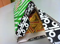
Here at Fenner Paper, we were delighted to receive a GP Tube-Mailer ™ (which is Generation Press's own invention) packed full of Toblerone bars!
Generation Press printed matching sleeves with the correct brand colours to go round the triangular bars of chocolate, honey and almond deliciousness! 
 ...and here's a close up of the GP Tube-Mailer ™, which in many ways is much more convenient and more robust than a postal tube - andthis is an excellent way of showing just how versatile this form of packaging is!
Our thanks to all at Generation Press for their generous, thoughtful and beautifully presented present. It's worth remembering those companies that look after their suppliers and not just their customers, after all any company is only as strong as it's suppliers! 

Happy Christmas!
Posted by Justin Hobson 24.12.2012

Wednesday 19 December 2012

Heal's Christmas 2012

This is a lovely invitation which makes you feel all Christmasy! This is the invitation to the Heal's Autumn Winter press show and it has all the ingredients of luxury, shades of mulled wine, and velvety feel with a bit of seasonal gold all thrown in!

This beautiful inviatation is A5 (210x297mm) landscape format and is made using our Flockage Colours, Bordeaux 400gsm, hot foil blocked in metallic gold foil. It is triplexed, together with two layers of Colorset Crimson 270gsm, which again is hot foil blocked in gloss white foil and metallic gold.
Design is by London based consultancy The Grid. Creative Director is Johnathan Collins and designer on the project is Matt Crowe. Beautiful foiling and finishing is by Push.
 
Posted by Justin Hobson 19.12.2012

Tuesday 18 December 2012

Happy Faces!

From time to time the teachers from Happy Faces pre-school in Tonbridge come and load up their car with left over paper scraps that are just a bit too good to go in the recycling bin!
 
Today, we had a lovely surprise, as a dozen gorgeous cupcakes were dropped off to say thank you and wish us a happy Christmas.  
Thank you Happy Faces, they were yummy! 
 
http://www.happyfaces.plus.com/
Posted by Justin Hobson 18.12.2012

Friday 14 December 2012

Frieze Film 2012

Frieze Film is a programme of artist films screened to coincide with Frieze London. Curated by Sarah McCrory, in 2012 the commissions included five new films by Bertrand Dezoteux, Patricia Esquivias, Jimmy Merris, John Smith and Wu Tsang & Nana Oforiatta-Ayim. This piece of promotional literature is the touring programme and works as both an information leaflet and a promotional poster (front and back film stills by Linder)
The size is  A5, landscape (148x210mm) and is a 16pp broadsheet format folding out to 592x420mm. The material chosen is our Avebury Recycled Wove 135gsm, which is a neutral white shade and very tactile. The material suits the muted colours in the film stills and is beautifully tactile.
Reverse side:

The job was printed and finished by Bethnal Green based print cooperative, Calverts. If you haven't come across them, maybe you should have a look. Unusually for a print company, they are a worker's cooperative, therefore the management, tasks and profits are all shared equitably - almost sounds too good to be true!
  
Posted by Justin Hobson 14.12.2012

Thursday 13 December 2012

Visit to Greiz Mill


Last week, together with Mr Fenner himself (!),  I was fortunate enough to visit the mill in Germany that makes our Colorset paper. Greiz Mill is part of the Koehler group of companies which is still a family owned papermaker. The group is mainly involved with the production of thermal coated and carbonless papers, but the mill we visited specialises in producing recycled products.

Greiz is a very attractive, ancient town in Thuringia in eastern Germany, close to Leipzig and is unusual in having two castles. The mill can trace it's history back to the 1590's, with the current machine at the mill being installed in the 1960's.

You can see from the picture here, how seriously they take their recycling (and it is stacked very neatly)


...and here I am, shivering, in front of the bales of recycled fibre (see the snow on the ground!)


Mr Mallon, the Technology and Quality Manager, taking us through the various stages of the recycling process:


...and below is the picture that shows the reason that Colorset is such a well made sheet of paper. What you are looking at is a picture of a "twin-wire" paper machine, which is generally regarded as the best type of machine on which to make fine paper.
Effectively, the machine starts by making two seperate webs of paper which come together in the papermaking process making a superior, even sided sheet of paper (not to be confused with duplexing).

...and here (above) is the magic piece of equipment manufactured by Escher Wyss, called a "top former".

Here I am standing by the paper machine, which is making our Colorset Magenta, with a smile on my face knowing that our lovely coloured paper is made on a machine with a superior twin wire, while the coloured paper made for that other well known, Hull based paper merchant, is only made on a single wire machine!

I would like to thank everyone at Greiz and Koehler who made our trip very worthwhile and enjoyable.
Posted by Justin Hobson 13.12.2012