Wednesday, 20 February 2013

Christian Dior - La Collection Privée

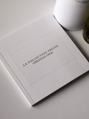
La Collection Privée from Christian Dior is their collection aimed at the world of haute parfumerie.  Dior’s perfumer, Francois Demachy, not only knows how to create amazing perfumes from blending raw materials but also knows how to create a story.

The story Demachy has created is that of Christian Dior’s life. Each fragrance is a tribute to the couturier’s creative life and the people and places that inspired the designer. Using a combination of illustrations and phototographs, this lovely little book tells the story ...beautifully.
The size is 140mm square, perfect bound. It has a 6pp cover with a full flap on the inside front cover and a 48pp text. The cover is blind embossed with a "frame" and the title is printed in black with a gloss "spot" UV varnish on the type giving it a raised effect. The material used is our Omnia 320gsm and 150gsm.
Many designers use Omnia because four colour work is fantastic and that means that most projects that people consider it for are heavily photographic. Omnia was chosen for this job because some of the illustrations are very fine and maintaining the detail was very important but a tactile uncoated feel was still essential.
 
Printing is by Identity, based in Paddock Wood, Kent and they have made a superb job of it - colour reproduction is fantastic - the illustrations look amazing as do the colour images - it is difficult for me to say too much more about it - the images speak for the job...
 
Posted by Justin Hobson 20.02.2013

Monday, 18 February 2013

Flockage saves the day!

Last Tuesday, the Lindt Big Egg Hunt was launched in Covent Garden in London. One hundred and one giant Easter eggs have been hidden around the former flower market area as part of a charity egg hunt in support of Action for Children. The two-and-a-half foot tall fibreglass eggs were on display in London until Sunday and have now gone  on tour around the country, returning to the capital on the 22nd of March, in time for Easter.
 
The eggs have been created by some of the world’s leading artists and designers and are auctioned off for the cahrity after the event.
Now you might be wondering what this has to do with paper or this blog? Well, back in December I was approached by Hoxton designers Baxter & Bailey who had been asked to submit a design for one of the eggs which had been accepted. Their entry sought to address the poultry/egg philosophical quandary, and is cleverly titled Eggsistentialism.
Eggsistentialism
Now, as with many clever ideas, they sometimes fall down when it comes to the execution. Matt and Dom got in touch with us here at Fenner Paper to see if we could suggest a material to manufacture the rosette which was also robust, weather-proof ...and red!

We discussed various plastic products but they were either too rigid or a bit too plasticy! Then, by chance, I saw a sample of a red flocked material with a PVC backing from our Flock supplier, SEF
(Société D'enduction et de Flockage) in France. They kindly agreed to help and sent a sample roll which was enough to produce the large rosette. Below is a picture of one of the partners, Dom Bailey, with their creation.
The eggs getting on a train to go on their tour around the UK,to Birmingham, Liverpool, Manchester and Glasgow.
Money raised goes to: http://www.actionforchildren.org.uk/get-involved/events/lindt-big-egg-hunt Established in 1869, Action for Children is committed to helping the most vulnerable and neglected children in the UK by helping young carers and providing fostering and adoption services.

A big thank you to SEF for supplying the material and making this 'eggsellent' project viable.

http://www.thebigegghunt.co.uk/the-hunt-tour/the-tour
www.baxterandbailey.co.uk
www.sef-france.com
http://www.designweek.co.uk/we-like/the-big-egg-hunt/3036011.article
Posted by Justin Hobson 18.02.2013

Thursday, 14 February 2013

Happy Valentine's Day


Thanks to Val Kildea of vtype for my lovely Valentine's Day A3 print.
This lovely, typographic, limited-edition print was silkscreened printed at Peckham Print Studio in two colours and sent to clients (and special people, like me!). I'm not sure what material it's printed on, but it's very lovely anyway!

www.vtype.co.uk
Posted by Justin Hobson 14.02.2013

Tuesday, 12 February 2013

Gardens By The Bay

This has got to be one of the best pieces of print to ever appear on this blog!
 
This publication is to showcase the result of a major landscape project in Singapore which started in November 2005 and was completed in June 2012. The gardens, including the amazing vertical 'supertrees', were commissioned by the National Parks Board of Singapore and was the result of a winning entry by a British team put together by Grant Associates, Wilkinson Eyre Architects, Atelier Ten and Atelier One.
This brochure is 340x240mm, portrait and has a 36pp text which is sewn along the spine with white thread. It has a 6pp cover with a full flap on the inside front. An absolutely sensational 'blind embossing' appears over the whole area of the cover - which looks and feels amazing. The cover is printed in the dark purple of the Mangosteen fruit, an intrinsic part of the brand identity of the gardens. 
 
It may not surprise regular readers of this blog to learn that the material used is our lovely Omnia, the cover is 280gsm and the text 150gsm. Image reproduction was paramount but it was also important that the feel of the publication conveyed the tactility of plants and landscape, so a silk or gloss coated paper wasn't an option. The images with CMYK dark areas - with loads of ink going down, looks great on the Omnia, reproducing bright vibrant colours as well and the darker colour saturated images as well, whilst retaining all the detail and feel. ...and it looks brilliant.
The images below, speak for the job...  
There is a seperate 32pp inserted in the middle, printed on uncoated 80gsm offset, which has all the details, relating to the project (below) 
 
a staggeringly blue spread...
The below pictures show the binding which is worthy of note. This type of binding is generally known as 'three hole sewn' - because there are three holes, the thread comes out of the middle up and into the top hole, down the inside of the book out of the middle hole again and now down to the lower hole and in again up the inside of the book to the middle hole, where it is knotted. In this case, there are two banks of three hole sewing and this is to take account of the extra bulk and position of the extra 32pp text section, inserted in the middle. 
Here's a close up showing the sewing and the beautiful embossing:


Thomas.Matthews are the branding and communication designers who formed part of the winning bid, to design the identity for the gardens. The intricate, shape based illustration forms the basis of the identity (embossed on the cover), together with the brand typography. Creative Director on the project is Sophie Thomas.
Gardens by the bay branding pattern
'Gardens' typeface

Thomas.Matthews also art directed and designed this brochure. To have the opportunity to produce a piece of literature about a project with which they had been so intimately involved, must have been a total delight and something that I think shows, in this beautifully considered piece of design for print. Art director on this project is David Grbac.

The exceptional printing, repro, debossing and binding is by London based Jigsaw Colour.

http://www.gardensbythebay.com.sg/en/home.html
www.thomasmatthews.com
www.jigsawcolour.co.uk
Posted by Justin Hobson 12.02.2013

Monday, 11 February 2013

BCN:MCR

This is some news about an exciting event which is happening in Manchester on 21st February.
Dave Sedgwick is a Manchester based designer who has organised an exhibition featuring 5 of Barcelona's best design agencie: Hey, Lo Siento, Mayuscula Brands, Mucho and Lamosca. They are are exhibiting their work at exhibition space 2022NQ (http://www.2022nq.co.uk/), just off Dale Street in the Northern Quarter, Manchester. The exhibition launches on February 21st from 6pm with an exhibition launch evening and runs for two weeks.

This is a fantastic opportunity to see some exciting work by some great designers from another country. Here are the links to the five agencies:

http://www.losiento.net/
http://www.mayuscula.es/es/home
http://heystudio.es/
http://www.lamosca.com/
http://www.mucho.ws/

You can checkout the exhibition website http://www.bcnmcr.co.uk for more information. The exhibition is free but tickets for the launch event on 21st Feb will be reasonably priced - for more information, you can email Dave dave@designbydave.co.uk

It's worth pointing out that this event has been entirely organised and currently funded by Dave alone which I think is fantastic - hats off to him. This shows two things; firstly what one person can achieve with a great idea and talking to people; second, it shows that organisations like D&AD, DBA, ISTD, Typographic Circle et al are certainly not pulling their weight.

http://www.bcnmcr.co.uk
http://www.designbydave.co.uk
http://www.2022nq.co.uk/
Posted by Justin Hobson 11.02.2013

Thursday, 7 February 2013

The Herb House

Lime Wood is a boutique country house hotel, set in the heart of the New Forest and is the only 5 star hotel in the New Forest National Park. As you might expect from a hotel of this type there are many luxury facilities, including a spa - and on the roof of the spa is a ‘Herbery’. The Herb House, which is the spa and garden have been designed to reflect the hotel's location so as not to detract from the amazing views of the surrounding forest – this is complimented with the planting of the herbs and the experience of touch and smell.
This folder is a simple piece of literature to promote the facilities at the Herb House. It is a 6pp gatefold format, (297x230mm) printed on Flora Anice 350gsm - for those that aren't familiar with it, Flora is a 50% recycled paper (and FSC accredited) with natural, deliberately visible, inclusions & fibres and it works amazingly well with these beautiful images.
Outside Back Cover
I'm not sure there's a lot more I can add, except that this really is a lovely piece of literature - with a natural, quality feel. Art Direction and design is by Strattons. Print is by Pureprint.

www.limewoodhotel.co.uk
www.strattons.com
www.pureprint.com
Posted by Justin Hobson 07.02.2013

Tuesday, 5 February 2013

Jacksons Fencing ...in practice

This is an extremely interesting publication produced by Jacksons, a company which produces, fencing, gates, railings etc. In house graphic designer, Lauren Soutan, got in touch with me and explained that they wanted to produce a catalogue which would appeal and inspire architects. To this end, her proposal was to produce a piece of literature, more along the lines of a fashion "look-book" which would be more inspirational, rather than having all the specifications and facts and figures (which, of course, can all be found on-line). The end result is this superb piece of print, titled ...in practice.
 
On page one is a quote by Charles Eames " Design is a plan for arranging elements in such a way as best to accomplish a particular purpose"   
The layout is simple and alows the monochrome photography to work really well. Printed in CMYK throughout. Section divider pages printed in solid blue (also out of CMYK).
Size is 200 x 240mm, Landscape format, saddle stitched. It has a 4pp cover on Omnia 200gsm and a 36pp text on Marazion Ultra 90gsm. The deliberately lightweight feel allows the pages to flow freely and to sit flat, allowing for perfect read-overs. The materials are perfectly chosen with the Marazion Ultra in particular having a lightweight, matt look and feel but with the images reproducing beautifully with great clarity and detail.
 
Design is by Lauren Soutan at Jacksons Fencing. Print production is by James Stewart Printers in Hertford. Thanks to Lauren for sending me file copies and a note.

www.jacksons-fencing.co.uk
www.jacksons-security.co.uk
www.james-stewartprinters.com
Posted by Justin Hobson 05.02.2012