Tuesday, 18 March 2014

What is ...Singer Sewing?

What is ...Number 3
Regular followers of this blog will know that in the middle of the month, I publish a "What is ....? post. The article covers various aspects of paper, printing and finishing in greater depth. However, many of these subjects are complex, so these posts are only intended to be a brief introduction to the topic.
 
What is ...Singer sewing?
Singer sewing is a binding method which uses thread. Generally it is done in a highly visible way and often uses a coloured thread to highlight the binding.
 
The machinery used by the bindery for this is, in fact, very similar to a domestic sewing machine and like all the best sewing machines that our Mum's have, it's made by Singer! (other makes are available). It works in exactly the same way as a conventional sewing machine for cloth but with an industrial motor and a high strength needle. Researching this article, I understand that some machines will sew up to 10mm of paper - that's quite a lot!
 
Singer sewn projects have appeared often enough on this blog that I can easily illustrate it with these existing projects. The below picture shows a singer sewn publication:
http://justinsamazingworldatfennerpaper.blogspot.co.uk/2011/03/wrangler-bluebell-ss11.html
There are however two distinct types of singer sewing and unfortunately in the mysterious world of print terminology, it's not always clear what people mean or what terms they are using, so I shall try an de-mystify!
 
The project below has been finished over a "saddle", in the same way that a "wire stitched" or "saddle stitched" job is finished (or as most people out of the industry would call it - stapled with metal staples). The term saddle is used because it sits astride a saddle in the same way as a saddle sits on a horse. This then allows the machine to guide the thread or wire, accurately through the folded spine. As with wire stitching, there is a limit to how thick you can bind, because you have to consider the fold. 
http://justinsamazingworldatfennerpaper.blogspot.co.uk/2010/11/wrangle-bluebell-fallwinter-2010.html
However, you can also set it up so that the thread penetrates the whole thickness of the publication and is therefore visible on both the outside front cover and outside back cover. Normally the sewing is set in about 5-10mm in from the spine, as in the picture below. Often this is done with loose sheets of paper (as below) and there is no folded paper on the spine and the edge of the paper is visible on the spine. 
http://justinsamazingworldatfennerpaper.blogspot.co.uk/2013/06/coming-up-for-air.html
Both examples above are accurately described as singer sewn. However, I prefer to call the above example (that goes through the whole book) "Side Sewing" as I think it is more descriptive but it is also referred to as "Stab Sewn". Like most terminology in printing, it is as much useful as it is a hindrance. Most important of all is to communicate clearly what is required, either in words, drawing or picture.

I am often asked if this type of binding is a machine process or a hand process. The best way to describe it, is a "hand operated machine process" as unlike a truly mechanised process, the book has to be manually handled through the machine .

Another feature of the binding, is that you can leave the thread hanging, rather than having it cut flush in line with the edge of the book. This can work beautifully with the design, as with the project below:


http://justinsamazingworldatfennerpaper.blogspot.co.uk/2011/03/jobs-from-past-number-17.html
Not all binderies have a machine that can do this type of binding but there are a fair few finishers around the country that can handle this type of work. If you want a suggestion, just ask me...
 
Posted by Justin Hobson 18.03.2014

Friday, 14 March 2014

Design Bridge - 25 years

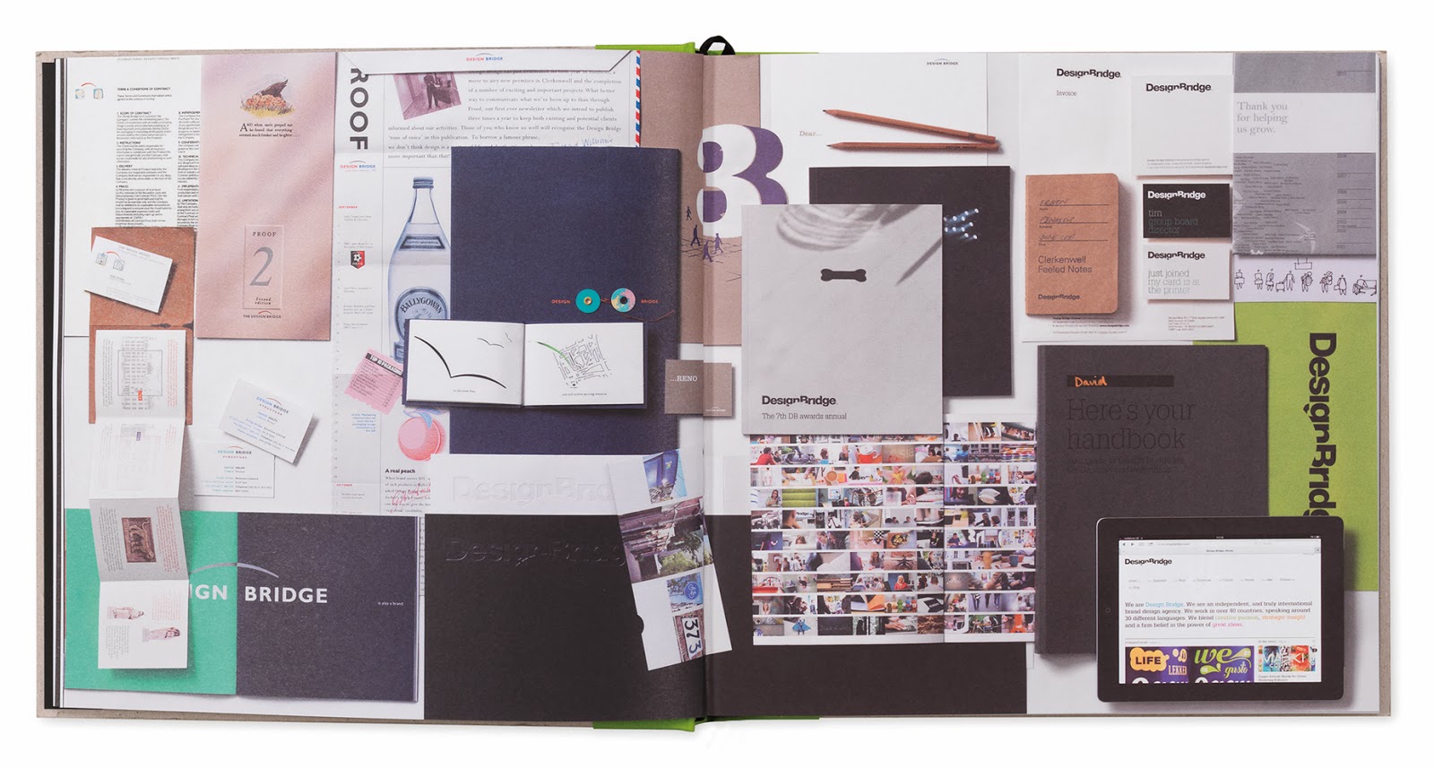
Design Bridge has published this beautiful book to celebrate their twenty fifth anniversary. This well known brand design agency started in London but now has a truly global reach with offices in Amsterdam and Singapore.
 
The book is titled 'Twenty Five Stories' and is a collection of 25 thoughts which make up a cohesive story of Design Bridge, about the brands, clients and products that have been the focus of their business over the years and include many references to that well known and popular Clerkenwell watering hole, The Three Kings!
 
The format of the book is 250mm square in a casebound greyboard cover with binding tape (in four different colours) along the spine which is silkscreen printed in black. The greyboard has been exquisitely embossed with 25 'tree rings' (or Dendros as they are known). 
The 122pp text is printed on our StarFine White 170gsm and is absolutely sublime, both in terms of the design and print (and paper, of course!) The text sections are printed offset litho in CMYK throughout with some of the sections printed with a pantone silver as well.
As one might expect, the quality of the images is superb and the quality of the print is stunning, the black solids are particularly impressive. 

The books are finished with a black headband and ribbon.
The team that designed and produced the book is Vicky Evans, Rhian Brain, Holly Pallister, James Minta, David Clabon, Craig Goldhawk, Nathan Jordan and Adam Stanley.
Photographers include Iain Crockart, Rupert Singleton, Lisa Tubbs, Ian Forsyth and Terry Benson.

The printing and production is by Identity Print, based in Paddock Wood in Kent and the print quality, finishing and binding is quite simply superb. Paul Winter handled the job at Identity.

All in all a beautifully produced piece of literature that will undoubtedly stand the test of time.

www.designbridge.com
www.identityprint.co.uk
...and it's also worth pointing out that we supplied the custom made boxes for the book, which as you can see from the picture are constructed in such a way that the books are perfectly protected.
www.designbridge.com
www.identityprint.co.uk
https://www.facebook.com/pages/The-Three-Kings-in-Clerkenwell/122709598813
Posted by Justin Hobson 14.03.2014

Thursday, 13 March 2014

The Letterpress Collective

I've just been emailed with a pic of a lovely job printed on our board, which I want to share with you. It's been printed two colour letterpress on our Kemikal Cotton White 1500mics (...yes that's right, it one and a half millimetres thick!)  
 
It's a wedding invitation and it's been printed letterpress at Bristol's newest (and only) letterpress print workshop called 'The Letterpress Collective'
 
This new workshop started last year after the last letterpress printer in Bristol quietly closed it's doors, without anyone really noticing. Well someone noticed! ...as a small group of enthusiasts collected machinery, including a Heidelberg Windmill Platen, a Stephenson Blake proofing press, various Adana's together with a collection wood and lead type. Put this all together with a lovely workspace and experienced compositors and printers and you have a thriving environment for creativity - and education, as they run courses as well!
 
Do have a look at their site:
www.theletterpresscollective.org
The Letterpress Collective, Studio 31 Centrespace, 6 Leonard Lane, Bristol BS1 1EA

This invitation is designed by Tony Cresswell (...who's wedding it is!) and produced by Nick Hand, who is one of the founding members and keen letterpress printer.

www.theletterpresscollective.org
http://www.departmentofsmallworks.co.uk/

...and if you're interested to see a sample of the Kemikal, Cotton White 1500mic, just drop me a line and ask for a sample.
Posted by Justin Hobson 13.03.2014

Tuesday, 11 March 2014

From paper mill to shopping mall!

Regular readers of this blog will be aware that the paper industry has been going through a very hard time in recent years and the manufacturing sector which is "heavy industry" has suffered with mill closures and the resulting job losses. Last year, I wrote about the paper mill in Finland which has been converted into a Google datacentre:
http://justinsamazingworldatfennerpaper.blogspot.co.uk/2013/01/from-paper-to-data.html

Aticarta in Pompeii - the derelict factory building
I recently came across another interesting and creative solution for what to do with a redundant paper mill, this time in Italy. The "Aticarta" paper mill is based just outside the historic and ancient city of Pompeii. Founded in 1927 the mill manufactured cigarette and filter papers, which is a specialist area of paper manufacturing. The holding company also had production at another site and so sadly, the Aticarta mill was closed in 2005.

Subsequently a co-operative including the regional government and regeneration agency purchased the site with a bold plan to regenerate the buildings as a retail destination with particular emphasis on making the project as sustainable as possible.

The former paper factory has been transformed into a modern integrated shopping centre, over two levels with 120 retail units, 12 food/restaurant outlets and 2,000 parking places. The whole project is focussed on sustainability, integration with the environment and the surrounding historic ruins and the use of  energy efficient technologies. The shopping areas and galleries, are cooled by 26 reversible Roof-Top units installed on the roof which maximize energy efficiency and compliments the sustainable development of the whole project.
Building work started in 2010 and was completed in 2012. There is 30,000m2 of space employing over 150 people.
It's an interesting and innovative solution to use a redundant factory in an environmentally sound way, especially in such a sensitive, historical cultural area as Pompeii.

...and I hope you enjoyed reading about it.
 
Posted by Justin Hobson 11.03.2014


Friday, 7 March 2014

Five Dollar Shake ...on Stardream

Many readers of this blog will have purchased a greeting card or two from this remarkable greeting card publisher, Five Dollar Shake. Based in Hastings and established in 1998, they design and manufacture all their cards in the UK, including the application of the crystals, sequins, bows and trinkets that many of their ranges are renowned for.  
This new range of cards is produced on a bespoke production of our lovely Stardream board, made by Cordenons in Italy. For those not familiar, Stardream is a pearlescent/metallic range which shimmers beautifully. The board for these cards is made especially with a stripy emboss (called Cannetè) with a coloured reverse (see below pic) which complements the outside of the card, enabling a message to be written inside with ink or ballpoint pen.
The size of the cards is 160mm square. This particular range of cards is hot foil blocked only, the 'appy birthday card (above) in four different foil colours! The cards are also embossed on the foiled area and you can see the wonderful depth of embossing on this 80th Birthday card...

The "Henries" are the awards for the greeting card industry (named after the inventor of the greeting card - Sir Henry Cole) - their industry equivalent of the D&AD Awards (www.thehenriesawards.co.uk) and Five Dollar Shake have won over twenty awards in the last fifteen years ...pretty amazing stuff!
Creative director at Five Dollar Shake is Beth Genower.

These cards are exquisitely hot foil blocked and embossed by Robert Armstrong, who is based in Keighley, Yorkshire. Intricate and impeccably produced.

robertarmstrong59@hotmail.co.uk
http://www.cordenons.co.uk/
Posted by Justin Hobson 07.03.2014

Wednesday, 5 March 2014

Ultrabold 14

This is the Autumn 2013 edition of Ultrabold magazine, which is the Journal of the St Bride Library - if you aren't familiar with St. Brides, have a look at the link: http://www.stbride.org/
 
Fenner Paper is pleased to support this publication, by supplying discounted material - hopefully doing our bit to preserve the history of our industry for future generations. This latest edition has some really interesting articles, worth a mention.
In this issue, there is a very interesting article about, designer and artist Eric Ravilious (1903-1942) who, in his short career, produced a prodigious amount of work.
  
In this issue there are three separate articles by James Russell, looking at three aspects of his talents, as wood engraver, lithographer and watercolourist.
The publication is designed by Simon Loxley and is published by the Friends of St Brides.Printing is sponsored by Principal Colour. The journal is a 40pp self cover, 190x265mm Portrait, saddle stitched and is printed on Brand X FSC 135gsm.

The cover price is £7.00, although as I've mentioned before, it's worth mentioning that this publication is free to friends of St Bride - so why not look into joining - might be cheaper than just buying the books!

http://www.stbride.org/
http://www.principalcolour.co.uk/
Posted by Justin Hobson 05.03.2014


Monday, 3 March 2014

Jobs from the past - Number 53

Regular followers of this blog will know that my first post of every month is a "job from the past" so that I can show some of the really good work from years gone by...

Children Nationwide - Annual Review 1995/96
The charity was originally set up in 1977 under the name “Kidney” by an individual whose friend’s daughter had died of kidney disease with the aim of funding research into kidney disease. At that time there was virtually no research into children’s health issues and the specific treatment of children with kidney disease had only just begun. Over the years, “Kidney” evolved into “Children Nationwide Medical Research Foundation”, and moved towards supporting all areas of paediatric research.

This beautifully crafted report was produced in 1996, to both report on the charity's progress, financial status and a document to encourage further donations. For the record, it's worth pointing out that the charity awarded £2,093,868 in research grants in 95/96.

The size of the report is 310x235mm, portrait. It has a 4pp cover on our Kapok 400gsm, which is a brown board with a raw look and feel. The cover is printed in just one colour both sides but the outside cover has a printed self adhesive label (printed one colour, halftone in blue) "tipped on" which registers with the one colour printed surround - very effective.
The 24pp text is printed on our Neptune Unique 135gsm and is printed in two colours throughout. It's worth remembering that back (nearly twenty years ago) two colour offset litho printing was substantially cheaper than four colour which is the norm, these days. Beautifully printed, with flat solid colours.
The photography throughout is by Andy Rumball:
As a result of this charity, there have been major clinical advances in many areas of paediatric research, especially in Kidney treatment. In 2003, Children Nationwide was renamed “WellChild” to better reflect the broadening remit of the research.
The report was designed by designer, Marek Gwiazda. It's a superb example of a well thought out, beautifully crafted piece of literature which has stood the test of time. It certainly isn't a lavishly produced job and shows then, as now, that a well considered design with the right materials can be produced in a cost effective way and still look fantastic. Marek Gwiazda is now based in Bristol.

The report was printed by Principal Colour, who are still based in Paddock Wood in Kent.

www.wellchild.org.uk
http://www.marekdesigns.com/
http://awrprojects.blogspot.co.uk/
www.principalcolour.co.uk
Posted by Justin Hobson 03.03.2014