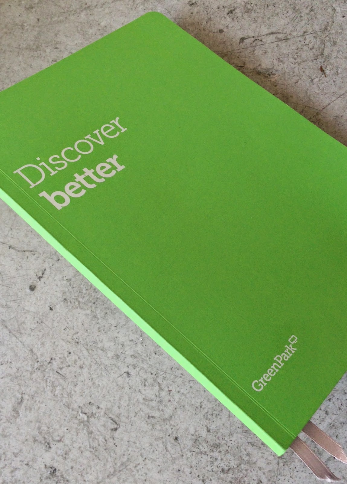
Regular followers of this blog will know that in the middle of the month, I publish a "What is ....? post. The article covers various aspects of paper, printing and finishing in greater depth. However, many of these subjects are complex, so these posts are only intended to be a brief introduction to the topic.
What is ...Sapphire Treatment?
 Indigo was founded by Benny Landa in Israel and in 1993 they launched the first Indigo digital printing press (the Indigo E-print 1000). It took many years to take a hold in the digital print market as it was up against very established competitors such as Xerox.
  However, it works in a totally different way to the other toner based printers and in fact is an 'offset' process which is similar to offset litho.
 I first saw an Indigo press when I visited DRUPA (a printing and graphic arts fair held in Germany) in 1995. I picked up the print examples and still have the original sales brochure!
 The print result further improved with subsequent models and became an industry leader in digital quality print. In 2001 Hewlett Packard (HP) purchased Indigo and the press manufacturer became known as the HP Indigo. There has been much investment and many new models including the game-changing B2 format press...
http://justinsamazingworldatfennerpaper.blogspot.co.uk/2012/03/hp-indigo-unveils-b2.html
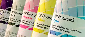 Unlike other digital printing methods an Indigo press uses an ElectroInk which contains charged pigmented particles in a liquid carrier.
Like other digital printing technologies, such as toner, ElectroInk
enables digital printing by electrically controlling the location of the
print particles. However, unlike other digital technologies, Indigo is still an 'offset' process where the ink is transferred from the plate onto a blanket and then onto the paper substrate http://www8.hp.com/h20195/v2/GetPDF.aspx%2F4AA3-9326EEW.pdf
At the time when the Indigo press was first launched, the majority of papers were produced for offset litho or for dry toner. The results were a little hit or miss, although better for coated papers and the problem was that the ink was coming off and caused a particular problem around folded areas. To get round this problem 'Sapphire Treatment' was developed. This is a polymer-based solution which is coated on the sheet before the printing process. It provides a 'key' between the surface of the paper and the ElectroInk that binds the ink to the paper and maximizes ink adhesion. This 'treatment' or 'coating' is applied as a pre-coat before the paper is printed.
 |
| Image Courtesy of POSCO Inc http://www.poscoinc.com/default.aspx |
The image below shows the detail of the machine, which is a series of rollers which evenly spreads the liquid coating.
So basically, pretty much any paper can be treated/coated to make it suitable for printing on an HPIndigo press ...so who does the coating?
 Some paper merchants have their own coating facilities (as we do at Fenner Paper) ...however our coater is not suitable for mass production, so larger batches are sent to specialist coating companies. One such company, called ACCEL, is based in the Midlands and is an HP Indigo Authorised Media Treatment Centre. They coat for many merchants and printers for the HP Indigo sheetfed market.
http://www.acceluk.com/
 However it is important that you don't think that everything printed using this technology needs treating! There are nearly 4000 media, which are certified substrates (papers and plastics) -made by mills and manufacturers which are ready to print on an HP Indigo with no additional treatment. The chemicals have been added at the manufacturing stage at the mill and the products have been successfully tested and approved by HP Indigo certification centres at the Rochester Institute of Technology and in Singapore. At Fenner Paper, we carry some products which are 'HP Indigo ready' such as Stardream and Shiro Echo. However, even with 4000 approved products that still doesn't cover all the materials that people would like to use, which is why having the ability to pre-coat using sapphire treatment is essential to making the digital printing offer, truly flexible.
I understand that to many people this will seem like a tediously technical, boring subject. However, as digital printing becomes more prevalent in the industry, it's a good idea to have an understanding of some of the issues. Below are further links that you might find useful.
http://www8.hp.com/uk/en/commercial-printers/indigo-presses/overview.html
http://www.acceluk.com/
http://www.michelman.com/Printing-%26-Packaging/Digital-Printing/HP-Indigo-Solutions/
http://www.acceluk.com/
 However it is important that you don't think that everything printed using this technology needs treating! There are nearly 4000 media, which are certified substrates (papers and plastics) -made by mills and manufacturers which are ready to print on an HP Indigo with no additional treatment. The chemicals have been added at the manufacturing stage at the mill and the products have been successfully tested and approved by HP Indigo certification centres at the Rochester Institute of Technology and in Singapore. At Fenner Paper, we carry some products which are 'HP Indigo ready' such as Stardream and Shiro Echo. However, even with 4000 approved products that still doesn't cover all the materials that people would like to use, which is why having the ability to pre-coat using sapphire treatment is essential to making the digital printing offer, truly flexible.
I understand that to many people this will seem like a tediously technical, boring subject. However, as digital printing becomes more prevalent in the industry, it's a good idea to have an understanding of some of the issues. Below are further links that you might find useful.
http://www8.hp.com/uk/en/commercial-printers/indigo-presses/overview.html
http://www.acceluk.com/
http://www.michelman.com/Printing-%26-Packaging/Digital-Printing/HP-Indigo-Solutions/
Posted by Justin Hobson 17.03.2015


