Thursday, 28 May 2015

Timberland

This is certainly one of the best pieces of print that I've seen so far this year.
 
This publication, produced for Timberland, by Document Studios is a limited edition book which is designed to tell a story....
Click on images to enlarge
This piece of literature is as much about the words as the images. Although the products have centre stage, it is set within 'the spirit and cultural context of the brand'.
The size of the book is 235x165mm, portrait, has a 132pp text with a 4pp limp cover and is section sewn. It is printed on our Redeem 100% Recycled 240gsm cover and 130gsm text. The paper is a neutral white shade gives the publication a 'booky' feel which really works with the images and most importantly, the pages which are purely type.
The quality of image reproduction is simply off the scale. I have never seen Redeem printed as well as this.
In their own words.... "Document Studios is all about storytelling. We tell brand and product stories through unique editorial content, art direction and design. Set up by Editorial Director David Hellqvist and Creative Director/Designer Mark Thompson, Document Studios has three main objectives: to inspire, educate and create desire.
Commissioned by Timberland, the iconic American footwear and apparel brand, Hellqvist and Thompson set out to capture the true spirit of the brand.

Documenting the history and story of Timberland, the limited edition book looked closer at Timberland’s sub-cultural history. Through commissioned photography and interviews, pop cultural icons, such as Visvim’s Hiroki Nakamura, Gary Aspden, Ronnie Fieg and Stussy’s Nick Bower, offered their point of view of the brand, while designers like Patrik Ervell, Martine Rose and Soulland’s Silas Adler shared their personal experiences of the brand."
Here is the piece about Ronnie Fieg:
The publication is 132pp, section sewn text, with a 12mm wide spine:
A particularly interesting feature is the cover, or rather the finish on the cover. Because this is more of an editorial publication, requiring a more magaziney feel, a lamination was considered to be a good idea for protection, however something more tactile and engaging was required....
A textured lamination finish was selected, which is a lamination film which already has a texture on the surface, hopefully you can see from the image below...
Click on image to enlarge
For interest, I wrote about lamination films and textured lamination on a previous post here:
http://justinsamazingworldatfennerpaper.blogspot.co.uk/2014/06/what-is-film-lamination.html

It is produced for Timberland by Document. Editorial Director is David Hellqvist and the Art Director is Mark Thompson.

Print production is by Push based in London. The quality of reproduction of these images on this paper has simply got to be seen to be believed, it is a truly stunning job.

www.timberland.com
www.mgtstudio.co.uk
www.push-print.com
Posted by Justin Hobson 28.05.2015

Wednesday, 27 May 2015

Crush from Favini

Many of you will know about our lovely range called CRUSH from Favini. The paper is made partly using the residue from the industrial processing of crushed citrus fruit, coffee, nuts, olives, kiwi and corn.
 
These agro-industrial "end of life" products replace up to 15% of conventional tree pulp. The range is available in 100, 120, 200, 250 and 350gsm and the shades are natural, earthy tones and the feel of the paper is natural and tactile. We launched the range in 2013 and here is the link about the launch:
 
Well, here is the new 2015 swatch....
...and this is the new colour range including two new shades, Cherry and Lavender.
The new shades are made using residues from cherry and lavender processing and make truly delightful, natural looking shades but with a strong dense colouring.
You can read more about CRUSH here on the Favini website:
http://www.favini.com/gs/en/fine-papers/crush/all-about-crush/

If you would like samples, please just get in contact and I'll send you a new swatch.
Posted by Justin Hobson 27.05.2015

Friday, 22 May 2015

Painted Nudes

This is an extraordinary book showing the work of an extraordinary artist. Throughout the 1950's and 60's Saul Leiter was a highly regarded and well known fashion photographer. His work, associated with other associated contemporary photographers, came to be recognized as the 'New York School' of photography.
 
More recently, in the early 2000's, with a resurgent interest in his work, Saul Leiter came to the fore as one of the most accomplished colour photographers of the 20th century. Few of those familiar with his photography are aware that over many years he created a formidable body of paintings and more remarkably, painted photographs.
This superbly produced book is the first ever publication dedicated to this largely unknown part of Leiter’s work which he produced over the course of four decades.
The size of the book is 260x210mm, portrait and casebound. There is a 'tipped in' image printed in four colour, mounted into a 'plate sunk' panel on the front cover, which is also hot foil blocked in two colours. The case is covered with a self coloured, linen embossed bookcovering paper in a deep, rich,  red.

The 160pp book contains a selection of more than 70 painted photographs "intimate, brilliantly coloured pieces that marry Leiter’s two artistic passions. Produced over the course of four decades, these fiercely expressive nudes are a testament to Leiter’s intuitive sense of colour and composition, and showcase a great 20th century artist at his resplendent best."
The foreword by Margit Erb, from the Saul Leiter Foundation in New York is followed by an essay by Mona Gainer-Salim. These incredibly expressive images are  in dispersed with passages from various relevant texts.
The majority of spreads are full colour images bleeding off the page which are discretely merged with other images set within solid colour panels, which are printed out of four colour process. 
The text is printed on our Neptune Unique SoftWhite 120gsm, an uncoated off-white, smooth (yet tactile) text and cover paper - the printed result is simply fantastic.
The book is beautifully bound (section sewn) and has a 14mm spine.
Binding is by Boekbinderij Van Waarden in the Netherlands utilising a special 'lay-flat' technique which retains the integrity of the section sewing thread but without having to 'fight' with the binding! it lays nice and flat...
...as you can see from the below image.
The book is published by Sylph Editions. Design is by Ornan Rotem and production is by Num Stibbe.

Scanning is by Laumont Studio (New York) and the book is typeset in Trinité. The superb printing is offset litho on a Komori H-UV press and is printed by Cassochrome in Belgium. The printed result on this uncoated substrate is simply superb, which combined with the superlative binding makes this a piece of print that is seriously noteworthy.

http://www.sylpheditions.com/Books/painted_nudes.html
http://www.sylpheditions.com/
http://www.csc.be/
http://www.boekbinderijvanwaarden.nl/index.en.html
Posted by Justin Hobson 22.05.2015

Wednesday, 20 May 2015

St Bride Foundation Wayzgoose

On Sunday I had a table at the St Bride Foundation WAYZGOOSE. This is a term (unfamiliar to most people) that used to refer to an annual holiday in a printworks and was often an awayday to the coast or some other sort of day out, more often than not, paid for by the firm. In this instance the St Bride's Wayzgoose was a kind of letterpress 'bring a buy' sale.
Over twenty different tables displaying and selling everything from lead type to tabletop presses and printed examples of work.
Here is the table that I was allocated, where I adopted a "throw it all on the table" approach! I took lots of offcuts and discontinued paper and board items. All paper, cards and envelopes were sold by weight - 20 pence per 100 grams.


...and I raised £125, donated to the St Bride Foundation.

My neighbours on the table opposite was Caslon. Many readers will be familiar with the typeface, Caslon, first cast by William Caslon in the 16th century. The firm is still run by the Caslon family and there were three generations represented at St Brides on Sunday, pictured below. Today, they supply machinery, inks, powders and the ever popular Adana printing press.
Three generations of the Caslon family. http://www.caslon.co.uk/
My thanks to Mick Clayton for inviting me and to all the staff and friends of St Brides.
 
...and I mustn't forget to thank Zillah Curtis at St Brides, who has recently taken up wood engraving. Zillah created this beautiful commemorative Wayzgoose, goose, which she printed on Shiro Alga Carta and kindly presented it to me on Sunday. Thank you Zillah.
If you missed out this year, make a note in your diary for next May, as it is sure to become an annual event.
Posted by Justin Hobson 20.05.2015

Monday, 18 May 2015

What is ...Chlorine Free?

What is ...Number 17
Regular followers of this blog will know that in the middle of the month, I publish a "What is ....? post. The article covers various aspects of paper, printing and finishing in greater depth. However, many of these subjects are complex, so these posts are only intended to be a brief introduction to the topic.
What is ...Chlorine Free?
Shortly after I became a paper merchant in the mid to late 1980's, alarming reports that the chlorine chemicals used in the bleaching of pulp were causing cancer causing dioxins were widely talked about and made international news. Greenpeace launched a campaign against Chlorine bleaching in pulp producing companies and they carried out research and lobbied manufacturers, culminating in the Greenpeace guide to paper published in January 1990. I went and bought a copy, which I still have and it continues to make interesting reading.
As I understand things, it was only in the mid 1980's when scientific machinery was developed that could detect the miniscule amounts of dioxins that are highly toxic and carcinogenic. These dioxins are not present in the finished paper, they appear in discharges from pulp mills with emissions of Adsorbable Organic Halogens (measured as AOX) within the effluent being measured in kg per tonne of pulp produced. The Greenpeace initiative was undoubtedly one of the most successful environmental programmes (possibly ever) as under this pressure, the pulp and paper industry turned it's processes around and greatly eliminated the use of chlorine in just a few years.
 
By the early 1990's several European pulp mills had invested in 'Chlorine Free' pulp production. The predominant (and environmentally worse) type of bleaching used Chlorine Gas and this was the bleaching method that needed to be eradicated. Replacing this method are two processes:
 
Elemental Chlorine Free (ECF): A less harmful bleaching method using Chlorine Dioxide (no Chlorine gas) which produces much lower levels of organochlorines.
 
Totally Chlorine Free (TCF): The Oxygen bleaching process uses no Chlorine or Chlorine containing chemicals.
 
One of the pioneers of TCF pulp is a company called Sodra Cell. They were an early investor in the Oxygen bleaching technology and very cleverly marketed their pulp, called Z pulp, not only to paper manufacturers but to paper merchants, designers and large end users and corporates. Z pulp stands for 'Zero Pulp' as it contains zero chlorine.
 
They even produced a guide to TCF papers which listed the grades and brands of papers manufactured using Z pulp.
Sodra broke the ground in TCF papers and although Z pulp is not a branded product anymore, they are still a large producer of TCF pulp. http://www.sodra.com/en/pulp/

I've noticed that in recent years a new acronym PCF has been referred to and it has come over from North America.  PCF stands for Processed Chlorine Free. The term is used to describe papers made using some portion of recycled content (minimum 30%) which meets EPA (Environmental Protection Agency) guidelines. An important point is that PCF papers have not been re-bleached with chlorine containing compounds, but it is unknown if the recycled content was bleached with chlorine or chlorine compounds. You can read more here: www.chlorinefreeproducts.org

As far as I am aware, there are no PCF accredited products available in Europe.

If you are interested in this subject, there's a great book titled: 'Paper Trails - From Trees to Trash, the true cost of paper' by Mandy Haggith. This not only covers forestry but also the bleaching angle.
http://www.amazon.co.uk/Paper-Trails-From-Trees-Trash/dp/0753513293


Posted by Justin Hobson 18.05.2015

Thursday, 14 May 2015

Rocco Forte Hotels Brochure

Rocco Forte Hotels is a collection of very individual hotels. They combine landmark, city hotels with a resort destination in the wilds of Sicily. This promotional brochure encompasses all the hotels in the small group describing the style and individuality of these contemporary, luxurious hotels.
The brochure is 180mm square with a 4pp cover & 40pp text and is perfect bound. The cover is printed offset litho in four colour process plus a metallic special in a champagne gold shade. The board used for the cover is our Omnia 280gsm which has an uncoated look and feel and yet prints superbly but which also prints metallics which actually look metallic! The printed image on the outside front cover (below) is also 'plate sunk' (that's a square de-boss) and this also works well on Omnia as it has excellent bulk and compressibility, so embosses/debosses very well.
Plate sinking on outside front cover

Click on images to enlarge
The text is printed on our Marazion Ultra 150gsm, chosen mainly because of it's matt flatness which would reproduce the interior images well without a glossiness which would detract from the classic look and feel of the hotel. The paper also works well with the cool flat matt shades laid down as tints out of CMYK.
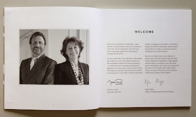
The below image show how the four colour image and the subtle tint colours work on every other spread. Nice and even ...and very matt.
 A simple but effective choice of materials. The spine is approximately 4mm.
Design and art direction is by Saffron in London and the designer on the project is Wendy Roberts. Print production is by Harness Publicity based in Basildon.

www.roccofortehotels.com
http://saffron-consultants.com/
http://www.harnesspublicity.com/
Posted by Justin Hobson 14.05.2015