Friday, 25 September 2015

ESPA life at Gleneagles


The Gleneagles Hotel is set in 850 acres in the heart of Scotland. Aside from the international reputation as one of the foremost golf resorts, there is a luxurious Spa.  This beautifully produced piece of literature is available for guests to see the treatments offered. The brochure conveys the luxury and subtlety of both the space and the experience.
Click on images to enlarge
Below shows inside front cover spread with hot foil blocked emblem in metallic gold foil on inside front cover
Detail showing hot foil blocked logo:
Size is 210x148mm, portrait and is section sewn. The paper used is our StarFine Natural White 300gsm for the cover and 150gsm for the 40pp text. The uncoated paper is a subtle, neutral, white which perfectly suits the imagery and typography in the publication. The images have reproduced superbly, even with some of the dark interior shots.
The publication is superbly printed offset litho in four colour process plus hot foil blocking on four areas. The spine width is 5mm.
Art direction and design is by London based Burgess Studio. Creative director is Alexis Burgess. Senior designer on the project is Tom Green. Printing is by Glasgow based 21 Colour.

http://www.gleneagles.com/
www.espa.com
http://burgess-studio.co.uk/
http://www.21colour.co.uk/
Posted by Justin Hobson 25.09.2015

Wednesday, 23 September 2015

D&AD President's Lecture - Philippe Starck

Yesterday evening I went to the D&AD presidents lecture to hear eccentric designer, Philippe Starck at Shoreditch Town Hall.

It was billed as follows: "Notes from Elsewhere" will open new windows into the inner workings of this prolific and profound creative ‘supermonkey’, as he challenges us to explore the space between dreams and reality via carefully chosen topics to entertain, inspire and provoke the audience"

Yep, well I reckon he did that OK! He certainly did jump around the many subjects he spoke about and as promised to his wife, hardly swore or mentioned sex at all!
In my opinion, attending events like this is very important. It helps to get other people's perspective and hear what else is going on. At £15 per ticket, it's good value too....
 
Posted by Justin Hobson 23.09.2015

Monday, 21 September 2015

The Marina and Boka Bay

The number of large yachts under construction has more than tripled over the past ten years and few marinas in the world can accommodate superyachts let alone offer onshore provisions and crew services.

Porto Montenegro is being developed as the Mediterranean’s most comprehensive nautical facility for yachts of any size. Currently offering 450 berths for yachts 12-180m, it is planned by completion to offer 850, of which 350 will be specifically for superyachts and complemented by five private residential buildings, totalling 228 apartments.

Mark Read is a photographer with wide ranging talents but who was awarded 'travel photographer of the year' in 2012. He was commissioned by London based branding studio &Smith, to photograph the marina, with the images being used in a large format, almost broadsheet newspaper format.
The size is a large 585x380mm, portrait, which is endorsement folded to 292x380mm.
Endorsement folded to 292x380mm
When I received a copy of this publication, I was absolutely bowled over. The location, art direction, quality of the images and print are simply sublime and that's even before I noticed the paper!
Click on images to enlarge
It really is impossible to show the quality of these images and the printed result in this format and you are missing the scale which is huge - the double page spreads you are looking at here are 585x760mm!
The 16pp publication is unbound and is printed on our Shiro Echo, White 80gsm which 100% recycled and FSC accredited. It has a 'nod' to a newsprint material but with amazing image reproduction! Printed in four colour process (CMYK) offset litho, the colours are vibrant, exceptional detail in the highlights and flat even solids. Below is the outside back cover
...and I hope you can see from the detailed image below, just how fab the images are
Click on images to enlarge
Front cover (below) is hot foil blocked in metallic gold foil - exquisite detail.
The Mark Read photographic journal is just one piece of promotional literature which makes us a whole collection of collateral (below) for this exclusive marina.
Art direction and design is by London branding agency &Smith. Creative Directors are Rachel Smith and Dan Bernstein. The truly exceptional repro and print is by Gavin Martin Colournet.

www.portomontenegro.com
www.markreadphotography.co.uk
www.andsmithdesign.com
http://www.gavinmartincolournet.co.uk/
Posted by Justin Hobson 21.09.2015

Friday, 18 September 2015

What is ...the way to describe Portrait/Landscape?

What is ...Number 21

Regular followers of this blog will know that in the middle of the month, I publish a "What is ....? post. The article covers various aspects of paper, printing and finishing in greater depth. However, many of these subjects are complex, so these posts are only intended to be a brief introduction to the topic.

What is ...the way to describe Portrait/Landscape?
The names Portrait and Landscape are taken from the world of painting and art. Portraits are painted with the short edge at the top and longer edge at the sides. Landscape pictures have an long edge at the top and short edges at the sides
There is a convention in the printing "trade" that the first dimension given determines the depth of a given publication. Therefore 297x210mm indicates an A4 portrait and 210x297mm indicates an A4 landscape.

I am unable to find any reference material that backs this up but it is certainly well entrenched in the psyche of printers. Personally I think it is better to actually state whether the desired format in words rather than relying on a potentially misleading way of doing things - but maybe that just me!
Posted by Justin Hobson 18.09.2015

Wednesday, 16 September 2015

Packaging Innovations 2015

Today I visited the Packaging Innovations exhibition at Olympia. The exhibition also incorporates the Luxury Packaging show and many of the country's leading packaging suppliers are present, together with many suppliers from around the globe.

The show launched in 2010 and Luxury Packaging was introduced in 2013. With over 150 exhibitors at the two-day event it is on today and tomorrow.
http://www.cordenons.co.uk/
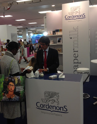
There are several paper mills represented at the show, including Cordenons (above) who were showing their new Papermilk range, which is manufactured using a proportion of milk fibres, which produces a luxurious feeling paper.
Last year, the show attracted 4,000 visitors with numbers expected to be far higher this year.
http://www.favini.co.uk/
Favini from Italy (above) were exhibiting a wide range of their products from their Astralux cast coated range to Shiro range of Ecological papers.

If you fancy going, you'll have to be quick! You can register for free on the following link:
http://www.easyfairs.com/events_216/packaging-innovations-london-2015_65089/packaging-innovations-london-2015_65090/
Posted by Justin Hobson 16.09.2015

Tuesday, 15 September 2015

Sign of the Times

Sign of the Times is an exhibition of designs from 100 of the world's great designers held last week at the Protein Gallery in London EC2.
Invitation hot foil blocked in two colours by Gavin Martin Colournet
on Neptune Unique 700gsm
NB:Studio, together with Spring Chicken and Michael Wolff, launched a competition to redesign the famous ‘elderly people’ road sign.
In NB's own words:
The ‘elderly people’ road sign - you probably know the one – it’s a depressing silhouette of a stooping elderly couple with a walking stick.

We feel this sign gives a derogatory and out-of-touch impression of older people that implies both frailty and disability. This has been picked up in recent months by the UK press and we feel it’s high time that the design community responded. So, we asked some of the best designers to create a new warning sign – a new icon – to make it easier for drivers to see that older adults may be crossing. And one that paints a more positive image of Britain’s older community.
 
The private view was held last Thursday evening and it was a very jolly party!
Click on images to enlarge
NB Studio received both serious and playful submissions from designers around the world. You can see all the entries here: http://www.creativecourage.co.uk/sign-of-the-times. The Huffington Post, Metro and The Daily Mail Online have covered the story. The ambition for the project is to lobby the UK’s Department for Transport into changing the sign and to raise further awareness of the issue. Amongst the many playful entries is this knitted road sign from The Partners (below)
Partner at NB:Studio, Alan Dye (below) gave the introduction and spoke eloquently about the project.
...and Michael Wolff was truly inspirational in his appeal to get designers involved and open their eyes to designing for the older generation.
The signs were supplied by Whybrow Wayfinding and they really are terrific. If you would like to own one, you can bid for it on the auction site: http://stores.ebay.co.uk/nbstudioshop with all proceeds raised going to Age UK.

...and you can also vote for your favourite here: http://www.springchicken.co.uk/signofthetimes/

Below is the book, which is printed on our StarFine, printed by Gavin Martin Colournet, which I will write about in a separate post.
It was a pleasure to be involved with the project and my thanks to everyone at NB:Studio and Gavin Martin Colournet, who put a huge amount of time and effort into making this a real success.

http://www.springchicken.co.uk/signofthetimes/
http://www.whybrow.co.uk/
www.nbstudio.co.uk
Posted by Justin Hobson 15.09.2015

Thursday, 10 September 2015

Caught by the River Teifi

Click on images to enlarge
Caught by the River Teifi is this wonderful poster, printed letterpress.
It was designed for a little festival in Cardigan run by fforest, a camp and events company in West Wales and Caught by the River, who organise music based events at lots of festivals and run a lovely website around music, countryside, writing and poetry.
The size is 1000x350mm - which exactly half the B1 sheet size (700x1000mm) cut lengthways. The illustration is by Bristol-based illustrator Jon McNought with words by Ben Myers.

Printed letterpress in three colours and here is the description by Nick Hand: " It was printed on a FAG Swiss proof 40, a letterpress proofing press. Ink hand mixed (until it looked right). The background image is printed in two hits and then the darker image around the boat a third colour and the lettering all printed from wood type printed in two further passes. The illustration printed from zinc blocks."
You can see the colour overprinting colour in the above image. The poster is printed on our Colorset (100% Recycled) Natural 120gsm and it looks just beautiful.

Design and print is by Nick Hand at The Letterpress Collective in Bristol.
 
This Letterpress Collective started a couple of years ago after the last letterpress printer in Bristol quietly closed it's doors. They now have a  Heidelberg Windmill Platen, a Stephenson Blake proofing press, various Adana's together with a collection wood and lead type. Put this all together with a lovely workspace and experienced compositors and printers and you have a thriving environment for creativity - and education, as they run courses as well!
 
Do have a look at their site:
www.theletterpresscollective.org
The Letterpress Collective, Studio 31 Centrespace, 6 Leonard Lane, Bristol BS1 1EA

You can buy these beautiful posters here: http://theletterpresscollective.org/shop
 
www.theletterpresscollective.org
http://www.departmentofsmallworks.co.uk/
Posted by Justin Hobson 10.09.2015