Showing posts with label Letterpress. Show all posts

Wednesday 20 September 2023

The Annual St Bride Foundation Conference returns!

St Bride Foundation has reprised its annual conference, with the event set to take place in November. It's live event and also being live-streamed to a worldwide audience for the first time.
Conference Identity by David Pearson
Talking to Printweek, event curator Becky Chilcott said the pandemic had resulted in “a greater need to bring our fantastic community together more often and inspire and engage with them and their creativity”, and it was the perfect time to revive the event. “Not only will the conference keep the St Bride Foundation alive in people’s creative imaginations, it will also raise vital funds to help the upkeep of our Grade II listed Victorian building, management and conservation of our unique and irreplaceable library collections and running of our print workshop and learning programme.” The St Bride Foundation said the event would be “a conversazione celebrating innovation, inspiration, imagination and invention”. 
The speaker line-up includes: Naïma Ben Ayed, Neville Brody, Jean Julien, Naomi Kent, Alicia Martin, Bob Richardson, Venessa and Vanice Scott, and Dominic Wilcox. Attendees will also be able to find out more about some of the treasures and notable items in the St Bride Library collection, and will have a chance to try letterpress printing using the historic presses in the St Bride printing workshop

Fenner Paper is pleased to be one of the principal sponsors along with Commercial Type and the Fleet Street Quarter together with Google and the Wynkyn de Worde Society Charitable Trust.
Principal Sponsors
The conference will take place on Saturday 11 November at the St Bride Foundation in London. In person tickets cost £60, £70 or £80. Online tickets for the live-stream are £35, £45, or £50. The discounted rates apply to students and Friends of St Bride.

You can book HERE. So why don't you get those little grey cells moving and sign up! NOW

Monday 29 May 2023

Kickstart the Typographic Workshop

This is a recently launched Kickstarter project which I think you might like to support...
Theo Hersey in the workshop. Photo by Owen Tozer.
Theo Hersey is a young designer who graduated from the LCC. Whilst at university and during his 'gap year' he has been assisting Alan Kitching at The Typography Workshop in Kennington. Even though he now has a full time job as a graphic designer, he continues to assist and collaborate with Alan.
Alan Kitching & Theo in the Workshop. Photo by Tom Gifford.
Alan Kitching floated the idea of Theo purchasing the workshop from him and he needs your help.
There is a vast collection of fonts held at the workshop, from Caslon Old Face to Futura and everything in between in both metal & wood type. The collection is a brilliant array demonstrating the rich history of type design from both British and overseas type foundries, many having been purchased from the type foundries in their closing years. Theo is now in the extremely fortunate position to be able to take over the space and continue the legacy of The Typography Workshop and develop letterpress in his own style into the future.
One of the 250+ cases of wood & metal type. Photo by Theo Hersey.
Fenner Paper has been in contact with Alan Kitching and the Typography Workshop for over 30 years, I first met Alan back in the Clerkenwell workshops back in the early 90's and he designed the Fenner Paper diary cover in 2010 and uses our diary in the workshop to this day. We are very happy to continue this collaboration and support Theo in his endeavour.

Theo is being supported by friend and collaborator Anthony Burrill and they have designed three exclusive prints for this Kickstarter campaign.
Theo Hersey & Anthony Burrill. Photo by Owen Tozer.
So, how do you support Theo? ...it's easy! have a look at the Kickstarter page HERE, where you can choose to either simply donate or purchase some of the excellent rewards. Do it NOW and ensure the continuation of The Typography Workshop and the craft of letterpress printing in its South London home whilst also helping a talented youngster who will take it forward into the future.

Posted by Justin Hobson 29.05.2023
 

Monday 22 May 2023

The annual Wayzgoose at the St Bride Foundation

 The 7th Wayzgoose

Yesterday, I had a stall at the St Bride Foundation WAYZGOOSE. This is a term (unfamiliar to most people) that used to refer to an annual holiday in a print-works and was often an awayday to the coast or some other sort of day out, more often than not, paid for by the firm. In this instance the St Bride Wayzgoose is a kind of letterpress 'bring and buy' sale.
Thirty or so tables displaying and selling many different items - everything from lead type to the Adana tabletop presses (see below picture) from Caslon, to secondhand books and printed examples of work.
Below is the table that I was allocated, where, as with previous years, I adopted a "throw it all on the table" approach! I took lots of offcuts and discontinued paper and board items. All paper and card sold by weight - 40 pence per 100 grams.
I served at my 'paper stall' from 11am to 4pm  ...and by the end of the day I had raised £280, all donated to the St Bride Foundation.
...and here is my beautifully crafted 'Weigh & Pay' signage.by Helen Ingham from the Hi Artz Press - It's now lasted four wayzgooses!
My thanks to all the staff and friends at St Bride's who organised the event.
https://sbf.org.uk/
Posted by Justin Hobson 22.05.2023

Thursday 27 April 2023

Letterpress Greeting Cards

 Bits and Bobs

This is a superb range of small greeting cards from greeting card designer, publisher ...and printer - Nineteen seventy three!

Based in Brighton, 1973 bought their first Heidelberg press a few years ago and now produce many of their ranges printed letterpress in house.
The 4pp cards are 120x85mm, portrait and they are printed on our Colorset 100% Recycled 270gsm in the Natural shade. Colorset is just perfect for letterpress as it's high bulk and compressibility allows the impression to sink into the board.
Here is a selection from the range, most are printed in two or three colours.
Above image shows reverse of cards, below shows detail:
The range all come with gummed ribbed kraft envelopes (90x125mm) in a cellophane bag and with a 'letterpressed with love' sticker
You can see the 'Bits and Bobs' whole range here:
Posted by Justin Hobson 27.04.2023

Tuesday 12 July 2022

Tolerance

Inspired by the home-made posters displayed in windows during the Covid lockdowns, this print pledges solidarity with marginalised communities and is a reminder to try and see both sides.
Seemingly random elements printed on the front and back of the sheet are revealed as letterforms when backlit. The print measures 720 x 145mm.
Created for window display, it is actually provided with hangers, so it hangs perfectly. It is printed on our Sixties paper in 60gsm. SIXTIES is a paper which has a similar translucency as a tracing paper - but it feels and behaves like a normal paper … you can see the degree of translucency in the images above and below.  Perfect for a project where the theme of being able to see both sides at the same time is of the utmost importance.
Set and printed by hand in a limited edition of just 25. Here it is set up on press (a 1959 Korrex Berlin precision proofing press) with the red inked up and ready to go...
Design and printing is by Richard Ardagh at New North Press. He gave himself the self-imposed limitation of only using three shapes: 'I', 'V' and ‘.’ As can often be the case, the font he chose was lacking in characters so they commissioned Type High Design to cut the additional glyphs needed, as you can see in the image below...
It isn't the first time Richard has used this paper, it was his little new years card, also printed on Sixties 60gsm, that you can see below that served as the inspiration for this print...
You can read more about the Tolerance project and buy one of the prints HERE

My thanks to Richard at New North Press for sharing the story and the images with me.
Posted by Justin Hobson 12.07.2022

Friday 10 September 2021

K is for...

This is a beautiful little book, which is a personal project for printer and bookbinder Katherine Anteney sent to my colleague Sarah Glennie. Produced in an edition of 200 of which 140 copies went to the Oxford Guild of printers. 
Size is 156x124mm, portrait with a 4pp cover and 8pp text which is cut short on the width at 156x124mm and is printed Letterpress throughout using this fantastic letter K in woodblock type.
The cover is printed on our Colorset (100% Recycled) Solar 270gsm and the text is on StarFine Natural 100gsm. Below image shows the front and back cover spread out...
A particularly nice touch is the use of a pink staple on the binding - one steel and one pink 
A really lovely little job and thanks to Katherine for sending it to Sarah!

Posted by Justin Hobson 10.09.2021

Tuesday 2 June 2020

Jobs from the past - Number 127

Regular followers of this blog will know that my first post of every month is a "job from the past" so that I can show some of the really good work from years gone by and this publication is from 2016. 

LCC - Design for Visual Communication (DVC) 2016

This publication reviews the work of 56 students who have undertaken the Postgraduate Certificate and Diploma in part-time and full-time modes at the London College of Communication (LCC) during 2016. The introductory section includes two features related to design activism and is illustrated using images taken from student submissions to the ISTD student assessment.

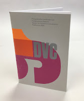
Size of the publication is 240x160mm (an oversize A5 which is economical to print using 'B'size paper). The cover design is by Caley Dewhurst and is letterpress printed at the LCC letterpress department by Christian Granados and Alex Cooper.
The 4pp cover is printed on our Colorset (100% Recycled) Light Grey 270gsm and printed in three colour letterpress.
The 64pp text is printed CMYK offset litho at the LCC litho printing department by Tony Yard and the result is excellent. The first pages are for the DVC Postgraduate Certificate
Click on images to enlarge
The second section is for the DVC Postgraduate Diploma...
It's also worth pointing out that one of the students on this course, Chia-Lin Lin (see r/h page below) was awarded the prestigious Vincent Steer prize at the ISTD Student Awards in that summer which you can read about here.
Click on images to enlarge
StarFine is a quality, uncoated paper and as the images show, image reproduction is excellent. The photographic images, montages and illustrations all look equally stunning - a great amount of detail for an uncoated paper.
64pp of StarFine 115gsm is about the maximum that you can successfully saddle stitch without it "gaping" in the centrefold too badly. This publication works but it would be a struggle if there were any more pages....
You can see below the "matrix" crease that means that the cover has been really well finished so that the cover sits as flat as possible and there's no cracking along the spine. Print finishing was also in-house at the LCC by Scott House.
The course leader is Tony Pritchard and this is an excellent example of a high quality publication that can be produced when like-minded individuals come together and in house facilities exist and have been fully utilised.

www.arts.ac.uk/lcc
https://www.istd.org.uk/education/2020-student-briefs
Posted by Justin Hobson 02.06.2020