Friday, 16 October 2015

What is ...a "Mill making"?

What is ...Number 22

Regular followers of this blog will know that in the middle of the month, I publish a "What is ....? post. The article covers various aspects of paper, printing and finishing in greater depth. However, many of these subjects are complex, so these posts are only intended to be a brief introduction to the topic.

What is ...a "Mill making"?
Many of you may have heard the term "mill making" - often it is used by printers when talking about ordering paper and the context that a mill making is referred to is generally because a a certain quantity is needed or special size or weight is required which can also save money.
However I should explain that all paper is in fact made at a paper mill and therefore all paper is the result of a "mill making"! The two areas I shall cover is mill makings of standard products and mill makings of bespoke products.
Firstly I'll just give a brief introduction to paper making. 
Twin wire paper machine
The manufacturing of paper is a mechanical process and is ”heavy industry”. The site of a paper mill covers many hectares and the machines themselves are housed in buildings the size of aircraft hangers. With the exception of mills making specialist material (such as artists papers) paper mills manufacture tonnes of papers per day. Typically a small mill might make 50 to 100 tonnes per day with larger mills making over 1000 tonnes per day. A paper machine is very large, typically 4 metres wide and over 100 metres long.
Bales of pulp on conveyor
Pulp being mixed in hyropulper
Bales of refined pulp are tipped into a ‘Hydropulper’ which breaks the pulp up by adding huge amounts of water and movement. After several more refining stages the ‘stock’, now 99% water and 1% fibre, is pumped to the start of the paper machine called the Headbox. The stock is sprayed onto a fast moving mesh which due to gravity allows most of the water to fall through the mesh. The remaining fibres are ‘matted’ together on the mesh forming a knitted ‘web’ of interlocked fibres (if you tear a sheet of paper you can generally see the fibres). The web of paper which is still about 60% moisture passes through the press section which compacts the fibres and removes more moisture before entering the drying section which finally reduces moisture by use of steam heated drying cylinders.
The web is then wound into large rolls at the end of the machine which can weigh anywhere between 10 and 50 tonnes. The large rolls are then slit into smaller rolls which can either be used for printing on the roll or cut into sheets.

It is useful to have an appreciation of the manufacturing process as explained above as it can be hard to identify with this industrial procedure in the ‘digital’ world in which we live today.

Mill makings of standard products.
Mill at Mogi Guaçu in Brazil
Many paper mills, especially the larger ones, manufacture a very limited range of products. In the most extreme case, just one product. The mill I visited many years ago at Mogi Guaçu in Brazil basically just made one product with minor variations - and that mill made 1000 tonnes a day! and produced 365 days a year - that's right, 365,000 tonnes per annum! Today that would not be regarded as a big mill.

In the case of these mills which manufacture few products, a mill will usually customise making to a special size (and sometimes a special weight) and that basically is about it! So why is this useful? Well, here are a couple of examples:

Example 1: The project you are designing for requires 50,000 sheets of 150gsm, SRA1 (640x900mm), but the paper you have selected only comes in 720x1020mm (B1). The stock (in B1) weighs 5510kgs. If you were able to get a mill making in SRA1 it would weigh 4320kgs, thereby saving over 1 tonne of paper! All paper products are sold by weight so this would represent a considerable saving.

Example 2: The project you are designing has a tight budget. You want to use a 170gsm paper but it is too much for the budget. The next standard weight down is 150gsm which you consider too light. The project requires 250,000 sheets of SRA1 paper. That quantity of 170gsm weighs 24.4 tonnes. If you had 160gsm (non standard weight) made for you as a "mill making" it weighs 23 tonnes saving 1.4 tonnes of paper. Good for the budget and the environment.


Measuring Thickness in Microns
One thing that does need to be highlighted is that paper manufacturing is a continuous, industrial process. A paper machine is not something that can be simply turned on and off and does not work to precise (or digital) type accuracy. As a result all products are made within "manufacturing tolerances". These tolerances cover everything! from variations in shade, surface, moisture, weight, size, thickness and quantity etc. 

A scale that measures the weight of paper.

For example the weight tolerance for papers is plus or minus 5%, therefore if you ordered a paper that was 150gsm, it could be made as high as 157gsm or as low as 142gsm. BUT REMEMBER THE TARGET IS 150gsm! It must be understood and appreciated that all manufactured products, be it steel, glass, plastic etc. are all manufactured to such tolerances.

Special note: Problems often occur when a product is made and is at one end of a tolerance and then a subsequent making is at the opposite spectrum i.e. The EXTREMES of the tolerance. Following the example given above, if you received your 150gsm paper and it was actually 157gsm, you would accept and judge the feel of the paper on what you had received. If some time later, you received another making of 150gsm which measured 142gsm you would quite rightly complain as the difference would be marked. However now this has been explained, I hope you can see the logic - although it is hard to appreciate at the time when there is a situation where you have never come across the issue of manufacturing tolerances before.

Quantity tolerance. As I mentioned above, a paper machine is not something that can be simply turned on and off and does not work to precise quantity. As a result all orders are made to a quantity "manufacturing tolerance". This means that when you order a quantity of paper, there is an allowance for it to be so many % over or under the ordered quantity, so this needs to be taken into account when ordering. Example: If you order 5 tonnes of 720x1020mm 135gsm that is a dead quantity of 50,000 sheets but if the tolerance is +/- 5% (for example) you would get up to 53,000 or as few as 47,500 sheets. This means you need to allow enough money to pay for the 53,000 sheets and make contingency in case the making comes up 2500 sheets short!

Mill makings of Bespoke products.
Firstly it is important to realise that to have a paper made to your own specification is a question of commitment.

As mentioned earlier, a paper mill is a large manufacturing plant. The minimum quantity required to order a bespoke paper will depend on the size of paper mill/machine and type/quality of paper to be made. It is unlikely that a paper mill will make less than 1000kilos (1 tonne) of paper and many mills will have minimum quantities of 5 tonnes, 10 tonnes or more.

There is relatively little in papermaking that has not been made before! Therefore creating your own paper around an existing specification by "tweaking" it will ensure that you get the paper that you want. It also gives the client the opportunity of looking at previously made papers which are close to the specification to be ordered thereby giving a certain degree of confidence that what the client is ordering can be produced correctly! One of the biggest stumbling blocks to ordering a bespoke paper is that it isn’t possible to see an exact sample before ordering. Generally a client can be shown samples on which placing an order depends. If there is a bespoke shade, a laboratory sample (about 5cm square) made using pulp and dies is produced, if there is a texture, a previous sample can be shown and smoothness/roughness can also be demonstrated by previous examples.

Building a specification: There are many things that can be specified, although if you just want a paper in a certain shade and weight, it might be a fairly basic specification.

Common things to be specified are the shade, substance (gsm), caliper (thickness), grain direction, texture, smoothness, porosity, opacity, strength (burst) plus other criteria such as recycled/FSC content and whether inclusions and fibres are to be added etc. Other considerations are the end use, how it is being printed, sheet size etc..

Sample representation: The laboratory sample plus texture, weight samples etc. are representations of the way your paper will look and is the closest thing that the mill can supply as a ‘proof’, without making the actual paper. If you watch the video about CRUSH (above) it shows a paper sample being made in the lab.

An order can only be processed on the basis that the customer is happy with this representation but it must also be noted that paper is mechanical process made using natural fibres and water, therefore it a curious mix of skill, art and science and can never be exact.

Sample Approval:  If you approve the sample/representation, you will be required to agree to the samples supplied and the order will be placed on that basis.

...and now for the advert!
Fenner Paper has over 30 years experience in dealing with bespoke manufactured papers for Annual Reports, specialist packaging (luxury boxes), and other items such as security papers, watermark papers and even ammunition paper! We work with you to build the specification for the required material and select the right manufacturer to work with ...if you want to give it a try, just get in touch!
Posted by Justin Hobson 16.10.2015

Thursday, 15 October 2015

Caramel Baby & Child

Eva Karayiannis, founded Caramel Baby & Child in 1999. Originally from Greece, she came to London to study the history of Art at Sotheby's, eventually establishing a business selling and ultimately designing children's clothes. Caramel Baby Child is known for its fresh silhouettes, distinctive colour ways and intricate attention to detail.
 
This is the lookbook for the Spring Sumer collection. The format is a very simple 16pp broadsheet, which opens easily to read and displays a large poster type area, when fully open.
Click on images to enlarge
 Size is 594mm x 420mm  folding to 210x148mm. The birds eye view below should give you the best idea of the format and the way it works. 
On the reverse of the concertina is this delightful pattern, creating a calm space without every square inch being crammed with colour photography - a very nice idea.
The paper chosen is our Omnia Natural 120gsm because it would work with the intricate detail that is present in the images but that would give a natural look and tactile feel. It is printed offset litho in four colour process (CMYK) and as you can see from images, some of the images have dark areas, but there is no loss of detail, which is what can often happen printing on an uncoated paper. The neutral shade of the Omnia Natural works just right with these images.
Click on images to enlarge
Art direction and design is by the in house studio at Caramel Baby & Child. Designer on the project is Natalie Abram

Printing is by Gemini Print, based in Brighton.

http://www.caramel-shop.co.uk/
http://gemini-print.co.uk/
Posted by Justin Hobson 15.10.2015

Tuesday, 13 October 2015

The Big Book Bonanza

This is the invitation to the showcase of new books from Harper Collins. Billed as 'The Big Book Bonanza' the function was held at the Crimson Bar at The Soho Hotel in May.
The invitation has a fantastic illustration by Emily Forgot, which is like a psychedelic kaleidoscope - great illustration and a really strong image.

The invitation is 180mm square and rather than being printed in CMYK, it is printed using black plus 3 pantone colours - fluoro orange, blue and metallic gold.
The material chosen is our Omnia, which works especially well with metallic inks, as they actually look metallic! and the solid fluoro colours jump out, but still with an uncoated, tactile feel. 
As the invitation is just a single card, it is duplexed (2x320gsm) to make 640gsm. You can see the thickness in the image below.
Design and art direction is by Zoë Bather.

The invitations are printed offset litho in four colours as described above. Print and production was handled by Alan Mountain at Forward Print (sales@forward-print.com)

www.harpercollins.co.uk
www.zoebather.co.uk
http://www.emilyforgot.co.uk/
Posted by Justin Hobson 13.10.2015

Friday, 9 October 2015

Whatever happened to ....Marnix Zetteler?

It is with some regularity that I am asked "whatever happened to Marnix Zetteler"? ..so I thought I'd find out!

For those who don't remember or didn't know Marnix, he is the Dutch born paper-man who was a big noise in the 80's, 90's and beyond in the world of UK creative papers.

Originally he had a company called ISTD Fine Paper, a paper agency based in Reigate in Surrey. I first met Marnix in the mid 1980's and at that time he was agent for a coated paper mill in France called JOB, who made the paper range called Parilux.
Marnix was an unconventional paper agent as rather than selling to printers he took the paper range direct to designers, which while not totally unique, he promoted the paper using well designed collateral produced by highly rated designers of the day, such as Pocknell, Derek Birdsall, Trickett & Webb and Alan Fletcher to name a few.
Click on images to enlarge
Above shows the 'Print on Parilux' swatch. Creative direction by David Pocknell at Pocknell Studio, designer on the project was Jonathan Russell. A truly ground-breaking piece of paper promotion.

By the 1990's ISTD had a new identity (also Pocknell Studio I think?) and Marnix had added many other products to his portfolio, including from the USA Cranes Crest, Fox River and Monadnock. The image below shows a bound in insert from DesignWeek (back in the days when it was a printed publication) promoting Monadnock, which at the time was being stocked by a company called Modo Merchants (long since gone now!)
As the dawn of the millennium approached, ISTD morphed into a new company called VIP - The Very Interesting Paper Company Limited. This coincided with JOB Parilux mill being taken over by a German papermaker, Scheufelen and the Parilux papers were then handled by a mill owned agency.

Undaunted, Marnix began marketing his own products. the first of these was called Dutchman, a smooth uncoated paper range to compete with the American Text & Cover papers, such as Mohawk and our own Neptune Unique. Dutchman became quite a firm favourite with many designers.
He also created a range called Shoebox which many people still ask me about today. With characteristic flair, he took a low value board produced for the shoemaking industry and marketed it superbly.
This A6, wiro-bound production was designed by Trickett & Webb. Designer on the project was Heidi Lightfoot (who is now a partner at Together). Illustrations by Christopher Brown and all the illustrations are just reproduced in hot foil blocking - brilliant!
He produced a few promotional pieces with the late Alan Fletcher. Examples below produced to promote Monadnock, Confetti (Fox River), Shoebox and Dutchman. Printed by Gary Bird at Gavin Martin.
Click on images to enlarge
 ...and lastly he introduced a cheaper grade, uncoated offset paper called Hollander.
 ...by this time he had gone further afield for his graphic design using Andre Toet in Holland and also incorporating the now familiar 'Z' for Zetteler.
By the mid 2000's the paper market was changing, dominated by some large loss making conglomerates (PaperlinX, Antalis etc) and in 2004 Marnix 'retired' from the UK paper industry. He sold VIP to Jill Mannix (part of the GF Smith family) but it fizzled out in around 2007/8.

...and Marnix and his wife Sue sailed off into the sunset in Hawaii (Maui)! While there he grew 3,000+ palm trees from seeds on a derelict piece of land on West Maui which is now a palm forest. In his words "I had a dream to leave a positive footprint on the world and I managed to do it"

Whilst in Maui, rather than sitting and watching trees grow, Marnix acquired a new skill! He learned to restore old posters from Monsieur Alain Roger of Paris, who runs the conservation department of the French National Library and is highly regarded in the paper conservation business. After Hawaii, they moved to Okatie, South Carolina where Marnix established his own studio called 'La Feuilleraie' which restores and linen backs vintage posters.

...and here he is in the studio:
Image kindly supplied by Dude Magazine www.dudesc.com
Marnix works a few hours in the studio every day. His challenges include removing folds in the paper and repairing any rips or tears it may have. To remove folds in the paper the poster is laid on a sheet of clear plastic and water is sprayed on it. The water helps the fibres in the poster to expand, removing the folds. This also cleans the poster, removing dirt and acids from the paper.
Image kindly supplied by Dude Magazine www.dudesc.com
Some posters need to be set in a special water bath to remove any extra acidic pollution in the paper before the rest of the process can continue. Others need to have pencil or pen marks removed. The reverse of the poster is coated with special glue which won’t harm the paper or replace the chemicals he just removed. The poster is laid on a linen frame and is then rollered to ensure it is flat and sticks to the linen backing. None of this is a particularly speedy process!

He has customers sending him restoration work from all over the world including London. He says in his email to me that he has many years work ahead already booked!
Image kindly supplied by Dude Magazine www.dudesc.com
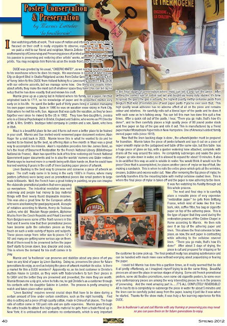
I was fortunate to find an article on Poster Conservation and Preparation written about Marnix Zetteler in a locally published magazine called DUDE which is published by Brad McDonald. I emailed Brad and he kindly put me in touch with Marnix and gave me permission to use the photographs taken at 'La Feuilleraie'. Thanks Brad - DUDE is now truly global!


You can find DUDE magazine here: http://www.dudesc.com/
Click on this page to enlarge
and if you would like to read the magazine editorial, it is on page 40 of this PDF link.
http://www.dudesc.com/uploads/spring2012web_1_.pdf

I hope this article has been of interest, especially for those of you who may remember Marnix personally and this period in the industry.

Like many, I miss Marnix, occasionally bumping into him at events in London but to be honest, I don't miss him as a competitor! Enjoy life Marnix...

Posted by Justin Hobson 09.10.2015

Tuesday, 6 October 2015

Kids With Puns #5

Kids With Puns is a printed publication which celebrates the humble pun. The magazine is a collaboration between illustrators, artists and designers and showcases a variety of wordplay related work. So if you love puns and visual puns in particular, you'll love this publication.


Click on images to enlarge
The size is A5 (210x148mm) portrait and is saddle stitched. It has a 4pp cover on our Colorset Pink Ice 120gsm and 20pp text on StarFine White 115gsm. It is printed in just one colour on a Riso machine. If you don't know about Riso, or Risography, you can read about it on an earlier post I wrote here:http://justinsamazingworldatfennerpaper.blogspot.co.uk/2014/09/what-is-riso-printing.html
Kids with Puns is the brainchild of designer Tom Dunn, who compiles and publishes the publication. It is published at irregular intervals - once he gets enough submissions!

Print is by Hato Press, who are based in East London and they have made a very tidy job of it.
...Thanks to Tom for the file copies and for the card.

Contributors (all links) are here:
Punny Pixels, Leeann Walker, Kieron C, Tiana Tucker, Henry Brown, Masum Khan, Alyssa Duhe, Keegan Steele, Pâté,
Adam Avery You can buy your copy here: http://www.kidswithpuns.com/
http://hatopress.net/
Posted by Justin Hobson 06.10.2015

Friday, 2 October 2015

Jobs from the past - Number 72

Regular followers of this blog will know that my first post of every month is a "job from the past" so that I can show some of the really good work from years gone by...

COS S|S 2007
Swedish label COS was launched with a catwalk show at the Royal Academy in 2007 and has since become a real presence on our high streets and shopping centres. COS (it stands for Collection of Style) is part of the H&M group which is one of the world's largest retail clothing groups. COS has become a go to shop for simple and anonymous clothing, minimal pieces and stylish basics. High on style and quality fabrics. Not for party clothes but a great range of  casually complex clothing at mid-market prices.
This is one of their very first look books produced in the UK and like their clothing, it is simple, very stylish and has great attention to detail lavished on it.
Click on images to enlarge
Size of the publication is A3 (420x297mm) portrait and is a 16pp 'self cover' which is saddle stitched. It has a deliciously floppy and tabloid newspaper feel. It is printed on our Redeem 100% Recycled 80gsm.
Click on images to enlarge
This is one of those projects that is virtually impossible to do justice to on this blog. The print image quality alone has left anyone that I have ever shown this job to, seriously impressed. Given that Redeem 100% recycled is at best, off white and 100% recycled and 80gsm, the reproduction on this paper is superb. The fleshtones are incredibly realistic and rarely have I ever seen such excellent black solids.  It is printed CMYK, offset litho by London based Push.
Lovely touch on the simple cover is the black coloured wire used for the saddle stitching:
As mentioned earlier it flops and folds in the hand beautifully.
Design and Art Direction is by the creative agency Saturday and the creative director on the project was Peter Hughes. Saturday merged with sister agency Wednesday in 2013. Peter Hughes has established his own agency called Assembly, based in Somerset House.

Print is by London based printers Push and is truly superlative.
http://www.push-print.com/
http://assemblylondon.com/
Posted by Justin Hobson 02.10.2015