Friday, 27 November 2015

The Big Book Bonanza Catalogue

This is the  'The Big Book Bonanza' catalogue which showcases the new Autumn releases from HarperCollins publishers. Throughout the publication are the same wonderful psychedelic Kaleidoscope style illustrations as on the invitations to the launch event (see previous post) by Emily Forgot. 
Size of the catalogue is 210mm square, saddle stitched. It is printed on our Omnia - 4pp cover on 320gsm and 32pp text on 150gsm.
Click on images to enlarge
The choice of material for this job was important, the reason being that the strong illustrations on the divider pages meant that it had to print solids really well but there's also lots of great commissioned photography included, so it was important to have a material which worked for both without compromising either and as I hope these pictures show, it looks really good.
Click on images to enlarge
The other very good reason that Omnia was chosen was the use of metallic gold pantone 'special' ink. On most traditional uncoated papers, metallics can look flat and with gold can just look a bit brown, but as I hope the below image demonstrates, metallic gold really does look metallic on Omnia.
Design and art direction is by Zoƫ Bather.

The catalogues are printed offset litho in four colour process plus metallic gold special. Print production was handled by Alan Mountain at Forward Print (sales@forward-print.com)

www.harpercollins.co.uk
www.zoebather.co.uk
http://www.emilyforgot.co.uk/
Posted by Justin Hobson 27.11.2015

Wednesday, 25 November 2015

The Private Press at Brand Union

A couple of weeks ago, the team at Brand Union, London got their hands dirty in the all-agency meeting to learn about and experience hand silk screen-printing.

...but first of all they had to climb into boiler suits and make an origami printer's hat!
Gary Parselle from The Private Press set up a temporary silkscreen print workshop in the Brand Union Studio.
He provided absolutely everything to ensure this was a truly fulfilling, creative process which involved absolutely everyone.
...and of course he also needed some paper! -so we were asked to supply a selection of different colours from our Colorset range in 270gsm. For those of you not familiar with this collection, Colorset has 26 colours and is made from 100% Recycled fibres. All colours are available in 120, 270 and 350gsm. Amongst other uses, it's become a firm favourite with Silkscreen printers.
Below are the fruits of their days printing, hung out to dry...
 Below is an image showing the printed results in the window of their Smithfield based studio:
The event was arranged by Creative Director, Clare Styles. What a fantastic thing for an agency to do. This is a truly engaging, interactive and creative activity for the whole company to get involved with - far more fun that a team building day paintballing!

www.theprivatepress.org
Posted by Justin Hobson 25.11.2015

Monday, 23 November 2015

Duh?

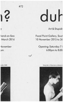
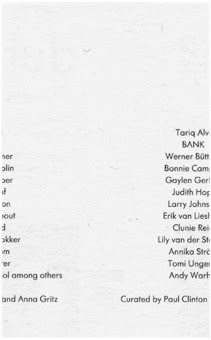
'Duh? Art & Stupidity' is an exhibition looks at stupidity as a subject and a tactic of art making, with a particular focus on its relationship to the politics and performance of identity. "High culture is meant to keep its audience from being stupid, but artists have repeatedly drawn upon stupidity, or playing stupid, as a form of dissidence, irreverence or as a means to cast off received thinking." The exhibition is at the Focal Point Gallery located in The Forum in Southend on Sea. It is curated by Paul Clinton and Anna Gritz and runs from 10 November to 26 March 2016.

This is the invitation to the opening. Echoing the theme of the exhibition, the invite is deliberately trimmed out incorrectly.
Front
 
Reverse
The size of the invitation is 130x80mm, portrait and is just a single sheet. It is an excellent example of a great idea, executed economically. The designer, Fraser Muggeridge, wanted a different type of board for this unusual idea and because it was a limited run, he called us and described the type of product he wanted. We sampled a redundant item (Bakri, Everest 250gsm from Cordenons - actually made 50% woodpulp and the other 50% is a mixture of cotton and goat's wool!) which is no longer manufactured, which was perfect! Just one pack was required which made this an economical and highly unusual piece. The below images show how it was mailed out in a cellophane bag with a piece of greyboard.
 
Design is by Fraser Muggeridge Studio. Print and the (deliberately bad) trimming is by Healeys Print Group based in Ipswich.

http://www.focalpoint.org.uk/
http://www.pleasedonotbend.co.uk/
www.healeys-printers.co.uk
Posted by Justin Hobson 23.11.2015

Friday, 20 November 2015

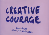
Creative Courage - A Lesson in Misdirection

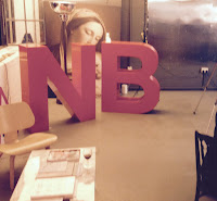
Creative Courage is NB:Studio's mantra; a rallying cry, a touchstone, a catalyst. It’s also a platform for a series of talks, events and activities. Yesterday evening, I was invited to a Creative Courage talk at NB's Bankside studio which was being given by Simon Evans. Titled 'A lesson in Misdirection' , this wasn't just a talk, it was magic!

This is the fourth in the series of talks/events hosted by NB:Studio and it is a brilliant idea. These evening events stimulate new ideas, are great for staff, clients and suppliers alike and can bring a fresh perspective and thinking to a creative environment - in my opinion more studios should host events such as this.
Simon Evans was introduced by NB:Studio partner Nick Finney(above). Simon is a Theatre director, two time Close-up Magician of the year and National Theatre Magic Consultant amongst many other activities.
Click on images to enlarge
Simon gave his masterclass in 'misdirection' explaining how magicians make you look in the right place at the wrong time – or the wrong place at the right time! This was part lecture, part performance and mostly magic show!
It's given me some great ideas for shuffling swatches and making other paper companies sample books disappear - what an illusion that would be!

It was a magical evening and my thanks go to all at NB:Studio for inviting me and to Simon Evans for an extremely insightful talk and a wonderful performance.

http://www.creativecourage.co.uk/
http://www.nbstudio.co.uk/
http://www.the-department.co.uk/simon-evans/
Posted by Justin Hobson 20.11.2015

Tuesday, 17 November 2015

What is ...Creep?

What is ...Number 23
Regular followers of this blog will know that in the middle of the month, I publish a "What is ....? post. The article covers various aspects of paper, printing and finishing in greater depth. However, many of these subjects are complex, so these posts are only intended to be a brief introduction to the topic.

What is ...Creep?

Because most bound publications are produced by folding large sheets down to a smaller size and forming multiples of 4pp sections, the number of printed pages of any document will start to affect the physical properties and the position of the printed matter. The inner sections will start to protrude beyond the outer pages - see diagram below.

If adjustment is not made, printed matter will get too close to the trimmed edge. To demonstrate, here is a 32pp saddle stitched, self cover brochure, which I wrote about last year: http://justinsamazingworldatfennerpaper.blogspot.co.uk/2014/02/breaking-down-barriers.html

If I hold the booklet open in the middle, you can see with the image below the difference in the width of the page size, which has effectively become staggered because of the straight cut edge.
To demonstrate further I've taken the book apart. With the spines in the same position I've laid the centre spread underneath the cover (below image). The finished size of the book is 235x165mm. The total width of the double page spread of the cover is 331mm, the total width of the centre spread is 327mm, so the difference pictured below is 2mm:
Click on images to enlarge
Creep Allowance is also known as "feathering" or "shingling" and unless an allowance is made for creep it can have a major impact on the margins and page layout.

There are three methods of creep allowance:
  • Manual Adjustment
  • Page Offsetting
  • Page Scaling
All the methods depend on the number of pages and the thickness of the material. Manual Adjustment is a very arduous procedure which involves a mathematical formula which calculates by how much the design elements are moved away from the foredge in tiny increments and the artwork is then adjusted manually. Creep Allowance by Page Offsetting is where a program has been written which moves page elements inwards progressively but can result with problems in the spine.

Creep Allowance by Page Scaling is the preferred method by printers. It works by having a program which reduces the page elements in size horizontally. It is a scaling program which inevitably is a distortion of the original but is the most effective automatic system.

As mentioned earlier, if the project is section sewn or even perfect bound the same issues are a factor as they are all made using folded sheets of paper. It may be less of an issue if a project is made using 16pp sections but with a bulky material, for instance, it could be a real issue.

MASSIVE PROBLEM!
In my experience, the first time people come across the term 'creep' (in printing) is when there is a production problem. Generally, a job has been printed and finished, then someone spots the issue (usually type or images getting to close to the foredge) and then someone will start talking about creep ...this is not helpful if you have never heard of it! Typically the event I've just described is usually followed with finger pointing and people looking for someone to blame.

Creep Allowance is something that should be discussed rather than ignored until there is a problem. Responsibility must be assumed and agreement should be reached at the start of a project about who (designer or printer) will make the adjustments. My advice is: Talk about it!
Posted by Justin Hobson 17.11.2015

Monday, 16 November 2015

Are you a parent ...?

Here's an interesting project which I thought you might like to see...

Regular readers of this blog will be aware of some of the projects which I have featured which have been funded by Kickstarter. Lorna and Daniel Freytag contacted me about this fun project which is on Kickstarter right now.
In their words:
We're a mum and dad team called HeyWow! working from the small seaside town of Oban on the north-west coast of Scotland with our two little highland monsters (aged 2 and 4). Twelve months ago we had the crazy idea of creating our own personalised children's books, to bring a bit more WOW to kids lives. Our aim was to create something vibrant, well designed and exciting that parents could enjoy too! How hard can that be??? Ha! Nearly one year later (in between caring for the kids) and after lots of brain storming, cups of tea, sketching, tea, emails, business plans, photo shoots, more tea, Skype calls and many many late nights, we're now ready to reveal our first picture book... 'In the City'.

Here are some HeyWow links
Our Kickstarter campaign
www.heywow.co
www.twitter.com/HeyWowBooks
www.facebook.com/heywow
Posted by Justin Hobson 16.11.2015

Thursday, 12 November 2015

Wrangler S|S 2015

This is the season's promotional literature for Wrangler’s new S|S 2015 collection. Kimi RƤikkƶnen is the face of Wrangler’s Denim Performance line and is the first male spokesperson for Wrangler Europe.

This 10pp concertina brochure is 190x135mm, expanding to 190x675mm. It is printed in CMYK offset litho on our Omnia, White FSC 320gsm and is printed and finished beautifully. Birds eye view below:
Click on images to enlarge
Although this is a simple publication, it's often the simple jobs which don't get the attention to detail. This is well creased and folded square which is just perfect
Omnia was chosen because it would work with the rich detail that is present in the images but that would still give a natural look and tactile feel. As you can see from images, some of the photography is quite dark, but there is no loss of detail, which is what can often happen printing on an uncoated paper.
Art direction and design is by JJ Marshall Associates. Creative Director is Jethro Marshall and thanks to Jethro for sending file copies and a note...
Excellent print and finishing is by Principal Colour based in Paddock Wood, Kent.
 
Posted by Justin Hobson .12.11.2015