Wednesday, 22 June 2016

Coast Lookbook

Coast is one of the leading occasionwear brands for women. Established in 1996, Coast now boasts 52 stand-alone stores with 184 concessions and 46 international stores. This is the lookbook for last Christmas and is a really sublime piece of print
The cover is printed on our Astralux board - this is a one sided 'Cast Coated' board which means it has a high gloss surface and an uncoated reverse. So in this instance, it's been used inside out! The uncoated reverse has been printed offset litho in a silver special solid colour and hot foil blocked in silver metallic foil and used as the outer cover - the high gloss has been printed in a champagne metallic shade which appears on the inside front and back cover.
The cover is printed on Astralux [1 sided] 350gsm. Size of the publication is 240x165mm (which is an economical size to be printed on a B2/B1 size press)
The text material chosen was our Omnia, which would beautifully reproduce the photography with the delicate patterns and dark colours superbly - without forgetting the fleshtones ...and it looks wonderful! The 44pp text is on Omnia White 150gsm, printed offset litho in CMYK throughout.
Click on images to enlarge
Image reproduction is paramount but it was also important that the publication also projected the tactility of the clothes and in the image above and below the detail of jewellery. An ordinary feeling silk or gloss coated paper wasn't an option, so Omnia fitted the bill perfectly.
Click on image to enlarge
Omnia is a very bulky paper, so even though it is only 44pp, the Omnia 150gsm gives it a 5mm spine thickness. As with all quality publications, it is 'section sewn' and here is a close up showing the spine and end of the book with the sewn sections:
Another impressive detail is the spine which is also hot foil blocked in silver metallic foil but which as you can see from the image below centred perfectly within the 5mm spine - great attention to detail
Art direction and design is by Coast. Printing, neat foiling and careful finishing is by Identity Print based in Paddock Wood.

Posted by Justin Hobson 22.06.2016

Monday, 20 June 2016

Refurbishment at Fenner Towers!

We have just redecorated our modest reception area at Fenner Paper, we have a new cabinet to display books and magazines and a new bright yellow sign to indicating where the intercom is.
We've used a Crown Matt Emulsion in a pale greeny grey with the imaginative name of 'Potting Shed'! ...to top it off, we have a new framed poster titled 'The Power of Creativity' which is a limited edition poster designed by Johnson Banks, originally produced for D&AD. I wrote about the posters on this blog before here
The design of the poster is such that there is plenty to read on the wall, should any visitors have to spend some time waiting! The posters are produced on Omnia 200gsm and are printed by Gavin Martin Colournet.

They are available to purchase from the studio here: http://johnsonbanks.co.uk/shop/power-of-creativity-poster/

http://johnsonbanks.co.uk/
http://www.gavinmartincolournet.co.uk/
Posted by Justin Hobson 20.06.2106

Thursday, 16 June 2016

The Winton Beauty of Mathematics Garden

This is the literature produced for one of the gardens at last month's Chelsea Flower show. This leaflet is about the Winton Beauty of Mathematics Garden, which is the Silver Gilt Medal winner. The garden is designed by Nick Bailey.

"The garden is a celebration of the beauty to be found in the mathematics and algorithms that underpin all plants, growth and life. It features a beautiful flowing copper band, etched with plant growth algorithms and represents an emerging seedling. As it snakes through the garden it takes on different functions from bench to stair banister, to planter pitched 3.5m (11 1/2ft) above the garden, and overflowing with trailing plants"
Finished size is 112x220mm concertina folding out to 448x220mm. It is printed on Omnia 150gsm, which is very bulky (around 200microns thick) which makes the leaflet substantial, but because it has been well pre-creased, it folds well and sits nice and flat.
Pia called to discuss the type of paper she was looking for, wanting something that was tactile and engaging but concerned that the images would reproduce accurately ...well Omnia certainly cracked it! - the printed result is superb. Excellent reproduction but still with tactility that the subject requires. It is printed offset litho in four colour process. The below image shows both sides, spread out flat.
Click on images to enlarge
Below is a hi res image of the actual garden....
The leaflet is designed by Pia Östlund, who is a graphic designer and printmaker with a long background of working with gardens (Chelsea Physic Gardens and Oxford Botanic Gardens). Print is by Severn Print based in Gloucester and was handled by Anita Barry. My thanks to Anita for sending me some copies and a lovely note.
Posted by Justin Hobson 16.06.2016

Tuesday, 14 June 2016

UEL Undergraduate Study Guide

The University of East London is world class university, based on three campuses in the Docklands area of London. On becoming a University in 1992, the establishment has grown with a particularly international outlook, having 19,000 students from over 120 countries.
This publication is the Undergraduate Study Guide and rather than being a dry old prospectus, which many of us will be familiar with, this is a far more engaging piece of literature. With all the information being available online, this is a book which stimulates the imagination, rather than just listing the vast array of courses.
Click on images to enlarge
Size is 265x200mm, portrait, with a 4pp cover, 112pp text and perfect bound. The spine is 8mm.
The whole publication is printed on our Shiro range from Italian manufacturer FAVINI. It is all printed on Shiro Echo, which is 100% Recycled, however the guide is cleverly divided into two sections using different shades of paper. The first 'introduction' section is 42pp and is printed on Shiro Echo Bright White 120gsm (see above images) and the second section (70pp) which gives an overview of the 150 courses available is printed on Shiro Echo White 120gsm, which is a more neutral white. You can see the difference in shades from the image below:  
The print result is superb. It is printed Offset Litho in four colour process plus a special - Fluorescent green. As I hope you can tell from these images, the quality of the photography has been enhanced by good repro and excellent printing. 
Click on images to enlarge

You can see the change in the shades of the paper on the foredge of the guide in the image below
Spine is nice and square and well creased and finished.
...no problem with printing a full bleed fluorescent solid green on the Shiro...
As you can see from the image below, the perfect binding is nice and neat.
The excellent art direction and design is by the in house team at UEL, which is lead by creative director Anton Webb, with the print managed by Head of Print Services, Stephen Marlow.
Printing is by Sure Print Services, based in East London, with Bradley Jones looking after the project. A really first rate piece of print.
Posted by Justin Hobson 14.06.2016

Friday, 10 June 2016

Season Zine

Following on with the footballing theme, here is another project on the subject, which is also a stunning piece of design and print.

SEASON is a cross between a fashion magazine and a football zine. This new publication reveals the preferences and rituals of fashion and football fans. Their perspectives on the world’s most popular sport are explored in thoughtful and intimate ways, focusing on why these fans care and what they wear.
Featuring interviews, essays, photography and more from up-and-coming creatives, SEASON aims to kick off a dialogue acknowledging how modern football and fashion play into each other. Issue 1 is dedicated to 'The Female Fan'
Above image shows front cover and back cover

Size is 240x165mm, portrait (very economical format on a B1 press). It is a 72pp 'self cover' and is printed offset litho on our Redeem 100% Recycled 100gsm. The paper is a neutral white shade gives the publication a 'newspapery' feel which really works with the images and zine design.
Many of the spreads which are purely type work particularly well with the paper - the neutral white just works with black type superbly.
At 72pp it is at the limit of saddle stitching - only because it can get a bit "gappy" in the middle. In my opinion this is acceptable, but were the gap or gape to get much larger, I think it would start to look a bit ugly.
As it is, the zine just flows beautifully. Pages turn easily and is an excellent example where the design, the print and the paper work in synergy. It has a wonderful quality about it - a really interesting, well put together piece of literature.
Season is published by Felicia Pennant. The designer is Natalie Doto. Production and print is by Ricky Aldred at VR Print based in Tonbridge. Superb reproduction.

http://www.season-zine.com/
https://www.instagram.com/season_zine/
http://www.vrdigital.co.uk/
Posted by Justin Hobson 10.06.2016

Wednesday, 8 June 2016

Euro 2016 Planner

As many of you will know, the UEFA Euro 2016 Football championship begins this week on Friday.

...well yesterday morning, I had a lovely surprise as I received a smartly packaged postal tube, containing a beautiful planner for the Euros - a gift from Crispin Finn, a Kent based design and silkscreen studio.
Simply produced in their trademark red, white and blue (all of their personal work appears in just these three colours) it has been hand silkscreen printed in red and blue. A truly stunning, visually stimulating planner.
Click on images to enlarge
The size of the planner is 510x700mm and is silkscreen printed on our Matrisse 200gsm, which is a perfect weight. Matrisse is a tactile uncoated white board with a high bulk. Below is a detail showing close up of the all important group B...
Each of the posters is embossed with their Crispin Finn seal.
It looks far to nice to put on the wall and write on! ...but I will. Every good design studio should have one of these on the wall - and luckily you can, because they are available on the Crispin Finn website! You can buy one of these lovely planners for just £10 plus shipping - it's a bargain - but you'll have to be quick, the competition starts on Friday:

My thanks to Roger Kelly and Anna Fidalgo for sending it on over.
Posted by Justin Hobson 08.06.2016

Monday, 6 June 2016

Launch of International competition....

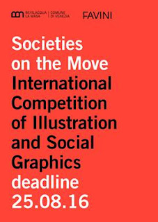
The Istituzione Bevilacqua La Masa and Italian papermakers Favini have announced the International Competition of Illustration and Social Graphics “Societies on the Move” which aims to stimulate the artistic imagination of cosmopolitan and multi-ethnic views of our society.

Nowadays, the movement of people and populations imposes increasing challenges on contemporary society: the use of common resources and rights is challenged by new needs to share, while an active and informed citizenship is required with regard to the environment, consumer choices, and the dynamics of production and institutional processes.

The creation of future societies can also start from a vision. The call is aimed at graphic artists and illustrators, with no limit on age or nationality, and both individuals and groups can participate. Participants are asked to create an original illustration or a graphical interpretation of the theme indicated.

A qualified jury will select the best works to be printed and displayed to the public in an exhibition at the Galleria in Piazza San Marco of the Bevilacqua La Masa Institution in Venice, from 20 October to 20 November 2016.

Moreover, the winner will receive a cash prize!

The selected works and the winner will be featured in the catalogue dedicated to the exhibition. An important factor is that there is no entry fee. The entrants may optionally decide on which type of paper produced by Favini to print the image they submit, especially on the lines Crush and Remake, although this is not compulsory.

Entries will be assessed by a qualified jury made up of international experts in the field of illustration, arts and visual communication. The five jurors for the prize will be: Giorgio Camuffo, Cedar Lewisohn, Riccardo Falcinelli, Steven Guarnaccia, and Hamelin Associazione Culturale.

Favini will also identify twelve images, independently from the jury’s decision, to use to create a calendar for the year 2017.

The application deadline is 25th August 2016. The call to competition can be downloaded here:

It would be lovely to see some UK entries, so please go on and HAVE A GO ...!

Posted by Justin Hobson 06.06.2016