Friday, 20 January 2017

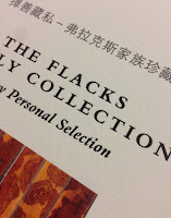
The Flacks Family Collection

On 16 September last year, a selection of 46 lots from the collection of Marcus and Debby Flacks were auctioned at Christie's in New York.

Marcus Flacks is one of the pre-eminent sources for classical Chinese furniture, rare scholar’s objects and contemporary Asian paintings. Among the highlights are an extremely rare pair of 17th century huanghuali and spotted bamboo scholar’s cabinets, perhaps the only known pair in existence.

This is the auction catalogue produced by the Flacks family and Christie's for the sale. Size is 210x268mm, portrait.
The publication has 148pp text pages printed on Neptune Unique SoftWhite 135gsm (a bespoke weight). The cover is printed on Dali Neve 320gsm, with 133mm flaps on the inside front and back covers.
An important feature that makes all the difference to this publication is the binding. It is a square backed limp bound book (spine is 13mm) but the binding type that is used is called OTASTAR. This is a method of bookbinding that offers an elegant binding solution with advantages over conventional soft cover binding. One of the main advantages is that it lays flatter than a conventional section sewn book. It mimics the construction of a case bound book, so the spine of the text is free from the cover (see image below). It is this that results in the text and whole book laying flatter.
The publication is printed in CMYK throughout and the imagery is truly striking. The Neptune Unique SoftWhite used for the text is an uncoated off-white, smooth (yet tactile) text and cover paper - the printed result is simply fantastic.
Click on images to enlarge
Below is the pair of 17th century huanghuali and spotted bamboo scholar’s cabinets. These are possibly the only pair in existence.
Click on images to enlarge
Below is Liu Dan’s Far-off Journey, painted in 2006 for Marcus Flacks.
Click on images to enlarge


The below images show the detail for the inside of the cover, printed in mono, showing the detail of the spotted bamboo.
Below is a detail of the outside front cover printed on Dali which is a felt-marked paper with a linear effect and a natural, tactile feel. The cover is printed CMYK and the title is hot foil blocked in metallic gloss foil. If you click on the image, you will be able to see the texture in the paper and the superb foiling...
Click on images to enlarge
The book is published by Sylph Editions. Design is by Ornan Rotem and production is by Num Stibbe. The superb printing is offset litho by Robstolk in Holland. The printed result on this uncoated substrate is simply superb, which combined with the superlative binding makes this a piece of print that is seriously noteworthy.

www.christies.com
http://www.mdflacks.com/
http://www.sylpheditions.com/
http://www.robstolk.nl/drukwerk/contact/
Posted by Justin Hobson 20.01.2017

Tuesday, 17 January 2017

Bally Women's S|S 2017

Bally was founded by Carl Franz Bally in the mid nineteenth century as a handmade shoemaking business which soon developed into factory production in the Swiss town of Schönenwerd. It is a brand which became internationally renowned with  shops in Montevideo Buenos Aires, Paris and London by the late 19th century.

Bally has extended its offering to include clothing, handbags and leather goods for both men and women and is now a truly global, luxury brand with retail outlets in Japan, Hong Kong, Malaysia, Saudi Arabia, Brazil, Lebanon Singapore, Australia, and Turkey.

This is the latest look-book for the Spring Summer collection 2017.
The size is A4 (297x210mm) portrait and has section sewn binding with a limp cover that is printed on Brossulin Xt 360gsm. The cover is printed four colour process, offset litho, using oxidising inks together with a panel which is hot foil blocked in matt white foil - looks superb! 
Click on images to enlarge
Here is the description about the range from the Bally website: A vision of vibrant style and bold sophistication, clothes and attitude embodying all the carefree joy of a never-ending summer day. Dazzling display of ice cream tones, shiny metals and pops of 60s ultra-colour: flared trousers and satin blouses in pink; a crushed velvet backpack and kabuki platforms in bright fuchsia; a leather shirt and mesh vest in cherry red; a gold metallic shirt and high-ankle espadrilles glistening like sweet wrappers in the light.
Click on images to enlarge
The 52pp text paper is printed on our Marazion Ultra 250gsm. Although this is heavier than many would use for a text paper, it really works giving this whole publication a chunky, thick feel. Marazion Ultra was chosen mainly because of it's matt flatness which would reproduce the interior images well without a glossiness which would detract from the classic look and feel of the products, whilst still reproducing the vibrant colours.

Click on images to enlarge
Detail (below) showing the section sewing. Because of the weight of the text paper (250gsm), it has been section sewn in 8pp sections.
Design is by the in house creative team at Bally. Designer on this project is Laura Goodwin and production was dealt with in-house. Photography is by Paul Wetherell

The superb print and production is by Orchid. Everything about this project is outstanding: printing, binding, hot foil blocking. A truly accomplished piece of design and print.
You can see the online version here: http://www.bally.co.uk/en_gb/lookbooks/ss17-womens-lookbook.html

www.bally.co.uk
www.orchidprint.com
Posted by Justin Hobson 17.01.2017

Thursday, 12 January 2017

D&AD President's Lecture - Simon Mottram


Yesterday evening I went to the D&AD presidents lecture to hear Simon Mottram, founder of the Rapha cycling brand at the Conway Hall in London.

Simon was introduced by D&AD President Bruce Duckworth. Using a mixture of films and images Simon charted the history of the Rapha brand from the early beginnings on his kitchen table, where the brand was placed at the centre of the business, which is quite firmly where it remains today.
Simon is an excellent speaker, clearly as passionate about cycling as the business he founded. His insights into creating a brand, being the brand owner and how he has managed to create a business which has the ethos of the brand in everything they do is a remarkable story. As he said:
"The brand drives everything. Phrases like ‘moments of truth’, ‘alignment’ and ‘engagement’ become more than buzzwords. They become reality".

He is modest enough to say that as much as it has been down to hard work and determination that there was also a fair element of luck and good timing.
He gave us 13 clues about how Rapha works. Looking at this list now, it looks a bit "dry" but when Simon was going through each point they jumped out at you. 
In my capacity as a small supplier to Rapha, I totally get it. The people I have dealt with over the years are totally engaged with the business, which is testament to Simon's point that "If your brand is going to be authentic at every point then it’s vital that you build the brand from the inside out"
There are many businesses that I work with (including design agencies) that have an excellent outward customer facing brand and image ...BUT if you are talking to that business as a supplier, you get treated very differently.

Interestingly, I checked back in my files and I first sent paper samples to Rapha on 12th May 2005 (to Ben Aquilina), which was in the very early days as Rapha only started in 2004! Since then we have supplied Rapha for a number of projects, here are just three for interest:
http://justinsamazingworldatfennerpaper.blogspot.co.uk/2014/07/glory-through-suffering.html
http://justinsamazingworldatfennerpaper.blogspot.co.uk/2010/11/rapha-springsummer-2010.html
http://justinsamazingworldatfennerpaper.blogspot.co.uk/2016/02/rapha-gt-shoes.html

 At a guess, I would think there were probably 300-400 people in the audience. Attending events like this is very important for all of us in the creative industry - it helps to share other people's perspectives and share what else is going on. At £15 per ticket, it's good value too....

I left feeling inspired and invigorated!

You can see the presidents lectures here:
http://shop.dandad.org/events/

Make it a belated new year resolution ...GO to more industry talks!

http://www.rapha.cc/gb/en/
Posted by Justin Hobson 12.01.2017

Tuesday, 10 January 2017

The BenRiach

Located in the ‘Heart of Speyside’, in the North-East region of Morayshire, BenRiach displays all the traditional charm of a Speyside distillery. Built by John Duff in 1898, BenRiach draws its water from the Burnside springs located underground, deep below the distillery.

The BenRiach Distillery Company was named Global Whisky Distiller of the Year at the 2015 Icons of Whisky Awards. A fantastic achievement for a small privately-owned independent company to win this prestigious global award.

This is a the tube packaging for their Single Malt, Batch 1. The tube takes a 70cl bottle of Scotch Whisky and is 292mm tall. The tube outer is printed on our Flora, Avorio 130gsm. It is printed in three special colours, offset litho and hot foil blocked using two color foils, metallic red and antique gold.
Click on images to enlarge
Reverse of tube:
If you aren't familiar with Flora, it is produced with 30% post consumer de-inked waste, together with 60% of virgin FSC pulp and with the "secret" ingredient of 10% of cotton fibres, which gives the paper a wonderful tactile feel. It has a deliberately recycled look and feel with specks and inclusions, so it looks deliberately flecky and specky, as you can see from the detail below:
Click on images to enlarge
Printing and production is by Gavin Watson Printers. Based in a purpose built factory in Glasgow, they have a formidable reputation for wet glue label printing for the packaging industry as well as commercial printing and finished packaging items (such as this example) for the drinks industry.
  
http://www.benriachdistillery.co.uk/
Posted by Justin Hobson 10.01.2017

Thursday, 5 January 2017

Season 02 Paris

This is issue 02 of SEASON  - a cross between a fashion magazine and a football zine. This new publication reveals the preferences and rituals of fashion and football fans. Their perspectives on the world’s most popular sport are explored in thoughtful and intimate ways, focusing on why these fans care and what they wear.
Featuring interviews, essays, photography and more from up-and-coming creatives, SEASON aims to kick off a dialogue acknowledging how modern football and fashion play into each other. Issue 02 is looking back to Euro 2016 through the eyes of the Parisian female fan.
Size is 240x165mm, portrait (very economical format on a B1 press). It uses lightweight materials sympathetic to the feel of a zine. It has a 4pp cover on 130gsm and a 72pp text on 100gsm. Both cover and text is on our Redeem 100% Recycled 100gsm and is printed offset litho. The paper is a neutral white shade gives the publication a 'newspapery' feel which really works with the images and zine design. 
Many of the spreads which are purely type work particularly well with the paper - the neutral white just works with black type superbly.
Click on images to enlarge
Another lovely touch is the use of holographic hot foil blocking for the title header.
At 76pp it is at the limit of saddle stitching - only because it can get a bit "gappy" in the middle. In my opinion this is acceptable, but were the gap or gape to get much larger, I think it would start to look a bit ugly.
As it is, the zine just flows beautifully. Pages turn easily and is an excellent example where the design, the print and the paper work in synergy. It has a wonderful quality about it - a really interesting, well put together piece of literature.
...and a zine wouldn't be complete without a sheet of football stickers!
Season is published by Felicia Pennant. The designer is Natalie Doto. Production and print is by Ricky Aldred at VR Print. A superbly produced magazine.

http://www.season-zine.com/
https://www.instagram.com/season_zine/
http://www.vrdigital.co.uk/
Posted by Justin Hobson 05.01.2017

Tuesday, 3 January 2017

Jobs from the past - Number 87

Regular followers of this blog will know that my first post of every month is a "job from the past" so that I can show some of the really good work from years gone by.

This month's piece is particularly poignant, as yesterday the death of John Berger was announced. John Berger was an English art critic, novelist, painter and poet. His novel G. won the 1972 Booker Prize. He is most widely known for writing and presenting his 1972 BBC series on art criticism titled "Ways of Seeing" together with his accompanying book. It is probably fair to say that Ways of Seeing turned the traditional art world upside down. 

Meanwhile - John Berger 2008
Drawing by Paul Davis
Drawbridge Books published an essay of John Berger's called Meanwhile. This short essay attempts to look at our historical age as we live it. Through words he searches for and finds a figurative image to serve as a landmark. "The landmark I've found is that of prison.”
I would describe this as a booklet or pamphlet style publication is a small format 210x124mm, portrait and is saddle stitched. It has a 4pp cover on our Colorset Natural 270gsm and 16pp text on Colorset Natural 120gsm (Colorset is 100% Recycled).
Click on images to enlarge
It is very simply printed, offset litho. The cover is printed in two colours only, red and black, while the text is black only.
The booklet is saddle stitched, in keeping with the simple illustration, design and typography. Printing is by Green-On printers.
The booklet was published by Drawbridge Books. The editor is Bigna Pfenninger. The designer is Stephen Coates and the managing editor is Mark Reynolds.

The Drawbridge was an independent quarterly of thought, wit and reflection giving equal focus to literature and visual arts, published in London from 2006 to 2013.

www.thedrawbridge.org.uk
www.greenonlimited.com
Posted by Justin Hobson 03.01.2017

Thursday, 29 December 2016

2016 Christmas Card by S-T

Thank you to everyone who has kindly sent me cards this festive season. I've received a wide selection of really lovely designs and beautifully produced cards, not all on our paper, of course! ...but many are.
Click on images to enlarge
This one particular card, I did think I would write about, because not only is it printed on our Colorset Crimson 270gsm (100% Recycled) but it is printed in an unconventional way. The card is designed by London based studio, Design by St. Titled "Who will you be this Christmas?" it is an infographic flow diagram which is very funny and well written. 
The finished size of the card is A6 (105x148mm) and it is an 8pp concertina format.
 The card is printed in just one colour - white. The result is fantastically effective and I looked at it to see how it has been achieved:
 Was it matt hot foil blocking? Silkscreen? HP Indigo digital white?
...Nope, none of the above!
In fact, it is printed by a Scottish printer called Kestrel Press based in Irvine. They have a digital press which is toner based and this is the result - in just one pass! The result is truly superb and as I discovered from speaking to Graeme Ferguson at Kestrel, achieved at a much more economical price in comparison with the processes I listed above.
Click on images to enlarge
Creative Partners at Design by St are Steve Fenn and Tom Pollard.

http://www.designbyst.com/
http://www.kestrelpress.com/
Posted by Justin Hobson 29.12.2016