Monday, 10 February 2020

Pentagram Papers 48

Pentagram Papers are an anthology of documents, cataloguing areas of interest of the partners behind the world renowned design firm, Pentagram. They are produced to be given to clients and colleagues of the firm and have been produced since 1975. The quirky booklets cover a range of curious, entertaining, stimulating, provocative and occasionally controversial points of view.

This is the latest edition, produced by one of the most recently appointed partners in the London office, Luke Powell. The title of this edition is "Long Lens, Wide Angle" and the subject is the Magnum photography cooperative, founded in 1947.

Size is 210x140mm, portrait with an 8pp cover and 48pp text.
The text pages are printed on Omnia 150gsm and it is a great example of just how well this paper prints, having said that, images such as these would look pretty good on anything! The high bulk of Omnia gives this 48pp publication a respectable 6mm spine.
Click on images to enlarge
Omnia was chosen is because it would beautifully reproduce the wide variety of very different images and feel special - with the reproduction that you would expect on a silk or gloss but with a natural tactile uncoated feel.
I must make a special mention about the printing, which is exceptional. Print is by Boss Print, based in West London and it is is printed offset litho using their Vivid Colour™ process. This colour technique has been combined in this project with the mono images being printed in duotone using two blacks (see above) and as you will see from the detail image below, the colour reproduction is superb.
The publication is section sewn in 12pp sections as you can see above and the thread used is black coloured thread which coordinates with the cover (below image).
The cover is printed on an embossed coverboard from that well known "Hull-based" paper merchant! ...and I must point out that it is printed black litho onto a white board with the type and keylines reversed out - but what about the black edge? I hear you ask. Well, the cover has been colour edged black, so there is no white edge. Great attention to detail by the printer Boss Print.
Design for this edition is by Luke Powell's team at Pentagram. This is a really special piece of print. Beg or steal a copy if you can...!

https://www.magnumphotos.com/
https://www.pentagram.com/
https://www.bossprint.com/
Posted by Justin Hobson 10.02.2020

Friday, 7 February 2020

Herman Miller in Paris

Last year, Herman Miller opened their new office in Rue Saint Augustine in Paris.  Herman Miller needs no introduction to readers of this blog, as they are at the vanguard of ergonomic office furniture, equipment and home furniture. The company works with contemporary designers of the time which, in the past, have included Charles and Ray Eames and more recently Bill Stumpf and Don Chadwick with the now iconic Aeron chair.

This is a beautifully designed and well executed piece of internal communication. To introduce staff to the area and their new community, the design team at Herman Miller created this wonderfully illustrated map which shows the cafes, bars, restaurants and shops in the locality. 
The size of the map is A6 folding out to A3. Below image shows the front...
Folding out to this...
Which then concertina folds out like so...
And the inside reveals this amazing map...
Click on images to enlarge
Design is by Tracy Stone and the wonderful illustrations are by Andy Council. It is digitally printed on our Offenbach Bible by Hampton Printing who are based in Bristol.

https://www.hermanmiller.com/en_gb/
https://www.andycouncil.co.uk/
http://www.hampton-printing.co.uk/
Posted by Justin Hobson 07.02.2020
Monday, 3 February 2020

Jobs from the past - Number 124

Regular followers of this blog will know that my first post of every month is a "job from the past" so that I can show some of the really good work from years gone by and this invitation is from 2014.

British Museum Invitation - September 2014 
In September 2014 the British Museum staged a major exhibition in the new Sainsbury Exhibitions Gallery on a golden age in China’s history. The exhibition explored the years 1400 – 1450, a pivotal 50 year period that transformed China during the rule of the Ming dynasty. The exhibition included rare loans of some of the finest objects ever made in China, shedding light on this important part of world history that is little known in Europe. China’s internal transformation and connections with the rest of the world led to a flourishing of creativity from what was, at the time, the only global superpower.
Click on images to enlarge
This is the private view invitation for special guests in September. The size is A5,portrait and is a 6pp gatefold format. It opens to reveal the spread below...
 ...and then folding out to the below:
The below image shows both sides, spread out.
This invitation is printed on our Omnia 280gsm, which is a very bulky board with a subtle, natural texture and tactile surface. Reproduction is superb, as I hope you can see with the black and red solids and with the most amazing detail retained in the images as I hope you can see in the image below...
Design is by the in-house team at the British Museum, headed by Ann Lumley. The invitation was printed offset litho by CPI Colour.

Posted by Justin Hobson 03.01.2020

Thursday, 30 January 2020

Destination

Book artist Caroline Penn was asked to collaborate with thirteen other artists on a project, published by WhnicPRESS and launched at the Bristol Artist Book Event (BABE) at the end of March 2019. Project C is about inter-semiotic translation: the translation from images to words, and words to images and the paths that form between them. Each artist was given an anonymised book cover and asked to respond to it with another book form.  All of the resulting fourteen books are held within a slip case in an edition of 25 copies.

Caroline wanted the form of her book to reference dictionaries and an unfolding train journey, hence the choice of Offenbach Bible, a double-sided, single sheet of Offenbach Bible folded into a concertina, and sewn into a cover.
Click on images to enlarge
The finished size is 173x124mm with the 8pp concertina text folding out to a 494mm length. You can see from the below image how the text folds into the 4pp cover...
Concertina text fully extended...
Given the lightweight nature of the Offenbach Bible, you probably won't be able to believe that it's digitally printed! The job was printed and finished by print company Typecast Colour, based in Paddock Wood. It was printed on their Xerox digital press and the result is excellent. For a limited run, such as this (25 copies) printing digitally makes a project such as this viable.
Click on images to enlarge
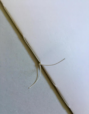
The above image shows the '5 hole sewn' binding, which is hand finished, as is the hole punching. Below shows the text fully extended:
The Offenbach Bible is enclosed within a Pergamenata paper cover which was all put into a loose cover, with the photo of the train in snow, supplied by WhnicPRESS. The other 13 artists also had their books enclosed within similar printed covers. All 14 books were then put into a slip case, see below...
Image courtesy of whnicPRESS
This was a lovely project to be involved with and many thanks to Caroline for taking the time to send me a copy of the finished publication and a handwritten note.
https://carolinepenn.com/
https://whnicpress.tumblr.com/
http://www.typecast.co.uk/
Posted by Justin Hobson 30.01.2020

Tuesday, 28 January 2020

Typographic 71

This is the latest edition of Typographic, a journal published by ISTD (International Society of Typographic Designers) issue 71. This is a good read and there is always something in it to inspire, the content is entirely devoted to those practising typographic design, both past and present.
The contents include eight articles by/about: David Quay, Stephen Banham, Jim Northover, Cal Swann, Jared Patterson, Trevor Finnegan, Tony Pritchard, Nicole Phillips, Mike Daines. The Editorial Board is Jim Northover, Tony Pritchard, Caroline Roberts.
Size is A4, portrait. The 4pp cover is printed offset litho, hot foil blocked and die cut on our Astralux Silver 250gsm. The die cut holes form the number 7, allowing the 2pp end-papers (which feature front and back) on Colorset Blush to show through. The number 71 on the cover was inspired by David Quay's typographic walk through Amsterdam which is one of the articles in the journal. Cover artwork is by Tony Pritchard.
Click on images to enlarge
The 32pp text is printed offset litho on Pergraphica High White, Rough 120gsm.
Click on images to enlarge
The colour images have reproduced excellently on the uncoated surface of the Pergraphica and the result is really superb...
Click on images to enlarge
The publication is section sewn and the book opens nicely and the pages lay quite flat. As you can see from the image below, how metallic the Astralux Silver looks on the cover...
Design is by Miriam Brüggen who is based in Berlin and production is by Playne Design. It is beautifully printed, bound and finished by Empress Litho in London.

You can buy a copy of Typographic 71 on this link here.

However...
If you are a practising designer that cares about typographic standards and you aren't already an ISTD member, maybe you should think about joining - there are many benefits, this journal (free to members) is just one! - have a look http://www.istd.org.uk/ - it costs less than £10 per month and is excellent value.

www.istd.org.uk
https://www.empresslitho.com/
Posted by Justin Hobson 28.01.2020

Thursday, 23 January 2020

Bricks & Mortar

Bricks and Mortar is a project by third year graphic design students at the University of the West of England (UWE). The project culminated in an exhibition at The Vestibules (Bristol City Hall) on Monday 18th November showcasing the student work followed by a discussion about the housing crisis...
"The scale of Bristol’s housing crisis has been revealed in a detailed new report that presents the latest facts and figures, including the housing market, rental prices, council housing and homelessness in the city. Number after brutal number sets out the harsh reality for thousands of Bristolians, as well as the complexity of the problem facing city leaders: More than 11,000 languish on a waiting list for a council house. Average house prices approach £300,000. Average rents exceed £1,000 a month. Around 120 people sleep rough every night. The list goes on. Many of these issues go unnoticed; nothing can be solved if the issues remain invisible. Our challenge is to highlight the problems to passers-by, in ways that are hard to ignore."
The team of UWE student organisers for this project are: Emilia Bermejo-Ford, Marta Celio, Ella Staines and Olivia Bellingham. The UWE tutors are Jennifer Conway and  Jessie Young known as Jen and Jessie of Conway and Young.

These promotional flyers for the project are digitally printed on our Crush, Corn 120gsm. Size is A4 folded to A6.
If you aren't familiar with Crush, it is one of our ranges made by FAVINI in Italy and is made using 15% residues from the industrial processing of agricultural food processing. As a result, the paper does have inclusions and a "rustic" feel, which you might just be able to see from the image detail below:
This is an excellent example of using an interesting material to raise the production values on a little project and has made all the difference.

http://bricksandmortar.site/empty_houses.html
http://www.conwayandyoung.com/
Posted by Justin Hobson 23.01.2020

Monday, 20 January 2020

Lollard Street

Lollard Street in Kennington epitomises Homes For Lambeth’s commitment to more and better homes for Londoners. The development consists of 12 private apartments and 7 townhouses, overlooking Lambeth Walk Open Space.

This is the superbly produced sales brochure for the development. The size is 380x280mm portrait, which is a size with lovely proportions.
It is 16pp self cover, saddle stitched, printed on Shiro Echo, White 160gsm and in this oversized format, it flows superbly with the large format pages working perfectly on the 160gsm weight.
The brochure is printed offset litho and the quality is superb. The colour work is excellent but the black solids (above and below) are exceptional...
Click on images to enlarge
Shiro Echo is our 100% Recycled range and also carries the FSC Recycled classification. Shiro Echo is available in two shades; there is a white shade (which is a natural/off white) and similar to the old shade of Cyclus and a Bright White shade which is similar to the old Cocoon range.
Click on images to enlarge
Simply saddle stitched but beautifully finished with the right paper in the correct weight is what makes this piece a job of real quality.
Branding, art direction and brochure design is by London based Ignite and you can read more about this project here.

The excellent print, repro and finishing is by Gavin Martin Colournet, based in Greenwich.

http://ignitetv.com/
https://www.lollardstreet.com/
http://www.gavinmartincolournet.co.uk/
Posted by Justin Hobson 20.01.2020