Tuesday 18 May 2021

Hamish Brown Photographs...

Hamish Brown is an award-winning photographer whose talent and style have secured him shoots worldwide for many of the top names in celebrity, music and sport. His photographs have graced the covers of British GQ, The Times Magazine, The Observer Magazine, The Telegraph, Men's Health and Vogue.

This is his amazing portfolio...
Front Cover...
Inside spread
The outside front cover is covered with an all over de-boss in type listing the names of his clients. The effect is fantastic.
Size of the brochure is 345 x 245mm, portrait, saddle stitched.
It has a 4pp cover on 200gsm and a 24pp text on 120gsm, all printed on our Omnia. For those readers not familiar with Omnia, it is an uncoated paper with a surface treatment. What this means is that it feels like an uncoated paper but because the surface treatment minimises 'dot-gain', the print result is much more like that of a coated silk or gloss coated paper.
The look and feel of the whole publication is very uncoated and tactile but there is absolutely no loss of detail in the images as you can see in the detail image below...
You are probably assuming that this quality piece of print is printed offset litho, but you would be wrong. This job is printed on a digital printing press - a Fujifilm Jet Press 720S. This (relatively) new B2 size digital press is a commercial inkjet printer, which has been built to produce high-quality short run to medium run digital print. Push Print in London installed the press three years ago and as you can see from the result on this job, it is producing the high quality print that Push is renowned for.
One advantage that the Fuji has over the HP Indigo digital presses is that the Fuji doesn't require papers to be 'sapphire treated'.
The book sits nice and flat and the finishing is well done. The weights are perfectly selected and it flows nicely in the hand.
The cover which is printed on the Omnia 200gsm, is the perfect weight as Omnia has a high bulk making it 280microns thick and is just right to take the de-boss. The outside cover is also film laminated with a satin lamination which gives the cover extra durability and as you can see, it has worked well on the Omnia.
Design is by Mark and Chris Thomson at Studio Thomson. The exceptional repro, printing and finishing is by Push Print in London.

Thursday 13 May 2021

Ultrabold 20 out now!

Ultrabold 20 is the first of two issues to mark the 125th anniversary of the St Bride Library, and in tribute to such a momentous milestone, it comes with four alternate covers, created by Rui Abreu, Luke Bird, Carol Kemp and Vaibhav Singh. 
The designs extend across issues 20 and 21 and join with their partner to form a single image.
Click on image to enlarge
In the latest issue, librarian Sophie Hawkey-Edwards reflects on the unique magic of the Library and what it means to er and the people who use it; Ursula Jeffries takes us back to the 1890s and how the whole thing got started; Jamhes Mosley examines the photographs Emery Walker took to help William Morris design his types for the Kelmscott Press; Elizabeth Fraser uses a personal health crisis to find creative inspiration; ‘Do it like you do it,’ says Agyei Archer – and does; while Bob Richardson looks at the Model press, the Gujarati Type Foundry, and a Beatrice Warde commission for the Curwen Press, yet more fascinating items from the collection. 
Ultrabold is £10 (only £8 for Friends of St Bride). You can choose your cover, subject to availability and you can buy your copy here... https://stbridelibrary.bigcartel.com/product/ultrabold-no-20
PS ...it is beautifully digitally printed by Principal Colour.
Posted by Justin Hobson 13.05.2021

Tuesday 11 May 2021

1:76

Founded in 2015 by Mark Leeds and Duncan Johnson c-ll-ct-v-ly is a London based Design and Research studio working in all media and especially editorial and moving image. As a studio project. they publish these limited edition magazines, using unpublished, reordered, remade, refound or newly created artworks. They are a quick-fire collaboration between the studio and a range of creatives ...an easy consumed, visual hit.
1:76 is Number 9, Model building ruins by Thom Atkinson. Thom is based in London and Kent and  works predominantly in a documentary style, centering around people and objects in locations. It is characterised by a gentle and observational approach and a natural and honest quality. Commercial and editorials clients include Barclays, Volkswagen, Tesco, Esso, Sainsbury’s, Cancer Research, FT Weekend, Hole & Corner, The Guardian and Telegraph Magazine.
"I’ve been working on a much bigger project for a few years and this was a sort of spin off from it. It’s also connected to a photobook I published about the Blitz in London and was kind of another way of coming at that same idea. The thread that joins these projects together is to do with British history and the way in which it is mythologised and remembered. In my head, the Airfix Ruins are like little found sculptures, made in memory of a war long ago, before the modellers were probably even born. They’re like devotions and dreams. And I think a lot of memory and mythology is to do with those things." Thom Atkinson.
Size is A5 (210x148mm) portrait, saddle stitched. It has a 4pp cover, cut short at 148mm high with a  16pp text.
The cover is printed on our Crush, Almond 120gsm in black only. Text is printed on Gardapat 13 Kiara 150gsm. For readers not familiar with GardaPat 13, it's a fully coated paper but it really does have a dead flat MATT surface. There are many papers on the market which profess to be matt - some which incorporate the word matt in the name, but aren't! Apart from the high quality matt surface, this paper has an extraordinarily high bulk - this 150gsm text with a thickness of 195mics. If you would like to read more about the bulk, you can read it here.
Cover and text are digitally printed using an HP Indigo digital press and the results are superb, beautifully showing the artworks. As many readers will know, many materials have to be "Sapphire Treated" to work successfully on HP Indigo presses, however this project has been printed without sapphire treatment ..and it's superb!
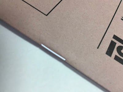
Printing and finishing, including the lovely white wire used on the saddle stitches (above) is by WithPrint who are based outside Bristol in Rooksbridge.
Concept and Design is by Mark Leeds and Ellie Rose. Font used is Grosa by Feliciano Type.
Posted by Justin Hobson 11.05.2021

Monday 10 May 2021

Zanders Mill closes

There is very sad news that Zanders, the German papermaker has closed. Zanders has been known for its high gloss, cast coated Chromolux range of paper, label papers, and board of which we are the stockist and UK distributor. The mill has been badly hit by the impact of the Covid-19 pandemic, which resulted in a decline in sales.
You can read the whole article (including quotes from me!) here: https://www.printweek.com/news/article/end-of-the-line-for-historic-papermaker

Zanders was founded by Johann Wilhelm Zanders in Bergisch Gladbach in 1829 and the Zanders family and name was a major force in the German paper industry until the 1980's when 'merger mania' meant the large groups in the industry were just getting bigger and bigger. Designers and printers working in the 70's 80's and 90's will remember the reputation of the Ikono range with Ikonofix and Ikonorex which were exceptional high quality 'real art' coated art papers which were then joined by the well marketed MegaMatt in the 1990's. The UK agent during that period was John Heyer Paper, who some people may remember.

Yet another very sad day in the paper industry...

PLEASE NOTE: The Reflex Paper Mill which used to be part of Zanders is a separate mill, also based in Cologne and they are nothing to do with Zanders and are not affected. They produce the Zeta range, Trevi label papers, Efalin and Elefantenhaut covering and Spectral translucent papers.
Posted by Justin Hobson 10.05.2021

Thursday 6 May 2021

Lemon Tree Business Cards

LemonTree are a cleaning company based in the South East ...and they are a cleaning company with an environmental ethos. Only businesses with the highest standards of social and environmental performance are eligible for a B Corps certificate and LemonTree is on the path to B Corp full Certification, which certifies companies worldwide, because of the positive impact on customers, workers, community and the environment. This is their lovely Business Card...
The size is 55 x 85mm and it is printed on our Crush Kiwi made by Favini in Italy. Crush is made partly using the residue from the industrial processing of crushed citrus fruit, coffee, nuts, olives, kiwi, corn, lavender cherries and grapes, these agro-industrial "end of life" products replacing up to 15% of conventional tree pulp. This is combined with 40% recycled fibres (post consumer waste) and the remainder is FSC virgin pulp and the product is FSC certified. The range is produced using green energy and is carbon balanced at the mill gate (we can also supply the paper in the UK, certified as carbon balanced).  
The card is digitally printed by MTA on their HP Indigo press. It has been printed with a white layer first with the yellow printing on top which makes the colors, especially the vivid yellow really pop!
As you can see from the image below, the Crush Kiwi has inclusions in the paper which are visible. The paper was chosen because of it's environmental pedigree and that the shade of pale green really worked with the identity.
The card is printed on Crush Kiwi 250gsm, which has then been duplexed to make 500gsm.

Design is by Imagist, a brand consultancy based in London and the design is by Rose Cornish.

Posted by Justin Hobson 06.05.2021

Tuesday 4 May 2021

Jobs from the past - Number 138

Regular followers of this blog will know that my first post of every month is a "job from the past" so that I can show some of the really good projects from years gone by and here's one from 2008. 

Tate St Ives - Summer 2008
I've written many posts on this blog which includes the phrase "...just the cover makes the difference" and the cover on this pocket guide is just superb. It is printed offset litho on our Colorset Lime 120gsm, in just one colour.
Click on images to enlarge
The size is A6 (148x105mm) portrait and is saddle stitched. It has a 4pp cover and 24pp text printed on an uncoated 120gsm, again the text is also just printed in 1 colour. For those of you not familiar with this collection, Colorset now has 36 colours and all colours are available in 120, 270 and 350gsm. Below shows the inside front cover...
Click on images to enlarge
For a little pocket guide, this has an excellent feel and flows nicely in the hand. This an excellent example of a project which is quite a long run and has been produced in a cost effective way, but the use of a self coloured cover (which will always be more expensive than a white paper) has massively raised the quality level of the publication.
Design is by Practise. Originally founded in London by James Goggin and Shan James in 1999, Practise is now based between Tāmaki Makaurau, Aotearoa (Auckland, New Zealand) and Providence, Rhode Island (United States)
Sadly I can't recall who printed this project, but if you can, please let me know!

Posted by Justin Hobson 04.05.2021

Friday 30 April 2021

Rathfinny Map

Husband and wife, Mark and Sarah Driver, established the Rathfinny Wine Estate in 2010 on a working arable farm with the express intention of producing some of the world’s finest quality sparkling wines. Today, the vines cover 600-acres of the Sussex South Downs and is set to become one of the largest single vineyards in Europe. Pentagram devised the brand strategy and visual identity.
Visitors to the estate are supplied with this map, which gives directions and points of interest about the vineyard and countryside. This publication is designed by London based studio UTILE.
Click on images to enlarge
The finished size is A6 (148x105mm) folding out to A3 (297x420mm) and is printed offset litho in four colour process.
Above and below images show the map-fold...
The choice of paper for this project is an interesting one! The original choice was to use a synthetic paper as typically, with the British weather, paper maps get wet and the paper falls apart. However, synthetic papers are basically plastic and it does not fit with the vineyard's environmental policy. The solution is a clever one! It is produced on a 100% recycled (post consumer waste) label paper called Trevi manufactured by the Reflex Paper Mill in Germany. So, I hear you ask, why is that so clever? Well, this label paper is manufactured with what is described as 'Wet Strength' (WS) and is manufactured with the addition of chemicals which improve the tensile properties of the paper both in wet and dry state by crosslinking the cellulose fibres with covalent bonds that do not break upon wetting. It basically mens that it doesn't fall apart when it gets wet. These papers are generally used for label papers where the label is required to come off in one piece in the recycling process. It is also the same technique that is used in facial tissues, which stops them falling apart when you blow your nose, unlike toilet paper, which falls apart. This looks and feels like a totally normal sheet of paper but when it gets wet it will hold together, much better than a normal sheet of paper - it's the perfect choice! 
Click on images to enlarge
Above and below images show both sides 
The design incorporates these superb woodcuts, which look perfect on the neutral white shade of the paper.
Click on images to enlarge
The paper is called Trevi Recycled 80gsm which is manufactured by the Reflex paper mill in Germany and we are pleased to be their UK stockist and distributor.

Below image showing front and back covers.
Design is by UTILE. Creative Director on the project is Nicholas Duggins and the designer is Sammy Taylor. Printing is by Identity Printers with Paul Martin handling the project.

...and just in case, I gave the map a total soaking in the sink and it holds together perfectly, just as promised!