Friday, 8 July 2022

Preen Home

Preen By Thornton Bregazzi was founded in 1996 by Justin Thornton and Thea Bregazzi, built on an aesthetic of darkly romantic and effortlessly modern, juxtaposing the masculine with feminine and mixing of hard and soft. Their debut collection at London Fashion Week for Spring Summer 2001 established the brand’s essence of punkish sensibilities with vintage elements and hand crafted details

Preen by Thornton Bregazzi has now expanded to include Preen Home – an opulent offering of soft furnishings
Size of the brochure is 330x240mm, portrait and is singer sewn. The text material chosen was our Omnia, which would beautifully reproduce the photography with the delicate patterns and dark colours superbly - without forgetting the fleshtones ...and it looks wonderful! There is a 4pp cover on Omnia 200gsm and 16pp text on 120gsm.
Click on images to enlarge
Unlike many of the look-books featured on this blog, which are printed offset litho, this has been digitally printed on an HP Indigo press. The colours are strong and punchy and the whole publication has a matt, tactile look and feel - in fact I can honestly say, every bit as good as litho!
Although Omnia was never originally developed for digital, we now keep it as a stock item with "sapphire treatment". This treatment is often applied to more unusual papers and provides a "key" so that the inks (which are different to litho inks) work on the paper surface. The great thing is the job just doesn't look and feel like a digital job. Below is a detail shot showing the excellent fleshtone reproduction.
Click on images to enlarge
Below shows the detail of the red thread used on the singer sewing - just beautiful!
Omnia is a very bulky paper, and the 200gsm cover just works perfectly with the format and the singer sewing
The art direction is by Mark and Chris Thomson and the quality of the direction and photography (by Ash Reynolds) is matched by the exceptional digital print by Screaming Colour.
https://preenbythorntonbregazzi.com/
https://studiothomson.com/
https://www.screamingcolour.com/
Posted by Justin Hobson 08.07.2022

Tuesday, 5 July 2022

Banknotes printed on PaperWise

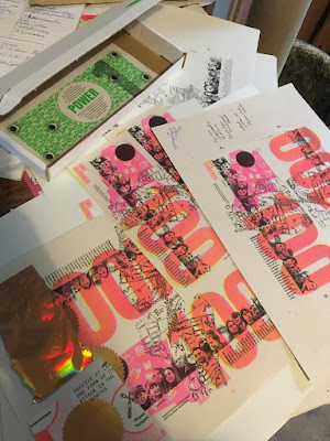
POWER is a show and do project—tracking the real-time progress and pitfalls of building a solar POWER STATION across the rooftops of North East London via enacting a grassroots Green New Deal. It involves mass participation art, documentary film and cooperative energy as a diverse community come together to recognise our collective power and quite literally create it—moving from consumers to producers of energy. This is a public work of art involving practical thinking through making—collaborating with people and photons to explore and expand our relationships with each other and the sun we all live under.
In 2018 they opened a ‘rebel bank’ in a former high street bank and printed paper money. This was part of a Bank Job. Find out more here. In May 2022 the bank will be issuing a new form of currency—the Greenbacks. The plan - to raise £100,000 by end of July 2022 and carry on to £1Million.
The original Greenbacks that became the dollar were a form of sovereign money creation. POWER’s Greenbacks are a form of money creation and economic stimulus that will directly back a grassroots Green New Deal now as the proceeds of their exchange for sterling will be fed directly into POWER—shared 50/50 between building the (solar) POWER STATION as template and demand and building community wealth working with an ecosystem of organisations both doing this and fire fighting cuts and their consequences.
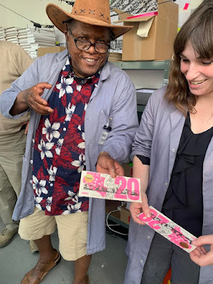
The greenbacks were printed in public in May 2022 in Walthamstow, NE London by a team of local people trained in the methods used and paid at London Living Wage. The printing processes used is a combination of offset litho, Riso, Silkscreen (UV ink) and hot foil blocking - amazing!
A wonderful project! ...and what about the paper?

These special banknotes are printed on our PaperWise Natural 90gsm, which is manufactured from 100% agricultural waste and you can read about HERE As you can see from the image below, PaperWise is a natural shade and is completely unbleached...
You can read more about the project here: https://www.power.film/

With thanks to Hilary Powell for the images and the introduction to the project.

Posted by Justin Hobson 05.07.2022

Friday, 1 July 2022

Jobs from the past - Number 152

Regular followers of this blog will know that my first post of every month is a "job from the past" so that I can show some of the really good work from years gone by...

New Brook Buildings 2010

Here is a job which that just exudes fantastic quality of both print and finishing (oh, and of course a pinch of all right design as well!). The project is a brochure for a property called New Brook Buildings.

Size is 240x330mm. Key points of interest is the fantastic de-bossing on the front cover (which if you enlarge the pic below, you should be able to see). It is also "swiss-bound" (explanation below) and the text is stepped with divider pages (printed with mono imagery).
Below pic shows the Swiss binding. For those that are unfamiliar with this type of binding, it is essentially a section sewn or perfect bound binding method which has a "lip" of about 15/20mm of cloth wrapped around the spine. The cloth covered spine is stuck flat on the reverse of the text block with a strip of glue into a 4pp cover with a "freestanding" spine which means that the cover (which can often be very springy with normal adhesive binding) sits very flat.
Click on images to enlarge
The text is stepped and is very tricky from a production point of view, especially with this type of binding. This has been done exceptionally well.
Below is the opening spread - inside front cover on left, stepped text on right.
The paper used is our Omnia - 320gsm on the cover and 120gsm for the text. The reason that Omnia was chosen is because it would beautifully reproduce the photography with the rich imagery of locations, the solid reds and detailed images. Of course the most important thing is for the publication to be special - with the reproduction that you would expect on a silk or gloss but with a natural tactile uncoated feel. Some of the spreads below: 
Design is by London design agency dn&co who specialise in property branding. Creative Director was Ben Dale. It was printed by Push based in Bermondsey, who are sadly no longer in business.
Post by Justin Hobson 01.07.2022

Tuesday, 28 June 2022

Alexander McQueen Winter Gift Guide

The Alexander McQueen brand was founded by designer Alexander McQueen in 1992 and is now part of the international Gucci group. The creative director is Sarah Burton and this publication is the Winter gift guide.
Size is 270x210mm, portrait and is section sewn. The cover is printed on an uncoated cover board (sadly I don't know which one) and the 36pp text is printed on our Marazion Ultra 150gsm.

Click on images to enlarge
The text is printed offset litho in CMYK on our Marazion Ultra 150gsm. The Marazion Ultra was chosen mainly because of it's matt flatness which would reproduce the interior images well without a glossiness which would detract from the images. A simple, effective choice of materials.
A thumbnail guide on inside back pages...
A particular favourite of mine is the "Knuckle Box" clutch bag! but then Alexander McQueen originally earned the reputation of being "the hooligan of English fashion"
..see detail below:
Art direction and design is in house at Alexander McQueen. The printing and production is by Identity Print, based in Paddock Wood in Kent.

https://www.alexandermcqueen.com/gb
http://www.identityprint.co.uk/
Posted by Justin Hobson 28.06.2022

Thursday, 23 June 2022

Astralux Range Swatches

ASTRALUX is the market leading range of cast coated papers and boards produced in Italy by the Favini Crusinallo paper mill. 'Cast Coated' papers and boards have an extremely high gloss, reflective surface on one side with an uncoated reverse. The weight range is 80gsm - 350gsm in white and is also available in 27 shades (including metallics and pearlescents) and we have some beautiful swatches... 
The swatch is A4, portrait and incorporates both the white and the colour range.
The colours are displayed in a "chip" format which is an ideal format to see selection of shades:
...and there is even a printed sample.
If you would like one of the swatches, just let me know justin@fennerpaper.co.uk

http://www.favini.co.uk/
Posted by Justin Hobson 23.06.2022

Tuesday, 21 June 2022

Marmoreal by dzek

Marmoreal is an engineered marble for architectural surfaces developed by Dzek in collaboration with the British designer Max Lamb. The graphic and immersive visual qualities of this engineered marble have also been harnessed in pieces of furniture, developed to illustrate the material’s capabilities beyond the typical two-dimensional expressions common to architectural surfaces.
This piece of literature works as both product information guide and promotional poster. Size is 838 x 590mm folding down to 148mm square. It folds into a 40pp broadsheet with an additional 8pp of 100mm high flaps.
It is concertina folded both horizontally and vertically as you can see in birdseye image below... The whole publication is printed offset litho on our Offenbach Bible 60gsm and it looks and feels absolutely gorgeous - it flops and folds in a delightful way when handling the publication as I hope these images demonstrate.
which folds out flat as below
The below image shows the way it concertina's from top to bottom (vertical folds) before folding horizontally.
The striking Marmoreal poster, which shows this amazing material...
Reverse, with details about the material together with images and the items of furniture made using Marmorial.
Photography is by Frank Hülsbömer. The publication is printed offset litho in CMYK and the colour reproduction on the Offenbach Bible is excellent, as you can see in the detail image below.
Field Projects, a London based studio, is responsible for the superb art direction and design. Creative Director on the project is Tom Watt.
...and many thanks for Tom for kindly sending me file copies and a lovely note.

https://dzekdzekdzek.com/marmoreal#marmoreal
http://maxlamb.org/157-marmoreal/
http://www.field-projects.com/
https://www.frankhuelsboemer.de/
Posted by Justin Hobson 21.06.2022 

Friday, 17 June 2022

Billy Tannery literature

Billy Tannery started with a discovery. Founders Jack and Rory found out that due to decades of decline in the British leather industry, many thousands of goatskins leftover from the food industry were being thrown away each year. So in 2016, building on centuries of local leather knowledge, they transformed a farm building in the Midlands into a small-batch tannery - the first to be built in the UK for well over 50 years.
This simple piece of promotional literature tells the story - Turning Waste into Worth. The finished size is A6 (148x105mm) but is simply a folded piece of A4 folding down to A6 - one of the simplest and most cost effective formats available, yet also one of the most effective. 
Click on images to enlarge
Below image shows the leaflet folded out to the A4 size spread...
...and what better paper to print this publication on than a paper made using 25% upcycled leather! Remake is the range produced by Favini and Remake is leather ‘upcycling’ on an industrial scale and represents the latest frontier in upcycling in the paper sector. This unique and innovative paper replaces 25% of wood tree pulp with leather residues. You can read more about Remake here.
Click on image to enlarge
In the detail image above you can see the visible leather fibres in the sheet. Below is the proud statement about the paper's provenance.
The publication is printed on Remake, Sand 120gsm It is printed and finished by Typecast Colour, based in Paddock Wood, Kent and was printed on their Xerox digital press.