Tuesday, 20 September 2022

L&W Appartments

...just the cover makes the difference!

Here's an interesting project which is well worth a look, because of the high quality finishing processes and the way the cover is used to add to the quality and feel of the whole project...

This 48pp brochure is for a residential development but the content is much more that of a magazine with eight writers and articles about the area, the architecture and the geography. The finished size is 380x285mm, portrait and is singer sewn. The 48pp text is printed on an uncoated paper.
The cover is printed on our Crush, Corn 250gsm and in fact it isn't printed using ink, it is simply hot foil blocked in a black gloss foil on both the front and back cover.
As you can see from the image below, the foiling looks amazing and you can see the subtle specks in the paper.

Quality of the singer sewing is superb

Design is by Ignite, who are based in Hoxton Square in London. You can read more about the project here. Print is by Gavin Martin.

https://longandwaterson.com/
http://ignitetv.com/
https://www.gavinmartin.co.uk/

Posted by Justin Hobson 20.09.2022

Friday, 16 September 2022

WPF Therapy Literature

WPF Therapy began life in 1969 as the Westminster Pastoral Foundation at the Methodist Central Hall in Westminster. They have grown to become a significant national provider of psychodynamic counselling, therapy and training and are based in a modern, purpose-designed centre in London Bridge. WPF provide affordable therapeutic services to promote mental and emotional well-being, provide training and educational opportunities for therapists and cares, engaging in research into mental health and raising awareness of mental health issues.

This delightful information pack has been thoughtfully designed and produced. The outer 6pp folder is 225x115mm with a 10mm spine, printed offset litho in solid grey (special pantone colour) with type reversed white out and hot foil blocking in bright yellow, gloss, pigmented foil.
Printed on StarFine 350gsm it produces a really nice 'solid' square pack.
Below picture shows the folder open, with "Making life feel better" also hot foil blocked.
...and this is where is starts getting clever! The below picture shows the folder open with a capacity pocket on the middle panel. In the pocket is an array of the WPF lead colours used in the identity, all at different angles.
If you take out what appears to be a booklet, it is as below.
BUT ...and here's the clever bit, it's five individual 6pp leaflets, all die cut at angles that just hold together, without binding, that make up this one 'booklet' like so..
with the beauty being that they can still be used as individual leaflets, or as one booklet. Incredibly simple and extremely effective. The image below shows the individual leaflets.
Each of the 6pp leaflets is printed on StarFine 200gsm, which is the perfect weight, heavy enough to hold together to make the booklet without being too 'springy'. All print is offset Litho and the colours are all made out of tints, not specials. The image below shows the reverse of all the individual leaflets:
There are also appointment cards also printed on the StarFine 200gsm in the same colour references.
The identity and design (including the website) is by Playne Design who have studios in London and Hastings. Creative Director is Clare Playne.

This is just an excellent example of a well thought out and well executed piece of print. Good consideration of the format, materials and printing processes is where this job scores most highly. It's not lavish or expensive and it's entirely appropriate for the client.

Printing and the tricksy die cutting is by Banbury Litho.

https://wpf.org.uk/
https://playnedesign.co.uk/
https://www.banburylitho.co.uk/
Posted by Justin Hobson 16.09.2022

Tuesday, 13 September 2022

One week to go until London Packaging Week...

London Packaging Week, is coming to Olympia in London next week. Easyfairs launched Packaging Innovations London and Luxury Packaging London, 10 years ago,creating a meeting place for packaging designers, technologists and suppliers in the capital. This year, it is bigger and better - London Packaging Week – a series of four events bringing a new, sharper focus on packaging development for the capital’s key luxury and FMCG markets.
Each of the four events targets a specific community – and they will combine to create an inspirational event that will drive packaging innovation, business and connections at the heart of the UK’s luxury and consumer products markets.
We will be showing our range of luxury packaging papers alongside the PaperWise range, manufactured from agricultural waste. We will be sharing our stand together with the team from PaperWise in Holland.
Come and see us on stand B102 and if you would like to register (for free!) you can do that HERE.

Posted by Justin Hobson 13.09.2022

Thursday, 8 September 2022

Colorset range has 36 shades!

For those of you not familiar with Colorset, it is our range of coloured text and cover papers which is 100% recycled and more competitively priced than some other well known brands of coloured paper!
Click on images to enlarge
A few years ago we started to bring in our Colorset range in 350gsm, so we now have ALL colours in 120gsm, 270gsm and 350gsm - all in B1 size (700x1000mm). 
A few years ago we further developed the range with 8 new colours, making this a collection of 36 shades.
The new shades include five light shades and three deep shades. The new shades are Blush, Warm White*, Glacier, Storm, Hopsack*, Charcoal*, Spearmint* and Deep Blue (Note: four of the new shades with an asterisk* are virgin fibre)
...so there you have it, a range with 36 colours including SEVEN greys!

If you would like the updated swatch, please drop me an email and I'll pop one in the post justin@fennerpaper.co.uk
Posted by Justin Hobson 08.09.2022

Tuesday, 6 September 2022

The paper market and energy crisis

Regular readers will have heard about paper shortages and massively increasing prices, which I have written about on this blog before. However, given the extreme price increases for energy last week, the situation is even more critical... 
I suggest you read the full Printweek article HERE.

As well as the paper mills listed in the article, the Lessebo mill in Sweden announced they would only be producing on a daily basis, depending on the energy costs for that day. Read the article HERE.

It's a very distressing situation and one that sadly affects all of us that are involved in design, print and paper. Please remember to discuss projects well ahead of time and also when talking to clients, suggest you build in a contingency in case the price of the project increases due to energy prices.

Posted by Justin Hobson 06.09.2022

Friday, 2 September 2022

Jobs from the past - Number 154

Regular followers of this blog will know that my first post of every month is a "job from the past" so that I can show some of the really good work from years gone by and this one is from 2015...

Studio Nicholson S|S 2015

Studio Nicholson is a contemporary design studio based in London. Creative Director and founder Nick Wakeman is obsessive about beautiful cloth and draws influences from Japanese and Italian culture. The Studio Nicholson brand embodies a total design ethos using refined materials, which is conveyed in this beautifully produced lookbook for the Spring|Summer 2015 collection printed on our Offenbach Bible.

Click on images to enlarge
Size is 240 x 190mm, portrait. It is a 24pp 'self-cover' is printed offset litho in CMYK on our Offenbach Bible 60gsm, the lightweight paper works exquisitely with the images.   
There is a combination of images printed in full colour and images in 'monochrome' but which are also printed out of CMYK.
The above image is the centre spread. This publication is saddle stitched using a white coated wire which is a lovely touch and works well. A nice, well considered finish.
The image below shows a stack of spines with the white wire stitching (staples)
The whole publication is all printed on our Offenbach Bible 60gsm ...and it looks and feels absolutely gorgeous - it flops and folds in a delightful way when handling the publication as I hope these images demonstrate:
Art direction and design is by JJ Marshall Associates. Creative Director is Jethro Marshall.

Excellent print and finishing is by Principal Colour based in Paddock Wood, Kent.
Posted by Justin Hobson .02.09.2022

Wednesday, 31 August 2022

Examination Paper for Paper!

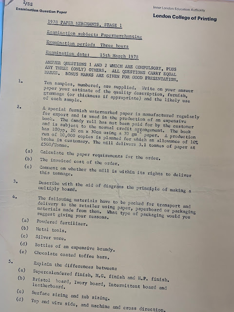
There has been much in the news about examinations with the recent GCSE and A level results announced recently, so it was quite a surprise when I received an email from Simon at the London Centre for Book Arts asking how I would fare answering the below examination paper from 1978!
The exam paper from the London College of Printing came to light in the archive that the LCBA has inherited from the late Jane H. Reese who was a hand paper maker who ran the Nautilus Press and Paper Mill based in North Kensington in the 1970's 80's and 90's.

If I couldn't answer the questions on the paper, I can always look at my paper merchanting handbook to find the answers - 722 pages of paper merchanting information, given to me when I left the James McNaughton Paper Group 30 years ago!
Thanks to Simon for sending over the old exam paper, which is now very much a historical artifact!

Posted by Justin Hobson 31.08.2022