Thursday, 2 March 2023

Jobs from the past - Number 160

Regular followers of this blog will know that my first post of every month is a "job from the past" so that I can show some of the really good work from years gone by and this one is from 2013...
 
ITV Studios is the UK's biggest production and distribution company, making distributing and selling over 40,000 hours of television around the globe. The worldwide business is growing fast and
they now have studios in London, Paris, Stockholm, Cologne, New York, Los Angeles, Sydney and Hong Kong together with partners in other regions

ITV Studios don't just make TV shows for ITV, they make them for a wide variety of broadcasters including the BBC, Channel 4, Sky etc.
 
This brochure shows the wide diversity of formats and programmes that they are responsible for, showing images and emphasising the company's capabilities.  
Size is 220x170mm, portrait. it has a 4pp cover with 96pp text and is section sewn. The cover (above) is matt laminated with a sticker which has been applied by hand.
The material used is our Neptune Unique FSC, which is a VERY high white, smooth uncoated paper which reproduces colour fabulously (well I would say that!). Cover is 350gsm, text 160gsm. An uncoated material, gives the publication an engaging 'booky' feel and given the variety of source material, makes the images work together well, whether commissioned photography is sitting next to a screen grab, it has a consistency in look and feel. Printed offset litho in CMYK with a special grey (on the cover).
Flap on inside back cover, with multiple creases, to take subsidiary literature.
Creative direction and design for this and all ITV Studios new marketing collateral and events is by Theobald Fox. Creative Director is Pete Owen. Production and project management is by Sam Stocking. Print is by Principal Colour - just worth pointing out that with some large solids, some tricky CMYK images, they've made a cracking job of this project.

https://www.itvstudios.com/
https://theobaldfox.com/
www.principalcolour.co.uk
Posted by Justin Hobson 02.03.2023

Saturday, 25 February 2023

Zeta - business stationery papers

The ZETA range of business papers has been around for decades and should need no introduction. For many years it has been the gold standard for stationery papers in Europe, with it's excellent availability in all European countries and Fenner Paper became the UK stockist in 2015. The range has now been refreshed with the addition of a new Laid finish and new shades, including Diamond White, which is now presented in a new swatch designed by Wolfgang Forsch, who has handled the re-brand.

The new swatch is DIN A4 size, portrait format and is a 6pp gatefold. The cover is printed on Zeta Linen, Brilliant 350gsm and is printed in black plus a fluorescent orange.
The swatch shows the new stock range together with all the weights, surfaces and colours...
These fine papers are manufactured at the Reflex Paper mill in the town of Düren in Germany, which was founded in 1857 and the mill also produces transparent papers, label papers and artists papers. All ZETA products are made from Chlorine Free pulp (ECF) and carry the Forest Stewardship Council (FSC) certification.

If you would like one of the new swatches, please email me: justin@fennerpaper.co.uk
http://zetapaper.co.uk/
Posted by Justin Hobson on 25.02.2023

Monday, 20 February 2023

Villa Saletta Book

This is one of the most wonderful books to have appeared on this blog, it is quite simply stunning. Villa Saletta is a 1,760-acre estate in the heart of Tuscany, featuring an historic borgo, three luxurious holiday villas and a boutique winery. The estate was purchased by British investor, Guy Hands around 15 years ago and it is used both as a family holiday home and is also being developed with apartments and houses as a resort for Tuscany loving guests.
This superb case-bound book is bound in leather. The size of the book is 300mm square and has 284pp text pages given an overall spine thickness of 35mm.
The book which is subtitled 'History in the Making' is divided into seven chapters, explaining the history, the estate, the wine and produce and the vision for the future...
In the centre of the book there is a gatefold throw out showing a stunning panorama of the Italian countryside surrounding the Villa.
The one thing that has struck me about this publication is the space. It is unhurried and nothing is crammed in. Photography by Richard Waite is allowed the space to breath and it really makes the most of the wonderful images.
It is printed offset litho throughout in CMYK. The paper chosen is our StarFine, White 170gsm. StarFine is a quality, uncoated paper and as the images show, image reproduction is excellent. The solids chapter dividers, photographic images and the illustrations all look equally stunning - a great amount of detail for an uncoated paper.
One of the chapter divider spreads, the terracotta colour is made out of CMYK, not a solid special colour.
Image below shows the head and tail bands and the way the text moves. The edge of the book is gilt edged in gold.
The below image shows the thread in the centre of the 24pp sections...
Below image shows the ribbon marker and also the gilt edge binding.
The book is published by Terra Firma Holdings Ltd. Photography is by Richard Waite.

The truly stunning printing and production is by Stuart Van Den Bergh at Intaglio Communications who are based in London.

https://www.villasaletta.com/
http://www.intaglioltd.co.uk/
Posted by Justin Hobson 20.02.2023

Friday, 17 February 2023

Sad news for last white paper mill in Oz...

This the very sad news that the last remaining manufacturer of white printing paper in Australia is ceasing production. The manufacturer Opal (part of the Nippon Paper Group) will cease production of their white  paper at the Maryvale mill in Victoria’s Latrobe Valley. They manufactured over 200,000 tonnes of a white copier grade called Reflex. The plans are that they will still produce packaging grades for the time being...


Posted by Justin Hobson 17.02.2023

Thursday, 9 February 2023

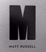
Matt Russell Photographer

Matt Russell is a London-based photographer specialising in food, travel, lifestyle and portraiture. With a strong reputation for his natural style and ability to capture life, Matt has established himself internationally as a trusted, reputable photographer. He has an inherent ability to work closely with clients to achieve their vision for both editorial and advertising.
“I absolutely love my job and the places that it takes me, not to mention the amazingly talented and passionate people that I get to work with everyday. I feel incredibly privileged.”
This 40pp portfolio shows Matt's wide ranging photography skills in one superbly produced package. The size is 285x225mm (a good economical size out of a B1 sheet)
Click on images to enlarge
It has a 40pp text printed on our Omnia 120gsm. For those readers not familiar with Omnia, it is an uncoated paper with a surface treatment. What this means is that it feels like an uncoated paper but because the surface treatment minimises 'dot-gain', the print result is much more like that of a coated silk or gloss coated paper.
Centre spread...
There are so many good images here which look so good, that it's hard not to show you every spread!
The publication is printed offset litho throughout in CMYK. As you can see from images, some of the images are quite dark, but there is no loss of detail, which is what can often happen printing on a true uncoated paper. As you can see from the detail image below, the reproduction is simply stunning.
The brochure is saddle stitched and even though Omnia is a very bulky paper, even with 40pp the spine looks good and doesn't "gape" in the middle, as you can see below.
Another lovely feature is the use of copper wire stitches. Just another lovely touch which makes this publication superb
Design is by Sandra Zellmer. Printing is by Ambrose Press. Jonathan Savory handled the project. Particular care has been taken over the repro - as with all projects for photographers, there is detail in the images which can only be truly appreciated by the photographer and it is the skill of the printer to be able to listen and interpret these comments in the finished printed job. Not always easy to do but this is a beautiful piece of printed literature.

https://mattrussell.co.uk
http://www.sandraswork.com/
http://www.ambrosepress.co.uk/
Posted by Justin Hobson 09.02.2023

Thursday, 2 February 2023

Jobs from the past - Number 159

Regular followers of this blog will know that my first post of every month is a "job from the past" so that I can show some of the really good work from years gone by and this one is from 2016...

The Big Book Bonanza is the showcase of new books from Harper Collins and this is the bewitching invitation for the launch that was held this April at the Ham Yard Hotel.

The invitation is quite literally a gatefold! The delightfully lasercut gates are hinged over the inner invitation which is tipped onto the back panel of the main invite. 
Finished size of the invitation is 150x265mm with the inner card being 128x245mm. It is printed on Colorset Natural 350gsm (100% Recycled) throughout.
Click on images to enlarge
Below shows the corner cuts where the inner card sits, holding it in place.
Below image shows outside back cover with the corner slits.
Click on images to enlarge
The reproduction on the Colorset Natural is bright and vivid, the colours really lifting off the page.
The lasercut gates are wonderfully crisp and really set this invitation off.
Art direction and design is by London based studio, Design by St. Creative Partners are Steve Fenn and Tom Pollard. The excellent print and production is by Hampshire based Senator Press.

www.harpercollins.co.uk
https://www.designbyst.com/
Posted by Justin Hobson 02.02.2023