Friday, 5 June 2015

From Babies with love

From Babies with Love supply organic baby clothes and printed cards by post, they then send all of their profits around the world to help abandoned and orphaned children.

The identity has been created by Paul Belford Ltd and has been applied across a range of collateral, including print. The design and illustrations reference postal ephemera, building on the postmark identity.

Business cards are 85x55mm
...and the swing tags are 135x55mm
The cards and swing tags are printed on our Kemikal, Cotton White 1500mics which is a natural feeling, neutral white thick board - 1.5mm thick. so it gives great thickness, but is nice and tactile.

The swing tags are beautifully finished, with punched holes, hole protectors and coloured string.
The below image highlights just how thick the material is:
Now you might think that being this thick, that they were silkscreen printed, however they are not, as beautifully crisp type was required juxtaposing with the smudged rough and ready 'postage mark'. So you might be surprised to learn that they have been litho printed! ...how come? I hear you ask, on a board that is 1.5mm thick. Well, they have been produced using a litho, flat bed printing press. These are machines which (in years gone by) used to be used to produce proofs (and progressive proofs, if you remember them) and because the printing bed is flat and not round a cylinder, the machines can cope with thicker substances, such as this. These cards were produced by Linnetts Proofing based in London NW10.

Design is by Paul Belford, Martin Brown and Bethan Jones at Paul Belford Ltd. You can read more about the project here: http://paulbelford.com/project/from-babies-with-love-brand/ 
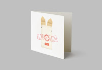
There are other parts to the project printed on our Shiro Echo, White, including stationery paper and compliments slips and greeting cards, but maybe I'll write about those another time.

https://www.frombabieswithlove.org/
http://paulbelford.com/
Posted by Justin Hobson 05.06.2015

Wednesday, 3 June 2015

Progressive Greetings 2015

Yesterday, the Progressive Greetings Exhibition known as "PG Live" opened at the Business Design Centre in Islington. Aimed purely at the greeting card industry, it's open on 2nd and 3rd June only.
Our modest stand of 3 x 2 metres, displays our boards that are especially suitable for greetings cards and as you can see from the display shown on the stand, we now have quite a few! 
On the stand, we display a wide range of materials from our supplying mills including Cordenons, Reflex (Zanders) and Favini and Euler to name just a few...
We also have on display some sample cards printed on a variety of our materials, by Ricoh. These cards are printed on a Ricoh ProC1900, digital press and the results are excellent.  
Our stand is designed by Vincent Design, who I must thank for their considerable input. Fenner Paper is proud to have been the first paper company to be granted Associate Membership of the Greeting Card Association (GCA), in 2013.
If you are a designer or publisher of greeting cards, please do come along today and we look forward to welcoming you - we're on stand 506.
www.progressivegreetingslive.com
Posted by Justin Hobson 03.06.2015

Tuesday, 2 June 2015

Jobs from the past - Number 68

Regular followers of this blog will know that my first post of every month is a "job from the past" so that I can show some of the really good work from years gone by...

Pigs are Great - 2001
This self promtional piece of literature was designed by The Partners for Gavin Martin, the printing company back in 2001. The mailing is designed to be one piece, inserted into a neat 'Oink' envelope. The photography is by Geoff Smith.
The finished size is 120x77mm, portrait and is a long concertina. This gives the mailing 5 spreads in total.
The concertina which is 987mm long, folds up as below:
One of the things to note is the 2mm, free standing spine, into which the concertina folds. This is where the choice of material is important, so that the weight/bulk is light enough that it will take a machine made crease, yet be light enough for the pages to turn over nicely.
It is printed on our Matrisse 140gsm, which is a white very bulky uncoated with a toothy feel. Images, showing the fully extended mailer, printed CMYK plus pantone special, with the inside printed with the special only...
Art direction and design is by The Partners. Print is by Gavin Martin. Photography is by Geoff Smith.
A clever and well thought out piece of literature, which maximises the format of a B1 press and sheet of paper...

http://www.gavinmartin.co.uk/old_site/
http://www.the-partners.com/
http://www.gavinmartincolournet.co.uk/
Posted by Justin Hobson 02.06.2015

Thursday, 28 May 2015

Timberland

This is certainly one of the best pieces of print that I've seen so far this year.
 
This publication, produced for Timberland, by Document Studios is a limited edition book which is designed to tell a story....
Click on images to enlarge
This piece of literature is as much about the words as the images. Although the products have centre stage, it is set within 'the spirit and cultural context of the brand'.
The size of the book is 235x165mm, portrait, has a 132pp text with a 4pp limp cover and is section sewn. It is printed on our Redeem 100% Recycled 240gsm cover and 130gsm text. The paper is a neutral white shade gives the publication a 'booky' feel which really works with the images and most importantly, the pages which are purely type.
The quality of image reproduction is simply off the scale. I have never seen Redeem printed as well as this.
In their own words.... "Document Studios is all about storytelling. We tell brand and product stories through unique editorial content, art direction and design. Set up by Editorial Director David Hellqvist and Creative Director/Designer Mark Thompson, Document Studios has three main objectives: to inspire, educate and create desire.
Commissioned by Timberland, the iconic American footwear and apparel brand, Hellqvist and Thompson set out to capture the true spirit of the brand.

Documenting the history and story of Timberland, the limited edition book looked closer at Timberland’s sub-cultural history. Through commissioned photography and interviews, pop cultural icons, such as Visvim’s Hiroki Nakamura, Gary Aspden, Ronnie Fieg and Stussy’s Nick Bower, offered their point of view of the brand, while designers like Patrik Ervell, Martine Rose and Soulland’s Silas Adler shared their personal experiences of the brand."
Here is the piece about Ronnie Fieg:
The publication is 132pp, section sewn text, with a 12mm wide spine:
A particularly interesting feature is the cover, or rather the finish on the cover. Because this is more of an editorial publication, requiring a more magaziney feel, a lamination was considered to be a good idea for protection, however something more tactile and engaging was required....
A textured lamination finish was selected, which is a lamination film which already has a texture on the surface, hopefully you can see from the image below...
Click on image to enlarge
For interest, I wrote about lamination films and textured lamination on a previous post here:
http://justinsamazingworldatfennerpaper.blogspot.co.uk/2014/06/what-is-film-lamination.html

It is produced for Timberland by Document. Editorial Director is David Hellqvist and the Art Director is Mark Thompson.

Print production is by Push based in London. The quality of reproduction of these images on this paper has simply got to be seen to be believed, it is a truly stunning job.

www.timberland.com
www.mgtstudio.co.uk
www.push-print.com
Posted by Justin Hobson 28.05.2015

Wednesday, 27 May 2015

Crush from Favini

Many of you will know about our lovely range called CRUSH from Favini. The paper is made partly using the residue from the industrial processing of crushed citrus fruit, coffee, nuts, olives, kiwi and corn.
 
These agro-industrial "end of life" products replace up to 15% of conventional tree pulp. The range is available in 100, 120, 200, 250 and 350gsm and the shades are natural, earthy tones and the feel of the paper is natural and tactile. We launched the range in 2013 and here is the link about the launch:
 
Well, here is the new 2015 swatch....
...and this is the new colour range including two new shades, Cherry and Lavender.
The new shades are made using residues from cherry and lavender processing and make truly delightful, natural looking shades but with a strong dense colouring.
You can read more about CRUSH here on the Favini website:
http://www.favini.com/gs/en/fine-papers/crush/all-about-crush/

If you would like samples, please just get in contact and I'll send you a new swatch.
Posted by Justin Hobson 27.05.2015

Friday, 22 May 2015

Painted Nudes

This is an extraordinary book showing the work of an extraordinary artist. Throughout the 1950's and 60's Saul Leiter was a highly regarded and well known fashion photographer. His work, associated with other associated contemporary photographers, came to be recognized as the 'New York School' of photography.
 
More recently, in the early 2000's, with a resurgent interest in his work, Saul Leiter came to the fore as one of the most accomplished colour photographers of the 20th century. Few of those familiar with his photography are aware that over many years he created a formidable body of paintings and more remarkably, painted photographs.
This superbly produced book is the first ever publication dedicated to this largely unknown part of Leiter’s work which he produced over the course of four decades.
The size of the book is 260x210mm, portrait and casebound. There is a 'tipped in' image printed in four colour, mounted into a 'plate sunk' panel on the front cover, which is also hot foil blocked in two colours. The case is covered with a self coloured, linen embossed bookcovering paper in a deep, rich,  red.

The 160pp book contains a selection of more than 70 painted photographs "intimate, brilliantly coloured pieces that marry Leiter’s two artistic passions. Produced over the course of four decades, these fiercely expressive nudes are a testament to Leiter’s intuitive sense of colour and composition, and showcase a great 20th century artist at his resplendent best."
The foreword by Margit Erb, from the Saul Leiter Foundation in New York is followed by an essay by Mona Gainer-Salim. These incredibly expressive images are  in dispersed with passages from various relevant texts.
The majority of spreads are full colour images bleeding off the page which are discretely merged with other images set within solid colour panels, which are printed out of four colour process. 
The text is printed on our Neptune Unique SoftWhite 120gsm, an uncoated off-white, smooth (yet tactile) text and cover paper - the printed result is simply fantastic.
The book is beautifully bound (section sewn) and has a 14mm spine.
Binding is by Boekbinderij Van Waarden in the Netherlands utilising a special 'lay-flat' technique which retains the integrity of the section sewing thread but without having to 'fight' with the binding! it lays nice and flat...
...as you can see from the below image.
The book is published by Sylph Editions. Design is by Ornan Rotem and production is by Num Stibbe.

Scanning is by Laumont Studio (New York) and the book is typeset in Trinité. The superb printing is offset litho on a Komori H-UV press and is printed by Cassochrome in Belgium. The printed result on this uncoated substrate is simply superb, which combined with the superlative binding makes this a piece of print that is seriously noteworthy.

http://www.sylpheditions.com/Books/painted_nudes.html
http://www.sylpheditions.com/
http://www.csc.be/
http://www.boekbinderijvanwaarden.nl/index.en.html
Posted by Justin Hobson 22.05.2015