Thursday 7 March 2013

Gok Wan for Tu

This is the lookbook for Gok Wan's fifth collection for Sainsbury's Tu clothing label. Gok Wan is the flamboyant fashion expert known for his direct personality and tell-it-how-it is styling advice.

This book is 215x125mm, portrait. It is a casebound, hardcover book with 36pp text. The cover is simply the simplest, yet most stunning part of the job. It is produced using Flockage Colours, Bordeaux 100gsm and you can see just how good it looks from these pictures...

The cover is simply hot foil blocked in two colours, metallic gold and matt black. Although Flockage is an expensive material, on a short run, it certainly creates an effect which is very luxurious and can be cost effective. Although they say you shouldn't judge a book by it's cover, you certainly can with this one! (The 32pp text is on an uncoated but I don't know what paper it is)
The job was produced by the Inspired Thinking Group. Print is by Bristol based Apple Litho and the binding is by Diamond Print Finishers.

http://www.sainsburys-live-well-for-less.co.uk/gok-for-tu/
http://www.gokwan.com/
www.inspiredthinkinggroup.com
www.applecolour.co.uk
Posted by Justin Hobson 07.03.2013

Tuesday 5 March 2013

Susan Hiller Catalogue

This is another exceptional exhibition catalogue for the artist Susan Hiller which features text by Andreas Leventis and a foreward by Stella Santacatterinaan. Published by the Timothy Taylor Gallery.

It is a casebound (hardback) book which is 260 x 200mm, portrait format and is section sewn. It features endpapers and two different materials for the text 
The casebound cover is printed on Neptune Unique FSC 135gsm, offset litho and is matt laminated, mounted onto the case, hot foil blocked in silver metallic foil and debossed. The unprinted, black endpapers are on our Notturno 170gsm.
Text is made up using 16pp of Neptune Unique 135gsm (uncoated) which is printed in the special PMS pink and black. The artwork themselves is reproduced on a 36pp text section printed on printers "house" coated silk 170gsm.
 
Design is by Matt Bucknall. Print and the excellent binding is by Chapter Press.
 
Posted by Justin Hobson 05.03.2013

Friday 1 March 2013

Jobs from the past - Number 41

Regular followers of this blog will know that my first post of every month is a "job from the past" so that I can show some of the really good work from years gone by. This is perfect timing as it's exactly ten years ago since the anti war protests.

Why Iraq? Why Now?

On 15th February 2003, the Stop the War Coalition (StWC) held a protest in London which is claimed to be the largest political demonstration in the city's history. The estimated attendance has been anywhere in between 750,000 and 2,000,000!

The day before the protest, a full page advertisement appeared in The Guardian, which was organised (and maybe funded?) by the architect Richard Rogers. He approached Alan Kitching to design the advert, which you can see above. The ad is designed to work both as a 'make yourself banner' and also list the some of the prominent public figures who opposed the invasion of Iraq and who were lending support to the Stop the War Coalition.

I confess to neither have seen the original ad in the Guardian or in fact going on the demonstration but I did see it reported in DesignWeek the week afterwards ...which I still have!
 ...so I called Alan and offered to re-print the page for him (with The Guardian's permission) which we did, on our Redeem 100% Recycled 70gsm. This gave them lots of extra copies and me some file copies on our lovely paper. Printed in one colour, black, only.The size is 600mm x 378mm (or the same size that The Guardian used to be)
Alan Kitching and the late Celia Stothard with the posters outside their home in Kennington
www.thetypographyworkshop.com
http://www.stopwar.org.uk/index.php/did-millions-protesting-against-the-iraq-war-on-15-february-2003-achieve-anything
www.theguardian.co.uk
www.designweek.co.uk
Posted by Justin Hobson 01.03.2013

Thursday 28 February 2013

Future of Print ...

Tim Milne runs a London based company called Artomatic that I've written about before on this blog, and he's been passionate about print for as long as I've known him. He has just produced this interesting little slideshare which might be worth showing to clients who don't quite get what print can do in this digital age!

Have a look...
http://www.slideshare.net/Timmilne/future-of-print-in-a-digital-age-artomatic

Posted by Justin Hobson 28.02.2013

Tuesday 26 February 2013

Whistles - Autumn/Winter


This is the Autumn/Winter 2012 lookbook for Whistles - (we've only just taken the pics which is why it's a bit late for this season!)
 
Since 2008, Whistles has been under the leadership of Jane Shepherdson, a former brand director at Topshop. Shepherdson has positioned Whistles as an intelligent choice - often described as ‘the thinking woman’s fashion brand' and this new lookbook is surely a reflection of this objective.

The size is 240x180mm Portrait, saddle stitched. It is printed on our Omnia and has a 4pp cover on 200gsm and a 20pp text on 120gsm. The weights are just right - Omnia is an extremely bulky sheet, so this is just perfect. 
...and here we go for a bit of a plug! - As you can see from the above images above, there is lots of colour and images with CMYK dark areas - loads of ink going down and it looks great on the Omnia, reproducing bright vibrant colours as well and keeping all the detail in the darker images. The other important thing to note is that unlike most uncoated products, you can successfully gloss UV varnish on this paper (with a single hit) and it works really well - as you can see...
Art Direction and design is by Simmonds Ltd. Superb print (and UV varnish - which really is in very good registration/fit) is by Push ...and thanks to Kate for sending me a copy. 
http://www.push-print.co.uk/
Posted by Justin Hobson 26.02.2013


Friday 22 February 2013

Donovan returns to Frost*

Just heard the news that Anthony Donovan has returned to Frost* as Creative Director at the Sydney studio. He's spent the past two and a half years as creative director at Moon who are also based in Sydney's burgeoning creative district in Surry Hills.

Anthony Donovan and Vince Frost
Ant was previously at Frost and also spent some time in London working for Frost, together with Nicole Bradfield, back in 2009. During this time, we worked together on a couple of projects including this lovely book for architects Sheppard Robson.
This book was produced using our Construction Blackstone 1500microns on the cover with the text on Redeem 100% Recycled 100gsm. Sheppard Robson are committed to sustainability, and as such all materials used had to be 100% Recycled and it was printed by Pureprint. This may be the subject for one of my "jobs from the past" in the future!

I also saw Ant when I popped in to visit Frost* in Sydney at the end of 2009.
http://justinsamazingworldatfennerpaper.blogspot.co.uk/2009/12/roving-report-frost-design-in-sydney.html

Ant ...welcome back to Frost* and best wishes for the future.

http://www.frostdesign.com.au/
www.sheppardrobson.com
www.pureprint.com
Posted by Justin Hobson 22.02.2013

Wednesday 20 February 2013

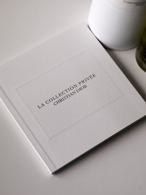
Christian Dior - La Collection Privée

La Collection Privée from Christian Dior is their collection aimed at the world of haute parfumerie.  Dior’s perfumer, Francois Demachy, not only knows how to create amazing perfumes from blending raw materials but also knows how to create a story.

The story Demachy has created is that of Christian Dior’s life. Each fragrance is a tribute to the couturier’s creative life and the people and places that inspired the designer. Using a combination of illustrations and phototographs, this lovely little book tells the story ...beautifully.
The size is 140mm square, perfect bound. It has a 6pp cover with a full flap on the inside front cover and a 48pp text. The cover is blind embossed with a "frame" and the title is printed in black with a gloss "spot" UV varnish on the type giving it a raised effect. The material used is our Omnia 320gsm and 150gsm.
Many designers use Omnia because four colour work is fantastic and that means that most projects that people consider it for are heavily photographic. Omnia was chosen for this job because some of the illustrations are very fine and maintaining the detail was very important but a tactile uncoated feel was still essential.
 
Printing is by Identity, based in Paddock Wood, Kent and they have made a superb job of it - colour reproduction is fantastic - the illustrations look amazing as do the colour images - it is difficult for me to say too much more about it - the images speak for the job...
 
Posted by Justin Hobson 20.02.2013