Thursday 6 June 2013

Howard Tangye - The Artist

Here's a project that I've been working on with design studio Stinsensqueeze. This is a project that has just gone live on Kickstarter.

If you're not familiar with it, Kickstarter is the largest funding platform for creative projects in the world. Every month, tens of thousands of people pledge millions of pounds to projects from all creative fields.

This project is a book titled WITHIN and features the work of artist Howard Tangye. Howard is best known for his work, as a designer, illustrator and teacher in the world of fashion. As head of womenswear at Central Saint Martins, he has taught designers such as John Galliano, Hussein Chalayan, Stella McCartney, Christopher Kane, Richard Nicoll, and Julie Verhoeven amongst others.

Until recently his work as an artist was less well known. His distinctive style depicting the clothed figure is finally gaining wider recognition and in 2012, a selection of 56 of his drawings and watercolours, were donated to the V&A

Richard Nicoll
 
Howard Tangye with Stina and Louise from Stinsesqueeze (www.stsq.org)
Stina and Louise first met Howard when studying at Central Saint Martins in 2010 and admired his work ever since. Since that first meeting they've built up a 3 year continuous collaboration, culminating in this project. Howard has previously declined working with several established publishers since he chooses to distinguish his work as a fashion teacher, from his personal work as an artist. The introduction is written by Abraham Thomas, Curator of Design at the V&A, together with an essay by Marie McLoughlin, dress historian at the University of Brighton.
 
An important factor for all the collaborators is to capture his narrative and the sensitivity of his work, whilst ensuring there is no compromise on the reproduction of the artwork and the production of the book. They spoke to me about the paper side of things and decided on a combination of our Omnia White and Natural 150gsm which would faithfully reproduce the artworks whilst still lending the tactility of the original materials used. They partnered with London based printer Jigsaw Colour www.jigsawcolour.co.uk who has extensive experience in fine art printing.  In order to get funding by Kickstarter, Paul Martin at Jigsaw Colour produced a fully working pre-production dummy (which is beautiful)

Please have a look at the following KICKSTARTER page - watch the short video - and even  better, pledge some money!
http://www.kickstarter.com/projects/311248544/within-howard-tangye?ref=live

Posted by Justin Hobson 06.06.2012

Monday 3 June 2013

Jobs from the past - Number 44

Regular followers of this blog will know that my first post of every month is a "job from the past" so that I can show some of the really good work from years gone by and here's one from 2006.

Borderline Annual Report 2006

Borderline is a small, independent charity that has been helping homeless Scots in London for over 20 years by understanding their particular problems and needs. They offer resettlement options in Scotland and London, referrals to specialist agencies and advice on welfare benefits.

This is their annual report, which by definition, needs to contain certain financial information but is used also as a vital piece of communication with their benefactors and donors.
Design company OSBORNE ROSS designed the annual report and here's some information from a press release written at the time:
Andrew Ross, Creative Director, said "using the theme of 'Looking back, looking forward', clients were asked to write down what had happened to them in the past year and to describe what the future holds, now they have the charity's help"
These notes were combined with photography by Nick Turner, providing a powerful and immediate explanation of the charity's work.
The publication is 210x210mm, square, saddle stitched and is a self-cover (for those of you not familiar with this term, it means that the cover and text are on the same weight of paper). It was printed in CMYK on Neptune Unique FSC 170gsm which is a high white, smooth, uncoated text and cover paper. It was printed offset litho by Magnet Harlequin (www.bva.org.uk)

This report won the award for the best annual report in the 2007 Third Sector Excellence Awards. This award programme is organized by publisher Haymarket, to recognize organizations working in the charity and public sector. http://www.thirdsectorexcellenceawards.com/
 
 ...and here's the page showing it as the winning category of the third sector awards:
 
Art direction and design is by Osborne Ross. Photography by Nick Turner.
 
Posted by Justin Hobson 03.05.2013

Thursday 30 May 2013

Summer Show 2013


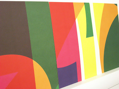
Now is the time when many readers of this blog will be receiving invitations to degree shows from all corners of the country. Here is a particularly lovely and inspired example for the University of Portsmouth.
Below is the A1 poster (841x594mm) printed in CMYK, one side only, on Redeem 100% Recycled 130gsm.
...then to make the invitations, the material on the run was changed to Redeem 100% Recycled 315gsm and the run completed. The reverse of the board was then printed in one colour forming 16 x A5 invitations with CMYK on the reverse of the invite - a smart idea! 
Reverse of the A5 Invitations
The design is by  Michael Harkins, who is a senior Lecturer in Graphic Design and the course leader of the MA Graphic Design at the University of Portsmouth. Given the complexity of the design, I asked Mike to write some words to explain the project:

Often my work plays with complex ideas found within the design problem itself, yet this is something for the viewer to find within the work, not something obvious initially.

The idea really came from thinking about 2013 as a number in itself. For many people the date could be seen as a portentous one, unlucky, lucky, superstitious etc. This led me to think about what it is when we read into numbers as individuals, we often bring our own meanings/readings.

The numbers within the date are also the first in the sequence of natural, ordinal or cardinal numbers. 2013 is also the first time these numbers appear together in a year date since 1320, so quite special in that sense. They also form the idea of a countdown 3,2,1,0 to the show. As in the ordered sequence 0123, we arrive at 3, the number of years students commit to their degree programmes, culminating in the show.

So really the numbers become celebratory and playful. The use of the CMYK adds to this idea of playfulness in terms of interaction of form and colour. It also gets us, the viewer to bring about our own readings of the numbers. 

The invitations extend the playfulness by dividing the colour composition into 16 parts, each one producing a unique composition in itself, something we take time to view, enjoy, contemplate.
Posters on display behind glass

Printing is by L&S Printing based in Worthing, West Sussex and a beautiful job they've made of it.

...and thanks to Mike for sending me some file copies and a note (written on the printed reverse of the A5 invitation):
The preview is tomorrow evening at the Eldon Building at University of Portsmouth and the show is open from 3-14 June.

Posted by Justin Hobson 30.05.2013

Tuesday 28 May 2013

Trust New Art

This is a piece of literature for an interesting experiment run by the Arts Council. The basic idea is to select works from the Arts Council collection and place them in various National Trust properties enabling visitors to encounter contemporary pieces that they may not ordinarily be exposed to.  
This book is 210x130mm, portrait and shows some of the artworks and the sites at which the work is being displayed together with an essay by Colin Wiggins. It has an 8pp cover with 115mm flaps and a 32pp text and is saddle stitched. It is printed on our StarFine white 300gsm cover and 150gsm text. Printed CMYK throughout with hot foil blocking in metallic silver foil on the outside cover.
The below pic shows the extent of the full flaps.
The publication is designed by Catherine Nippe, who is a Swiss/German graphic designer who has been running her studio in London since 2006. Print is by Principal Colour who are based in Paddock Wood, Kent.

www.artscouncilcollection.org.uk
www.cnippe.com
www.principalcolour.co.uk
Posted by Justin Hobson 28.05.2013

Thursday 23 May 2013

Beat 5


I've been fortunate enough to have been involved in every issue of the Beat series published by illustration agency Heart. Although the size has remained constant, every issue has been quite different whilst providing an exquisite showcase for their illustrators (...as an example, Beat 4 was designed by Angus Hyland's team at  Pentagram and is a fully illustrated edition the Rime of the Ancient Mariner http://www.heartagency.com/beat/4)

Beat 5 is described as a 'double issue' (at 148pp, it is twice the size of previous editions) and as with previous issues it showcases the work of each artist with words providing an insight into their working methods, inspiration, idiosyncrasies and foibles. Beat 5 is edited by Helen Osborne.
http://www.heartagency.com/artist/LaraHarwood/gallery/1
 
http://www.heartagency.com/artist/JimmyTurrell/gallery/1

http://www.heartagency.com/artist/TomGauld/gallery/1

http://www.heartagency.com/artist/AdamSimpson/gallery/1
 
The size of the publication is 330x235mm, portrait and is section sewn. The 4pp cover is on our Matrisse 350gsm, which is incredibly bulky, uncoated and tactile (really suits the illustration by Lara Harwood). The 148pp text is printed on Neptune Unique FSC 135gsm and looks truly amazing! Neptune is smooth uncoated with a dazzlingly white shade and the illustrations have reproduced amazingly (in no small way, due to the printer as well). 
http://www.heartagency.com/artist/MarionDeuchars/gallery/1

http://www.heartagency.com/artist/EdaAkaltun/gallery/1

http://www.heartagency.com/artist/RoderickMills/gallery/1

http://www.heartagency.com/artist/JosieJammet/gallery/1

http://www.heartagency.com/artist/DarrelRees/gallery/1
The beautifully crafted and considered design is by Jason Godfrey of Godfrey Design. Print production and repro is by David Holyday and the printing, which really is exceptional, is by Gavin Martin Colournet.
 
Posted by Justin Hobson 23.05.2013

Tuesday 21 May 2013

Clerkenwell Design Week

Today is the start of Clerkenwell Design Week and I popped in today, to have a quick shufti. Now in it's 4th year, it's firmly established as one of the London design community's favourite events and it's growing every year.
 
It takes place all over the Clerkenwell and Smithfield area and combines exhibitions with talks and with showrooms. For the first time ever, they've also introduced some pop up pavilions.

I particularly noted the origami flowers outside the Secret Gin  Garden
http://www.gingarden.com/#8ac/custom_plain
You better get down there - it's only on until Thursday...
http://www.clerkenwelldesignweek.com/

Friday 17 May 2013

Mother of Pearl

 
Maia Norman is the Creative Director at Mother of Pearl and each season, she works with an acclaimed artist. Previous collaborators include Polly Morgan, Francesco Simeti, Gary Hume, Fiona Banner, Keith Tyson, Jim Lambie, Matt Collishaw and Carsten Holler. This last season, Amy Powney, the head designer at Mother of Pearl collaborated with New York based artist Fred Tomaselli to produce their collection and this is their beautifully produced lookbook.
The size is 260 x 185mm, portrait, perfect bound with an 8pp cover and a 40pp text. It is printed on our Omnia and has a 8pp cover on 280gsm and a 40pp text on 150gsm. Omnia is an extremely bulky sheet, so this has a solid, chunky, feel. It is printed offset litho, CMYK throughout, with the small M monogram being hoy foil blocked in gold foil on the outside front cover.
...and here we go for the plug about the paper! - As you can see from the images, there is lots of colour and detail in the images with CMYK dark areas - loads of ink going down and it looks great on the Omnia, reproducing bright vibrant colours as well and keeping all the detail in the darker images, epecially the little detail shots below...

Original design concept is by William Hall with the artwork being produced 'in house' at Mother of Pearl. Photography is by Robert Wyatt.

The superb print is by Push ...and thanks to Danny Kirk at Push for sending me some file copies.


http://www.motherofpearl.co.uk/
www.williamhall.co.uk
www.robertwyatt.net
http://www.push-print.co.uk/
Posted by Justin Hobson 17.05.2013