Thursday 2 June 2022

Jobs from the past - Number 151

Regular followers of this blog will know that my first post of every month is a "job from the past" so that I can show some of the really good work from years gone by...

...and being the platinum jubilee weekend, it seems like a good time to write about this project!

Lightness of Being 2008 - Chris Levine

Chris Levine is a Canadian born light artist who studied at Chelsea School of Art and Central St Martins and this is the invitation and show catalogue for his 2008 show held at the Old Truman Brewery in March 2008.
The centrepiece of the show is Chris’s (now, well known) work "Equanimity", the historic hologram portrait of Queen Elizabeth II (above) commissioned by the Island of Jersey to commemorate 800 years of allegiance to the crown and reputedly the only "portrait" of Her Majesty with her eyes closed. Equanimity 9, is pictured below:
The catalogue and invitation are pictured below. Catalogue is left, invite on the right. The invitation and cover of the catalogue are both printed on Astralux [1 sided] 250gsm which is a "cast coated" board (high gloss one side, uncoated reverse). Gloss coated side is printed in a fluoro pink solid. The invitation is printed CMYK on the outside (uncoated) with the coated (fluoro) on inside...
If you click on the image above, to enlarge, you'll see that the catalogue cover - which is an 8pp cover with the flaps reverse folded so they are on the outside - has a fantastic embossing - which shows the Equanimity image in relief. It just looks fantastic.
Size of both the invitation and the catalogue are A5, portrait. The catalogue is perfect bound with a 36pp text printed on our Neptune Unique FSC 160gsm.Text is printed four colour plus fluoro pink throughout.
Catalogue, invitation and graphics are by Why Not Asscociates. Print is by Push. Sadly neither companies are still trading.

This is simply the most innovative use of Astralux as a cover material that I have seen - the way the invitation and catalogue cover switch inside and outside and switch processes is superb and compliments the subject - as it should!
https://chrislevine.com/
Posted by Justin Hobson 02.06.2022

Monday 30 May 2022

Malone Souliers x Bridgerton

Netflix and Shondaland - the media company behind “Bridgerton” - have partnered with the footwear brand, Malone Souliers. The result is an exclusive 14-piece collaboration of sumptuous shoes which reference the period as well as characters from the show. The Creative Director and Founder of Malone Souliers is Mary Alice Malone.
This tabloid size promotional piece is 430 x 285mm, portrait and was printed in February for the launch in March.
It is 16pp and is printed on our Shiro Echo White (100% Recycled) 100gsm, giving the publication a deliberately newsy feel, however the reproduction is far from a newsprint, as I'm sure you can see from the detail image below...
Click on images to enlarge
It is a superbly designed and printed publication which flops and folds in the hand beautifully...
It is loose bound, no staples, just folded as you can see in the image below.
Outside back cover...
Art direction and design is by Assembly. Print production is by Roy Killen.

Posted by Justin Hobson 30.05.2022

Friday 27 May 2022

Unburnable book set to be auctioned

Today an article appeared in Printweek written by Jo Francis about Penguin Random House, who have  created a one-off ‘unburnable’ edition of Margaret Atwood’s The Handmaid’s Tale that will be auctioned for charity on 7th June.
The article is reproduced below...

PRINTWEEK
Jo Francis 
Friday, May 27, 2022 

Penguin Random House has created a one-off ‘unburnable’ edition of Margaret Atwood’s The Handmaid’s Tale that will be auctioned for charity.

The publisher said the volume had been printed and bound using “fireproof materials” and described the edition as “completely unburnable”. 

“Across the United States and around the world, books are being challenged, banned, and even burned. So we created a special edition of a book that’s been challenged and banned for decades,” the publisher stated. 

The print specification involved: a black Cinefoil dust jacket, white heat shield foil pages, section sewn with nickel wire, phenolic hard cover, stainless steel head and tail bands, and Kapton high temperature adhesive. 

“Printed and bound using fireproof materials, this edition of Margaret Atwood’s The Handmaid’s Tale was made to be completely unburnable. It is designed to protect this vital story and stand as a powerful symbol against censorship,” Penguin Random House said. 

The book will be presented for auction by Sotheby’s New York from 23 May to 7 June with all proceeds going to benefit PEN America’s work in support of free expression. 


My thanks to Printweek for reporting this. You can read the whole article here: 

Posted by Justin Hobson 27.05.2022

Thursday 26 May 2022

The annual Wayzgoose at the St Bride Foundation

Last Sunday, I had a stall at the St Bride Foundation WAYZGOOSE. This is a term (unfamiliar to most people) that used to refer to an annual holiday in a print-works and was often an awayday to the coast or some other sort of day out, more often than not, paid for by the firm. In this instance the St Bride Wayzgoose is a kind of letterpress 'bring and buy' sale.
Thirty tables displaying and selling many different items - everything from lead type to the Adana tabletop presses (see below picture) from Caslon, to secondhand books and printed examples of work.
Below is the table that I was allocated, where, as with previous years, I adopted a "throw it all on the table" approach! I took lots of offcuts and discontinued paper and board items. All paper and card sold by weight - 40 pence per 100 grams.
I served at my 'paper stall' from 11am to 4pm  ...and by the end of the day I had raised £206, all donated to the St Bride Foundation.
...and here is my beautifully crafted 'Weigh & Pay' signage.by Helen Ingham from the Hi Artz Press - It's now lasted three wayzgooses!
My thanks to all the staff and friends at St Bride's who organised the event.
https://sbf.org.uk/
Posted by Justin Hobson 26.05.2022

Tuesday 24 May 2022

The Bristol Hotel

The Doyle Collection is a carefully curated collection of eight Irish family-owned luxury and urban hotels. Each hotel has a strong identity that is closely connected to its location. Set in the city's vibrant harbourside, The Bristol’s contemporary exterior overlooks the busy harbour. With 187 well appointed guest rooms and suites, this is a wonderfully luxurious hotel.
Branding agency, Brave New World  undertook an extensive re-branding exercise of the parent brand and of each individual hotel. The work included everything from strategy to interior design, website, high-profile advertising campaigns and the literature for each hotel.
Click on images to enlarge
The size of the brochure is 260x185mm, portrait and is saddle stitched. The cover is printed on an uncoated 300gsm board. 
The brochure is saddle stitched using three stitches:
The text material chosen was our Omnia, which would beautifully reproduce the photography with the rich interiors and exteriors superbly  ...and it looks wonderful! The 20pp text is on Omnia White 150gsm, printed offset litho in CMYK throughout.
Click on images to enlarge
Image reproduction is paramount but it was also important that the publication also projected the tactility of the interiors and in the image below the detail of the wedding venue and the reproduction of the fine voile used on the chairs. An ordinary feeling silk or gloss coated paper wasn't an option, so Omnia fitted the bill perfectly.
Omnia is a very bulky paper but with a 20pp text and the saddle stitching, it lays nice and flat allowing each spread to be enjoyed without 'fighting' against the binding.
Branding and creative direction is by Brave New World. The designer on this project is Caroline King. 

https://www.doylecollection.com/hotels/the-bristol-hotel
https://bravenewworldgroup.com/
http://www.carolinelking.com/
Posted by Justin Hobson 24.05.2022

Thursday 19 May 2022

The Modern House - postcard set

Established by Albert Hill and Matt Gibberd, The Modern House is the UK’s foremost estate agency, only selling modernist and contemporary architecture for over a decade.
This is their most recent promotional mailer titled "Selling Britain's Finest Modern Architecture" showing four properties in the format of a concertina postcard book.
  
The format is a 12pp A6 concertina. Flat size is 148x634mm, folding to 148x105mm. The concertina folds into a pre-creased 3mm spine. Printed CMYK offset litho and the cards are perforated.
Click on images to enlarge
The concertina is printed on Redeem 100% Recycled 315gsm, which prints beautifully and fits with the modernist, utilitarian architecture.
showing how the concertina folds into the spine
The superbly creased 3mm spine. It's touches such as this - good creasing - that make all the difference to a project like this:
Click on image to enlarge & see perforation
...and the other thing that shouldn't be overlooked is the perforations. As you can see from this picture, perforations can look great, even beautiful. These perfs. only look this good because the designer took the time to explain what he wanted to the printer. There are a selection of different perforation "bars" available at print finishers - so do ask a printer to get samples and to show you different types. If you don't convey your expectations to the printer, then they'll generally use the perforating bar that's on the machine and you may be disappointed.

Art direction and design is by Field Projects. Print production is by Michael Keyworth at Keyprint Printers.
Posted by Justin Hobson 19.05.2022

Monday 16 May 2022

St Bride Wayzgoose this coming Sunday

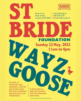
This coming weekend on Sunday 22nd May it will be the 6th LIVE annual St Bride Foundation WAYZGOOSE (during Covid there have been virtual events). A Wayzgoose is a term (unfamiliar to most people) that used to refer to an annual holiday in a print-works and was often an away-day to the coast or some other sort of day out, more often than not, paid for by the firm. In this instance the St Bride Wayzgoose is a kind of letterpress 'bring and buy' sale.
It is a chance for a large number of people who love printing, letterpress, type (and of course, paper!) to get together, as you can see from a picture below from a previous year...
Every year I run the Fenner Paper stall, where we sell offcuts and leftovers with the money raised donated to the St Bride Foundation. In 2019  we raised a record breaking £357! For interest, this is the way my stall usually looks like...
It's open from 11am until 4pm - I look forward to seeing you there!
The poster is printed on our Colorset Lemon 270gsm by the Chapel at the St Bride workshop. 
https://www.sbf.org.uk/
Posted by Justin Hobson 16.05.2022