Showing posts with label Jo Malone. Show all posts

Monday, 14 March 2022

Michael Angove for Jo Malone

Jo Malone is a London based company renowned for British bespoke fragrances for Women, Men and the Home. Michael Angove who specialises in refined highly detailed chinoiserie wallpaper has created exquisite, bespoke designs for Jo Malone London inspired by Blackberry & Bay and Orange Blossom. This is the literature for this limited edition home collection.
The 8pp, self cover, booklet is 150mm square and is saddle stitched. Reflecting the tactile, natural subject matter, the paper chosen is Modigliani Candido 260gsm - it is a feltmarked paper with a texture reminiscent of a watercolour paper.  
The reproduction of these softly rendered images on the Modigliani is just right, while the inside back spread (below) reflects the style of the brand packaging in a signature cream box with black corners - packaging which defines quality and an understated style.
Art direction and design is by the Jo Malone design team. Print production is by CPI Colour.

https://www.jomalone.co.uk/
Posted by Justin Hobson 14.03.2022

Friday, 13 August 2021

Wood Sage & Sea Salt

Jo Malone is a London based company renowned for British bespoke fragrances for Women, Men and the Home. This is the superb promotional collateral for their Wood Sage & Sea Salt fragrance... 'Escape the everyday along the windswept shore. Waves breaking white, the air fresh with sea salt and spray. The mineral scent of rugged cliffs, mingling with earthy sage'
The finished size is 150mm square and is concertina folded out to a size of 900x150mm and you can see the birdseye image below:
Click on images to enlarge
The below image shows both sides laid out flat...
It is printed on our Kaizen 350gsm, which is a dead flat matt uncoated text and cover range with a surface treatment and the result is it prints amazingly but still doesn't feel like a coated paper.
Kaizen has a high whiteness and an excellent bulk. It isn't just CMYK that prints superbly. As you can see from the image below, solid flat colours reproduce superbly.
On a simple piece of collateral like this, the attention to detail makes all the difference. As you can see from the detail image below, it has been properly and beautifully creased. Perfectly square and perfectly executed...
Art direction and design is by the Jo Malone design team. Superb repro, print and finishing is by CPI Colour with Mark Pitman handling the project.

https://www.jomalone.co.uk/scents/woody/wood-sage-sea-salt
https://www.cpi-print.co.uk/
 Posted by Justin Hobson 13.08.2021

Monday, 7 January 2019

Jo Malone Notebook

Jo Malone is a London based company renowned for British bespoke fragrances for Women, Men and the Home. The brand is renowned for it's products being immaculately wrapped in a signature cream box with black corners - packaging which defines quality and an understated style. With these values in place, it's unsurprising that the company's literature is of equal quality ...but what shows how deep the ethos of quality runs, this is a notebook produced for internal use and visitors.

The books are A5 (210x148mm) portrait, they have a 4pp cover using our new Blackgold 290gsm which is a new range of black papers which is a super intense, deep black, produced without the use of Carbon Black pigment.

The cover is simply (but beautifully) silkscreen printed in one colour, which is their signature cream colour.
 
The 32pp text just has lines printed using offset litho and is printed on our Neptune Unique SoftWhite 120gsm, which is a paper that Jo Malone has used for many years
Click on images to enlarge

The book is simply saddle stitched with two wires...
The notebook has been beautifully produced by Mayfield Press who are based in Oxford.

https://www.jomalone.co.uk/
https://www.mayfield-press.co.uk/
Posted by Justin Hobson 07.01.2019

Monday, 2 July 2018

Jobs from the past - Number 105

Regular followers of this blog will know that my first post of every month is a "job from the past" so that I can show some of the really good work from years gone by and here's one from seventeen years ago...

Jo Malone Express 2001
Jo Malone and husband Gary opened their first store in Walton Street, London in 1994. Since then Jo Malone London has become a name internationally synonymous with all that is most coveted in British style. In 1999, the company was acquired by the Estée Lauder group ensuring investment and a truly global outlook. In November 2001, Jo Malone Express – a bespoke delivery service for sending gifts worldwide was introduced. and this was one of the pieces of collateral used to promote the service.
Click on images to enlarge
Size is 210mm, square and is saddle stitched. There is a 4pp cover with pocket on inside back cover and a 22pp text (the extra 2pp is due to the throw out). Printed offset litho throughout.

Opening spread...
The material chosen is our Neptune Unique SoftWhite, which is an uncoated off-white, smooth (yet tactile) text and cover paper - the printed result is simply fantastic. The cover is 300gsm and the text weight is 155gsm
Click on images to enlarge
There is a 'throw out' which is how it makes 22pp, as you can see below
6pp text, flat...
The remarkable thing about this project is that it has an exceptionally contemporary look and feel. It certainly doesn't feel like a job from 17 years ago!
Click on images to enlarge
Creative Direction and Design is by Claire Lloyd. According to my notes, it was printed by First Impressions (Howden Litho) based in Camberwell. Established and run by Murray Wolfe-Arbiter, First Impressions was a highly regarded London based printer throughout the 1990's. Sadly like many other printing companies of that era, they went bust in August 2004. The file copies I still have are labelled with their stickers. 
Jo Malone continued to use Neptune Unique SoftWhite for mailing and collateral for many years as a more competitive alternative to some of the expensively priced American text and cover papers. Below are some other pieces of collateral produced in the mid 2000's using Neptune Unique SoftWhite for the cards and bespoke envelopes. These were produced by Pegasus Colour (now CPI Colour)
https://www.jomalone.co.uk/
http://www.clairelloyd.com/
Posted by Justin Hobson 02.07.2018

Wednesday, 10 May 2017

Jo Malone - Rare Teas

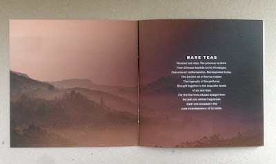
This new collection of colognes is a first in perfumery. Made using fragrance from ultra rare teas grown in the foothills of China to the Himalayas. The ancient art of the tea master is combined with the ingenuity of the perfumer to create these new scents. There are six colognes based on different teas - delicately floral Silver Needle Tea, sparkling and sweet Darjeeling Tea, herbaceous green Jade Leaf Tea, rich and earthy Oolong Tea, deeply seductive Midnight Black Tea and spicy Golden Needle Tea.

This is the promotional brochure produced by Jo Malone. Size is 150mm square and is saddle stitched.

The 4pp cover is on Omnia 280gsm with 12pp text on Omnia 150gsm. The reason that Omnia was chosen is because it would work with the rich detail that is present in the images but that would give a natural look and tactile feel.
Click on images to enlarge
It is printed offset litho in four colour process (CMYK) and as you can see from images, some of the photography is quite dark, but there is no loss of detail, which is what can often happen printing on an uncoated paper, which is why the Omnia was chosen.
Click on images to enlarge
The image below shows the outside back cover printed in solid black and as you can see, the solid looks great...
The image below shows the detail and the way the glass and fine detail has reproduced.
Art direction and design is by the Jo Malone design team. Superb repro, print and finishing is by CPI Colour with Mark Pitman handling the project.

http://www.jomalone.co.uk/rareteas
http://www.cpicolour.co.uk/
 Posted by Justin Hobson 10.05.2017

Monday, 17 November 2014

Jo Malone - Michael Angove

Jo Malone is a London based company renowned for British bespoke fragrances for Women, Men and the Home. Michael Angove who specialises in refined highly detailed chinoiserie wallpaper has created exquisite, bespoke designs for Jo Malone London inspired by Blackberry & Bay and Orange Blossom. This is the literature for this limited edition home collection.
The 8pp, self cover, booklet is 150mm square and is saddle stitched. Reflecting the tactile, natural subject matter, the paper chosen is Modigliani Candido 260gsm - it is a feltmarked paper with a texture reminiscent of a watercolour paper.  
The reproduction of these softly rendered images on the Modigliani is just right, while the inside back spread (below) reflects the style of the brand packaging in a signature cream box with black corners - packaging which defines quality and an understated style.
Art direction and design is by the Jo Malone design team. Print production is by Mark Pitman at CPI Colour based in Croydon.

www.jomalone.co.uk
http://cpibooks.com/uk/commercial/
Posted by Justin Hobson 17.11.2014