Showing posts with label Generation Press. Show all posts

Tuesday 15 July 2014

Glory Through Suffering

It is particularly apt to be writing this piece as the Tour de France is in progress. This piece is basically what is often described a 'leaflet' or 'flyer' so what makes it so special and why does it deserve space on this blog? Basically it is simple, well written, beautifully designed and exquisitely produced piece of literature and printed on lovely paper!

Produced by Rapha, the specialist cyclewear brand, it is an essay written by the author and broadcaster, Graeme Fife, who has written many books on cycling and the Tour de France in particular. Titled in Latin 'Ex Duris Gloria' (Glory through Suffering) the essay is about the pain and suffering that road riders endure on their bike.

Size is A5, portrait and it is a 2pp, yes, just a single sheet of paper. Printed Offset litho in two colours, black and a grey special for the background tint which reads 'Kings of Pain'.
It is printed on our lovely Offenbach Bible 60gsm.
It is used, very simply, as a supporting piece of branding that Rapha uses in a variety of ways, including sending it out with online purchases - a very nice touch.

Art direction and design is by the in-house team at Rapha. Printing is by Generation Press.

www.rapha.cc/kingsofpain
www.graemefife.com
www.generationpress.co.uk
Posted by Justin Hobson 15.07.2014

Monday 24 December 2012

A Triangular Christmas

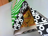
Here at Fenner Paper, we were delighted to receive a GP Tube-Mailer ™ (which is Generation Press's own invention) packed full of Toblerone bars!
Generation Press printed matching sleeves with the correct brand colours to go round the triangular bars of chocolate, honey and almond deliciousness! 
 ...and here's a close up of the GP Tube-Mailer ™, which in many ways is much more convenient and more robust than a postal tube - andthis is an excellent way of showing just how versatile this form of packaging is!
Our thanks to all at Generation Press for their generous, thoughtful and beautifully presented present. It's worth remembering those companies that look after their suppliers and not just their customers, after all any company is only as strong as it's suppliers! 

Happy Christmas!
Posted by Justin Hobson 24.12.2012

Tuesday 11 December 2012

The Rug Company

Chris and Suzanne Sharp founded The Rug Company in 1997 creating really iconic and desirable rugs. Uniquely, they achieve this by combining the ancient craft of rug making with the creative brilliance of contemporary designers including Alexander McQueen, Rob Ryan, Tom Dixon to name but a few. These beautiful rugs are available through a worldwide network of shops and outlets from London to New York, Los Angeles, Moscow, Hong Kong and more!

This is the catalogue for their new Studio Collection which includes Dhurries, Udaipur Dhurries, Tibetan Hand Knotted, Bamboo Ikats and cushions
Image reproduction was paramount but it was also important that the publication also projected the tactility of the actual rugs, so a silk or gloss coated paper wasn't an option. The material chosen was our Omnia. The cover would print, de-boss and foil beautifully and the Omnia would reproduce the photography with the delicate weave, bold patterns and strong blue solids superbly ...and it looks brilliant! Size of the book is 167x230mm, portrait format, perfect bound. 4pp cover is on Omnia 280gsm and the 64pp text is printed in CMYK throughout.  
Detail showing cover which is de-bossed and hot foil blocked in gold foil. This is one of those jobs that images of the publication look good but they can't really project the quality and production values that you feel if you actually had the piece in your hand. The detail in the foiling, the crispness of the de-bossing and the colour reproduction is simply superb. It's worth noting that Generation Press, who produced the job, are one of the few printers to have foiling and finishing in-house so they can keep a close control on quality and they certainly have with this job.  
Suzanne Sharp at The Rug Company, orchestrated the desert photography shoot and design was handled in house.
 
The excellent print, foiling and finishing is by Generation Press.
 
www.therugcompany.com
www.generationpress.co.uk
Posted by Justin Hobson 11.12.2011

Thursday 8 November 2012

V&A 2011-2012


Pieces of print like this don't come along every day! This is the beautiful 2011/2012 Annual Review published by the V&A.  The museum celebrates it's highest attendance ever, at 2.88 million! ...so there's lots to celebrate. The report is divided into various sections combining the pictures and words about the collections and the life of the museum with a major section on the museum's Futureplan.
 
The cover is hot foil blocked in a white gloss pigmented foil on a Cool Grey 350gsm material from the well known, Hull based paper merchant!
With image reproduction being so important, it was essential that everything reproduced amazingly! The text chosen for the project is Omnia 150gsm because the print includes solid colours and images of exhibits - and it looks brilliant.
 
Size of the book is 200x265mm, portrait format, perfect bound. The 68pp text is printed in CMYK throughout - beautifully. Additionally, there are 4 tracing paper inserts as section dividers and an 8pp coloured section for the accounts.

Generation Press have written about it on their blog and they've also taken the time to show the foiling die used for the cover - very nice to see:
http://generationpress.co.uk/archives/3467

Design is by independent designer, Jo Glover. Photography is by David Short and the V&A photography studio.
 
Print, foiling and finishing is by Generation Press.
 
http://www.vam.ac.uk/
http://www.joglover.co.uk/
Posted by Justin Hobson 08.11.2012

Friday 3 August 2012

25 James Street

This is a very simple and beautifully finished publication produced by British Land for their residential development at 25 James Street in London. Size is 270x210mm, Landscape format. The book has a 4pp cover with a 12pp text and is singer sewn.

The cover and text pages are printed on our Marazion Ultra 300gsm and 150gsm with the natural, flat mattness which works fantastically reproducing both the colour images and the muted flat colours.


Design is by Egelnick and Webb. Creative Directors are Toby Egelnick and Malcolm Webb. Designer on the project was Gala Slater. There are some beautiful touches on this piece including the the cover which is hot foil blocked with a gloss black foil and the singer sewing. The excellent print, foiling and finishing is by Generation Press.
 
...and thanks to Kate and Paul at Generation Press for taking the time to send me a copy:

The project (which also came in a presentation box) was also reviewed in Creative Review:

 
Posted by Justin Hobson 03.08.2012

Monday 2 April 2012

Jobs from the past - Number 30

Regular followers of this blog will know that my first post of every month is a "job from the past" so that I can show some of the really good work from years gone by....
 
Aquascutum - Show Invite
Spring Summer 2006

This is the invitation for the launch of the Aquascutum Spring/Summer 2006 collection at the Banqueting House in London.
Unfortunately it's a really hard job to satisfactorily show on this blog. The reasons being that it's printed on our lovely Offenbach Bible 60gsm and therefore has a light feel and "rattle" to it and unfortunately you can't get an idea of the tactility on the screen! The design uses show through which works really well, but is equally hard to demonstrate here!

The invitation is A3 size (297x210mm) and is folded to A5. It is printed in just one colour, both sides by Generation Press. It looks and feels beautiful.

It is designed by Studio Thomson and fortunately I still have Mark's explanatory note which tells you about it far better than I can...
www.aquascutum.com
www.studiothomson.com
www.generationpress.co.uk
Posted by Justin Hobson 02.04.2012

Wednesday 14 December 2011

V&A 2010/2011

This is a superb piece of print - the 2010/2011 Annual Review published by the V&A.  The report is structured in such a way that it literally goes through the year on a month by month basis, showing the exhibitions and the life of the museum in a close up way.

With image reproduction being so important, it was essential that everything reproduced amazingly! The text chosen for the project is Omnia 150gsm - chosen because the print includes solid colours and images of exhibits - and it looks brilliant.


The cover is hot foil blocked in a grey pigmented foil. It is a 350gsm material from the well known, Hull based paper merchant, in Smoke with a morocco embossing. It has an elastic loop which is riveted to the cover - a very nice touch.
Size of the book is 200x265mm, portrait format, perfect bound. The 72pp text is printed in CMYK throughout - beautifully. Additionally, there are 6 tracing paper inserts.

The report was designed in house at the V&A by Nadine Fleischer and Lindsay Pentelow. Since the publication of the report earlier this year, Nadine and Lindsay have left the museum and set up their own design practice called Irish Butcher (www.irishbutcher.co.uk)

The excellent print, foiling and finishing is by Generation Press.

http://www.vam.ac.uk/
Posted by Justin Hobson 14.12.2011

Monday 9 August 2010

Believe in

Devon based design studio biz-R has rebranded itself as ‘Believe in’ and also moved to a new studio in Exeter.

biz-R has been established for over 14 years but they felt that "the name no longer represented who we are and said little about the business we’re in", explained Blair Thomson, Creative Director, ‘After a lengthy renaming process ‘Believe in’ was chosen for its clear and creative brand appeal and its ability to be integrated into a unique language-centric approach. i.e. Believe in branding" The renaming has also resulted in some swanky new stationery, some of which incorporates our Colorset 100% recycled papers!

The cards and CD wallets were produced by duplexing Colorset Nero 270gsm and Dark Grey 270gsm. Printed Pantone 877 silver, offset litho and hot foil blocked in silver ...very nice.

These items were duplexed, printed and foiled by Generation Press. All beautifully done.
http://www.believein.co.uk/
http://www.generationpress.co.uk/
Posted by Justin Hobson 09.08.2010

Wednesday 17 March 2010

Selected Works

This is a new brochure for design company Campbell Hay which shows some of their selected works.

The cover is particularly interesting as it makes a clever and unusual use of a one sided paper. It uses Astralux 1 sided (cast coated) paper in 115gsm. As you may be able to see from the picture the top strip is whiter and this is because the cover (which is saddle stitched) is longer than the text. The cover is stitched on with the uncoated side on the outside but because it is longer, it then folds up from the bottom with the glossy side showing on the outside. This provides a really nice contrast between tactile and smooth on the cover.

The size of the brochure is 165x240mm and has a 32pp text, saddle stitched. The text is on Omnia 120gsm which has reproduced the wide variety of their work fantastically. It is written in English and French.

Art Direction was by partners Elly Cambell and Charlie Hay. Designer on the project was Jonathan Baron.
These are only a couple of the spreads but it gives you an idea of the quality and diversity of the work this studio produces . From packaging, to identity and literature and even luxury muffin boxes (see above pic)!

The excellent print and finishing is by Generation Press.

Designer, Jonathan Baron has recently left Campbell Hay to work on his own projects ...so good luck and best wishes to you Jonathan mailto:jonathan@studio-baron.com.

Posted by Justin Hobson

Thursday 11 February 2010

Proud to use Colorset!

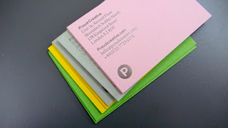
Proud Creative are a design company based in London who have just refreshed their identity using our Colorset 100% recycled paper range. As you can see from the pics, a really clean identity, nice crisp foiling and a lovely range of colours!


Design by James Greenfield at Proud Creative. The cards were produced by Generation Press.