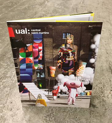
I've written many posts on this blog which includes the phrase "...just the cover makes the difference!" The cover on this 2019 prospectus is just superb. It is printed offset litho on our
Colorset Lemon 270gsm, in just one colour (Silver, Pantone 877) which is a photo composition of 28 works by CSM postgraduate students, all laid out with the wonderful King's Cross building as the backdrop. The cover is also hot foil blocked.
The size of the publication is 240x164mm, portrait. The cover has 90mm flaps, which you can see in the birds eye picture below...
The below image shows the opening spread, with the 40pp text, printed on gloss art...
The cover is printed one colour offset litho in black on the inside cover. Below image shows 90mm flap folded out:
The cover is printed on Colorset Lemon 270gsm, a 100% recycled board. For those of you not familiar with this collection, Colorset now has
36 colours and all colours are available in 120, 270 and 350gsm. Below shows the outside cover, fully extended showing the photo-composition of all 28works...
The 40pp text, printed offset litho on 100gsm coated gloss paper:
Below shows the detail of the hot foil blocking...
This is a superb piece of literature demonstrating that CSM is a world class arts and design college. Design is by
Boyle & Perks but was produced last year before the launch of the new
CSM Shifts (...also by Boyle & Perks!)
Print is by Pureprint, printed offset Litho throughout in CMYK with the cover printed in just silver and black.
https://www.arts.ac.uk/colleges/central-saint-martins
http://boyleperks.com/
https://www.pureprint.com/
Posted by Justin Hobson 27.03.2020


 Design is by Boyle & Perks and congratulations on getting well deserved recognition for creating another excellent CSM prospectus. You can see all the winners HERE.


