Thursday 30 April 2015

Johnson Banks 21 years #3

To mark their 21st birthday, Johnson Banks has produced a series of four brochures. Johnson Banks was established in 1992 and is now a studio which has an international reputation.  Previously I have written about 'Blue Chip and Commercial projects' and 'Charity and Not for Profit'.  
 
I'm writing about each of the four brochures individually. This post is about 'Education and Government'.  As you can see from the images below, they have worked on a many projects for the government in the 'noughties' and the Design Council, British Council, Kings College London and Ravensbourne, amongst many others.
 Size of the publication is 148mm square with a 4pp cover with a 32pp text and is perfect bound. It is printed on our StarFine White 300gsm and 150gsm. The spine is 3-4mm thick. As you can hopefully see from these images, the printed result on this StarFine uncoated text & cover paper is superb. The whole project is all printed digitally on an HP Indigo press by Pureprint - simply a stunning printed result.
StarFine is not a 'digital' paper but it has been "sapphire treated". This treatment is a pre-coat and is often applied to more unusual papers and provides a "key" so that the inks (different to litho inks) adhere to the paper surface. If you would like to know more, you can read about it here:
http://justinsamazingworldatfennerpaper.blogspot.co.uk/2015/03/what-is-sapphire-treatment.html
This project doesn't have a 'digital' look and feel like many digitally printed projects in part, due to the materials chosen.

Creative director is Michael Johnson, designers on the project being Kath Tudball and Julia Woollams.
Posted by Justin Hobson 30.04.2015

Tuesday 28 April 2015

Tullis Russell Papermakers ceases production

I have previously drawn people's attention to the poor state of the paper industry, in general. Unfortunately the decline in quantities required and the high cost of production in western economies has meant many mill closures, and more recently the demise of PaperlinX paper merchants which includes the names of Robert Horne, Howard Smith and The Paper Co.
 
Yesterday, a further blow for the UK paper industry was struck. It was announced that Tullis Russell Papermakers Ltd, a paper mill in Markinch (Fife, Scotland) had been placed into the hands of administrators. The management had tried to sell the business but to no avail and the losses at the £125million turnover mill continued to mount. The mill employs over 470 people.
 
This is very sad news for the staff, the local area and for UK manufacturing. It will also affect readers of this blog - graphic designers and printers - it means far less product choice.
Tullis Russell makes many products that you will be familiar with: Naturalis, Trucard,  Advocate, Gemini, Mellotex, Lustrulux and Rothmill to name just a few.
You can read more about it here on the Printweek website: http://www.printweek.com/print-week/news/1151059/tullis-russell-in-administration

It would be great to think that a buyer for the business can be found and I sincerely hope that the mill can be saved. It's further evidence, if more were needed, as the dire state of the paper and print industry globally and especially in Europe.
Posted by Justin Hobson 28.04.2015

Monday 27 April 2015

Fieldwork literature

Last week I received a lovely little envelope in the post. Contained inside was a selection of printed items from  Emily Macaulay at Stanley James Press, a "Brighton based design company, specialising in the design and production of printed goods"
 
The items in the pack are pieces of printed literature for an organisation called Fieldwork.  Fieldwork is a company that does ethnographic research into people's working lives and they produced a pack to help assist with the collaborative part of their research.
 
There are two notebooks with covers on Flora Betulla 130gsm - covers are three hole sewn. There are business cards on Flora Betulla 350gsm. They are printed one colour letterpress and are beautifully produced. 
Below is an A5 form, printed on Flora Betulla 130gsm ...but there is a lovely touch...
in the top left hand side of the form, a lovely neat de-boss produced using their Adana letterpress:
 
Stanley James Press describe themselves as follows: We enjoy designing and making real things, physical things that you can hold in your hands. We mainly make paper things like books, interesting mail-outs and portfolios. We can letterpress things, we design complicated fold out and pop up things. Most importantly we love a challenge and projects that make us consider how to make things differently.

Design, Print and production by Stanley James Press. Illustrations by Eliza Fricker

www.stanleyjamespress.com
Posted by Justin Hobson 27.04.2015

Thursday 23 April 2015

Alan Kitching's A-Z of Letterpress

Yesterday evening I was fortunate to be invited to the book launch of Alan Kitching's A-Z of Letterpress. This new book showcases Alan's extensive wood-letter fount collection that he has collected over the decades and which also celebrates the 25th anniversary of The Typography Workshop.

The book is a collaboration between Kitching and Angus Hyland and the book launch was held at Pentagram. Having devised a page layout together, Alan then set the entire book, printing an original in letterpress at The Typography Workshop, which was then used as artwork to produce the book (which was litho printed in China).

After an introduction by Laurence King, the publisher of the book, Alan gave a brief insight into the project which remarkably took less than a year to complete.
Alan Kitching, Angus Hyland and Laurence King
The hardback book boasts 1352 pieces of type and has 272 pages. Size is 196x152 mm
Images courtesy of Pentagram
You can read more about the book here:
http://new.pentagram.com/2015/04/new-work-alan-kitchings-a-z-of-letterpress/

Thank you to Pentagram and Alan Kitching for inviting me. It was a lovely evening with the usual friendly nature and good hospitality found at Pentagram.
Posted by Justin Hobson 23.04.2015

Tuesday 21 April 2015

Zanders Zeta now stocked by Fenner Paper

For most of you the Zanders Zeta range will need no introduction, it's Europe's market leading paper for business. Unfortunately with the abrupt closure of the Paperlinx group (Robert Horne, Howard Smith and PaperCo) there was no UK stockist - follow the link for my previous post about Paperlinx: http://justinsamazingworldatfennerpaper.blogspot.co.uk/2015/04/sad-demise-of-paperlinx-in-uk.html. 

As a result of their sad demise, the mill needed a distributor for this range in the UK which has been extensively marketed over the years ...and that's where Fenner Paper comes in!
The good news is that we taken on a broad range of Zeta papers into stock, including the popular Zeta Hammer and Linen embossed finishes. Yesterday the first large stock consignment arrived by trailer, as you can see from the picture below: 
Zanders Zeta is produced by the Reflex Paper mill in Düren, Germany which was founded in 1857. The mill also produces transparent papers, label papers and artists papers.

You can read more about the new arrangement in Printweek:
http://www.printweek.com/print-week/product-news/1150950/fenner-paper-now-exclusive-uk-stockist-of-zanders-zeta

You can see the current range here: http://www.zetapaper.co.uk/

BUT...
please don't throw away your old Zeta swatches as currently we don't have any available. We'll distribute new swatches when they are produced but in the meantime, at least you know where to come to get the product (in fact if you have a moment why don't you grab the Zeta swatch off the shelf and write Fenner Paper on the back - it might save you time and trouble at a later date!
Posted by Justin Hobson 21.04.2014

Friday 17 April 2015

What is ...Greyboard?


What is ...Number 16
Regular followers of this blog will know that in the middle of the month, I publish a "What is ....? post. The article covers various aspects of paper, printing and finishing in greater depth. However, many of these subjects are complex, so these posts are only intended to be a brief introduction to the topic.
What is ...Greyboard?
Sounds obvious doesn't it? ..but Greyboard is something I get asked about quite a lot and I thought it was worth writing about.

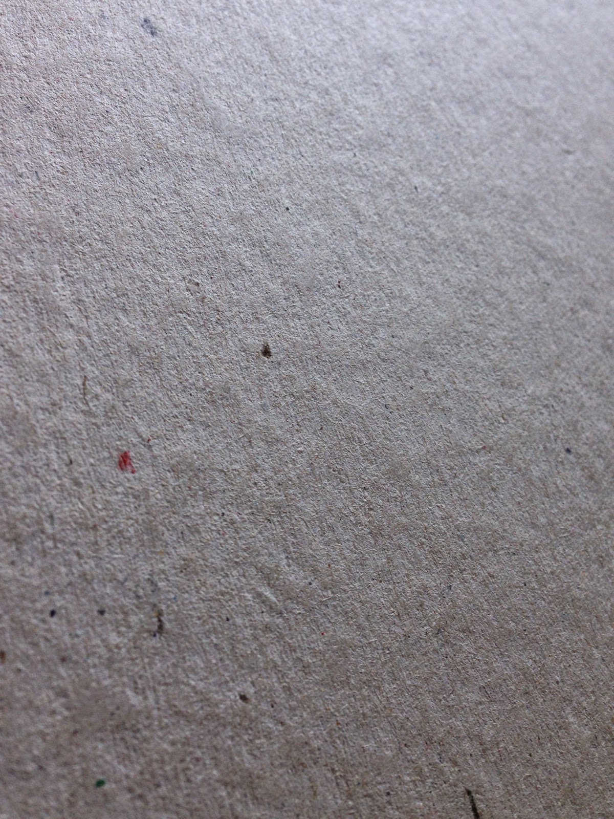
These days, the term Greyboard is used to describe a low grade, 100% recycled, grey coloured thick board used for pad backing, rigid boxes, carton (not corrugated) toy packaging and bookbinding. The product 'greyboard' which is now manufactured has many forebears and the names of these products are sometimes still referred to. In particular, names which people often refer to are strawboard (it used to be made using cereal straw), unlined chipboard, millboard, container board, Dutch greyboard etc etc.

...and this is what it looks like:
Click on image to enlarge all images
Back 'in the day' Dutch Greyboard just came from Holland and was a superior product to the UK manufactured chipboards but nowadays the 'dutch' has been dropped and 'Greyboard' is the generic term used in the UK industry.

Although all paper and board is sold by price which is calculated by weight (grams per square meter - gsm) Greyboard and other boards are manufactured to a thickness or caliper, which is measured in microns, often referred to as mics or by the symbol µ (classical Greek for the letter M)
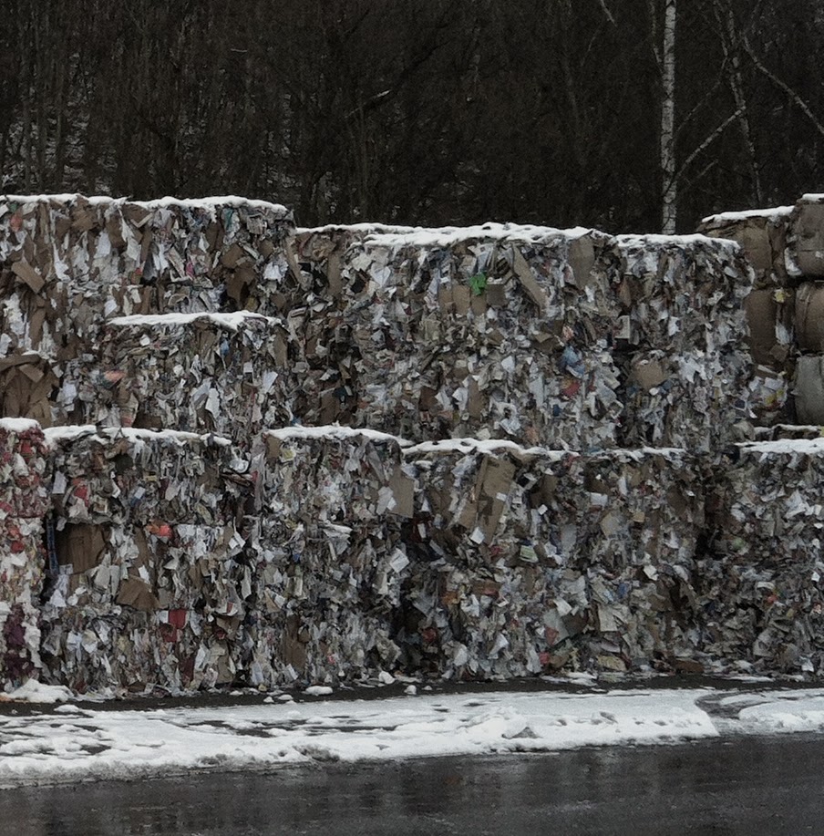
Many people want to use greyboard because it has a 'raw' unfinished appearance. It's also extremely cheap compared with virtually any other heavyweight/thick product and it is environmentally friendly, being made using the lowest grade recycled fibres (pictured left).
Greyboard can be used very effectively in a variety of ways including business cards, postcards and as covers, such as this RCA catalogue from 2004 - in this instance, it has been hot foil blocked in a clear foil with cloth tape running along the spine.
http://justinsamazingworldatfennerpaper.blogspot.co.uk/2011/02/jobs-from-past-number-16.html
As you can see this is a great result, however, be warned, there are a few issues about the product which is important to realise and I'm about to reveal what they are...
 
Firstly, the shade (colour) and surface is not consistent both from batch to batch and mill to mill. Below is an image of 1000 micron greyboard which I recently received from a board mill. The one on the left was the sample I received and the one on the right was a piece taken from the actual order we received - quite different in both shade and surface BUT they both measure 1000microns thick and that is about the only criteria that this product is made to.
click on image to enlarge
In a high volume, cost driven business, using a low quality 100% recycled fibre this is to be expected and is totally acceptable - so don't expect to send it back or be unhappy if it isn't quite the same as the sample you received!
Above is a set of samples of different weights from a supplier - the only thing you can say regarding consistency, is that there isn't any!
 
Click on image to enlarge
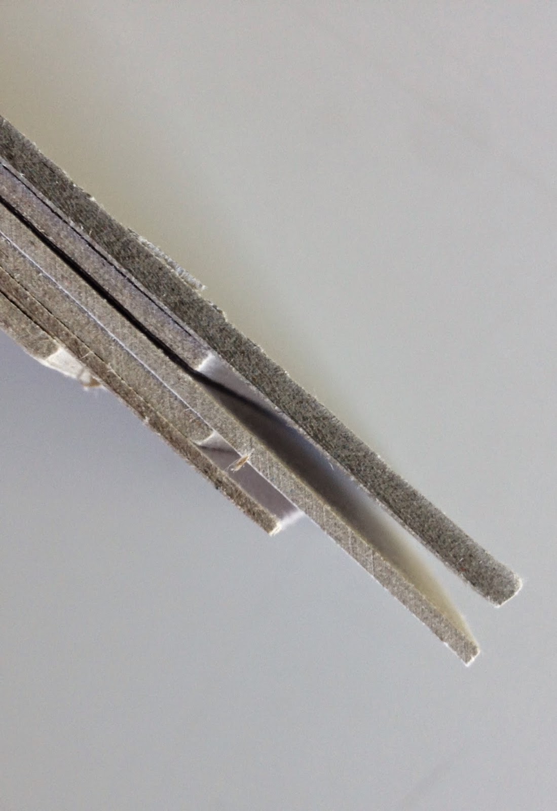
Generally speaking, the weight range of greyboard is from around 300gsm/500micron and goes up to around 1500gsm/3000micron, but as I mentioned previously the importance with this as a product, is it's thickness as you see in the image on the right, showing boards up to 3mm thick (3000microns)
Greyboard is not guaranteed for printing, certainly not offset litho printing. That is not to say that printers won't or can't print it but many printers are reluctant, as the manufacturing mills don't make any guarantee for the printability of the product and if it was to go wrong/cause a problem in the printing press, the mill would not cover any losses due to the product. The same can be said for hot foil blocking, it may work, but it may not and the risk/responsibility is all with the foiler and the designer.

Another issue, is that because it is made with the lowest grade of waste, it is not guaranteed to be acid free, and can (not will) discolour and fade, as you can see in the picture below. 
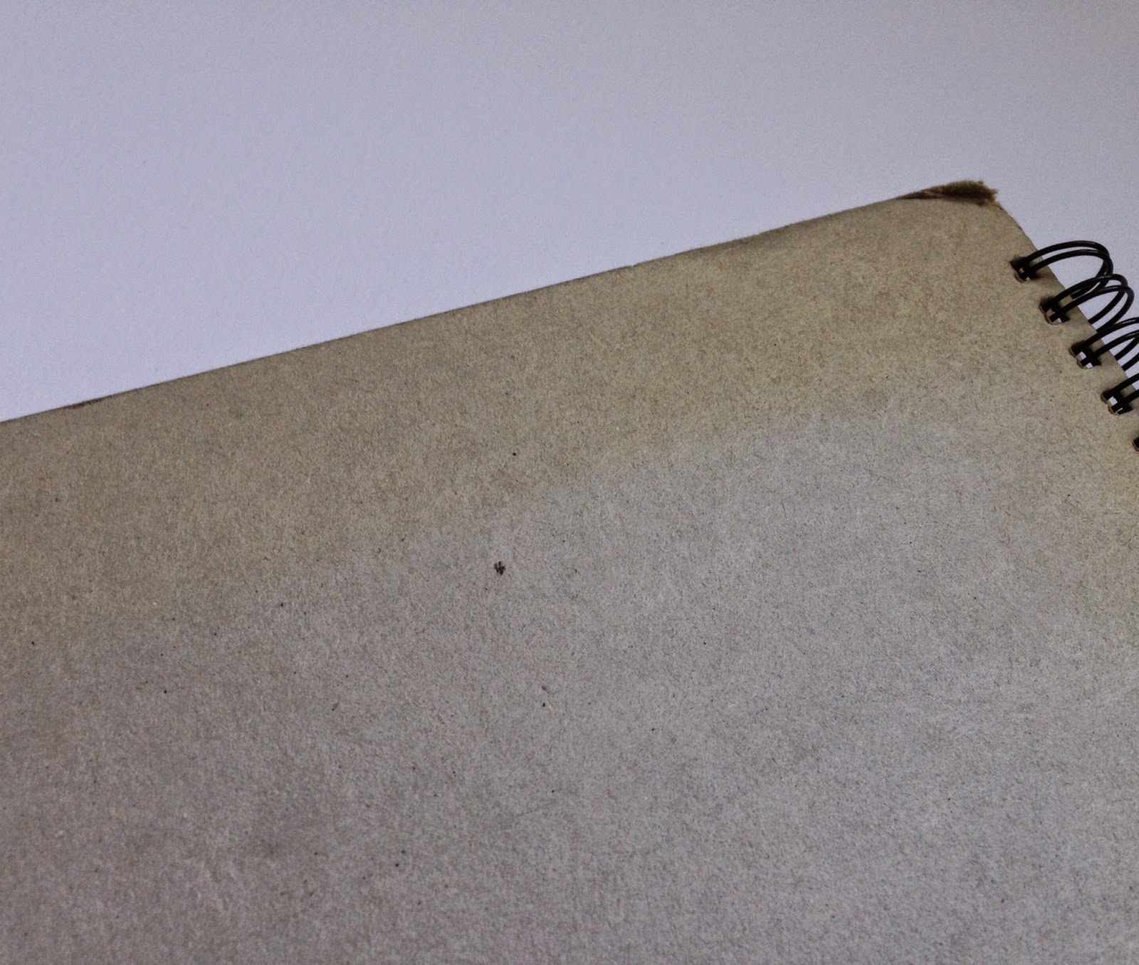
Because of it's unrefined, soft, fiberous nature, greyboard does not tend to wear well and will oftern "feather" along worn edges - this is where fibers  come loose along a cut edge. As you can see from the back cover of the annual report below (Speedy Hire Annual Report 2003, designed by NB:Studio for MerchantCantos) it does not wear well.
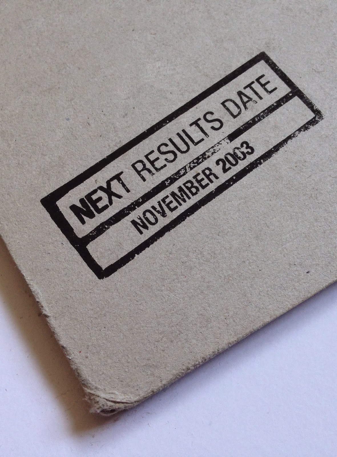
Click on image to enlarge

It might seem like I'm giving a doom and gloom report about this type of product and only writing negative things! Greyboard is a useful, cheap product and can be used in innovative, exciting and different ways and yes, people can revel in it's grungy appearance! BUT, many people (clients in particular) expect manufactured products to have a consistency (and almost a perfection!) to them, which this product just doesn't have. All I'm trying to do is draw people's attention to some of the product's shortcomings.

Another question I get asked is why is some greyboard called unpasted and some called pasted. Basically this refers to the manufacturing process. Unpasted greyboard is produced in a single ply and tends to be rougher, whereas pasted greyboard is produced in layers on the board machine and is almost always smoother - it is NOT duplexed like a paper can be, to make a thick board, it is produced on the board machine in multiple layers.
Like most areas of industry, there are many different grades of product available - superior quality for bookbinding or photographic mounting for example.

For interest, here is a link to a greyboard manufacturer in the US, but they still call it Chipboard over there! http://www.newmanpaperboard.com/#

Posted by Justin Hobson 17.04.2015

Thursday 16 April 2015

Go and hear about how it's done...

Regular followers of the blog know that I often write about talks or lectures that I think might be an interest to readers of this blog and this is just one of those events...

Next Tuesday (21st April) there is a talk being given by designers Carter Wong. The consultancy was founded by two RCA graduates, Phil Carter and Phil Wong in 1984 and over the last thirty years they have produced a considerable body of work. Two of my favourites is their internationally recognised Heartbrand ice cream identity:
...and their work for Howies
But these are just two projects from their extensive portfolio.

So, if you want to hear about the ups and downs of a design business over the last thirty years and pick up some interesting and useful pointers - GET A TICKET. Don't delay.

The talk is titled '60 minutes in 29' and is next Tuesday 21st April and there are still tickets available on Evenbrite:
https://www.eventbrite.co.uk/e/60-minutes-at-29-an-evening-with-carter-wong-design-tickets-16157295907

Tickets are only £15 (concessions available). The talk is being held in the Bridewell Hall at the St Bride Foundation in London EC4 on Tuesday 21st April starting at 7pm. The speakers are Phil Carter, Helena Bland, Chris Bounds, Ian Froome, Martyn Garrod and Nicola Taylor

http://www.sbf.org.uk/events/60-minutes-at-29
http://www.sbf.org.uk/
www.carterwongdesign.com

...interestingly I've been a paper merchant for nearly 30 years and I've never knowingly supplied paper for a Carter Wong project in all that time ...and I still think it's worth you going to hear their talk!
Posted by Justin Hobson 16.04.2015