Monday 23 February 2015

Aylesford Newsprint in administration

Today, the sad news has been announced that Aylesford Newsprint has gone into administration (going into administration effectively means your company is being taken under the management of a court appointed administrator – who must be a licensed insolvency practitioner - appointed by the courts).
Aylesford Newsprint Ltd is a paper mill based near Maidstone in Kent, producing on average 400,000 tonnes of recycled newsprint every year from recycled waste fibre, much of it sourced from London. Paper has been manufactured on the Aylesford site since 1922.

In 1993 they harnessed new recycling technology and became a leader in the production of 100% recycled newsprint under the brand name Renaissance newsprint.
In October 2012 the mill joint owners (SCA and Mondi) sold the mill to Martland Holdings, a US investment group. At the time of the sale SCA reported that the mill had been loss making for several years. However, ahead of the sale, Aylesford Newsprint was recapitalised to leave a business with no debt. Sadly this does not appear to have set them on the road to recovery.

Aylesford Newsprint processes over 500,000 tonnes of recycled waste fibre, produces 400,000 tonnes of newsprint paper operating 365 days a year. The mill is situated on a 100 acre site which, as you'll be able to appreciate from the picture below, is huge.
This is very sad news for the area and the 300 employees that work there. This is 'heavy' industry - the type of industry that once it is lost, is unlikely to come back. I hope that the administrators will be able to restructure the business and find a buyer.

...however it is not all bad news for the UK paper industry. In September 2009, I wrote about a new paper mill opening in Kings Lynn in Norfolk.
http://justinsamazingworldatfennerpaper.blogspot.co.uk/2009/09/paper-mill-actually-opens-in-uk.html

Well, last month they produced the two millionth tonne of newsprint - a remarkable achievement as it was achieved in 12% less time than the initial million tonnes produced on this machine. You can read about it on the following link: http://www.palmpaper.co.uk/en/News/

http://aylesford-newsprint.co.uk/
http://www.kentonline.co.uk/malling/news/aylesford-newsprint-goes-into-administration-32271/

Posted by Justin Hobson 23.02.2015

Friday 20 February 2015

Size | Format | Stock - 2015 edition

The latest, revised, edition of Size|Format|Stock is now available. Size Format Stock is the booklet that I wrote in collaboration with ZoĆ« Bather at Studio8. Originally written in mind for the students that I give occasional talks to, it has since become a firm favourite with many graphic designers.
This is now it's fourth printing and I've printed and distributed over 25,000 copies! ..through colleges, by post and also through Eye Magazine.
The booklet is A5 portrait saddle stitched with a 4pp cover on Colorset 120gsm and a 16pp text printed on Offenbach Bible 60gsm.
If you would like a copy, drop me an email and I'll pop one in the post.
 
Posted by Justin Hobson 20.02.2015

Wednesday 18 February 2015

Johnson Banks 21 years

To mark their 21st birthday, Johnson Banks has produced a series of four brochures. Johnson Banks was established in 1992 and is now a studio which has an international reputation.
They have a portfolio of branding and identity projects which is the envy of companies ten times their size. In fact, on their website, they say "People are often surprised that we're relatively small" We like being compact, and enjoy breaking the paradigm that ‘only big companies can do big projects’- which sounds a bit like us at Fenner Paper...

I thought it might be more interesting if I wrote about the four brochures individually. This post is about the one titled 'Blue Chip and Commercial projects'

As you will be able to see, over the last two decades, they have worked on a wide range of huge branding projects, as well as some much smaller identity work for interesting clients.
Size of the publication is 148mm square with a 4pp cover with a 32pp text and is perfect bound. It is printed on our StarFine White 300gsm and 150gsm. 
It was 2002 when Johnson Banks produced the identity for shoe designer Rupert Sanderson (...we supplied the stationery paper as I recall) since which time, his shoes have become a global sensation. www.rupertsanderson.com/ 
As you can hopefully see from these images, the printed result on this StarFine uncoated text & cover paper is superb. The whole project is all printed digitally on an HP Indigo press by Pureprint - simply a stunning printed result.

Showing 3.5mm spine
StarFine is not a 'digital' paper but it has been "sapphire treated". This treatment is a pre-coat and is often applied to more unusual papers and provides a "key" so that the inks (different to litho inks) adhere to the paper surface. This project doesn't have a 'digital' look and feel like many digitally printed projects and this is in part, due to the materials chosen.

Creative director is Michael Johnson, designers on the project being Kath Tudball and Julia Woollams.

Posted by Justin Hobson 18.02.2015

Monday 16 February 2015

What is ...Embossed Paper?

What is ...Number 14
Regular followers of this blog will know that in the middle of the month, I publish a "What is ....? post. The article covers various aspects of paper, printing and finishing in greater depth. However, many of these subjects are complex, so these posts are only intended to be a brief introduction to the topic.
 
What is ...Embossed Paper?
One of the first things to clarify is that this post is about an all over embossed finish on a paper or board. This is more correctly described as paper 'graining' and also referred to as sheet embossing. This article is NOT about 'blind embossing' which is a print finishing process where specific area or areas of a sheet, such as a logo, is embossed. 
Below is an image of a board which has been grained with a linear finish embossing:
Graining/Embossing is a process in which a permanent pattern is put into the surface of the substrate by heavy pressure, generally from a patterned roller. The mark is made by the rollers literally crushing/smashing the paper fibres in the sheet. The process uses a piece of heavy machinery called an 'embossing calender', such as in the picture below:
A small diameter steel roll which is engraved with the pattern pairs up with a larger diameter compressed fibre backing roll (which has some 'give' unlike steel). The paper or board passes through a 'nip' between the two which imparts the pattern on the surface. The image below show the close up detail of an engraved roller with a linen/canvas pattern.
If a one sided effect is required (EG greeting cards or covers) the backing roll is left plain and the pattern is only apparent on one side. For a two sided effect or what is referred to as a 'through embossing' the two rolls are geared together and the metal roll is run against the fibre roll which forms an interlocking  male/female impression. The effect produces a pattern on the topside of the sheet and a reverse effect on the underside.
At one time, there were many 'trade embossers' or 'paper grainers' in the industrial world of print and it was mainly a process that was handled by these 'trade' companies. Some paper mills also invested in embossing equipment and larger tonnages were supplied ready embossed by the paper mill. Some paper merchants also bought machines.
 
These days there are relatively few 'trade embossers' around and many people think that embossed papers and boards ONLY come from the paper mill or (Hull based) paper merchant ...this is not so!
 
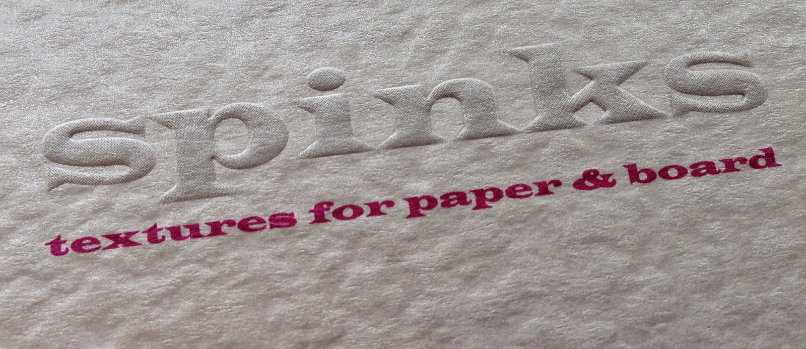
http://spinksembossers.co.uk/SPINKS is a trade embossers, based in Enfield, which has been graining paper since the 1960's and they very helpfully supplied the photographs and information for this article. They have a range of over fifteen standard finishes which can be applied to ANY paper.
There is another interesting factor to consider - it makes sense, from a printing point of view, to put ink onto a flat surface. So what we are suggesting here is to emboss sheets after printing! ...yes this has been common practice for years but has now largely been forgotten because paper companies have been too busy selling 'ready embossed' paper ranges! Problems associated with 'bottoming out the print' especially with uncoated substrates can be eliminated by embossing the printed sheets after printing. The below image shows a cover printed CMYK on a silk coated board which has then been sheet embossed.
 
So I now have an example of how this process was applied to a project in the real world. Jason Maclaren at Cantate (www.cantatecommunications.com) was briefed on a project to produce cocktail menus for Dirty Martini, a collection of London based cocktail bars. In order to keep within the budget, Jason supplied a self coloured, black 350gsm board into Spinks and had it 'grained' with their 'Seal' pattern . After graining, the board was then taken to a print finishers where it was 'blind debossed' with a diamond pattern and hot foil blocked with gold foil. As I hope you can see from the image below, it is a cracking result.
 

Colorset Crimson embossed
- click on image to enlarge
Hopefully this article will serve to demystify the process of graining or sheet embossing. It is possible to emboss virtually all paper and board and it's worth mentioning that our Colorset embosses very well indeed! Some papers with a very hard surface sometimes don't emboss that well but you can always request a sample to be produced.

 ...and don't forget, you can emboss paper after it has been printed - that really isn't rocket science!

Thanks to Gary Spinks and Rebecca Standley at SPINKS Embossers and to Jason Maclaren at Cantate for the interesting case study.

http://spinksembossers.co.uk/
www.cantatecommunications.com
Posted by Justin Hobson 16.02.2015

Friday 13 February 2015

Will we be able to see our digital present in the future?

Vice president of Google, Vint Cerf has stated that he is concerned that today's digital files, may not be retrievable in the future. His comments were made at the annual meeting of the American Association for the Advancement of Science in San Jose.

He fears that future generations will have little or no record of the 21st Century as we enter what he describes as a digital Dark Age. "Even if we accumulate vast archives of digital content, we may not actually know what it is”

You can read the article and hear the BBC interview here:
http://www.bbc.co.uk/news/science-environment-31450389

It goes without saying that we shouldn't overlook the value of print and paper which has stood the test of time for hundreds of years, ensuring that we can pass on history and knowledge published at the time it actually occurred. Certainly worth remembering that when a client says what an "important project it is" - that it's a great time to get them to commit to print - even if it's done as a pdf/web/usb etc. as well ...and get them to make their mark in history!

You may also remember I wrote previously about a paper mill that has been converted to a data farm by Google in Finland:
 
Posted by Justin Hobson 13.02.2015

Tuesday 10 February 2015

Colefax and Fowler Collection

I've written many posts on this blog which includes the phrase "...just the cover makes the difference!" None of the previous posts can compare with the cover on this superb piece of literature.
The cover alone is quite simply stunning. It has the most amazing embossing which is present over the entire front and back cover. This fine piece of embossing just exudes quality and is a fine introduction to the wallpapers, fabrics and trimmings in the collection.
The size of the publication is 280x220mm, portrait and is saddle stitched. The 4pp cover is simply hot foil blocked in matt white foil and beautifully embossed on our Colorset Dark Grey 350gsm (which is also 100% recycled). The 20pp text is printed on 150gsm "house silk".
 
Hopefully you will be able to see from the images below just how crisp, detailed and deep the embossing is.
The embossing is based on one of the new collections in the Colefax and Fowler range called "Sinclair". This fabric design has been redrawn and reinterpreted to works as an embossed finish and it has translated delightfully.
The text pages certainly don't disappoint, with beautiful room settings and photography.
The below image shows the full extent of the emboss over the front and back cover.
Click on image to enlarge
This image below shows the cover from the inside and hopefully you can make out the depth of the embossing.
I hope I have done this piece of literature justice. Colefax and Fowler are renowned for epitomising the very best of English style. Investing in printed publications of this quality demonstrates a confidence and belief in their brand which will surely ensure their longevity.
Creative direction and production is handled in house at Colefax & Fowler. The designer on this project is Rachael Ashley. Print production, including the incredible embossing, is by Greenshires based in Leicester.

http://www.colefax.co.uk/
www.greenshires.com
Posted by Justin Hobson 10.02.2015

Thursday 5 February 2015

The Jocelyn Herbert Archive

Baal by Bertolt Brecht. Illustration by Jocelyn Herbert
Wimbledon College of Arts is part of the University of the Arts London (UAL) and they hold archive material relating to film and theatre designs, as well as the Jocelyn Herbert Archive. Jocelyn Herbert (1917-2003) was a theatre and set designer, who worked within many theatre companies and she left a substantial amount of information on her work for different theatres including the Royal Court and National Theatre. The collection includes original costume and set designs, letters, masks, puppets, set mock-ups, photographs and notebooks.

This simple piece of literature has been produced to give information about the archive, research possibilities and the Jocelyn Herbert Award which is given bi-annually.
It is a simple 8pp, self cover, printed offset litho in two colour, black and a special orange. the images are reproduced as monotones/halftones Size is 225x160mm portrait. It is printed on our StarFine Natural White 100gsm, which gives the publication a light feel with a neutral white which works well with the mono images.
An interesting thing about this project is that the designer on the project Daniel McGhee, didn't want to saddle stitch - sometimes 8pp with a saddle stitch just feels a bit "leaflety"! He had previously seen some jobs which had glue along the spine and wondered how and if that could be done.
This process is usually called "seam glue" or sometime spine glue and can be done on literature with a small number of pages - generally only 8pp on an A4 size or up to 16pp on an A5. It is a machine process which runs a small seam of glue along the spine. The advantage is that there is no bulky stitch, which can sometimes look ugly but the disadvantage is that it makes the 'read-overs' virtually impossible as it takes about 5mm out of the spine. It is not an easy thing to photograph but hopefully these show it well enough
I've deliberately formed a crease, to give an idea of where the glue is hidden
Design is by Atelier Dreibholz and the creative director is Paulus Dreibholz. Designer on the project is Daniel McGhee and thanks to Daniel for the kind note and file copies.
Excellent print and finishing is by Robert Young at R.Young & Son in Croydon.

http://www.arts.ac.uk/study-at-ual/library-services/collections-and-archives/wimbledon/
http://www.dreibholz.com/
http://www.ryoungprint.com/
Posted by Justin Hobson 05.02.2015