Thursday 18 June 2015

Today is Waterloo Day!

Today is the the 200th anniversary of the Battle of Waterloo, a vital turning point in world history. The battle started at 11.30am and ended at 8.30pm, a bloody battle with 44,000 casualties and over 10,000 horse dead. This was the last major battle before the invention of photography and so what we are left with is the media of the age: eyewitness accounts, hand drawn maps, sketches, paintings and of course, artefacts.  This was a battle which for good or ill, set the course of European history until the First World War and still shapes the world we live in today. The names Wellington and Napoleon and to a lesser extent Blücher are still well known, popular history, mainly because of this major land battle in a small corner of Belgium exactly 200 years ago today.
 
I have been fortunate enough to have been involved in an amazing limited edition publishing project by independent publisher Extraordinary Editions. This major publication is an amazingly detailed account of the battle with much new and previously unpublished information about the battle. It has over 500pp and has a huge number of special production features, including leather casebinding, gilt edging, coloured end ribbons to name but a few.... 
It is printed on our lovely Modigliani Neve 145gsm, which has a subtle feltmarked texture in a neutral white shade. Printing is by Pureprint.

I will write about this truly historic publication in a longer article when I have all the information together, however in the meantime, you can read more about it here:
http://extraordinaryeditions.com/our-books/waterloo-1815-3/
Posted by Justin Hobson 18.06.2015

Monday 15 June 2015

What is ...PUR Binding?

What is ...Number 18
Regular followers of this blog will know that in the middle of the month, I publish a "What is ....? post. The article covers various aspects of paper, printing and finishing in greater depth. However, many of these subjects are complex, so these posts are only intended to be a brief introduction to the topic.

What is ...PUR Binding?
Brochures, paperback books, hardcover books and magazines with a sqaureback and a thickness greater than around 5mm will be bound using either glue (perfect bound) or thread and glue (section sewn). In the early 1990's a new development in adhesive technology changed the strength and therefore the reputation of perfect binding forever.

Section sewn binding has been around since books were first produced - using different types of glue as times changed. Section sewn binding is still regarded as the best and strongest as it relies on both thread and glue. Perfect Binding (glue only) has always been regarded as weaker and less durable (...remember all those magazines and paperbacks where pages have fallen out?)

In the early 1990's, a new type of adhesive was developed. This adhesive is called Polyurethane Reactive Hotmelt and is known as PUR. As the name hotmelt suggests, the glue is heated and applied hot. This new adhesive involves a chemical reaction between the glue and moisture in the atmosphere and paper to give a much greater strength and flexibility than using normal glue. The finished bound books reach their optimum strength 24 hours after binding.

There was a bindery close to us called Tonbridge Trade Binders (TTB) which was the first bindery in the UK to install the tanks to handle PUR glue on their binding line, this was around 1995. Unfortunately TTB closed down about ten years ago but many trade binders now have PUR systems.
PUR binding is very strong but one of the limitations in the early days was that it was only suitable for longer runs, which I believe was to do with the time it took to set up the machinery, these days that isn't the case and there are PUR machines that can do small runs.
...for example, below is an image of the BB3002 PUR binding line by CP Bourg, a machinery manufacturer based in Belgium. It's representative of the relatively small machines now available, many of which are being installed by printers in house.
Today PUR binding is highly regarded and is many customer's preferred binding method.

Posted by Justin Hobson 15.06.2015

Thursday 11 June 2015

Ted Baker - Take the Lead

Ted Baker is one of the UK's leading clothing brands. The label has become a desired brand through engaging with customers through the "words of Ted" using interesting themes and stories for its marketing.

Titled "Take the Lead" this publication showcases the Autumn/Winter collection and is set in the auditoriums and backrooms of dance halls and rehearsal rooms.

"From the Mambo and Tango right through to Fandango, Ted can out-Fred then nimblest Astaire and to celebrate, his Menswear and Womenswear collections are dancing cheek to cheek to create a thrilling display of rhythm and electric blues. Ted has choreographed a luxurious Womenswear clothing and accessories collection for Autumn/Winter, effortlessly combining vintage-inspired floral prints in a layered and lavish palette of pinks. His continued love affair with the1950s has also created an ultra-feminine look to ensure all ladies become belles of the (mirror) ball."
This publication is A5 (210x148mm) portrait with 4pp cover and 96pp text and is perfect bound. The book is printed offset litho in four colour process.
The paper used throughout is our lovely Omnia text and cover range - 280gsm for the cover and 120gsm for the text. As you can see from the images, there are dark colours and images with CMYK dark areas (Autumn/Winter colours) - lots of heavy ink coverage going down and it looks great on the Omnia, reproducing those bright vibrant colours, whilst retaining detail in the dark areas as shown in the image below. Flat, matt and tactile. 
Below is the opening spread of the brochure. The inside front and back cover are printed in one colour, offset litho in metallic gold.
Below is detail of the pattern and the great thing about metallic inks on Omnia, is that they actually look metallic!
Click on images to enlarge
Another stunning thing to point out is the detail that is retained in the images, both with the details of the accessories and also fleshtones...
 ...as can be seen with the image of these legs and shoes!
The superb printing is by Absolute Ink who are based in East London. The publication is perfect bound and has a 9mm spine.
Design and art direction is by the in house team at Ted Baker. A superb piece of art direction and design resulting in a superb piece of print.

Posted by Justin Hobson 11.06.2015
Tuesday 9 June 2015

Gorse Hill Brochure

Gorse Hill is a prestigious North Wales Holiday Home Park in the heart of the Conwy Valley in North Wales. Located at the edge of the Snowdonia National Park there is breath-taking scenery from the beautiful North Wales coastline, to hills and valleys and the nearby marina.

This brochure is part of the branding project produced by Conwy based design studio View Creative Agency.  New branding has been applied to a range of promotional communications including carrier bags for use at events, and this corporate brochure.
Size of the brochure is A4 (210x297mm) landscape. It has a 4pp cover which is produced on our Colorset 100% Recycled, Dark Grey 350gsm. I was originally contacted by Nicky Howard at View for a deep grey shade as they couldn't find exactly the colour that was right, so I sent Colorset and it turned out to be just right!
The 12pp text is printed offset litho in CMYK on a 170gsm 'house' silk coated paper and the majority is covered in a gloss UV varnish, to great effect. As you can see from the image below, it had to be a Landscape format document...
The outside cover is hot foil blocked in two colours, white and bright yellow and the quality of foiling and print is excellent.
Click on image to enlarge
Branding and design is by View Creative Agency (VCA) in Conwy.  Printing is by Zenith Media based in Tonypandy.
 
http://viewcreative.co.uk/
http://www.zenith-media.co.uk/
Posted by Justin Hobson 09.06.2015

Friday 5 June 2015

From Babies with love

From Babies with Love supply organic baby clothes and printed cards by post, they then send all of their profits around the world to help abandoned and orphaned children.

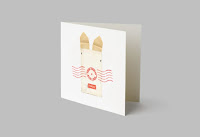
The identity has been created by Paul Belford Ltd and has been applied across a range of collateral, including print. The design and illustrations reference postal ephemera, building on the postmark identity.

Business cards are 85x55mm
...and the swing tags are 135x55mm
The cards and swing tags are printed on our Kemikal, Cotton White 1500mics which is a natural feeling, neutral white thick board - 1.5mm thick. so it gives great thickness, but is nice and tactile.

The swing tags are beautifully finished, with punched holes, hole protectors and coloured string.
The below image highlights just how thick the material is:
Now you might think that being this thick, that they were silkscreen printed, however they are not, as beautifully crisp type was required juxtaposing with the smudged rough and ready 'postage mark'. So you might be surprised to learn that they have been litho printed! ...how come? I hear you ask, on a board that is 1.5mm thick. Well, they have been produced using a litho, flat bed printing press. These are machines which (in years gone by) used to be used to produce proofs (and progressive proofs, if you remember them) and because the printing bed is flat and not round a cylinder, the machines can cope with thicker substances, such as this. These cards were produced by Linnetts Proofing based in London NW10.

Design is by Paul Belford, Martin Brown and Bethan Jones at Paul Belford Ltd. You can read more about the project here: http://paulbelford.com/project/from-babies-with-love-brand/ 

There are other parts to the project printed on our Shiro Echo, White, including stationery paper and compliments slips and greeting cards, but maybe I'll write about those another time.

https://www.frombabieswithlove.org/
http://paulbelford.com/
Posted by Justin Hobson 05.06.2015

Wednesday 3 June 2015

Progressive Greetings 2015

Yesterday, the Progressive Greetings Exhibition known as "PG Live" opened at the Business Design Centre in Islington. Aimed purely at the greeting card industry, it's open on 2nd and 3rd June only.
Our modest stand of 3 x 2 metres, displays our boards that are especially suitable for greetings cards and as you can see from the display shown on the stand, we now have quite a few! 
On the stand, we display a wide range of materials from our supplying mills including Cordenons, Reflex (Zanders) and Favini and Euler to name just a few...
We also have on display some sample cards printed on a variety of our materials, by Ricoh. These cards are printed on a Ricoh ProC1900, digital press and the results are excellent.  
Our stand is designed by Vincent Design, who I must thank for their considerable input. Fenner Paper is proud to have been the first paper company to be granted Associate Membership of the Greeting Card Association (GCA), in 2013.
If you are a designer or publisher of greeting cards, please do come along today and we look forward to welcoming you - we're on stand 506.
www.progressivegreetingslive.com
Posted by Justin Hobson 03.06.2015

Tuesday 2 June 2015

Jobs from the past - Number 68

Regular followers of this blog will know that my first post of every month is a "job from the past" so that I can show some of the really good work from years gone by...

Pigs are Great - 2001
This self promtional piece of literature was designed by The Partners for Gavin Martin, the printing company back in 2001. The mailing is designed to be one piece, inserted into a neat 'Oink' envelope. The photography is by Geoff Smith.
The finished size is 120x77mm, portrait and is a long concertina. This gives the mailing 5 spreads in total.
The concertina which is 987mm long, folds up as below:
One of the things to note is the 2mm, free standing spine, into which the concertina folds. This is where the choice of material is important, so that the weight/bulk is light enough that it will take a machine made crease, yet be light enough for the pages to turn over nicely.
It is printed on our Matrisse 140gsm, which is a white very bulky uncoated with a toothy feel. Images, showing the fully extended mailer, printed CMYK plus pantone special, with the inside printed with the special only...
Art direction and design is by The Partners. Print is by Gavin Martin. Photography is by Geoff Smith.
A clever and well thought out piece of literature, which maximises the format of a B1 press and sheet of paper...

http://www.gavinmartin.co.uk/old_site/
http://www.the-partners.com/
http://www.gavinmartincolournet.co.uk/
Posted by Justin Hobson 02.06.2015