Friday, 7 August 2009
It's not just the big jobs that count....
I don't only want to write about large lavish productions as quite often the best literature is the well considered, nicely executed smaller project.
This job is for the Fulham Horticultural Society and is an A5 size book. There are the entry tickets as well. All printed in one colour.
Simple and lovely. Designed by Jane Chipchase.
The jobs are printed on Colorset Tuscan Brown and Pink Ice. Colorset is 100% Recycled.
And thank you for the note Jane.....
Thursday, 6 August 2009
New Ultrabold
Have a look at this! It's the new Ultrabold magazine, which is the Journal of the St Bride Library - I know a lot of people have heard of St Brides but don't really know much about it -see http://www.stbride.org/
Anyway, we at Fenner Paper have supported this publication for the last three years (by supplying discounted material) and the print is sponsored by Principal Colour. The publication is designed by Simon Loxley and is published by the Friends of St Brides.
In this issue, there is an article about the Hand and Eye press (letterpress printer) based in London and a very interesting article about Rian Hughes' hand drawn magazine and comic lettering.
I am also very fortunate that design duo Debbie Osborne and Andrew Ross (who many of you will know) very kindly produce the Fenner advert which appears on the inside back cover. This has involved trawling the St Bride's library for suitable and diverse "F" (for Fenner) letterforms. Thank you to Andrew and Debbie for your time and generosity.
Below is a picture taken at St Brides, where Andrew Ross is "giving it some welly" on a Columbian press - trying desperately to make an impression!
If you want your own copy, simply join the Friends of St Brides and you'll get one free. Alternatively you could e-mail me and I may be able to find a file copy...
Tuesday, 4 August 2009
RCA - MA Fashion
Over the years I have been lucky enough to have been involved in several of the catalogues for the RCA MA Fashion course. One particularly memorable job was the 2004 catalogue, the text of which was all on Offenbach Bible 50gsm, made up entirely of French Folded sections.
This year's catalogue is also exceptional. It is a 290x215mm format. It is "swiss bound" [for those of you who are unfamiliar, this is where the text block is section sewn and glued. Then binding tape is applied around the spine and then this text "block" is glued/bound into the inside back cover by a strip of glue running parallel to the spine. The spine of the actual cover is therefore "freestanding" and not glued to the cover so opens and sits completely flat] which is a lovely finish and brings a material/textile feel to the binding.
The book is cleverley divided into five sections using bright divider spreads- MW-WW-MK-WK-AF (Menswear, Womenswear... etc).
Design is by Mark El-khatib (mark.el-khatib@network.rca.ac.uk)
The superb repro and printing is by David Holyday
d.holyday@googlemail.com
...and now for the paper! The paper used for this project is StarFine White - 300gsm for the cover and 130gsm for the text. The colour reproduction is fantastic - although it goes without saying that it is as much to do with the originals and the repro treatment as it is with the paper!
http://www.rca.ac.uk/
Monday, 3 August 2009
Land Securities 2
I've just received the second leaflet in the Land Securities series designed by Hat-Trick and printed on Colorset 100% Recycled.
This is a series of leaflets being produced to promote events over the Summer at New Street Square (details on previous post 20.07.09).
This is the "Ashes" event and is printed on Colorset, Spring Green 120gsm.
Thank you for the file copies and the note Alex!
http://www.hat-trickdesign.co.uk/
Saturday, 1 August 2009
Out and about
I managed to get out of the office this week and went to see John Dowling who is based in Newark in Nottinghamshire.
I first met John when he was working at Pentagram in John Rushworth's team and since then he's worked with Sea and Vince Frost before setting up his own studio.
John (pictured left) has a lovely space in a warehouse on the River Trent. He combines running the studio with lecturing part-time at the University of Lincoln.
Whilst at the studio I also met photographer Andy Weekes with whom John has collaborated on work for many years, their work for THE COLLECTION [Art & Archaelogy in Lincolnshire] is well worth a look.
Pictured below is a poster John designed for a talk to Lincoln University (before he became a lecturer!) which features his four business cards from Area/Pentagram/Frost/Dowling.
And here below is a self initiated project (poster- A2 size) by John.
Just goes to prove (what many already know) that there is creative life outside the major cities....
http://www.dowlingdesign.com/
http://www.andrewweekes.net/
Friday, 31 July 2009
British Museum Review
I've just received some copies of the British Museum Review 2008/9. Although it is called a "Review" it is really an Annual Report - and what a shame that we don't see Annual Reports like this in the corporate sector (anymore!)
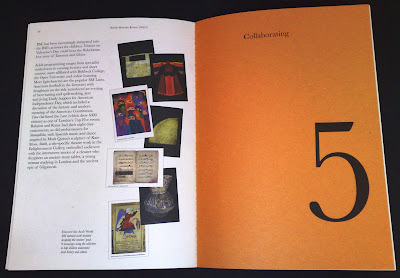
It is designed by McConnell Design and Zach John was the senior designer on the project.
Beautifully "printed and bound in England" by Gavin Martin Associates ...take a bow Mr Gary Bird!
The text of the review is printed on Redeem 100% Recycled 100gsm. The cover is on a light brown manilla board and the paper weight dividers are on "Sugar Paper"
http://www.mcconnellstudio.com/
http://www.gavinmartin.co.uk/
New Review from Crescent Lodge
Every year Crescent Lodge produce a Review of projects they have done in the the previous twelve months. It demonstrates a real diversity of work ranging from their work in education, the Royal Mail, the London Philharmonic Orchestra to a private bank.
This review is printed on StarFine Natural White 150gsm and has a MirriSilver cover (in Bookjacket style).
The A5 format follows previous years and I'm lucky enough to have been involved in the past reviews, so I'm building a nice set now!
A really lovely touch is the letterpress card which goes out with the reviews which is hand printed in the studio at Crescent Lodge as they have a Letterpress machine (an Adana I think?) with and a selection of woodblock and metal type.
Design is by Lynda Brockbank (Creative Director) and Andrew Collier.
Printed by Granite
http://www.crescentlodge.co.uk/
http://www.granitecolour.com/
Subscribe to:
Posts (Atom)