Wednesday, 1 September 2010

Jobs from the past - Number 12

Followers of this blog will know that my first post of every month is a "job from the past" so that I can show some of the really good work from years gone by and this one is only from last year!

Tate Britain Summer Party 2009 - Invitation

Arguably this is an invitation to one of the hotest tickets in town for the art world and normally coincides with the opening of an exhibition. Last year it was the opening of the Eva Rothschild exhibition.
The invitation was designed and produced by the design team at The Tate and is a simply stunning example of the design working perfectly with the material and the process (which in this instance is hot foil blocking) . The invitation is a 4pp landscape format and the size is 210x135mm. The material is our Flora Tabacco in 350gsm (manufactured by Cordenons in Italy) which is a very substantial board with a high bulk, an industrial look & feel and with deliberate "inclusions" or specs. This rough and ready looking material has been juxtaposed with some exceptionally fine hot foil blocking in a matt white foil - and it really is superbly done as you can see from the Tate logo and even more impressive if you look at the size of the BP logo (sponsors) on the inside front cover, it is absolutely minute but as you'll see if you enlarge it - it's perfect.
...and that literally is it - a well creased piece of board, beautifully designed, superbly hot foil blocked, no images and no print - what more can I say?

Designer on the project was Michael Windsor-Ungureanu.

Print production was by Push.

Posted by Justin Hobson 01.09.2010

Tuesday, 31 August 2010

Anti Design Festival 2010

Now I'm probably a bit behind the times but I didn't know that there was a rival to the London Design Festival and I certainly wasn't aware that there was so much dissatisfaction with it!

The following information has been taken from the Anti Design Festival site:
Created initially as a direct response to the pretty commerciality of the London Design Festival, the festival will shift the focus from bums-on-seats to brain food, and from taste and style to experiment and risk. The festival will provide a rare space for unhindered exploration and creative opportunity, where ideas may fail as equally as succeed. At multiple venues around Redchurch Street in London’s Shoreditch area, the festival will incorporate exhibitions, installations, workshops, performances and talks in Art, Design, Product, Film, Sound, Fashion, Performance, Print and Interactive.

Events and exhibitions will be curated by the likes of Daniel Charny, Terry Jones, James Payne, Harry Malt, Stuart Semple and Neville Brody. To date, contributors include Stefan Sagmeister, Jonathan Barnbrook, Yugo Nakamura, Yomi Ayeni, and Mark Moore.

The main venue is the Londonewcastle Project Space at 28 Redchurch Street. The Royal College of Art will host a one-day intervention, as will the London College of Communication. British illustration collective Le Gun will be part of a collective show curated by Bare Bones’ Harry Malt, and at the Aubin Gallery, Stuart Semple will host the first UK show by the radical French illustration group Bazooka. The Anti Design Festival has some pretty fancy sponsors and is being supported by Taschen, Londonewcastle and Arts Council England, with additional support and contributions from USE Architects and Epson.

...anyway, the reason that I got to hear about it is that the publication produced for Goldsmith Art Writing that I was involved with (with Ken Kirton and Clare Acheson) which was printed on the SHIRO Alga Carta 90gsm, has been selected to be a part of the Anti Design Festival exhibition:
See my previous post all about it:

To read more about how "as a response to 25 years of cultural deep freeze, the Anti Design Festival will attempt to unlock creative fires and ideas, exploring spaces hitherto deemed out-of-bounds by a purely commercial criteria" have a look at the site...
Posted by Justin Hobson 31.08.2010

Wednesday, 25 August 2010

Daunt Books

The Children's Short Story Competition is run by Daunt Books, a London based bookseller. The awards are held to highlight the best of Children's writing and Children of all ages are encouraged to enter. Their aim is to encourage, recognise and celebrate high standards of young writing.

This publication includes fourteen stories which are the winners of the competition and by virtue of this book they have all now become "published" authors!
The job has been designed by Catrin Morgan and Valerio Di Lucente, both formerly at the RCA. Catrin also did the superb illustrations

It is a simply produced job at a size of 145x200mm, just sub A5 size. It has a 4pp cover on Colorset Lemon 270gsm and 60pp text on Redeem 100% Recycled 100gsm. The job is saddle stitched which is a bit of a push at 60pp - because sometimes jobs "gape" open in the middle,  but on this publication it does just work (we also made dummies using the Redeem in 80gsm)

It is printed 3 special colours on the Colorset Lemon on the cover which just looks amazing for the colour illustration and the text is printed in a dark pantone grey which works well with the illustrations.

And thank you for the lovely note:
You can view Catrin's illustrations here: http://catrinmorgan.co.uk/. Valerio has set up his own studio based in London with some ex RCA friends and their website is here: http://www.julia.uk.com/

And this is a picture of one of the Daunt Books shops - you don't get that experience on the internet - so forget amazon and go and support a bookshop!
Posted by Justin Hobson 25.08.2010

Monday, 23 August 2010

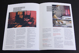
Central St Martins - 2010/2011 Course brochure

Here is a really excellent piece of literature, which I guess we would all hope for and expect as it's for Central St Martins.

There's also one thing in particular which I would like to point out [below]. The job size is 165x240mm which is an economical size to produce from a B1 sheet. It is printed on our StarFine White which is an uncoated with a good bulk but you wouldn't describe it either as toothy or smooth! It has a 4pp cover and only a 24pp text. Potentially this could have posed a problem, because a printed spine was considered important and part of the design brief but by using 130gsm  for the text it gave a 2.5-3.0mm spine width which is about the thinest that you can successfully perfect bind (and it's been very well finished with the 6 point, I think, type on the spine)

Now the thing that I have noticed about this piece and that I want to point out is that the cover is not as heavy as most people (that I speak to) would use - but it really, really works. It is only on 200gsm and the
point is that the relationship between the text and cover is perfect. It just flows and feels perfect in the hand. The cover doesn't feel cheap or insubstantial. Getting the relationship between the text and cover right can make or break the piece of literature -it's crucial - heavy covers do not always give a job a prestigious feel, often it makes a brochure unusable! ...so don't always reach for the 350gsm, just get the relationship right!
This piece is designed by Paulus Dreibholz who runs his studio in London and lectures at CSM and University of Applied Arts in Vienna amongst others.


Print is by Principal Colour.

http://www.csm.arts.ac.uk/
http://www.dreibholz.com/
http://www.principalcolour.co.uk/
Posted by Justin Hobson 23.08.2010

Thursday, 19 August 2010

Venice uses Alga Carta

Now although this wasn't a project that I worked on, it is of interest as it's printed on the new SHIRO Alga Carta. It is a pack produced for the Venice Tourist board which incorporates a card which lists places and events and a map.
Don't know who the designer is for the project but obviously the material choice does make a lot of sense as the Alga Carta includes seaweed which is taken from the Venice lagoon, which is growing because of pollution and has to be taken out ...and here's a picture of what it looks like  
If anybody out there is now thinking of ordering some some samples of our new SHIRO Alga Carta as a cheap way of getting a seaweed body wrap, forget it - I've tried it and it doesn't work! (no, not really)
Posted by Justin Hobson 19.08.2010

Tuesday, 17 August 2010

PoetryQuest

Here's a really inspired piece of literature for PoetryQuest which is a national arts project run by the Price's Foundation for Children and the Arts.
The project was designed by BOB Design. Creative Directors on the project were Alexis Burgess and Mireille Burkhardt. Designer on the project was Matt Price. The illustrator is Robert Hanson.

The size is an unusual 190x238mm, with a 4pp cover and 48pp text. Printed on Redeem 100% Recycled 240gsm and 130gsm. Print is by Push (note the really good CMYK/tint layed solids).

This project is a combination of poetry and visual art being run through schools and art professionals and manifests itself in the construction of a decorated Tipi! Below you will see some of the finished Tipis which were set up in Kensington Gardens on 7th July. Camilla, Duchess of Cornwall attended and the visit finished with the Duchess reading one of her favourite poems to the school children ...and she also had the pleasure of meeting Lexi and Matt who were appropriately suited and booted!
Posted by Justin Hobson 17.08.2010

Friday, 13 August 2010

THE LIGHT - Portraits of the Hibakusha

...and I thought no one had noticed how tall I was!
Anyway, this beatifully folded and superbly executed piece, was sent to me by Leah and Sara at Happily Ever After. Below is the finished (folded up) piece which is A5 size:
- which then folds out like so...
THE LIGHT - Portraits of the Hibakusha - is an exhibition which runs from the 5th August- 8th October at the Brunei Gallery at the School of Oriental and African Studies, University of London.

The subject of the exhibitions is as follows: At 00.15am on the 6th August 2010 in London it will be 08.15am in Hiroshima and it will have been 65 years since ‘Little Boy’ was dropped on Hiroshima by the USA’s B-29 bomber ‘Enola Gay’. The exhibition of the 65 Hibakusha portrait paintings will last for 65 days, one for each year since the bombs were dropped on both Hiroshima and Nagasaki. Each painting will be accompanied by a detailed description of each subject’s haunting recollection of exactly how they came to survive and be found after the bombing.

Hibakusha are survivors of the atomic bombings of Hiroshima and Nagasaki and the Japanese word translates literally to “bomb affected people”. There are no names on any of the Hibakusha Portraits as is the tradition in Japan all are ‘subjects’ and always remain unnamed.

The open size is 592x420mm. The job is printed on our beatifully thin and lightweight Offenbach Bible in 60gsm. It was printed and finished by Beacon Press, who have produced this really well - not only the print but the very tricksy folding!

...and thanks to Leah and Sara for sending it to me and for the lovely note - yes, it certainly is a blogworthy piece!
Posted by Justin Hobson 13.08.2010