Wednesday, 8 September 2010

Shiro mailer drops on the doorstep...

If you're one of the lucky people in my address book, you should receive a natty little mailer, as pictured, from paper manufacturer Favini about their range which we are now stocking in the UK, called SHIRO.
It's a lovely little piece held together by a "rivet" and is to highlight the three distinct sub-ranges within the Shiro collection. They arrive in a custom made envelope (made from Shiro, of course) 238x65mm which is important as they fall in the cheaper "Letter" category for UK postal costs! They were designed in house by the creative team at Favini and produced in Italy.

This is a new range of really beautiful papers - they are lovely to the touch, have a great formation and will print really well - hopefully over the coming months you'll see some lovely jobs on this paper featured on this very blog!

If you would like one of the new swatches (pic below), please e-mail me: justin@fennerpaper.co.uk
Here's a bit about the three papers in the SHIRO range: 

SHIRO - Alga Carta
Alga Carta is a paper manufactured using polluting alga harvested from the Venice lagoon, combined with FSC certified fibres. Algae blooms at the end of Summer in the Venice lagoon as the warm water combines with pollution. The algae must be harvested to maintain the lagoon's eco-balance (circa 5,000 tonnes of wet algae is removed annually). The algae (seaweed) is used partly as pulp replacement but mainly as a filler and this accounts for its unusual smooth feel and the random specks.

SHIRO – Echo
Echo is the highest quality bright white and natural recycled paper. It’s made from 50% Post Consumer Waste (PCW) combined with 50% FSC virgin fibres. There are two shades, a bright White and a Natural and the weight range is from 90gsm up to 300gsm

SHIRO - Tree Free
Tree Free is a naturally different paper that uses fibres from annual plants such as bamboo, cotton or bagasse – it is made with 100% non-tree fibres – it is a naturally different paper – no trees!

Anyway that's the end of my sales pitch! - If you would like a swatch (or a mailer if you didn't receive one!) drop me an e-mail: justin@fennerpaper.co.uk

Posted by Justin Hobson 08.09.2010

Tuesday, 7 September 2010

D&AD New Blood 2010

Promoting D&AD's showcase of the best student work (New Blood) is a tricky job. While the spotlight is firmly on the graduates, the invitation needs to attract a wide range of visitors from the creative industry.

NB: Studio created a series of A1 posters for the 2010 New Blood campaign  "Sorry old blood, the new blood has arrived". Photographed by the now eponymous David Stewart, the images show how the creative elite might react once the new students unveil their work ...exhaust pipe through the car window, gun to the head, jump off a tall building etc. 

The A1 posters which folded down to A5 were printed on Offenbach Bible in 60gsm because at this weight (and if folded correctly - i.e. concertina and concertina, therefore allowing all air to escape) there are no "crows feet" appearing - if you're not familiar with that term, it's where a rather ugly crease appears parallel to the fold.

This is the A5 folded example:
Which concertina's out to this:
To reveal the A1 size poster:
As in previous years, it's famous faces that get the interest up, so characters such as Michael Wolff, Dick Powell all seemingly declaring "I won't be there, 'cos I've topped myself!"  - eyecatching stuff!

Here are some of the other images:


Creative Directors are Nick Finney and Alan Dye. Designer is Ed Wright.

Posted by Justin Hobson 07.09.2010
Thursday, 2 September 2010

It's Nice That - issue #4 ...details announced

Today the full line-up for It's Nice That Issue #4 has been announced. Included in the content are interviews with the likes of Nick Knight, Neville Brody and Miranda July, as well as features from Adam Buxton and Sara de Bondt. The stellar line-up is also complimented by the usual collection of brilliant work from the last six months on the blog.

Every pre-order will also be treated to a free, exclusive screen print by James Jarvis. It has been designed specifically to give anyone who orders a copy of the publication before midnight on 30 September - this print will not be available anywhere else. The print fits neatly into the inside of the magazine meaning no folds...

It's Nice That is printed using our Colorset 100% recycled 270gsm cover and our Redeem 100% Recycled 100gsm for the text - and here's how it looks when it's at the printers:
So pre-order your copy now, otherwise you won't get your free print!
http://shop.itsnicethat.com/products/its-nice-that-issue-4
Posted by Justin Hobson 02.09.2010

Wednesday, 1 September 2010

Jobs from the past - Number 12

Followers of this blog will know that my first post of every month is a "job from the past" so that I can show some of the really good work from years gone by and this one is only from last year!

Tate Britain Summer Party 2009 - Invitation

Arguably this is an invitation to one of the hotest tickets in town for the art world and normally coincides with the opening of an exhibition. Last year it was the opening of the Eva Rothschild exhibition.
The invitation was designed and produced by the design team at The Tate and is a simply stunning example of the design working perfectly with the material and the process (which in this instance is hot foil blocking) . The invitation is a 4pp landscape format and the size is 210x135mm. The material is our Flora Tabacco in 350gsm (manufactured by Cordenons in Italy) which is a very substantial board with a high bulk, an industrial look & feel and with deliberate "inclusions" or specs. This rough and ready looking material has been juxtaposed with some exceptionally fine hot foil blocking in a matt white foil - and it really is superbly done as you can see from the Tate logo and even more impressive if you look at the size of the BP logo (sponsors) on the inside front cover, it is absolutely minute but as you'll see if you enlarge it - it's perfect.
...and that literally is it - a well creased piece of board, beautifully designed, superbly hot foil blocked, no images and no print - what more can I say?

Designer on the project was Michael Windsor-Ungureanu.

Print production was by Push.

Posted by Justin Hobson 01.09.2010

Tuesday, 31 August 2010

Anti Design Festival 2010

Now I'm probably a bit behind the times but I didn't know that there was a rival to the London Design Festival and I certainly wasn't aware that there was so much dissatisfaction with it!

The following information has been taken from the Anti Design Festival site:
Created initially as a direct response to the pretty commerciality of the London Design Festival, the festival will shift the focus from bums-on-seats to brain food, and from taste and style to experiment and risk. The festival will provide a rare space for unhindered exploration and creative opportunity, where ideas may fail as equally as succeed. At multiple venues around Redchurch Street in London’s Shoreditch area, the festival will incorporate exhibitions, installations, workshops, performances and talks in Art, Design, Product, Film, Sound, Fashion, Performance, Print and Interactive.

Events and exhibitions will be curated by the likes of Daniel Charny, Terry Jones, James Payne, Harry Malt, Stuart Semple and Neville Brody. To date, contributors include Stefan Sagmeister, Jonathan Barnbrook, Yugo Nakamura, Yomi Ayeni, and Mark Moore.

The main venue is the Londonewcastle Project Space at 28 Redchurch Street. The Royal College of Art will host a one-day intervention, as will the London College of Communication. British illustration collective Le Gun will be part of a collective show curated by Bare Bones’ Harry Malt, and at the Aubin Gallery, Stuart Semple will host the first UK show by the radical French illustration group Bazooka. The Anti Design Festival has some pretty fancy sponsors and is being supported by Taschen, Londonewcastle and Arts Council England, with additional support and contributions from USE Architects and Epson.

...anyway, the reason that I got to hear about it is that the publication produced for Goldsmith Art Writing that I was involved with (with Ken Kirton and Clare Acheson) which was printed on the SHIRO Alga Carta 90gsm, has been selected to be a part of the Anti Design Festival exhibition:
See my previous post all about it:

To read more about how "as a response to 25 years of cultural deep freeze, the Anti Design Festival will attempt to unlock creative fires and ideas, exploring spaces hitherto deemed out-of-bounds by a purely commercial criteria" have a look at the site...
Posted by Justin Hobson 31.08.2010

Wednesday, 25 August 2010

Daunt Books

The Children's Short Story Competition is run by Daunt Books, a London based bookseller. The awards are held to highlight the best of Children's writing and Children of all ages are encouraged to enter. Their aim is to encourage, recognise and celebrate high standards of young writing.

This publication includes fourteen stories which are the winners of the competition and by virtue of this book they have all now become "published" authors!
The job has been designed by Catrin Morgan and Valerio Di Lucente, both formerly at the RCA. Catrin also did the superb illustrations

It is a simply produced job at a size of 145x200mm, just sub A5 size. It has a 4pp cover on Colorset Lemon 270gsm and 60pp text on Redeem 100% Recycled 100gsm. The job is saddle stitched which is a bit of a push at 60pp - because sometimes jobs "gape" open in the middle,  but on this publication it does just work (we also made dummies using the Redeem in 80gsm)

It is printed 3 special colours on the Colorset Lemon on the cover which just looks amazing for the colour illustration and the text is printed in a dark pantone grey which works well with the illustrations.

And thank you for the lovely note:
You can view Catrin's illustrations here: http://catrinmorgan.co.uk/. Valerio has set up his own studio based in London with some ex RCA friends and their website is here: http://www.julia.uk.com/

And this is a picture of one of the Daunt Books shops - you don't get that experience on the internet - so forget amazon and go and support a bookshop!
Posted by Justin Hobson 25.08.2010

Monday, 23 August 2010

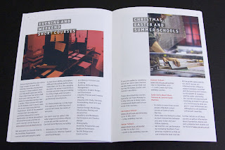
Central St Martins - 2010/2011 Course brochure

Here is a really excellent piece of literature, which I guess we would all hope for and expect as it's for Central St Martins.

There's also one thing in particular which I would like to point out [below]. The job size is 165x240mm which is an economical size to produce from a B1 sheet. It is printed on our StarFine White which is an uncoated with a good bulk but you wouldn't describe it either as toothy or smooth! It has a 4pp cover and only a 24pp text. Potentially this could have posed a problem, because a printed spine was considered important and part of the design brief but by using 130gsm  for the text it gave a 2.5-3.0mm spine width which is about the thinest that you can successfully perfect bind (and it's been very well finished with the 6 point, I think, type on the spine)

Now the thing that I have noticed about this piece and that I want to point out is that the cover is not as heavy as most people (that I speak to) would use - but it really, really works. It is only on 200gsm and the
point is that the relationship between the text and cover is perfect. It just flows and feels perfect in the hand. The cover doesn't feel cheap or insubstantial. Getting the relationship between the text and cover right can make or break the piece of literature -it's crucial - heavy covers do not always give a job a prestigious feel, often it makes a brochure unusable! ...so don't always reach for the 350gsm, just get the relationship right!
This piece is designed by Paulus Dreibholz who runs his studio in London and lectures at CSM and University of Applied Arts in Vienna amongst others.


Print is by Principal Colour.

http://www.csm.arts.ac.uk/
http://www.dreibholz.com/
http://www.principalcolour.co.uk/
Posted by Justin Hobson 23.08.2010