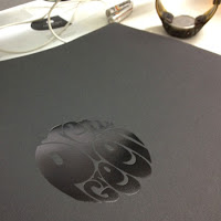
 Now, I've not come across many promotional pieces from printing companies in the past that are coveted, let alone put up for sale! However, a copy of the recently produced photographic book from London print company Push has been put up for auction on e-bay!
This beautifully produced, limited edition book, with photography by Peter Guenzel records the journey of Push's new Heidelberg press from Germany to their factory in London.

BPSfwPZ,j!~~60_14.jpg) Book design is by Studio Thomson. Photography by Peter Guenzel ...and unsurprisingly it's printed by Push on their spanky new press!
Book design is by Studio Thomson. Photography by Peter Guenzel ...and unsurprisingly it's printed by Push on their spanky new press!You can read more about it on the ebay post:
http://www.ebay.co.uk/itm/230752823107?ssPageName=ADME:B:EF:GB:1120
Rw~~60_14.jpg)
I was fortunate enough to receive my own copy, so I won't be joining in the bidding but it'll be interesting to see how much it goes for!
www.studiothomson.com
www.peterguenzel.com
www.push-print.com
Posted by Justin Hobson 28.02.2012


