Friday, 11 January 2013

Edward Green Shoes

Edward Green is a men's shoemakers founded in 1890, when Mr. Green began to make hand-crafted shoes for gentlemen in the traditional shoe making area of Northampton. The company has passed through several owners but remains owned and run by an individual, Hilary Freeman. The shoes are still craftsmen made, in Northampton using the finsest quality calf and each pair of shoes takes several weeks to make!

This is the range brochure which shows the wide range of styles available and is used for promotion to both customers and press.  The size is 155x118mm, portrait and is "singer sewn" in a green thread which matches the Edward Green brand colour. The cover is unprinted, displaying only a beautiful de-boss logo on the front (click on pics to enlarge). It has a 44pp text printed on our Marazion Ultra 135gsm which reproduces the shoes and the detail in the leather, beautifully, whilst still having a matt, tactile feel which relects the tactile nature of the calfskin. Printed in 4 colour process plus PMS 3275C.
This brochure was designed in-house by the Edward Green creative team. Print was handled by Rob Squires at Pureprint, and thanks to Rob for the file copies and the kind note. 
www.edwardgreen.com
www.pureprint.com
Posted by Justin Hobson 11.01.2013

Wednesday, 9 January 2013

Ampers-Fans unite!


On Saturday, there was a very interesting little program on Radio4 about the ampersand, which will appeal to all those with a typographic interest!


Here's the  BBC review :"Journalist Alistair Sooke traces the history of the funny little character that has quietly given joy to so many, from a
bored medieval scribe right the way through to a modern day digital font designer. Delighting type designers throughout the centuries as a chance within a font to create a small piece of art, it is a joyful moment in a functional resource. Speaking to Ampersfans Alastair enters into a world of letterpress, punchcutting and typography and discovers how the ampersand can be found at every step of the way, bringing a joyful flick of a tail to the dullest document. If you thought the ampersand was a bright young thing in the world of type, you couldn't be more wrong; first credited to Marcus Tiro around 63 BC, combing the letters e and t from the Latin word "et". Fighting off competition from his nemesis, the "Tironian Mark", Alastair then tracks the ampersand to 16th Century Paris where it was modelled in the hands of type designer to the King, Claude Garamond, then back across the sea to William Caslon's now famous interpretation, designed with a joyful array of flourishes and swirls. Alastair will discover how the ampersand became a calling card for many typographers, showcasing some of their best and most creative work. A simple twist of the pen, the ampersand has managed to captivate its audience since print began, in Ampersfan Alistair tries to pin down this slippery character down once and for all"

You can click on the "listen again" button and hear it ...but only up until Saturday 12th January, so you'd better hurry! Here's the link:
http://www.bbc.co.uk/programmes/b01gvlfr
Posted by Justin Hobson 09.01.2013

Monday, 7 January 2013

The Guide to Hondaness

This is a really well thought out piece of literature produced by Wieden + Kennedy for Honda. This guide takes the reader through the Honda way of doing things, referencing the company's founder and past president, Soichiro Honda.
The publication is 197x210mm, maling it just slightly Landscape and is section sewn. It has a 4pp cover and 40pp text and is printed on our Avebury Recycled Wove (50% Recycled) 250gsm cover and 170gsm text. Avebury was chosen because it is part recycled, has FSC (Forest Stewardship Council) accreditation and has a lovely tactile feel, due in part to a small amount of rag (cotton) fibres used in it's manufacture.    
There are also a couple of really tricksy bits of print finishing, featuring duplexed text pages so that a lift up flap (bonnet) can be lifted up. Difficult to do, but perfectly executed.
Designed by Wieden + Kennedy in London. Print and the excellent finishing is by Chapter Press, handled by Jonathan Savory.
 
www.honda.co.uk/
Posted by Justin Hobson 07.01.2013

Thursday, 3 January 2013

Jobs from the past - Number 39

Regular followers of this blog will know that my first post of every month is a "job from the past" so that I can show some of the really good work from years gone by and here's one from 2009.

The Breastfeeding Chair
This publication is a research book about the development of a breastfeeding chair suited to the needs of breastfeeding women and their infants. Written by Dr Lynn Jones the book documents the project, from it's beginnings as a PhD research project at the School of Design & Craft, Faculty of Creativity & Culture at Buckinghamshire New University, right up to prototype.

Research by Professor Sally Kendall, along with other professionals, led to the premise that there was something fundamentally wrong with the way that women sit when they breastfeed their babies. Lynn Jones carried out research right up to chair development by Upholstery Trading Ltd in High Wycombe.The chair was awarded Best Product of The Year in 2005 by the BCFA (British Contract Furniture Association) and Parenting Product of The Year in 2006. The design is now registered both in the EU and US and the ongoing development of the chair continues to inform her teaching practice. Dr. Jones has collaborated with industry partners including Ercol Furniture, John Lewis and Vitra.

The book is 234 x 156mm, portrait, 4pp cover and 88pp text, printed in just two colours, black and red on Redeem 100% Recycled, 100gsm. The paper, which is a natural white shade, works particularly well with the mainly typographic design (there are only a few images) - it isn't as harsh on the eye as it would be with a high white paper and suits the subject and design perfectly.
The cover is printed on the colour range from the other "Hull based" paper merchant! (in 270gsm Bright Red) which is hot foil blocked in gloss white foil.
 
The beautifully simple, clear typographic solution is by London based designer, Jo Murray. Print is by Team Impression.   
 
www.bucks.ac.uk
www.upholstery -trading.co.uk
www.jomurray.co.uk
www.team-impression.com
Posted by Justin Hobson 03.01.2013

Friday, 28 December 2012

Studio Cookbook 2

This is the new Studio cookbook2, published by East London Riso printer, Hato Press. Studio cookbook1 was a collection of recipes aimed to inspire social lunches at the workplace and included recipes from åbäke, Alex Bettler, Mind Design, Sara De Bondt studio and many more.

Studio cookbook2 includes recipes from An endless supply, AND Publishing, Art Licks, Goodwin Hartshorn, The Gourmand, Manystuff, Meadham Kirchhoff, Sarah Gottlieb, Fraser Muggeridge studio, Bahbak Hashemi-Nezhad and Sophie Demay  to name but a few!

The book is 236x132mm, portrait. The covers and end papers are cut 20mm short at the head. There are 60pp of text and the binding is "spiral bound" in a dark red plastic spiral. Spiral binding is different from wiro binding. Spiral binding is formed from a continuous length of either plastic or metal and is a finishing method produced by a few specialist binders/finishers. It is an effective binding method which tends to hold things a bit tighter than a wiro.

The book is printed on a mixture of Coriandoli and Flora. The cover is on Coriandoli Blu 250gsm but the text is a mixture of deliberately mixed up shades from Flora and Coriandoli ranges which gives the book a beautifully unstructured feel which works fantastically with the Riso printing. The text is all printed in one colour, although that colour depends on the shade of paper and the recipe - it works really well.
The book is edited and designed by Ken Kirton and thanks to Ken for sending me a copy and a lovely note.
The cookbook costs £12 and although this post comes a bit late to make this a Christmas present, it is a great idea for any upcoming birthdays etc!

www.hatopress.net
http://kenkirton.com
Posted by Justin Hobson 28.12.2012

Monday, 24 December 2012

A Triangular Christmas

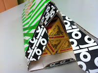
Here at Fenner Paper, we were delighted to receive a GP Tube-Mailer ™ (which is Generation Press's own invention) packed full of Toblerone bars!
Generation Press printed matching sleeves with the correct brand colours to go round the triangular bars of chocolate, honey and almond deliciousness! 
 ...and here's a close up of the GP Tube-Mailer ™, which in many ways is much more convenient and more robust than a postal tube - andthis is an excellent way of showing just how versatile this form of packaging is!
Our thanks to all at Generation Press for their generous, thoughtful and beautifully presented present. It's worth remembering those companies that look after their suppliers and not just their customers, after all any company is only as strong as it's suppliers! 

Happy Christmas!
Posted by Justin Hobson 24.12.2012

Wednesday, 19 December 2012

Heal's Christmas 2012

This is a lovely invitation which makes you feel all Christmasy! This is the invitation to the Heal's Autumn Winter press show and it has all the ingredients of luxury, shades of mulled wine, and velvety feel with a bit of seasonal gold all thrown in!

This beautiful inviatation is A5 (210x297mm) landscape format and is made using our Flockage Colours, Bordeaux 400gsm, hot foil blocked in metallic gold foil. It is triplexed, together with two layers of Colorset Crimson 270gsm, which again is hot foil blocked in gloss white foil and metallic gold.
Design is by London based consultancy The Grid. Creative Director is Johnathan Collins and designer on the project is Matt Crowe. Beautiful foiling and finishing is by Push.
 
Posted by Justin Hobson 19.12.2012