Monday, 8 December 2014

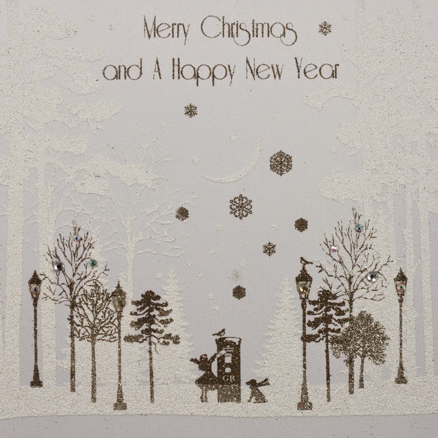
Snowfall Forest

This is the season when many of us our writing our Christmas cards, so what better time than to show you some beautiful cards printed on our paper!

Five Dollar Shake is a passionately British greeting card publisher. Based in Hastings and established in 1998, they design and manufacture all their cards in the UK, including the hand application of the crystals, sequins, bows and trinkets that many of their ranges are renowned for.
This new range of cards is produced on our Stardream Dolomite 285gsm. Stardream is a market leading pearlescent/metallic range which shimmers beautifully and is made by Cordenons in Italy. The size of the cards is 160mm square.
This particular range of cards is printed and flittered. Flitter is a process where glitter is put onto a glued area creating a really sparkly effect.
This range of cards is also an award winning range, having won the 'Best Christmas Counter range' at the recent Henries awards in October. The "Henries" are the awards for the greeting card industry (named after the inventor of the greeting card - Sir Henry Cole) - the greeting card industry equivalent of the D&AD Awards (www.thehenriesawards.co.uk). Five Dollar Shake have won over twenty awards in the last fifteen years.

Here is joint founder Matt Genower collecting the award from comedian Alun Cochrane.
These cards are exquisitely printed an flittered by Abbot who are one of the few specialist printers in the UK who also have flittering equipment. The cards are then hand finished at Five Dollar Shake.
http://www.cordenons.co.uk/
Posted by Justin Hobson 08.12.2014

Friday, 5 December 2014

Brown's Hotel

Brown's Hotel in Albermarle Street in London is a familiar landmark, having opened in 1837. The hotel is steeped in history and has had many famous guests over the years. The building consists of eleven townhouses which are now combined into one elegant structure.
 
This piece of promotional literature is a brochure which strikes the balance between showing the history, while still showing the very contemporary features and facilities at this luxurious hotel.
'metallic on Omnia'
'Plate sunk'
The brochure is 180mm square. It has a 4pp cover and a 28pp text. The cover is printed offset litho in four colour process plus a metallic special in a champagne colour. The board used for the cover is our Omnia 280gsm which has an uncoated look and feel and yet prints superbly but which also prints metallics which actually look metallic! The printed image on the outside front cover (right) is also 'plate sunk' (that's a square de-boss) and this also works well on Omnia as it has a good bulk and compressibility, so embosses/debosses very well.

The text is printed on our Marazion Ultra 150gsm. The Marazion Ultra was chosen mainly because of it's matt flatness which would reproduce the interior images well without a glossiness which would detract from the classic look and feel of the hotel. A simple but effective choice of materials. The spine is about 3mm wide.
Design and art direction is by Saffron in London and the designer on the project is Wendy Roberts. Print production is by Harness Publicity based in Basildon.

https://www.roccofortehotels.com/hotels-and-resorts/browns-hotel/
www.roccofortehotels.com
http://saffron-consultants.com/
http://www.harnesspublicity.com/
Posted by Justin Hobson 05.12.2014

Wednesday, 3 December 2014

St Brides Christmas Lecture - 10th December

The St Brides Annual Christmas lecture is next week and you should think about going!

Brian Webb and Rob Shepherd will be talking about their involvement in the making of the special edition of Under Milk Wood that Sir Peter Blake illustrated to coincide with the Dylan Thomas centenary. The work Blake produced depicting characters and key scenes from the play has been a labour of love as it's taken him just under 30 years to complete – he's created 170 works so far!
© Sir Peter Blake
The artworks were shown in a special exhibition at The National Museum of Wales in Cardiff earlier this year. The Queen Anne Press (once owned by Ian Fleming) has now published various editions of a book showcasing Blake’s work from the exhibition, ranging from a paperback edition priced at £30 and a Fine Binding edition of 10 books priced at £5,500 per copy! The Fine Binding edition is the subject of the talk and you can see the cover design here:
© Sir Peter Blake
Brian Webb is an extremely known designer having been one half of Trickett & Webb and who now runs his own studio Webb & Webb. Rob Shepherd is a book binder, from Shepherds, Sangorski & Sutcliffe, who is responsible for this beautiful fine bound edition.

...and if that weren't enough, there a glass of wine and a mince pie included in the ticket price! Tickets are just £15 (concessions are available). 7pm on 10th December.

You can book (excuse the pun!) here:
http://www.eventbrite.co.uk/e/to-begin-at-the-binding-brian-webb-and-rob-shepherd-tickets-14261156503?aff=es2&rank=9

http://www.queenannepress.com/dylanthomas.html
http://www.sbf.org.uk/
http://www.webbandwebb.co.uk/
http://www.bookbinding.co.uk/
Posted by Justin Hobson 03.12.2014

Tuesday, 2 December 2014

Jobs from the past - Number 62

Regular followers of this blog will know that my first post of every month is a "job from the past" so that I can show some of the really good work from years gone by...

The Wapping Project
Diary - 2001

The Wapping Project was, until recently, an arts project housed in the old Wapping Hydraulic Power Station (built 1890). The building originally housed steam operated boilers to generate electricity in the early days of electrification. The works was decommissioned and mothballed in 1977. The building was converted and reopened by the Womens Playhouse Trust (WPT) which is a charity and under the management of Jules Wright, it was opened as an arts centre in October 2000.

The project included exhibition space in the basement and SHED54, where pieces of original equipment are still in place and a restaurant on the ground floor, called WAPPING FOOD, under head Chef Justin Aubrey.
A folded down broadsheet called 'Wapping Diary' was regularly produced to give the information about events and exhibitions. The size of the broadsheet is 420x712mm, folding down to a 32pp 210x89mm.

It was printed in CMYK plus a special - a metallic silvery blue on one side and one colour (special) reverse. It is printed on our Redeem 100% Recycled 80gsm, which is a neutral white recycled paper with enough industrial feel that really worked well for this project with it's mix of heritage and electricity/neon imagery. A beautifully simple piece of literature which just used all the elements correctly and sets this piece miles away from just a 4 colour leaflet on a bit of silk coated paper!
Below is a close up of the way the metallic has worked on the paper:
This project was designed by Frost in London. Creative director was Vince Frost who now runs Frost in Australia and the designer is Sonya Dyakova, who now runs her own studio in London.

It was printed offset litho by FS Moore in London. Richard Davey handled the project and he is now Sales Director at Leycol.

Sadly the building was sold to developers in 2013 and the project has subsequently closed - a great loss for London and the Wapping area.

http://www.thewappingproject.com/
www.atelierdyakova.com
http://www.frostdesign.com.au/
http://www.mooreprint.co.uk/
http://www.leycol.com/
Posted by Justin Hobson 02.12.2014

Friday, 28 November 2014

UOP Showcase 2014

You may remember that back in the summer I went to New Designers exhibition, where I wrote about one of the students from Portsmouth University (Eric Downer) who was awarded the coveted "New Designer of the Year" title. http://justinsamazingworldatfennerpaper.blogspot.co.uk/2014/07/new-designers-2014.html  I also mentioned that the course showcase publication at the show was printed on our paper and that I would write about it at a later date ...well, here it is!
 
Size is 225x160mm, portrait and is perfect bound. It has a 4pp cover with a 64pp text and has a superb quality and feel about it ...and there a really clever little twist as well!
The covers, which are all printed just one colour - magenta- have been printed on five different colours of our Colorset, 100% Recycled. This is a wonderful 'print design' solution as maximises the impact and the processes used. It looks and feel like you are getting so much more out of a project, but a no extra cost!
All that is required to make this effective, is a design that will work printed in one colour, that can be applied successfully on a range of colours ...and this does just that, beautifully.
The text is printed on our Redeem 100% Recycled 130gsm which is printed beautifully and does great justice to the wide and varied work of the students. Being a neutral white it gives the publication a 'booky' feel which works really well with the imagery.
The catalogue design team is Andy Lethbridge, Ellie Taylor, Ali Bird and Eric Downer and they have done a superb job. The academic team is Sarah Houghton, Andrew Denham, Mike Harkins, Dan McCabe, Estelle Taylor, Alex Tibus.

...and below you can see the striking result of how the different colour covers look, all stacked up at the New Designers show:
Catalogue production and coordination was handled by Sarah Houghton, Course Leader at the University of Portsmouth. Printing is by PPG Print in Portsmouth.

www.port.ac.uk
http://www.ppgprint.co.uk/
Posted by Justin Hobson 28.11.2014

Thursday, 27 November 2014

Notecards from Velvet Olive

This is a lovely box set of esoteric notecards. Very cool, obscure images, complimented by monotone reproduction on a lovely light grey "raw" board, called Anvil. 
The cards are 4pp cards and are 170x120mm. Printed on Anvil SG 350gsm and are blank on the inside, so they are suitable for any occasion! Eight cards in each box ( two of each)
The cards come with a contrasting envelope, manufactured from our Colorset Lemon (100% Recycled), the gummed envelope with a diamond shaped flap is 173x125mm.
The cards are designed by Kathryn Fletcher, who is the founder of Velvet Olive. Kathryn started publishing cards in 2004 and she now supplies to a wide range of shops and boutiques including Paperchase and Waterstones.

The cards are printed by Graphite Creative who are based in St Albans. Graphite, specialise in the production of Greetings cards and have many 'in house' capabilities. These include die-stamping, hot foil blocking, blind embossing, flitter (that's like glitter), film lamination and they can also do film lamination with effects.

Thanks to Kathryn for sending me the selection of cards.

http://www.graphite-creative.co.uk/
Posted by Justin Hobson 27.11.2014

Tuesday, 25 November 2014

The arrival of the Dürer Press in London

This is a particularly fascinating project, which if you have any interest in History, you'll be interested in....

Here's the copy which I have lifted from the Dürer press website:
 No records remain of the machine Johann Gutenberg used to print the first books with moveable type. The question of what this press and other early presses were like has occupied the minds of generations of historians. It can never be definitively answered. The person who has probably come closest to a reasonable reconstruction of a very early press is Alan May, a man who has both the knowledge of a print historian and the technical skills of a craftsman. Alan used these abilities to acclaimed effect in 2008 when a television production company gave him the chance to construct a press to print a facsimile page from Gutenberg’s 42-line Bible of the 1450s. The process of research, design and construction of the press was a key feature of The machine that made us, the resulting documentary presented by Stephen Fry.

Following from the construction of this press and from a well-known sketch of a printing press made, probably from memory, by the artist Albrecht Dürer in 1511, Alan made a number of observations about the way presses probably developed from the very first examples. When the Dürer Press Group commissioned a new working press from Alan in 2014, his insights led to a machine that can either be used as a ‘one-pull’ press, as we believe Gutenberg’s was, or as a ‘two-pull’ press. The two-pull configuration is shown in Dürer’s sketch and gives greater output by allowing two pages of a book to be printed without taking the paper out of the press and putting it back in again. It is probable that older, one-pull, presses were modified in this way to give the printer a considerable boost from a machine that would be costly to replace.
www.duererpress.co.uk
The press, handmade by Alan May in Summer 2014.
The press has been given a home in the print workshop at the St Bride Foundation in London and there was a launch event on Wednesday 12th November. Unfortunately, I was unable to attend, but here are some pictures of the recent installation of the "new press"!
There aren't many printers in London who can claim to have a 500 year old press, let alone a brand new model!

www.duererpress.co.uk
www.sbf.org.uk
Posted by Justin Hobson 24.11.2014