Wednesday, 17 December 2014

What is ...B1 size?

Regular followers of this blog will know that in the middle of the month, I publish a "What is ....? post. The article covers various aspects of paper, printing and finishing in greater depth. However, many of these subjects are complex, so these posts are only intended to be a brief introduction to the topic

What is ...B1 size?
The metric system of sizes which are common in most countries around the world, with the exception of USA and Canada, has been commonplace in the UK since the 1970's. The ISO (International Organization for Standardization) was founded in 1947 and for paper sizes they adopted German DIN (Deutsches Institut für Normung) -  meaning "German institute for standardisation" who established the DIN paper sizes in 1922 .
The whole system of standardisation was so that machinery manufacturers of both printing presses and finishing equipment and suppliers of paper could harmonise production for the benefit of the industry and I think it is fair to say, in comparison with many other industries, it has been a success which, even now, is translating into the new digital/home printing arena.

The premise of the system is to fix the size of finished jobs - being A6, A5, A4, A3 etc. Therefore the system works like this:
===========================================
'A' sizes are intended to be the finished job sizes
'RA' sizes are to allow grip on the printing press, which is then trimmed to give a finished 'A' size
'SRA' sizes allow for both grip and bleed on the printing area, which is then trimmed to give a finished 'A' size
'B' sizes allow for oversize formats (...whatever that means!)
===========================================

Here is a list of ISO 'B' sizes - but remember they are 'theoretical' sizes:
B0 1000 x 1414mm
B1 707 x 1000mm
B2 500 x 707mm
B3 353 x 500mm
B4 250 x 353mm
B5 176 x 250mm
B6 125 x 176mm
B7 88 x 125mm

So why this whole post about what size is B1? Well basically it is because it causes much confusion ...and the reason is that  the B1 size held in stock by paper mills and merchants differ from the 'theoretical' B1 size listed above. I have never come across a mill or merchant in the world who holds a B1 sheet size of 707x1000mm in stock - it simply does not exist!

B1 stock sizes can be 720 x 1020mm,720 x 1010mm, 710x1020mm or 700 x 1000mm — all are regarded as B1 size. This can be confusing and is worth considering if you a specifying a particular paper for a project - especially when considering the finished size.

For example, this Modern House brochure which I wrote about on this blog some time ago, is a finished size of 340x240mm. The Omnia used for the text and cover comes in a sheet size of 720x1020mm but the Colorset, Light Grey 120gsm, which also forms part of the text pages, comes in a size of 700x1000mm. Therefore the finished size of the brochure was dictated by the size of the smaller sheet size. If both sheet sizes had been 720x1020mm, it would have been possible to increase the finished size of the job to 345x245mm.
http://justinsamazingworldatfennerpaper.blogspot.co.uk/2012/03/modern-house.html
To avoid confusion, either check the B1 stock size of the chosen paper or check with the printer what is the largest size possible out of the sheet size available.

...and one more piece of advice: it's not a good idea to refer to B4 or B5 as "finished job sizes" - T he reason being that you are asking someone to produce a finished size from sheets of paper without allowing any room for trim or bleed, so it is impossible to produce a job to that size - not without doing it either at a ridiculous cost or subsequently reducing the size. If you want to maximise the sheet size (which is an excellent idea) then you are best to give the actual dimensions rather than trying to describe it as a B size job. The Modern House job above (340x240mm) could be described as a B4 size job but I wouldn't advise that because someone may look up the theoretical size (250x353mm, as listed above) and use that size and then you wouldn't then be able to produce the job. Hope that makes sense!

With thanks to Justin at Push for clarifying some of the points in this post.

http://www.papersizes.org/
Posted by Justin Hobson 17.12.2014

Thursday, 11 December 2014

THOMASTAIT SS15

This is the invitation to the Thomas Tait preview show for his Spring|Summer 2015 collection held in London this September. This is his first show since last year, when he won the inaugural LVMH Prize for Young Fashion Designers. Thomas Tait is originally from Montreal but now lives and works in London and graduated from the Central Saint Martins Womenswear MA course four years ago.

For his new show, he has collaborated with Paris based visual artist Georges Rousse, who uses derelict buildings as his medium and paints on walls. Working with the artist, Thomas Tait has transformed his show into a living art space and this is reflected in this beautifully produced invitation.
The invitation itself is actually a 12pp loose bound (no binding) production. Size is 270 x 180mm and is printed on our Omnia 200gsm ...and it looks and feels just beautiful. It perfectly shows the images of the derelict spaces - lots of detail and excellent reproduction and great solids - no patchiness or mottle. It is totally in sympathy with the rough concrete interiors - tactile and engaging.
Centre spread.
The images above and below show how it is unbound and how well it works - it holds together beautifully ...and that is because it is the correct choice of weight of material - Omnia is very bulky and 200gsm works perfectly. If it were on the 280 or 320gsm it would be far too 'clunky' and would not hold itself together as a single piece of literature.
Below image showing the outside back cover where the event details are printed on the solid yellow.
You can read more about the event and collection here:

Field Projects, a London based studio, is responsible for the superb art direction and design. Creative Director on the project is Tom Watt. Unfortunately I don't know who the photographer is because they also deserve a credit!

Print production is by FE Burman, who are based is south London and they have made an excellent job printing on the Omnia.

Posted by Justin Hobson 11.12.2014

Monday, 8 December 2014

Snowfall Forest

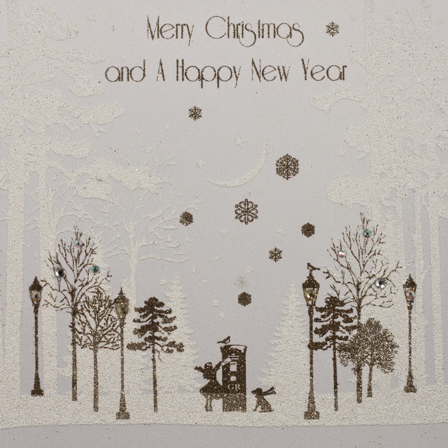
This is the season when many of us our writing our Christmas cards, so what better time than to show you some beautiful cards printed on our paper!

Five Dollar Shake is a passionately British greeting card publisher. Based in Hastings and established in 1998, they design and manufacture all their cards in the UK, including the hand application of the crystals, sequins, bows and trinkets that many of their ranges are renowned for.
This new range of cards is produced on our Stardream Dolomite 285gsm. Stardream is a market leading pearlescent/metallic range which shimmers beautifully and is made by Cordenons in Italy. The size of the cards is 160mm square.
This particular range of cards is printed and flittered. Flitter is a process where glitter is put onto a glued area creating a really sparkly effect.
This range of cards is also an award winning range, having won the 'Best Christmas Counter range' at the recent Henries awards in October. The "Henries" are the awards for the greeting card industry (named after the inventor of the greeting card - Sir Henry Cole) - the greeting card industry equivalent of the D&AD Awards (www.thehenriesawards.co.uk). Five Dollar Shake have won over twenty awards in the last fifteen years.

Here is joint founder Matt Genower collecting the award from comedian Alun Cochrane.
These cards are exquisitely printed an flittered by Abbot who are one of the few specialist printers in the UK who also have flittering equipment. The cards are then hand finished at Five Dollar Shake.
http://www.cordenons.co.uk/
Posted by Justin Hobson 08.12.2014

Friday, 5 December 2014

Brown's Hotel

Brown's Hotel in Albermarle Street in London is a familiar landmark, having opened in 1837. The hotel is steeped in history and has had many famous guests over the years. The building consists of eleven townhouses which are now combined into one elegant structure.
 
This piece of promotional literature is a brochure which strikes the balance between showing the history, while still showing the very contemporary features and facilities at this luxurious hotel.
'metallic on Omnia'
'Plate sunk'
The brochure is 180mm square. It has a 4pp cover and a 28pp text. The cover is printed offset litho in four colour process plus a metallic special in a champagne colour. The board used for the cover is our Omnia 280gsm which has an uncoated look and feel and yet prints superbly but which also prints metallics which actually look metallic! The printed image on the outside front cover (right) is also 'plate sunk' (that's a square de-boss) and this also works well on Omnia as it has a good bulk and compressibility, so embosses/debosses very well.

The text is printed on our Marazion Ultra 150gsm. The Marazion Ultra was chosen mainly because of it's matt flatness which would reproduce the interior images well without a glossiness which would detract from the classic look and feel of the hotel. A simple but effective choice of materials. The spine is about 3mm wide.
Design and art direction is by Saffron in London and the designer on the project is Wendy Roberts. Print production is by Harness Publicity based in Basildon.

https://www.roccofortehotels.com/hotels-and-resorts/browns-hotel/
www.roccofortehotels.com
http://saffron-consultants.com/
http://www.harnesspublicity.com/
Posted by Justin Hobson 05.12.2014

Wednesday, 3 December 2014

St Brides Christmas Lecture - 10th December

The St Brides Annual Christmas lecture is next week and you should think about going!

Brian Webb and Rob Shepherd will be talking about their involvement in the making of the special edition of Under Milk Wood that Sir Peter Blake illustrated to coincide with the Dylan Thomas centenary. The work Blake produced depicting characters and key scenes from the play has been a labour of love as it's taken him just under 30 years to complete – he's created 170 works so far!
© Sir Peter Blake
The artworks were shown in a special exhibition at The National Museum of Wales in Cardiff earlier this year. The Queen Anne Press (once owned by Ian Fleming) has now published various editions of a book showcasing Blake’s work from the exhibition, ranging from a paperback edition priced at £30 and a Fine Binding edition of 10 books priced at £5,500 per copy! The Fine Binding edition is the subject of the talk and you can see the cover design here:
© Sir Peter Blake
Brian Webb is an extremely known designer having been one half of Trickett & Webb and who now runs his own studio Webb & Webb. Rob Shepherd is a book binder, from Shepherds, Sangorski & Sutcliffe, who is responsible for this beautiful fine bound edition.

...and if that weren't enough, there a glass of wine and a mince pie included in the ticket price! Tickets are just £15 (concessions are available). 7pm on 10th December.

You can book (excuse the pun!) here:
http://www.eventbrite.co.uk/e/to-begin-at-the-binding-brian-webb-and-rob-shepherd-tickets-14261156503?aff=es2&rank=9

http://www.queenannepress.com/dylanthomas.html
http://www.sbf.org.uk/
http://www.webbandwebb.co.uk/
http://www.bookbinding.co.uk/
Posted by Justin Hobson 03.12.2014

Tuesday, 2 December 2014

Jobs from the past - Number 62

Regular followers of this blog will know that my first post of every month is a "job from the past" so that I can show some of the really good work from years gone by...

The Wapping Project
Diary - 2001

The Wapping Project was, until recently, an arts project housed in the old Wapping Hydraulic Power Station (built 1890). The building originally housed steam operated boilers to generate electricity in the early days of electrification. The works was decommissioned and mothballed in 1977. The building was converted and reopened by the Womens Playhouse Trust (WPT) which is a charity and under the management of Jules Wright, it was opened as an arts centre in October 2000.

The project included exhibition space in the basement and SHED54, where pieces of original equipment are still in place and a restaurant on the ground floor, called WAPPING FOOD, under head Chef Justin Aubrey.
A folded down broadsheet called 'Wapping Diary' was regularly produced to give the information about events and exhibitions. The size of the broadsheet is 420x712mm, folding down to a 32pp 210x89mm.

It was printed in CMYK plus a special - a metallic silvery blue on one side and one colour (special) reverse. It is printed on our Redeem 100% Recycled 80gsm, which is a neutral white recycled paper with enough industrial feel that really worked well for this project with it's mix of heritage and electricity/neon imagery. A beautifully simple piece of literature which just used all the elements correctly and sets this piece miles away from just a 4 colour leaflet on a bit of silk coated paper!
Below is a close up of the way the metallic has worked on the paper:
This project was designed by Frost in London. Creative director was Vince Frost who now runs Frost in Australia and the designer is Sonya Dyakova, who now runs her own studio in London.

It was printed offset litho by FS Moore in London. Richard Davey handled the project and he is now Sales Director at Leycol.

Sadly the building was sold to developers in 2013 and the project has subsequently closed - a great loss for London and the Wapping area.

http://www.thewappingproject.com/
www.atelierdyakova.com
http://www.frostdesign.com.au/
http://www.mooreprint.co.uk/
http://www.leycol.com/
Posted by Justin Hobson 02.12.2014

Friday, 28 November 2014

UOP Showcase 2014

You may remember that back in the summer I went to New Designers exhibition, where I wrote about one of the students from Portsmouth University (Eric Downer) who was awarded the coveted "New Designer of the Year" title. http://justinsamazingworldatfennerpaper.blogspot.co.uk/2014/07/new-designers-2014.html  I also mentioned that the course showcase publication at the show was printed on our paper and that I would write about it at a later date ...well, here it is!
 
Size is 225x160mm, portrait and is perfect bound. It has a 4pp cover with a 64pp text and has a superb quality and feel about it ...and there a really clever little twist as well!
The covers, which are all printed just one colour - magenta- have been printed on five different colours of our Colorset, 100% Recycled. This is a wonderful 'print design' solution as maximises the impact and the processes used. It looks and feel like you are getting so much more out of a project, but a no extra cost!
All that is required to make this effective, is a design that will work printed in one colour, that can be applied successfully on a range of colours ...and this does just that, beautifully.
The text is printed on our Redeem 100% Recycled 130gsm which is printed beautifully and does great justice to the wide and varied work of the students. Being a neutral white it gives the publication a 'booky' feel which works really well with the imagery.
The catalogue design team is Andy Lethbridge, Ellie Taylor, Ali Bird and Eric Downer and they have done a superb job. The academic team is Sarah Houghton, Andrew Denham, Mike Harkins, Dan McCabe, Estelle Taylor, Alex Tibus.

...and below you can see the striking result of how the different colour covers look, all stacked up at the New Designers show:
Catalogue production and coordination was handled by Sarah Houghton, Course Leader at the University of Portsmouth. Printing is by PPG Print in Portsmouth.

www.port.ac.uk
http://www.ppgprint.co.uk/
Posted by Justin Hobson 28.11.2014