Wednesday, 20 May 2015

St Bride Foundation Wayzgoose

On Sunday I had a table at the St Bride Foundation WAYZGOOSE. This is a term (unfamiliar to most people) that used to refer to an annual holiday in a printworks and was often an awayday to the coast or some other sort of day out, more often than not, paid for by the firm. In this instance the St Bride's Wayzgoose was a kind of letterpress 'bring a buy' sale.
Over twenty different tables displaying and selling everything from lead type to tabletop presses and printed examples of work.
Here is the table that I was allocated, where I adopted a "throw it all on the table" approach! I took lots of offcuts and discontinued paper and board items. All paper, cards and envelopes were sold by weight - 20 pence per 100 grams.


...and I raised £125, donated to the St Bride Foundation.

My neighbours on the table opposite was Caslon. Many readers will be familiar with the typeface, Caslon, first cast by William Caslon in the 16th century. The firm is still run by the Caslon family and there were three generations represented at St Brides on Sunday, pictured below. Today, they supply machinery, inks, powders and the ever popular Adana printing press.
Three generations of the Caslon family. http://www.caslon.co.uk/
My thanks to Mick Clayton for inviting me and to all the staff and friends of St Brides.
 
...and I mustn't forget to thank Zillah Curtis at St Brides, who has recently taken up wood engraving. Zillah created this beautiful commemorative Wayzgoose, goose, which she printed on Shiro Alga Carta and kindly presented it to me on Sunday. Thank you Zillah.
If you missed out this year, make a note in your diary for next May, as it is sure to become an annual event.
Posted by Justin Hobson 20.05.2015

Monday, 18 May 2015

What is ...Chlorine Free?

What is ...Number 17
Regular followers of this blog will know that in the middle of the month, I publish a "What is ....? post. The article covers various aspects of paper, printing and finishing in greater depth. However, many of these subjects are complex, so these posts are only intended to be a brief introduction to the topic.
What is ...Chlorine Free?
Shortly after I became a paper merchant in the mid to late 1980's, alarming reports that the chlorine chemicals used in the bleaching of pulp were causing cancer causing dioxins were widely talked about and made international news. Greenpeace launched a campaign against Chlorine bleaching in pulp producing companies and they carried out research and lobbied manufacturers, culminating in the Greenpeace guide to paper published in January 1990. I went and bought a copy, which I still have and it continues to make interesting reading.
As I understand things, it was only in the mid 1980's when scientific machinery was developed that could detect the miniscule amounts of dioxins that are highly toxic and carcinogenic. These dioxins are not present in the finished paper, they appear in discharges from pulp mills with emissions of Adsorbable Organic Halogens (measured as AOX) within the effluent being measured in kg per tonne of pulp produced. The Greenpeace initiative was undoubtedly one of the most successful environmental programmes (possibly ever) as under this pressure, the pulp and paper industry turned it's processes around and greatly eliminated the use of chlorine in just a few years.
 
By the early 1990's several European pulp mills had invested in 'Chlorine Free' pulp production. The predominant (and environmentally worse) type of bleaching used Chlorine Gas and this was the bleaching method that needed to be eradicated. Replacing this method are two processes:
 
Elemental Chlorine Free (ECF): A less harmful bleaching method using Chlorine Dioxide (no Chlorine gas) which produces much lower levels of organochlorines.
 
Totally Chlorine Free (TCF): The Oxygen bleaching process uses no Chlorine or Chlorine containing chemicals.
 
One of the pioneers of TCF pulp is a company called Sodra Cell. They were an early investor in the Oxygen bleaching technology and very cleverly marketed their pulp, called Z pulp, not only to paper manufacturers but to paper merchants, designers and large end users and corporates. Z pulp stands for 'Zero Pulp' as it contains zero chlorine.
 
They even produced a guide to TCF papers which listed the grades and brands of papers manufactured using Z pulp.
Sodra broke the ground in TCF papers and although Z pulp is not a branded product anymore, they are still a large producer of TCF pulp. http://www.sodra.com/en/pulp/

I've noticed that in recent years a new acronym PCF has been referred to and it has come over from North America.  PCF stands for Processed Chlorine Free. The term is used to describe papers made using some portion of recycled content (minimum 30%) which meets EPA (Environmental Protection Agency) guidelines. An important point is that PCF papers have not been re-bleached with chlorine containing compounds, but it is unknown if the recycled content was bleached with chlorine or chlorine compounds. You can read more here: www.chlorinefreeproducts.org

As far as I am aware, there are no PCF accredited products available in Europe.

If you are interested in this subject, there's a great book titled: 'Paper Trails - From Trees to Trash, the true cost of paper' by Mandy Haggith. This not only covers forestry but also the bleaching angle.
http://www.amazon.co.uk/Paper-Trails-From-Trees-Trash/dp/0753513293


Posted by Justin Hobson 18.05.2015

Thursday, 14 May 2015

Rocco Forte Hotels Brochure

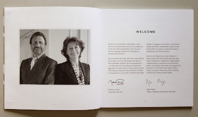
Rocco Forte Hotels is a collection of very individual hotels. They combine landmark, city hotels with a resort destination in the wilds of Sicily. This promotional brochure encompasses all the hotels in the small group describing the style and individuality of these contemporary, luxurious hotels.
The brochure is 180mm square with a 4pp cover & 40pp text and is perfect bound. The cover is printed offset litho in four colour process plus a metallic special in a champagne gold shade. The board used for the cover is our Omnia 280gsm which has an uncoated look and feel and yet prints superbly but which also prints metallics which actually look metallic! The printed image on the outside front cover (below) is also 'plate sunk' (that's a square de-boss) and this also works well on Omnia as it has excellent bulk and compressibility, so embosses/debosses very well.
Plate sinking on outside front cover

Click on images to enlarge
The text is printed on our Marazion Ultra 150gsm, chosen mainly because of it's matt flatness which would reproduce the interior images well without a glossiness which would detract from the classic look and feel of the hotel. The paper also works well with the cool flat matt shades laid down as tints out of CMYK.
The below image show how the four colour image and the subtle tint colours work on every other spread. Nice and even ...and very matt.
 A simple but effective choice of materials. The spine is approximately 4mm.
Design and art direction is by Saffron in London and the designer on the project is Wendy Roberts. Print production is by Harness Publicity based in Basildon.

www.roccofortehotels.com
http://saffron-consultants.com/
http://www.harnesspublicity.com/
Posted by Justin Hobson 14.05.2015

Tuesday, 12 May 2015

Wayzgoose

Why not come along...
It's this Sunday and I'll be there!
http://www.sbf.org.uk/events/st-bride-fundraising-wayzgoose
Posted by Justin Hobson 12.05.2015

Friday, 8 May 2015

RESOLVE

This book is a photographic study by Edward Barber with an essay by Danielle Inga. The introduction perfectly sums up the content of the publication: "Resolve: An intimate survey of work is a photographic study of a wider, burgeoning social movement, acknowledging and celebrating a highly significant yet almost invisible workforce. Individuals are linked through their own personal sense of resolve to persist and remain tenacious in their chosen field. This is not an exhaustive survey but and opportunity to start a dialogue about the nature of work in the twenty first century"
The book contains forty portraits of people working in a diverse range of occupations from Jeweller to textile trader, baker, shoe retailer, medical herbalist etc, The one thing these subjects have in common is that they all work for themselves.

The book is 270x210mm, portrait, and is section sewn. The 96pp text is printed on our Omnia 150gsm and as you can see from the above images, there is lots of colour going down  - loads of ink and it looks great on the Omnia, while still retaining a tactile uncoated look and feel.

Introduction and the essay
This 'limpbound' book has a cover on Colorset Flint 350gsm, which is hot foil blocked in black gloss foil. Below you can see the front cover of the book sitting inside the 'book-jacket' which is also printed on Omnia 150gsm
Inside the cover, there is a 2pp 'tipped-in' flysheet on our Colorset 120gsm and which is completely unprinted. This is a really cost effective way to increase production values and very little cost. By including a sheet like this in the publication, it reinforces value but because it isn't being printed or processed in any way, the only cost is the paper, no overs involved or the cost of printing.
Images showing 2pp unprinted flysheet which appears both at the front and the back.
The below image shows the 12mm spine and the way that the book-jacket wraps snuggly around the section sewn binding.
Ed Barber is a photographic artist, specialising in images of people and their relationship to space and environment. He is best known for his portraiture, through major projects such as Peace Moves, All Dressed Up, In the City. He is one of the few photographers to have their work displayed and in the collection of the National Portrait Gallery.

Design is by SampsonMay with the typography by Liam Weyell.

ALSO today (election day)  is particular apt day to be posting this project. Ed's response to the General Election countdown was to post an image every day on Visual Athletics Club - for the last 100 days http://visualathleticsclub.blogspot.co.uk/

Printing, including the hot foil blocking on the cover, is by Ambrose Press. Jonathan Savory handled the project. Particular care has been taken over the repro - as with all projects for photographers, there is detail in the images which can only be appreciated by the photographer and it is the skill of the printer to be able to listen and interpret these comments in the finished printed job. Not always easy to do but this is a beautiful piece of printed literature.

http://edwardbarber.net/
http://concreteed.blogspot.co.uk/
http://www.sampsonmay.com/
http://www.ambrosepress.co.uk/
Posted by Justin Hobson 08.05.2015

Wednesday, 6 May 2015

Wunderkammer


This is the cocktail and food menu for the brilliantly named Wunderkammer, which is a concept bistro in the Renaissance Wien Hotel in Vienna.

This modern European bistro is restaurant, bar & lounge, regularly featuring a DJ. There's a culinary offering of international cuisine, a Sunday brunch and a classic bar offering signature cocktails.

The menu covers are produced on Stardream Lapislazuli 285gsm. The finished size 230x153 mm and they are made up as an 8pp, with the flap on the inside front cover being stuck down, increasing rigidity, and a pocket being formed on the inside back cover to allow the text booklet to be inserted and held in place. The covers are simply hot foil blocked in metallic gold foil, which looks great.
Art direction is by Scott Wittman of the Gorgeous Group who are based in London. Designer on the project is Maartje Smolders.

Print production was done locally in the region by Scholz Druck & Verlag GmbH in Bremen www.scholz-bremen.de
This is an excellent example of a project where a material has been chosen which has been used to great effect with minimal print and processing. Having said that, it is important to stress that what has been done, hot foiling and creasing, has been completed to a very high standard, otherwise a production like this would not look and feel so special.

http://www.marriott.co.uk/hotels/travel/viehw-renaissance-wien-hotel/
http://www.gorgeousgroup.com/
http://www.cordenons.co.uk/
http://www.scholz-bremen.de/de/
Posted by Justin Hobson 06.05.2015

Friday, 1 May 2015

Jobs from the past - Number 67

Regular followers of this blog will know that my first post of every month is a "job from the past" so that I can show some of the really good work from years gone by...

Heart of Glass - November 2002
This is the private view invitation for an exhibition at the Crafts Council Gallery in London. The invitation is the the opening of an exhibition titled Heart of Glass, featuring work of the artists Jean-Michel Othoniel, Tony Oursler, Katy Schimert, Kiki Smith, Jan Vercruysse, Not Vital and Robin Winters. 
Click on image to enlarge
The size of the invitation is A5 (148 x 210mm) Landscape and is silkscreen printed on one side in one colour (red). The viewing apertures are die-cut, providing eyeholes to look through which is really effective.
The invite is printed on our Kemikal, Cotton White 1500mics which is a natural feeling, neutral white thick board - 1.5mm thick. so it gives great thickness, although it isn't as dense as other thick material that we do such as Monoblack. As you can see from the image below, the thickness makes this invitation work fantastically.
Design is by Andrew Collier, who works freelance in London.

As I recall the silkscreen printing was produced by Artomatic, who also ran a print boutique in Great Sutton Street EC1. Sadly they are no loger in existence. I wrote about Artomatic on this previous post here: http://justinsamazingworldatfennerpaper.blogspot.co.uk/2009/07/job-from-past.html

http://www.craftscouncil.org.uk/
Posted by Justin Hobson 01.05.2015