Tuesday, 11 August 2015

Cranbrook Prospectus

Cranbrook is unique school in the state sector, as the only state grammar school in the country that is 13+, co-educational and caters for both day and boarding students. Situated in the village of Cranbrook in Kent, the school is a highly regarded are desirable school in the local area. This outstanding school prospectus is worthy of one of the top schools in the country.

The format is a combination of a folder and saddle stitched brochure which work hand in glove.
The 4pp folder has a 75mm glued pocket on the inside back cover. The folder is produced on our Colorset Nero 350gsm (100% Recycled) and is printed offset litho in one colour (pantone gold).
The folder (open below) with prospectus in the pocket.
Click on images to enlarge
Size of the prospectus is A4, portrait with a 4pp cover which is cut short on both front and back. The cover is printed on our Colorset Crimson 270gsm (100% Recycled) and is printed offset litho in one colour (pantone gold) and hot foil blocked in metallic gold foil
 The crisp hot foil blocking 'lifts' the quality of the whole production without in any way looking 'bling' which, when overused, gold foil blocking can do. The combination of the print and foil is perfect.
The 20pp text is printed offset litho in CMYK on our StarFine White 150gsm. StarFine is a quality, uncoated paper and as the images show, the reproduction is excellent - great detail for an uncoated paper, colours are bright and vivid.
You can read more about the project here:http://www.wearetangerine.co.uk/project/cranbrook-school/
Another thing worth pointing out is the neat parallel creases on the folder. It's this sort of attention to detail that makes all the difference to literature such as this....
Branding and literature design is by Maidstone based consultancy We are Tangerine. Design director on the project is Claire Hobbs. The printing is by Paddock Wood based printer Typecast Colour.

http://www.typecast.co.uk/
Posted by Justin Hobson 11.08.2015

Thursday, 6 August 2015

De La Warr Pavilion is 80

Recently the De La Warr Pavilion partnered ISTD for the International Typographic Awards – and Ivan Chermayeff was made an Honorary Fellow of ISTD. Chermayeff, the son of Serge Chermayeff, one of the Pavillion’s original architects was asked whether he would be willing to design a logo to mark the iconic building’s 80th year.

...and here is the end result:
‘The goal is always to make something simple and memorable,’ comments Chermayeff, ‘you must be as clear and direct as possible.’ With this ethos, of his new symbol for the Pavilion's anniversary he says, ‘Not many numbers have three circles. Eighty has them – two on top of each other and one alone next door’.

Ivan Chermayeff is one of the most significant American graphic designers of the past 50 years. It is a real coup for DLWP to have a logo designed by Chermayeff who, with his partners Geismar and Haviv, has created some of the most enduring and iconic corporate symbols such as Mobil and Chase Manhattan Bank, along with many other instantly recognizable hallmarks of design.

Clare Playne FISTD and the team at Playne Design were commissioned to implement the 80th anniversary identity. Clare says that adding ‘De La Warr Pavilion’ in different lock-up combinations keeps the targeted years in alignment, and gives immediate recognition of what the symbol represents. Interestingly, the circles also reference the structure of the Pavilion’s two main staircases and echo the iconic Auditorium ceiling.
Fast outdoing major city venues in showcasing design, recent shows include Chermayeff's recent ‘Cut and Paste’ exhibition, two consecutive ISTD typography exhibitions and the Ladybird by Design exhibition, earlier this year. The DLWP is filling a much felt void in exhibiting graphic design.

You can read more about the DLWP 80th here:
http://www.dlwp.com/80th-anniversary/

...and this is the article I wrote about the ISTD awards:
http://justinsamazingworldatfennerpaper.blogspot.co.uk/2014/10/istd-awards-2014.html

Just one more thing to add. Organisations like the ISTD and the De La Warr Pavilion can only survive if they are supported and yes, that means money. It is so important that we retain industry and cultural organisations such as the DLWP and ISTD and we must take every opportunity to try and encourage membership, thus ensuring their continued viability. If you aren't a member or a friend, look into it and think about supporting.
www.dlwp.com
http://www.ivanchermayeff.com/
www.playnedesign.co.uk
www.istd.org.uk
Posted by Justin Hobson 06.08.2015

Tuesday, 4 August 2015

Jobs from the past - Number 70

Regular followers of this blog will know that my first post of every month is a "job from the past" so that I can show some of the really good work from years gone by...

Splash of Paint - 1999
"Why not go out on a limb... that’s where the fruit is" is a quotation from Mark Twain and forms the introduction for this excellent piece of print from over fifteen years ago. Splash of Paint are a design consultancy based just outside Reading and this was their promotional brochure produced in 1999.  
Click on images to enlarge
Size is 330x240mm portrait. The brochure is printed on our Neptune Unique SoftWhite and is just a beautiful piece of print. It has a 16pp text on 155gsm and a 6pp cover on 250gsm, but more about that later!
The brochure is three hole sewn but with a difference ...there are two banks of thread, making it six hole sewn in total! The thread is a natural colour.
One of the things that I'm sure you will be able to see from these pictures is just how exceptional the image reproduction is. The retouching is credited as being by Film Creative Services but I can't seem to find them online. The publication is printed offset litho in four colour process and the result is superb, it looks just as fresh and vibrant now as it did back then.
Earlier I mentioned it was a 6pp cover (with a difference). The extra flap is on the inside back cover but it is pasted down, which not only adds extra weight to the cover but allows the die cut tabs to pop out to hold either an A4 letterhead or card. Smart idea!
Below picture shows the exterior shot of the binding:
Design is by Splash of Paint and the creative director is Malcolm Hatton. Print production was by Alex MacLennan who is now a partner at Urban Print Support.

The project was printed  by a west London company called Fernedge, who were an excellent print company in their day. Pippa Redmond (Mustoe) was Managing Director at Fernedge. They ceased trading, having become Image Litho, in around 2003.

This brochure is exceptionally well printed and is still one of the best samples on Neptune Unique SoftWhite that I have in my collection. From my recent contact with Judith Evans at Splash of Paint, they still consider it as one of their favourites as well!

Posted by Justin Hobson 04.08.2015

Thursday, 30 July 2015

The Little Boy Lost

This limited edition publication is one of two publications produced by London based photographer  and artist Christopher Paul Sharpe.
This first book titled The Little Boy Lost (the second book is called Little Boy Found) contains images edited by Lu Bowan, with each of the photographs relating to the theme of ‘lost and found’ ...a very eclectic mix.
Size is 210x148mm (A5), portrait with a 4pp cover printed on Omnia 200gsm and 36pp text printed on Omnia 120gsm. 
Click on images to enlarge
 
The book is digitally printed on an HP Indigo press by Gavin Martin Colournet. Omnia is suitable for use on HP Indigo presses if it has been 'sapphire coated'. The colours are strong and punchy and the whole book has a matt, tactile look and feel, the effect of which is every bit as good as litho.
The book is 'singer sewn' with a white thread which is a perfect little detail that just adds to the overall effect of this beautifully produced little book.
Design is by Studio Thomson and the book has a limited print edition size of 150 copies. Print and finishing is by Gavin Martin Colournet.

http://christopherpaulsharpe.com/
http://www.studiothomson.com/
http://www.gavinmartincolournet.co.uk/
Posted by Justin Hobson 30.07.2015
Tuesday, 28 July 2015

RA Summer Exhibition

For 247 years, the Royal Academy Summer Exhibition has offered a snapshot of contemporary art – and this year’s exhibition is a riot of colour, variety and discovery with over 1,100 works. This year, the exhibition is co-ordinated by Michael Craig-Martin RA – a leading artist of his generation and the teacher who nurtured the talents of Gary Hume, Sarah Lucas and Damien Hirst. This year's choice was made from over 12,000 entries!

The Summer Exhibition is the world’s oldest open-submission exhibition: its earliest exhibitors included the likes of Reynolds, Constable and Turner.

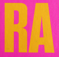
This is the invitation to the private view on the 3rd June. In line with the exhibition's "vibrant summer of colour" theme, it is a very striking and colourful invitation.
Click on images to enlarge
Size is A5 Portrait (210x148mm). As I hope you will be able to tell from the image above, it has a pearlescent effect and this is because it is printed on Stardream Crystal, which is our pearlescent and metallic range ( ...in fact it's the largest pearlescent and metallic range on the market!). What many people don't realise is that printing a solid colour onto a pearlescent board results in the solid having a pearlescent effect - this is because litho inks are transparent.
The invitations are printed offset litho using pantone special colours (three colours) and it really does convey a riot of colour.
The Stardream Crystal 120gsm has been pasted onto a 1500micron mount board which has then been edge coloured in the matching vibrant yellow. The result is superb.
Art direction and design is by Constanza Gaggero, at her London studio Gaggero Works. Print is by Basingstoke based Liquorice Press.

The Summer Exhibition is on at Burlington House in Piccadilly until 16th August.

https://www.royalacademy.org.uk/
http://www.gaggeroworks.co.uk/
http://www.theliquoricepress.co.uk/
Posted by Justin Hobson 28.07.2015

Friday, 24 July 2015

Bamford Haybarn

The Bamford brand is associated with a philosophy of natural ingredients. Having originally started with organic farming, the founder, Lady Bamford, embarked on a range of clothing from only natural fibres and purest bodycare from organic and botanical ingredients together.  Haybarn is the Bamford Spa and treatments brand and they have facilities at Daylesford and a few other exclusive locations.
 
This brochure has been produced by Sinéad Madden for the Bamford Haybarn at the Berkeley health club and spa at the Berkeley Hotel in Knightsbridge.
To convey the natural materials and ingredients used at the spa, the 4pp cover is embossed with a wood grain embossing ( ...printed on a well known text and cover from a Hull based paper merchant!). The brochure is 210mm square. The 64pp text is printed on our Omnia 150gsm, which has reproduced the images beautifully, whilst having that uncoated, tactile feel which the cover conveys.
Click on images to enlarge
There are 16pp of full size pages in the first section and the remaining 48pp appear in seven shorter sections, creating a divider feeling.
Each of the divider pages are printed with different wood grain effects to work with the embossing on the front cover.
The brochure is PUR bound and the overall spine thickness is 7mm.
The publication is printed CMYK, Offset Litho. The Omnia prints superbly and the fleshtones, which are notoriously difficult to reproduce well, look exquisite.
Design and art direction is by Sinéad Madden who runs her studio in London. This is a beautifully designed and luxurious publication. Print is by Pureprint.
 
www.pureprint.com
Posted by Justin Hobson 24.06.2015