Friday, 18 September 2015

What is ...the way to describe Portrait/Landscape?

What is ...Number 21

Regular followers of this blog will know that in the middle of the month, I publish a "What is ....? post. The article covers various aspects of paper, printing and finishing in greater depth. However, many of these subjects are complex, so these posts are only intended to be a brief introduction to the topic.

What is ...the way to describe Portrait/Landscape?
The names Portrait and Landscape are taken from the world of painting and art. Portraits are painted with the short edge at the top and longer edge at the sides. Landscape pictures have an long edge at the top and short edges at the sides
There is a convention in the printing "trade" that the first dimension given determines the depth of a given publication. Therefore 297x210mm indicates an A4 portrait and 210x297mm indicates an A4 landscape.

I am unable to find any reference material that backs this up but it is certainly well entrenched in the psyche of printers. Personally I think it is better to actually state whether the desired format in words rather than relying on a potentially misleading way of doing things - but maybe that just me!
Posted by Justin Hobson 18.09.2015

Wednesday, 16 September 2015

Packaging Innovations 2015

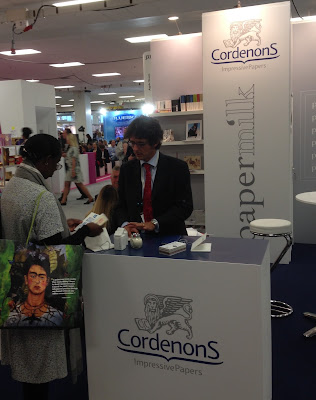
Today I visited the Packaging Innovations exhibition at Olympia. The exhibition also incorporates the Luxury Packaging show and many of the country's leading packaging suppliers are present, together with many suppliers from around the globe.

The show launched in 2010 and Luxury Packaging was introduced in 2013. With over 150 exhibitors at the two-day event it is on today and tomorrow.
http://www.cordenons.co.uk/
There are several paper mills represented at the show, including Cordenons (above) who were showing their new Papermilk range, which is manufactured using a proportion of milk fibres, which produces a luxurious feeling paper.
Last year, the show attracted 4,000 visitors with numbers expected to be far higher this year.
http://www.favini.co.uk/
Favini from Italy (above) were exhibiting a wide range of their products from their Astralux cast coated range to Shiro range of Ecological papers.

If you fancy going, you'll have to be quick! You can register for free on the following link:
http://www.easyfairs.com/events_216/packaging-innovations-london-2015_65089/packaging-innovations-london-2015_65090/
Posted by Justin Hobson 16.09.2015

Tuesday, 15 September 2015

Sign of the Times

Sign of the Times is an exhibition of designs from 100 of the world's great designers held last week at the Protein Gallery in London EC2.
Invitation hot foil blocked in two colours by Gavin Martin Colournet
on Neptune Unique 700gsm
NB:Studio, together with Spring Chicken and Michael Wolff, launched a competition to redesign the famous ‘elderly people’ road sign.
In NB's own words:
The ‘elderly people’ road sign - you probably know the one – it’s a depressing silhouette of a stooping elderly couple with a walking stick.

We feel this sign gives a derogatory and out-of-touch impression of older people that implies both frailty and disability. This has been picked up in recent months by the UK press and we feel it’s high time that the design community responded. So, we asked some of the best designers to create a new warning sign – a new icon – to make it easier for drivers to see that older adults may be crossing. And one that paints a more positive image of Britain’s older community.
 
The private view was held last Thursday evening and it was a very jolly party!
Click on images to enlarge
NB Studio received both serious and playful submissions from designers around the world. You can see all the entries here: http://www.creativecourage.co.uk/sign-of-the-times. The Huffington Post, Metro and The Daily Mail Online have covered the story. The ambition for the project is to lobby the UK’s Department for Transport into changing the sign and to raise further awareness of the issue. Amongst the many playful entries is this knitted road sign from The Partners (below)
Partner at NB:Studio, Alan Dye (below) gave the introduction and spoke eloquently about the project.
...and Michael Wolff was truly inspirational in his appeal to get designers involved and open their eyes to designing for the older generation.
The signs were supplied by Whybrow Wayfinding and they really are terrific. If you would like to own one, you can bid for it on the auction site: http://stores.ebay.co.uk/nbstudioshop with all proceeds raised going to Age UK.

...and you can also vote for your favourite here: http://www.springchicken.co.uk/signofthetimes/

Below is the book, which is printed on our StarFine, printed by Gavin Martin Colournet, which I will write about in a separate post.
It was a pleasure to be involved with the project and my thanks to everyone at NB:Studio and Gavin Martin Colournet, who put a huge amount of time and effort into making this a real success.

http://www.springchicken.co.uk/signofthetimes/
http://www.whybrow.co.uk/
www.nbstudio.co.uk
Posted by Justin Hobson 15.09.2015

Thursday, 10 September 2015

Caught by the River Teifi

Click on images to enlarge
Caught by the River Teifi is this wonderful poster, printed letterpress.
It was designed for a little festival in Cardigan run by fforest, a camp and events company in West Wales and Caught by the River, who organise music based events at lots of festivals and run a lovely website around music, countryside, writing and poetry.
The size is 1000x350mm - which exactly half the B1 sheet size (700x1000mm) cut lengthways. The illustration is by Bristol-based illustrator Jon McNought with words by Ben Myers.

Printed letterpress in three colours and here is the description by Nick Hand: " It was printed on a FAG Swiss proof 40, a letterpress proofing press. Ink hand mixed (until it looked right). The background image is printed in two hits and then the darker image around the boat a third colour and the lettering all printed from wood type printed in two further passes. The illustration printed from zinc blocks."
You can see the colour overprinting colour in the above image. The poster is printed on our Colorset (100% Recycled) Natural 120gsm and it looks just beautiful.

Design and print is by Nick Hand at The Letterpress Collective in Bristol.
 
This Letterpress Collective started a couple of years ago after the last letterpress printer in Bristol quietly closed it's doors. They now have a  Heidelberg Windmill Platen, a Stephenson Blake proofing press, various Adana's together with a collection wood and lead type. Put this all together with a lovely workspace and experienced compositors and printers and you have a thriving environment for creativity - and education, as they run courses as well!
 
Do have a look at their site:
www.theletterpresscollective.org
The Letterpress Collective, Studio 31 Centrespace, 6 Leonard Lane, Bristol BS1 1EA

You can buy these beautiful posters here: http://theletterpresscollective.org/shop
 
www.theletterpresscollective.org
http://www.departmentofsmallworks.co.uk/
Posted by Justin Hobson 10.09.2015 

Monday, 7 September 2015

Studio Nicholson S|S 2015

Studio Nicholson is a contemporary design studio based in London. Creative Director and founder Nick Wakeman is obsessive about beautiful cloth and draws influences from Japanese and Italian culture. The Studio Nicholson brand embodies a total design ethos using refined materials, which is conveyed in this beautifully produced lookbook for the Spring|Summer 2015 collection printed on our Offenbach Bible.

Click on images to enlarge
Size is 240 x 190mm, portrait. It is a 24pp 'self-cover' is printed offset litho in CMYK on our Offenbach Bible 60gsm, the lightweight paper works exquisitely with the images.   
There is a combination of images printed in full colour and images in 'monochrome' but which are also printed out of CMYK.
The above image is the centre spread. This publication is saddle stitched using a white coated wire which is a lovely touch and works well. A nice, well considered finish.
The image below shows a stack of spines with the white wire stitching (staples)
The whole publication is all printed on our Offenbach Bible 60gsm ...and it looks and feels absolutely gorgeous - it flops and folds in a delightful way when handling the publication as I hope these images demonstrate:
Art direction and design is by JJ Marshall Associates. Creative Director is Jethro Marshall.

Excellent print and finishing is by Principal Colour based in Paddock Wood, Kent.
Posted by Justin Hobson .07.09.2015

Friday, 4 September 2015

New Flora swatch

We have a brand new swatch for our Flora range manufactured by Cordenons in Italy!
Click on images to enlarge
Flora is available in nine natural shades and it comes in a sensible range of weights: 100, 130, 240 and 350gsm (160gsm is also available from the mill).
For those not familiar with Flora, it is a part recycled paper (with FSC accreditation) with natural, deliberately visible, inclusions and fibres. It has a tactile, rough feel and has a character all of it's own! Below is detail showing the inclusions (and a pencil for scale!):
It really is a lovely range. Muted natural colours and excellent printability. Here are some previous projects which have used Flora to great effect:
http://justinsamazingworldatfennerpaper.blogspot.co.uk/2015/06/baines-fricker.html
http://justinsamazingworldatfennerpaper.blogspot.co.uk/2014/08/lower-mill-estate.html

If you would like one of the new swatches, just drop me an email: justin@fennerpaper.co.uk

http://www.gruppocordenons.com/en/home.html
http://www.cordenons.co.uk/
Posted by Justin Hobson 04.09.2015

Wednesday, 2 September 2015

Jobs from the past - Number 71

Regular followers of this blog will know that my first post of every month is a "job from the past" so that I can show some of the really good work from years gone by...

The Wapping Project - 2000
The Wapping Project was, until recently, an arts project housed in the old Wapping Hydraulic Power Station (built 1890). The building originally housed steam operated boilers to generate electricity in the early days of electrification. The works was decommissioned and mothballed in 1977. The building was converted and reopened by the Womens Playhouse Trust (WPT) which is a charity and under the management of Jules Wright, it was opened as an arts centre in October 2000.
Click on images to enlarge
The project included exhibition space in the basement and SHED54, where pieces of original equipment were still in place. On 14th October the bar and restaurant WAPPING FOOD was opened, unusually with an all Australian wine list!

This is the promotional concertina folded leaflet, produced to give the information about events and exhibitions. Size is 225x696mm folding down to a finished size of 225x89mm.
Click on images to enlarge
Many readers of this blog may be unfamiliar with the contents of the panel on the left hand page - the 'reply card' or often 'reply paid card' which was the way that people used to get onto a mailing list before the days of the internet and email! (...and well before QR codes!)
It was printed in CMYK plus a special - a metallic antique gold on one side and one colour gold, reverse. It is printed on our Neptune Unique 160gsm, which has reproduced images superbly.

The superb photography is by John Spinks.from East Photographic. Amazing images.
Art direction and design by Frost in London. Creative director was Vince Frost who now runs Frost in Australia and the designer is Sonya Dyakova, who now runs her own studio in London.

It was printed offset litho by FS Moore in London. Richard Davey handled the project and he is now Sales Director at Leycol.

Sadly the building was sold to developers in 2013 and the project has subsequently closed - a great loss for London and the Wapping area.

http://www.thewappingproject.com/
http://www.frostdesign.com.au/
www.atelierdyakova.com
http://east.co/artists/johnspinks/
http://www.mooreprint.co.uk/
http://www.leycol.com/
Posted by Justin Hobson 02.09.2015