Tuesday, 6 October 2015

Kids With Puns #5

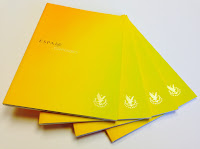
Kids With Puns is a printed publication which celebrates the humble pun. The magazine is a collaboration between illustrators, artists and designers and showcases a variety of wordplay related work. So if you love puns and visual puns in particular, you'll love this publication.


Click on images to enlarge
The size is A5 (210x148mm) portrait and is saddle stitched. It has a 4pp cover on our Colorset Pink Ice 120gsm and 20pp text on StarFine White 115gsm. It is printed in just one colour on a Riso machine. If you don't know about Riso, or Risography, you can read about it on an earlier post I wrote here:http://justinsamazingworldatfennerpaper.blogspot.co.uk/2014/09/what-is-riso-printing.html
Kids with Puns is the brainchild of designer Tom Dunn, who compiles and publishes the publication. It is published at irregular intervals - once he gets enough submissions!

Print is by Hato Press, who are based in East London and they have made a very tidy job of it.
...Thanks to Tom for the file copies and for the card.

Contributors (all links) are here:
Punny Pixels, Leeann Walker, Kieron C, Tiana Tucker, Henry Brown, Masum Khan, Alyssa Duhe, Keegan Steele, Pâté,
Adam Avery You can buy your copy here: http://www.kidswithpuns.com/
http://hatopress.net/
Posted by Justin Hobson 06.10.2015

Friday, 2 October 2015

Jobs from the past - Number 72

Regular followers of this blog will know that my first post of every month is a "job from the past" so that I can show some of the really good work from years gone by...

COS S|S 2007
Swedish label COS was launched with a catwalk show at the Royal Academy in 2007 and has since become a real presence on our high streets and shopping centres. COS (it stands for Collection of Style) is part of the H&M group which is one of the world's largest retail clothing groups. COS has become a go to shop for simple and anonymous clothing, minimal pieces and stylish basics. High on style and quality fabrics. Not for party clothes but a great range of  casually complex clothing at mid-market prices.
This is one of their very first look books produced in the UK and like their clothing, it is simple, very stylish and has great attention to detail lavished on it.
Click on images to enlarge
Size of the publication is A3 (420x297mm) portrait and is a 16pp 'self cover' which is saddle stitched. It has a deliciously floppy and tabloid newspaper feel. It is printed on our Redeem 100% Recycled 80gsm.
Click on images to enlarge
This is one of those projects that is virtually impossible to do justice to on this blog. The print image quality alone has left anyone that I have ever shown this job to, seriously impressed. Given that Redeem 100% recycled is at best, off white and 100% recycled and 80gsm, the reproduction on this paper is superb. The fleshtones are incredibly realistic and rarely have I ever seen such excellent black solids.  It is printed CMYK, offset litho by London based Push.
Lovely touch on the simple cover is the black coloured wire used for the saddle stitching:
As mentioned earlier it flops and folds in the hand beautifully.
Design and Art Direction is by the creative agency Saturday and the creative director on the project was Peter Hughes. Saturday merged with sister agency Wednesday in 2013. Peter Hughes has established his own agency called Assembly, based in Somerset House.

Print is by London based printers Push and is truly superlative.
http://www.push-print.com/
http://assemblylondon.com/
Posted by Justin Hobson 02.10.2015

Wednesday, 30 September 2015

Where is LCBA?

The London Centre for Book Arts (LCBA) is an artist-run, open-access studio based in East London. The studio provides education programmes for the community and access to resources for artists, designers and makers. I visited and wrote about LCBA in 2013: http://justinsamazingworldatfennerpaper.blogspot.co.uk/2013/12/london-centre-for-book-arts-lcba.html

LCBA have produced this superbly simple A6 wayfinding card. Simply produced in one colour both sides and just with a punched hole in the centre, it is amazingly effective.
The simply illustrated reverse, clearly shows their location and the bus routes and closest stations.
Printed on Redeem 100% Recycled 315gsm.

Design and production is by Simon Goode and Ira Yonemura
Posted by Justin Hobson 30.01.2015

Tuesday, 29 September 2015

Live in Denim - Wrangler S|S 2015

This is the season's promotional literature for Wrangler’s new S|S 2015 collection for women. Live in Denim is Wrangler’s new collection for women which incorporates Shape Keeper jeans using Lycra® and dualFX® to create stretch denim and silk soft jeans which achieves it's delicate touch through Cotton-Tencel® denim blends.

This 10pp concertina brochure is 190x135mm, expanding to 190x675mm. It is printed in CMYK offset litho on our Omnia, White FSC 320gsm and is printed and finished beautifully.

Front cover, below:
Birds eye view...
Click on images to enlarge
Although this is a simple publication, it's often the simple jobs which don't get the attention to detail. This is well creased and folded square which is just perfect.

Omnia was chosen because it would work with the rich detail that is present in the images but that would still give a natural look and tactile feel. As you can see from images, some of the photography is quite dark, but there is no loss of detail, which is what can often happen printing on an uncoated paper - fleshtones look superb!
Art direction and design is by JJ Marshall Associates. Creative Director is Jethro Marshall and thanks to Jethro for sending file copies and a note...
Excellent print and finishing is by Principal Colour based in Paddock Wood, Kent.

https://www.wrangler.co.uk/landing/live-in-denim
http://www.wrangler.co.uk/
Posted by Justin Hobson .29.09.2015

Friday, 25 September 2015

ESPA life at Gleneagles


The Gleneagles Hotel is set in 850 acres in the heart of Scotland. Aside from the international reputation as one of the foremost golf resorts, there is a luxurious Spa.  This beautifully produced piece of literature is available for guests to see the treatments offered. The brochure conveys the luxury and subtlety of both the space and the experience.
Click on images to enlarge
Below shows inside front cover spread with hot foil blocked emblem in metallic gold foil on inside front cover
Detail showing hot foil blocked logo:
Size is 210x148mm, portrait and is section sewn. The paper used is our StarFine Natural White 300gsm for the cover and 150gsm for the 40pp text. The uncoated paper is a subtle, neutral, white which perfectly suits the imagery and typography in the publication. The images have reproduced superbly, even with some of the dark interior shots.
The publication is superbly printed offset litho in four colour process plus hot foil blocking on four areas. The spine width is 5mm.
Art direction and design is by London based Burgess Studio. Creative director is Alexis Burgess. Senior designer on the project is Tom Green. Printing is by Glasgow based 21 Colour.

http://www.gleneagles.com/
www.espa.com
http://burgess-studio.co.uk/
http://www.21colour.co.uk/
Posted by Justin Hobson 25.09.2015

Wednesday, 23 September 2015

D&AD President's Lecture - Philippe Starck

Yesterday evening I went to the D&AD presidents lecture to hear eccentric designer, Philippe Starck at Shoreditch Town Hall.

It was billed as follows: "Notes from Elsewhere" will open new windows into the inner workings of this prolific and profound creative ‘supermonkey’, as he challenges us to explore the space between dreams and reality via carefully chosen topics to entertain, inspire and provoke the audience"

Yep, well I reckon he did that OK! He certainly did jump around the many subjects he spoke about and as promised to his wife, hardly swore or mentioned sex at all!
In my opinion, attending events like this is very important. It helps to get other people's perspective and hear what else is going on. At £15 per ticket, it's good value too....
 
Posted by Justin Hobson 23.09.2015

Monday, 21 September 2015

The Marina and Boka Bay

The number of large yachts under construction has more than tripled over the past ten years and few marinas in the world can accommodate superyachts let alone offer onshore provisions and crew services.

Porto Montenegro is being developed as the Mediterranean’s most comprehensive nautical facility for yachts of any size. Currently offering 450 berths for yachts 12-180m, it is planned by completion to offer 850, of which 350 will be specifically for superyachts and complemented by five private residential buildings, totalling 228 apartments.

Mark Read is a photographer with wide ranging talents but who was awarded 'travel photographer of the year' in 2012. He was commissioned by London based branding studio &Smith, to photograph the marina, with the images being used in a large format, almost broadsheet newspaper format.
The size is a large 585x380mm, portrait, which is endorsement folded to 292x380mm.
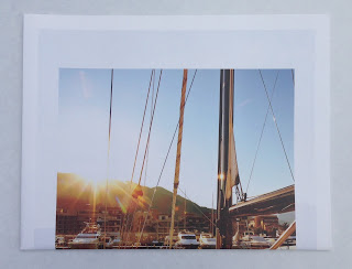
Endorsement folded to 292x380mm
When I received a copy of this publication, I was absolutely bowled over. The location, art direction, quality of the images and print are simply sublime and that's even before I noticed the paper!
Click on images to enlarge
It really is impossible to show the quality of these images and the printed result in this format and you are missing the scale which is huge - the double page spreads you are looking at here are 585x760mm!
The 16pp publication is unbound and is printed on our Shiro Echo, White 80gsm which 100% recycled and FSC accredited. It has a 'nod' to a newsprint material but with amazing image reproduction! Printed in four colour process (CMYK) offset litho, the colours are vibrant, exceptional detail in the highlights and flat even solids. Below is the outside back cover
...and I hope you can see from the detailed image below, just how fab the images are
Click on images to enlarge
Front cover (below) is hot foil blocked in metallic gold foil - exquisite detail.
The Mark Read photographic journal is just one piece of promotional literature which makes us a whole collection of collateral (below) for this exclusive marina.
Art direction and design is by London branding agency &Smith. Creative Directors are Rachel Smith and Dan Bernstein. The truly exceptional repro and print is by Gavin Martin Colournet.

www.portomontenegro.com
www.markreadphotography.co.uk
www.andsmithdesign.com
http://www.gavinmartincolournet.co.uk/
Posted by Justin Hobson 21.09.2015