Wednesday, 16 November 2016

Draw a line

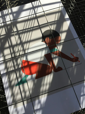
This is a recent collection of prints produced by Harvey Lloyd Screenprint for British graphic artist and illustrator, Adrian Johnson. His work is known for his economical, highly crafted graphic work an his working process all derives from obsessively drawing and re-drawing on paper, breaking down ideas and concepts into their purest form.
Size of the prints is 400x360mm, portrait. They are six-colour screen prints and are printed on our Matrisse 200gsm. Matrisse is a tactile uncoated white board with a high bulk and is perfect for silkscreen work.
You can see and read more about the project here:  http://www.adrianjohnson.co.uk/#/draw-a-line/
Adrian Johnson relentlessly aspires to seek balance between simplicity and sophistication, he is reductionist at heart. In October he gave a talk and workshop at the Apple Store on Regent Street, London about distilling ideas and images through reduction. In his words... "I'll be working with iPad Pro and Apple Pencil to help illustrate how my working process involves taking on board a plethora of information, and how I reduce this information into 'simple yet sophisticated' illustration and graphic art". 
Adrian Johnson's work has been exhibited in London, New York, Los Angeles, and Tokyo. He lives and works in Copenhagen, Denmark.
The prints are produced in an edition of 25 copies. and have been beautifully printed by Harvey Lloyd Screenprint, who are based in Wadhurst, East Sussex.

http://www.adrianjohnson.co.uk/
http://harveylloydscreens.co.uk/
Posted by Justin Hobson 16.11.2016

Monday, 14 November 2016

Cooper Associates

Cooper Associates is an award winning mortgage advisory firm based in the South West. The group also combines Cooper Associates Wealth Management and Cooper Associates Accountants offering accountancy services to clients.

This brochure is for the whole group and was designed by Maidstone based design studio, Project 64.

The size of the brochure is A4 (297x210mm) portrait and is saddle stitched. The cover is striking with the image of a skeleton of a leaf, reproduced by thermography in a subtle off white shade...
...which hopefully you can see in more detail here: 
It is printed on our StarFine White, with a 4pp cover on 350gsm and 8pp text on 150gsm, giving the publication a weighty, quality feel. StarFine is an uncoated paper and as the images show, image reproduction is excellent. The solid blue and photographic images look stunning - a great amount of detail for an uncoated paper, colours are bright and vivid. Printed CMYK, offset litho, throughout.
The below image is the inside back cover - no text, just the image, which conveys a sense of space without information being crammed into every nook and cranny...
Below is a detail showing the "read-over", which is where one page meets another in the spine and I think this is spot on:
Here are two further images showing the striking cover, where the leaf skeleton covers both the front and back cover.
If you would like to read more about Thermography, you can do so here: http://justinsamazingworldatfennerpaper.blogspot.co.uk/2014/02/what-is-number-2.html
Print, including the Thermography, is by Paddock Wood based printer Typecast Colour.

Literature design (and the stationery and Website) is by Kent based consultancy Project 64. Design director on the project is Claire Hobbs.

http://www.cooperassociatesltd.com/
http://www.project64.co.uk/
http://www.typecast.co.uk/
Posted by Justin Hobson 14.11.2016

Friday, 11 November 2016

RE Masters Exhibition - Etching

The Masters is a series of annual exhibitions established by the Royal Society of Painter-Printmakers focusing on a particular branch of printmaking and this year's exhibition, curated by Norman Ackroyd RA RE, is devoted to works that employ any intaglio printmaking techniques. The Royal Society of Painter-Printmakers (RE) was founded as the Society of Painter Etchers and Engravers in 1880. It was established to counter the Royal Academy’s then refusal to recognise printmaking as a creative rather than a merely reproductive art. All Members are elected on merit, based on the quality of their work alone, in a tradition reaching back over a hundred years.
I was pleased to be invited to the opening and private view of the exhibition, on Wednesday evening, at Bankside Gallery (next door to Tate Modern) which is a lovely space and is home to the Royal Watercolour Society.
The exhibition (which is free) runs from 9th -20th  November 2016 and the intaglio printmaking techniques utilised include: etching, aquatint, engraving, drypoint and mezzotint.
...as you can see below, the gallery was packed to capacity to hear Norman Ackroyd's introduction and official opening of the exhibition.
Fenner Paper sponsored one of the prizes awarded on the evening. The prize was awarded to Claire Willberg, a printmaker who is a member of the Slaughterhaus Print Studio in South London. Claire's winning entry titled Sugar Stick s an "etching and chine-collé" which I believe is made using cut out paper and is pictured below:
Claire Willberg and Michelle Avison currently have an exhibition titled Re-Pull at the Stone Space Gallery in Leytonstone.
 
I would thoroughly recommend a visit to the Bankside Gallery to see this amazingly diverse range of work - many works are also available to purchase at very reasonable prices. The exhibition runs from 9th -20th November 2016.

http://www.re-printmakers.com/
http://www.banksidegallery.com/
http://www.clairewillberg.com/
Posted by Justin Hobson 11.11.2016

Wednesday, 9 November 2016

LCC Degree Show Book

The identity for this year's LCC degree shows is by Tara Hanrahan at Think/Do, which includes interior signage, exterior signage, wayfinding and literature. With over 700 graduating students showing a diverse range of work, it is a serious challenge for any identity to encompass the breadth of what is on offer. You can read more about the identity work here:
http://blogs.arts.ac.uk/london-college-of-communication/2016/05/20/interview-tara-hanrahan-on-designing-for-lcc-degree-shows-2016/

The printed collateral includes this information booklet. Size is A5 (210x148mm), portrait and is saddle stitched.
The 4pp cover is on Colorset (100% Recycled) Lemon 270gsm, printed offset litho in black only.
The 8pp text is printed on Crush, Kiwi 120gsm, printed in two colours, black and a special colour.
If you are not aware of our range called CRUSH from Favini, it is very unusual! The paper is made partly using the residue from the industrial processing of crushed citrus fruit, coffee, nuts, olives, kiwi, corn, cherries, lavender and most recently grape. These agro-industrial "end of life" products replace up to 15% of conventional tree pulp and are combined 30% post-consumer recycled waste, FSC virgin fibre and is produced with 100% green energy. As a result, the sheet is not a "clean" paper, it has identifiable pieces of residue visibly in the paper, as you can see below...
The range is available in 100, 120, 200, 250 and 350gsm and the shades are natural, earthy tones and the feel of the paper is natural and tactile. See the range here.

Printing is by Calverts, who are a London based printing cooperative who focus on sustainable printing. Another lovely design and print touch, is the use of the black wire stitches (staples) below:
Sustainability is an important facet to Tara's practice, which accounts for the selection of these sustainable papers and printer. Thanks to Tara for sending file copies (and the note) and also for supplying me with images of the book.
Posted by Justin Hobson 09.11.2016


Monday, 7 November 2016

Ritz Hotel Brochure

Set in London's bustling Piccadilly, the Ritz is one of the most iconic hotels in the world. The hotel, which opened in 1906, boasts ornate rooms with Louis XVI-style decor and antique furnishings. There is a a palatial restaurant, a palm tree-lined courtyard for afternoon tea and a gaming room.

This is the "mini" brochure produced for the hotel and it is one of those projects where it uses paper (in this case the board used for the cover) to increase the quality and feel of the whole project. This is an excellent example of using a material, such as Omnia, for a part of a project which can just lift the whole of a publication and make it feel special.
Click on images to enlarge
Size is 99x210mm, Landscape and is saddle stitched. The cover is printed on Omnia printed only in the solid Ritz blue, together with hot foil blocking in metallic silver foil. The use of the Omnia gives a quality and texture that an ordinary uncoated or coated paper doesn't posses, plus the solid blue prints superbly on the Omnia. The 4pp text is printed on Omnia 320gsm and the 16pp text is on a house silk 200gsm. The image above shows the Omnia printed on the inside front and inside back covers. Detail image below...
Details showing the hot foil blocking on the reverse. Omnia, printed solid blue and foiled - superb.
Design is by the in-house team at The Ritz. Print is by Gavin Martin Colournet.

https://www.theritzlondon.com/
http://www.gavinmartincolournet.co.uk/
Posted by Justin Hobson 07.11.2016

Friday, 4 November 2016

BRANDING - In Five and a Half Steps

Yesterday evening I was lucky enough to be invited to the book launch of Michael Johnson's new book: BRANDING - In Five and a Half Steps.
The launch was at the Johnson Banks studio in Clapham and there were lots of people, drinks and yummy food too.
After an introduction by the commissioning editor at Thames & Hudson, Michael spoke for a short while about the gestation of the book and how a chance meeting with the publisher at Wally Olins memorial, helped everything fall into place.
It was a cracking evening and great to see so many familiar faces from past and present at Johnson Banks, in fact here's the JB 'alumni' shot:
...and of course to keep this somewhat paper related, I should mention that the A5 invitations are printed on our Colorset 100% Recycled board in the brand new Chilli Red shade. The invitations are digitally printed, including the white on an HP Indigo press by Screaming Colour. Printed on Colorset White 270gsm and Chilli Red 270gsm and duplexed ..very nice
Thanks to all at JB for a great evening.

...and don't forget to buy the book, which you can do right here:
https://www.thamesandhudson.com/Branding/9780500518960

http://johnsonbanks.co.uk/
Posted by Justin Hobson 04.11.2016

Wednesday, 2 November 2016

Jobs from the past - Number 85

Regular followers of this blog will know that my first post of every month is a "job from the past" so that I can show some of the really good work from years gone by and here's one from 2003.

CGA Newsletter
The Clerkenwell Green Association was founded in the early 1990's as a registered charity. Situated in two landmark buildings in Clerkenwell, the CGA was established to help creative businesses flourish, provide spaces, workshops and exhibition spaces. Now renamed Craft Central it remains a destination for those involved in craft who want to get somewhere, make something happen and see things differently.

This quarterly newsletter was produced in the early 2000's and is a superb piece of design as it is so much more than a leaflet.
The finished size is 210x100mm folding out to 420xx600mm. Printed in just two colours - black and a special colour. The format and design grid stayed consistent with just the special colour changing each issue. Everything else was printed in black, with all the images being produced as monotone (greyscale) making it a two colour job, which also was economical.
The newsletter is printed on our Redeem 100% Recycled 80gsm, which is a neutral white recycled paper with craft feel that really worked well for this project with it's images of hand crafted makers and textiles. A beautifully simple piece of literature which just used all the elements correctly and is perfectly suited to the audience who appreciated the design and production values.
Click on images to enlarge
A particularly characteristic feature was the timeline giving the information about events and exhibitions ...see detail below
Design was by Johnson Turnbull, a graphic design studio based in the CGA's Pennybank Chambers building. Designers on the project were Chris Turnbull and Steve Johnson. Sadly, I have no record of the printer.

Chris Turnbull still has his design studio and letterpress workshop in Pennybank Chambers and the studio is now called Turnbull Grey.

http://www.craftcentral.org.uk/
http://www.turnbullgrey.co.uk/
Posted by Justin Hobson 02.11.2016