Tuesday, 31 January 2017

Balvac 80th Anniversary

The use of concrete doesn't sound like the most exciting of subjects, but this book is about exactly that and it is a fascinating story.

Established in 1933, Balvac is a leading specialist contractor undertaking repair, strengthening, refurbishment and protection of civil and building structures throughout the UK. Their work includes road and rail bridges, tunnels, highways, marine structures, power stations, water treatment works, multi-storey car parks, residential and commercial buildings, and heritage structures. They are now part of the Balfour Beatty group.
Click on images to enlarge
The size of the publication is 245x180mm, portrait. The cover is printed on our Colorset Light Grey 350gsm, with a 56pp text printed on Omnia 150gsm

Designer on the project is Paul Grogan whilst at Manchester agency Make Complex Simple. The piece is profiled on his website as "a design project to make concrete sexy". Paul goes on to say... "It was a graphic designers dream. All this amazing source material to play with. The only problem was there was just too much to play with. The after wading through countless stories, news clippings and slides, we were finally able to agree a budget and page plan. The stories include the famous Summit tunnel fire in Lancashire, secret bank buildings, and a stolen dogs ear!"

The cover is beautifully blind embossed and it works perfectly with the black binding tape around the spine.
The cover has 135mm wide flaps on the inside front and back covers, which covers up the embossing on the inside. It also gives a "limp bound" publication, such as this, a "bookier" feel.
Below shows detail of the black binding tape around the spine.
The book is organised into spreads which tell a particular story, either of the company
...of a product, this is about Gunite
or of particular projects
Click on images to enlarge

The text is printed offset litho on Omnia, which looks and feels just beautiful. It perfectly shows the images, illustrating the stories - lots of detail and excellent reproduction and great solids - no patchiness or mottle. It is totally in sympathy with the rough concrete interiors - tactile and engaging.
The binding is section sewn and below shows the detail:
The publication is made from just the right weights, it flows in the hand and the pages turn over easily.
Photography is by Claire Wood Photography. Printing and finishing is by Galloways Printers in Poynton. You can read more about this project here:
http://www.thinkdesignagency.co.uk/a-design-project-to-make-concrete-sexy/

Posted by Justin Hobson 31.01.2017

Monday, 30 January 2017

Edward Barber

This morning, I learned that photographer Ed Barber died yesterday. Within a month cancer has claimed him. I've just found out and I feel desolate.
Ed Barber speaking at the IWM, 2016
Ed's work has featured many times on this blog, most recently his Peace Signs exhibition last year at the Imperial War Museum. Ed was passionate about life; he was nonconformist, a liberal, rebellious, a maverick and I would say an iconoclast but he'd not like that word! Ed was thoughtful, kind and fun. He was my friend.

Aside from being a photographer, Ed was a father and husband and my thoughts are with his daughters Nina and Sonya and his wife Danny.

http://edwardbarber.net/
http://concreteed.blogspot.co.uk/
Posted by Justin Hobson 30.01.2017
Updated 21.02.2017
Obituary by Peter Kennard in the British Journal of Photography, .


Wednesday, 25 January 2017

Sumo is in the news...

In the news today, Japan has named its first home-grown Sumo grand champion in almost two decades. Japanese born Sumo wrestler Kisenosato (aged 30) has been promoted to the top-most Yokozuna rank after his win in the first tournament of the year. He is the first Japanese wrestler to achieve this status since 1998. In recent years, foreign wrestlers have come to dominate the sport, so this is an important moment for Sumo and for Japan.
 
Quite coincidentally, we have just launched our latest range, called SUMO!
SUMO is a new range of heavyweight, thick boards from FAVINI (from Italy, not Japan!) The range consists of a whopping 1mm, 1.5mm, 2mm & 3mm ...seriously chunky!
Below is the new swatch:
...and the great thing is that it is available in both Black and White. Ideal for all your heavyweight requirements, such as invitations, business cards, special covers, swing tags etc...
Click on images to enlarge
Hopefully the image below will give you an idea of just how thick it is.
...and below, here's a Biro to give a sense of scale.
All items are available in B1 and we have stock in the UK

It is a seriously thick board, although not as heavy as the 172kgs that the new Sumo champion Kisenosato weighs!

If you would like samples, please drop me an email: Justin@fennerpaper.co.uk

http://www.favini.com/gs/en/fine-papers/sumo/features-applications/
Posted by Justin Hobson 25.01.2017

Friday, 20 January 2017

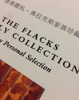
The Flacks Family Collection

On 16 September last year, a selection of 46 lots from the collection of Marcus and Debby Flacks were auctioned at Christie's in New York.

Marcus Flacks is one of the pre-eminent sources for classical Chinese furniture, rare scholar’s objects and contemporary Asian paintings. Among the highlights are an extremely rare pair of 17th century huanghuali and spotted bamboo scholar’s cabinets, perhaps the only known pair in existence.

This is the auction catalogue produced by the Flacks family and Christie's for the sale. Size is 210x268mm, portrait.
The publication has 148pp text pages printed on Neptune Unique SoftWhite 135gsm (a bespoke weight). The cover is printed on Dali Neve 320gsm, with 133mm flaps on the inside front and back covers.
An important feature that makes all the difference to this publication is the binding. It is a square backed limp bound book (spine is 13mm) but the binding type that is used is called OTASTAR. This is a method of bookbinding that offers an elegant binding solution with advantages over conventional soft cover binding. One of the main advantages is that it lays flatter than a conventional section sewn book. It mimics the construction of a case bound book, so the spine of the text is free from the cover (see image below). It is this that results in the text and whole book laying flatter.
The publication is printed in CMYK throughout and the imagery is truly striking. The Neptune Unique SoftWhite used for the text is an uncoated off-white, smooth (yet tactile) text and cover paper - the printed result is simply fantastic.
Click on images to enlarge
Below is the pair of 17th century huanghuali and spotted bamboo scholar’s cabinets. These are possibly the only pair in existence.
Click on images to enlarge
Below is Liu Dan’s Far-off Journey, painted in 2006 for Marcus Flacks.
Click on images to enlarge


The below images show the detail for the inside of the cover, printed in mono, showing the detail of the spotted bamboo.
Below is a detail of the outside front cover printed on Dali which is a felt-marked paper with a linear effect and a natural, tactile feel. The cover is printed CMYK and the title is hot foil blocked in metallic gloss foil. If you click on the image, you will be able to see the texture in the paper and the superb foiling...
Click on images to enlarge
The book is published by Sylph Editions. Design is by Ornan Rotem and production is by Num Stibbe. The superb printing is offset litho by Robstolk in Holland. The printed result on this uncoated substrate is simply superb, which combined with the superlative binding makes this a piece of print that is seriously noteworthy.

www.christies.com
http://www.mdflacks.com/
http://www.sylpheditions.com/
http://www.robstolk.nl/drukwerk/contact/
Posted by Justin Hobson 20.01.2017

Tuesday, 17 January 2017

Bally Women's S|S 2017

Bally was founded by Carl Franz Bally in the mid nineteenth century as a handmade shoemaking business which soon developed into factory production in the Swiss town of Schönenwerd. It is a brand which became internationally renowned with  shops in Montevideo Buenos Aires, Paris and London by the late 19th century.

Bally has extended its offering to include clothing, handbags and leather goods for both men and women and is now a truly global, luxury brand with retail outlets in Japan, Hong Kong, Malaysia, Saudi Arabia, Brazil, Lebanon Singapore, Australia, and Turkey.

This is the latest look-book for the Spring Summer collection 2017.
The size is A4 (297x210mm) portrait and has section sewn binding with a limp cover that is printed on Brossulin Xt 360gsm. The cover is printed four colour process, offset litho, using oxidising inks together with a panel which is hot foil blocked in matt white foil - looks superb! 
Click on images to enlarge
Here is the description about the range from the Bally website: A vision of vibrant style and bold sophistication, clothes and attitude embodying all the carefree joy of a never-ending summer day. Dazzling display of ice cream tones, shiny metals and pops of 60s ultra-colour: flared trousers and satin blouses in pink; a crushed velvet backpack and kabuki platforms in bright fuchsia; a leather shirt and mesh vest in cherry red; a gold metallic shirt and high-ankle espadrilles glistening like sweet wrappers in the light.
Click on images to enlarge
The 52pp text paper is printed on our Marazion Ultra 250gsm. Although this is heavier than many would use for a text paper, it really works giving this whole publication a chunky, thick feel. Marazion Ultra was chosen mainly because of it's matt flatness which would reproduce the interior images well without a glossiness which would detract from the classic look and feel of the products, whilst still reproducing the vibrant colours.

Click on images to enlarge
Detail (below) showing the section sewing. Because of the weight of the text paper (250gsm), it has been section sewn in 8pp sections.
Design is by the in house creative team at Bally. Designer on this project is Laura Goodwin and production was dealt with in-house. Photography is by Paul Wetherell

The superb print and production is by Orchid. Everything about this project is outstanding: printing, binding, hot foil blocking. A truly accomplished piece of design and print.
You can see the online version here: http://www.bally.co.uk/en_gb/lookbooks/ss17-womens-lookbook.html

www.bally.co.uk
www.orchidprint.com
Posted by Justin Hobson 17.01.2017

Thursday, 12 January 2017

D&AD President's Lecture - Simon Mottram


Yesterday evening I went to the D&AD presidents lecture to hear Simon Mottram, founder of the Rapha cycling brand at the Conway Hall in London.

Simon was introduced by D&AD President Bruce Duckworth. Using a mixture of films and images Simon charted the history of the Rapha brand from the early beginnings on his kitchen table, where the brand was placed at the centre of the business, which is quite firmly where it remains today.
Simon is an excellent speaker, clearly as passionate about cycling as the business he founded. His insights into creating a brand, being the brand owner and how he has managed to create a business which has the ethos of the brand in everything they do is a remarkable story. As he said:
"The brand drives everything. Phrases like ‘moments of truth’, ‘alignment’ and ‘engagement’ become more than buzzwords. They become reality".

He is modest enough to say that as much as it has been down to hard work and determination that there was also a fair element of luck and good timing.
He gave us 13 clues about how Rapha works. Looking at this list now, it looks a bit "dry" but when Simon was going through each point they jumped out at you. 
In my capacity as a small supplier to Rapha, I totally get it. The people I have dealt with over the years are totally engaged with the business, which is testament to Simon's point that "If your brand is going to be authentic at every point then it’s vital that you build the brand from the inside out"
There are many businesses that I work with (including design agencies) that have an excellent outward customer facing brand and image ...BUT if you are talking to that business as a supplier, you get treated very differently.

Interestingly, I checked back in my files and I first sent paper samples to Rapha on 12th May 2005 (to Ben Aquilina), which was in the very early days as Rapha only started in 2004! Since then we have supplied Rapha for a number of projects, here are just three for interest:
http://justinsamazingworldatfennerpaper.blogspot.co.uk/2014/07/glory-through-suffering.html
http://justinsamazingworldatfennerpaper.blogspot.co.uk/2010/11/rapha-springsummer-2010.html
http://justinsamazingworldatfennerpaper.blogspot.co.uk/2016/02/rapha-gt-shoes.html

 At a guess, I would think there were probably 300-400 people in the audience. Attending events like this is very important for all of us in the creative industry - it helps to share other people's perspectives and share what else is going on. At £15 per ticket, it's good value too....

I left feeling inspired and invigorated!

You can see the presidents lectures here:
http://shop.dandad.org/events/

Make it a belated new year resolution ...GO to more industry talks!

http://www.rapha.cc/gb/en/
Posted by Justin Hobson 12.01.2017

Tuesday, 10 January 2017

The BenRiach

Located in the ‘Heart of Speyside’, in the North-East region of Morayshire, BenRiach displays all the traditional charm of a Speyside distillery. Built by John Duff in 1898, BenRiach draws its water from the Burnside springs located underground, deep below the distillery.

The BenRiach Distillery Company was named Global Whisky Distiller of the Year at the 2015 Icons of Whisky Awards. A fantastic achievement for a small privately-owned independent company to win this prestigious global award.

This is a the tube packaging for their Single Malt, Batch 1. The tube takes a 70cl bottle of Scotch Whisky and is 292mm tall. The tube outer is printed on our Flora, Avorio 130gsm. It is printed in three special colours, offset litho and hot foil blocked using two color foils, metallic red and antique gold.
Click on images to enlarge
Reverse of tube:
If you aren't familiar with Flora, it is produced with 30% post consumer de-inked waste, together with 60% of virgin FSC pulp and with the "secret" ingredient of 10% of cotton fibres, which gives the paper a wonderful tactile feel. It has a deliberately recycled look and feel with specks and inclusions, so it looks deliberately flecky and specky, as you can see from the detail below:
Click on images to enlarge
Printing and production is by Gavin Watson Printers. Based in a purpose built factory in Glasgow, they have a formidable reputation for wet glue label printing for the packaging industry as well as commercial printing and finished packaging items (such as this example) for the drinks industry.
  
http://www.benriachdistillery.co.uk/
Posted by Justin Hobson 10.01.2017