Thursday, 23 August 2018

Beyond the Great Wave #2

Katsushika Hokusai (1760–1849) is widely regarded as one of Japan’s most famous and influential artists. He produced works of astonishing quality right up until his death at the age of 90. This new exhibition held last Summer at the British Museum covers the period of the last 30 years of Hokusai’s life – a time when he produced some of his most memorable masterpieces. The exhibition was a phenomenal success resulting in most tickets being sold out.

This is one of the private view invitations produced for the launch of the exhibition last May. The invitation is 8pp, A5 portrait and feature Hokusai’s artwork.
This invitation is printed on our Omnia 320gsm, which is a very bulky board with a subtle, natural texture and tactile surface. Reproduction is superb with the all the detail retained in the images. 
The images as reproduced on each of the invitations:

Click on images to enlarge
Below show the invitations laid out flat, front and back
Click on images to enlarge
Below is a birds eye view of the invitation:
Design is by the in-house team at the British Museum, headed by Ann Lumley.

The invitation is printed by Park Lane Press. It is printed offset litho but Park Lane print using a 'waterless' process that eliminates the water or dampening system used in conventional printing. The specialist plates allow the printed dot to be held more securely preventing any unwanted movement of ink and minimising dot gain to create a sharper image in ultra fine definition. They are one of the very few printers who champion the use of this waterless process.
 
Posted by Justin Hobson 23.08.2018

Monday, 20 August 2018

Hello Woolwich!

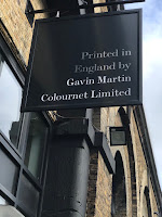
London printer, Gavin Martin Colournet have moved from their East London home in Hackney, south of the river to new premises in Woolwich. Although I just described them as 'new' the printworks is actually in a refurbished Victorian works, which I believe formed part of the old Royal Dockyard in Woolwich. It is a lovely building with period features, so I made a visit to see for myself...
The new pressroom looks great and they've decorated their Heidelberg XL102 printing press with some very lively graphics. Below is a picture of Gary Bird, modelling the new press...
Period features have been lovingly maintained in the refurbishment of the building.
Their 'Printlounge' customer suite has been safely installed and their HP Indigo digital press has much more space than at their previous premises.

A positive move and great to see a London printer staying in London rather than moving out of town.
https://www.gavinmartincolournet.co.uk/
Posted by Justin Hobson 20.08.2018

Thursday, 16 August 2018

Made of Manchester

Two years in the making this 'Made of Manchester' photo book documents more of Manchester from the photographer, Paul Grogan's, perspective. A limited first edition of only 100 copies, the book is beautifully designed by Manchester based branding and web agency Think Design Manchester.

With a foreword by local Celebrity Chef, Andrew Nutter and a contribution from local wordsmith and poet, David Scott who said of the book, “With a rich history that’s been well-documented I thought I had seen Manchester from every angle; and that’s where the charm of Paul’s photography lies. He captures our city with a fresh perspective; through his use of light, shadows and composition you get to see some our most famous landmarks with an unobserved twist; there are also plenty of surprises in how striking he can make Manchester’s deep-seeded urban decay."
Click on images to enlarge
 
Size of the book is 210mm square and is perfect bound. There is a 4pp cover on Omnia White 280gsm with a 96pp text on Omnia, White 150gsm.
The content has some wonderful spreads, with some wonderfully cropped images and a combination of colour and mono images.
Click on images to enlarge
The 96pp text is bulky but the book still flows well with the pages turning easily.
The 96pp text on 150gsm gives the book a 10mm spine
The book is printed and finished by Manchester's own Galloways Print. As it is a limited edition of just 100 copies, it is printed digitally on their Heidelberg Linoprint, which is a toner based digital press and the result is superb. 
Paul Grogan lives and works in the Manchester area, having also graduated from MMU in 1997 - so he is a Mancunian through and through, giving him this unique perspective of the city. You can buy the book here.
 
Posted by Justin Hobson 16.08.2018

Tuesday, 14 August 2018

De La Warr Pavilion Events Guide

This is the latest events guide for the De La Warr Pavilion. The De La Warr pavilion is on the seafront in Bexhill in Sussex and is an iconic modernist building by the architects Erich Mendelsohn and Serge Chermayeff which opened in 1936. Following a major renovation in 2005, the pavilion hosts many shows, exhibitions and cultural events.
The finished size is 210x111mm, folding out to 420x553mm and is a 20pp concertina letter fold (I had to look that up!). Side view....
This guide is printed on our StarFine White 130gsm which means that rather than feeling like the vast majority of mass produced leaflets printed on a bit of 115gsm silk or gloss, this has real character and value. The design is such that the listings of the exhibitions, activities and events are all listed on one side (outside)
...with the inside being reserved for a full size image of the exhibition.
As you can see from the image above, it's very dark but has reproduced superbly on the StarFine 130gsm. The project is printed offset litho in CMYK by Banbury Litho.

The new De La Warr identity and design (including the website) is by Playne Design who have studios in London and Hastings. Creative Director is Clare Playne. Print production is handled by Simon Hack. You can read more about the creation of the new identity here:

https://www.dlwp.com/
http://www.playnedesign.co.uk/
http://www.banburylitho.co.uk/
Posted by Justin Hobson 14.08.2018

Thursday, 9 August 2018

Vive La Vodka!

To create GREY GOOSE vodka, François Thibault maintains an unrivalled level of craftsmanship, using only the very finest ingredients. Its signature smoothness and distinct character are the result of an extraordinary passion for spirit making and an unparalleled commitment to the highest possible quality.

Grey Goose have a list of cocktails that can be made using their Vodka and they also have a range of featured "Holiday Cocktails". and this 8pp menu/recipe card is for the Grey Goose Martini.
The size is 195x105mm portrait and is an 8pp concertina format printed on our Omnia 280gsm. Omnia was chosen because it would work with the rich detail that is present in the images but that would still give a natural look and tactile feel. As you can see from images, the photography is quite dark, but there is no loss of detail, which is what can often happen printing on an uncoated paper. The "Grey Goose Blue" is rich and the solid has printed beautifully. Printed offset litho throughout.
Click on images to enlarge
Omnia 280gsm is a very bulky board with a thickness of over 400microns. As you can see below it creases beautifully and this has been professionally matrix creased.
Birds eye view below:
Creative direction and design is by London based branding agency Ragged Edge.
 
Printing is by Identity, based in Paddock Wood, Kent and they made a superb job of it - colour reproduction and solids are superb.
 
..and if you are over 18 (!) you can watch a video about the Cocktails here: https://www.youtube.com/watch?v=gNR3Gx-a34s
 
Posted by Justin Hobson 09.08.2018

Monday, 6 August 2018

New Astralux Range Swatches

ASTRALUX is the market leading range of cast coated papers and boards produced in Italy by the Favini Crusinallo paper mill. The weight range is 80gsm - 350gsm in white and is also available in 27 shades (including metallics and pearlescents) and we have some beautiful new swatches... 
The swatch is A4, portrait and incorporates both the white and the colour range.
The colours are displayed in a "chip" format which is an ideal format to see selection of shades:
...and there is even a printed sample.
If you would like one of the new swatches, just let me know justin@fennerpaper.co.uk

http://www.favini.co.uk/
Posted by Justin Hobson 06.08.2018

Thursday, 2 August 2018

Jobs from the past - Number 106

Regular followers of this blog will know that my first post of every month is a "job from the past" so that I can show some of the really good work from years gone by and here's one from 2006...

Young Timebank - Students Pack 2006
This is an excellent example of a practical solution to a design problem. Timebank is a national volunteering charity which runs volunteer mentoring projects to tackle complex social issues. The brief for this project was a self contained ring binder to be shaped like a box so it could contain other items, pens pencils and loose papers. It is a student pack to be given to young people so it needed to be hardwearing and practical.
The above image shows the spine, which is hot foil blocked. The below image shows the way that the box file opens...
The above image shows the front of the box. This 'paper over board' folder is printed in two colours offset litho on our Colorset 100% Recycled 120gsm and is hot foil blocked in silver foil. The print result is superb, bright solid colours. The below image shows the back of the binder.
One of the real challenges was to make a "box file" that could still be used for writing in without having to take the sheets of paper out. What I suggested was to turn the normal box file format on it's head by fixing the binding mechanism out of the box, enabling the user to write on the sheets easily whilst still in the mechanism. Effectively it has made the box, the lid.
The closing flap has a hidden magnetic catch
The below image shows with the magnetic flap open
...and the flap closed
Below you can see the way that Colorset has worked excellently as a covering material on the tight returns.
Design is by Spyros Zevelakis. An excellent project which looks as good today as it did 12 years ago!

https://timebank.org.uk/
Posted by Justin Hobson 02.08.2018