Sunday, 24 May 2020

Luzz 3D Puzzle

In these times of self-isolation and lock-down, a group of designers from London has gathered (virtually) and used our Colorset paper to respond creatively and responsibly to the unprecedented situation.

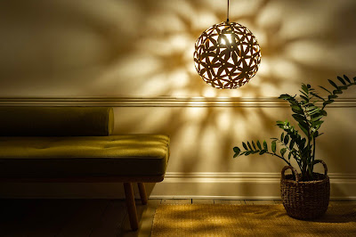
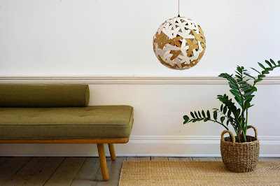
Their first creation is Luzz, a 3D puzzle formed of 100 unique pieces which once assembled, can be used as a lamp.
The design embodies the idea that we are all connected globally, both physically and virtually. With Luzz, the design team aims to promote social responsibility and with every puzzle sold, funds are being raised to support the production of essential PPE face masks for the frontline key workers of the NHS. 
Luzz has been imagined as a relaxing crafting passtime and an invitation to spend time away from our screens. Each of the 100 pieces are numbered and intuitively clip with one other to build the 3D spherical shape.
Click on images to enlarge
Once completed, the lamp measures 400mm in diameter and can shine a beautiful light in one’s home.
Colorset 270gsm has been duplexed to form 540gsm, which is strong enough to create the structure. The puzzle comes in 6 different colour combinations using our Colorset range of shades: Warm White, Hopsack, Deep Blue, Natural, Glacier and Storm.
Click on images to enlarge
The puzzle is laser cut from 10 A3 sheets of the thick, 540gsm card to give longevity and robustness to the lamp. Below are the components cut out of our new Colorset Hopsack...
All components of the puzzle nicely pack flat into an A3 envelope and come with a user friendly instruction guide to aid construction.
You can look (...and buy!) one of these amazing creations here.

The Luzz3D collective has boundless energy and imagination and are already working on developing their next 3D-puzzle-lamp. You can follow their designs at www.luzz3D.com or on social media: @Luzz3Dpuzzle

https://www.luzz3d.com/
www.laserbureau.com
Posted by Justin Hobson 24.05.2020

Thursday, 21 May 2020

StudioThomson portfolio

Brothers Mark and Christopher Thomson founded StudioThomson in 2004 as a multi-disciplinary agency specialising in design and art direction and in the last 16 years have built a reputation as one of London’s leading creative studios. Based in Portobello in London, they work with a wide roster of clients in fashion, skincare, photographers and many more ...and they have appeared on this blog many times over the years.

This is a superb printed portfolio showing their work...
Size is 250x176mm, portrait and is a 36pp self cover but is completely unbound. Many people might think this wouldn't work and would fall apart but because due consideration has been taken to choose the right material and weight, it holds together perfectly...
The text material chosen is our Omnia 120gsm, which would beautifully reproduce the variety of different images especially the vivid colours and not forgetting the fleshtones ...and it looks wonderful! Above shows the unbound sections fanned out. Below, shows the inside front and back cover, which works as a spread with the text pages placed underneath.
As one might expect, the images are superb and show a selection of their design and art direction projects...
Click on images to enlarge
Centre spread below...
Unlike many publications featured on this blog, which are printed offset litho, this has been digitally printed on an HP Indigo press. The colours are strong and punchy and the whole publication has a matt, tactile look and feel, every bit as good as litho.
Omnia is now kept as a stock item with "sapphire treatment". This special treatment is applied to papers and provides a "key" so that the inks (which are different to litho inks) work on the paper surface. The great thing is the job just doesn't look and feel like a digital job. Below is a detail shot showing the excellent fleshtone reproduction.
Inside back spread...
The Omnia 120gsm is a bulky sheet but in the unbound format, it flops and folds beautifully in the hand.
The art direction is by Mark and Chris Thomson and the quality of the direction and photography is matched by the exceptional digital print by Screaming Colour.

https://studiothomson.com/
http://www.screamingcolour.com/
Posted by Justin Hobson 21.05.2020

Monday, 18 May 2020

Crown Estate Annual Report & Accounts

The Crown Estate is an independent commercial business, created by Act of Parliament. They invest in and manage some of the UK's most important assets and have a diverse portfolio of UK buildings, shoreline, seabed, forestry, agriculture and common land. The business generates valuable revenue for the government and over the last 10 years has contributed £2.6 billion.

This publication is the current Annual Report for the year 2018/19 and is designed by communication and corporate reporting specialists Radley Yeldar.
Size of the report is A4 (297x210mm) portrait and is section sewn. It has a 4pp cover and 120pp text and is printed on our new Creative Print, Diamond which is a 100% Recycled paper and board range, which we launched on World Environment Day last year.
The report is printed using 270gsm for the cover and 120gsm for the text. Creative Print has an antique, tactile surface and is completely uncoated. It has an excellent bulk and good opacity, the 120pp text makes a document with an 11mm spine, as you can see in the above image.
Click on images to enlarge
The report makes excellent use of line illustrations and Creative Print looks great on these pages, with an engaging, tactile feel but printing the solid colours as you can see in the image below, is also no problem
The report is printed offset litho in CMYK plus a pantone special by Park Communications. The colour reproduction is bright and vibrant...
...as you can see in the detail image below
The report has a lovely use of space both for the report section and the accounts.
Click on images to enlarge
The 120gsm text is bulky, so it has a light weight, yet is thick, but flows well and turns nicely in the hand.
Below image shows the beautifully bound section sewn sections...
Creative Print is manufactured by Euler in Germany, which is part of the Koehler Paper Group. The range carries the "Blue Angel" certification. Introduced in 1978, the Blue Angel scheme is the oldest ecolabel in the world, and it covers some 10,000 products in some 80 product categories. The scheme is rigorously policed and gives total credibility to any product that is awarded the label, which I'm sure is just one very good reason that this paper was chosen to print this report on. Below is the credit page which appears in the back of the report which references the Blue Angel accreditation. 
You can see the online version of the report here: 

The report is printed by Park Communications based in East London, which is one of the major Annual Report printers in the UK and has been a finalist and winner of the Printweek Awards R&A category many times in recent years. Account Director at Park is Suresh Dhul.

https://www.thecrownestate.co.uk/
https://ry.com/
https://www.parkcom.co.uk/
Posted by Justin Hobson 18.05.2020

Wednesday, 13 May 2020

Design Interview 1Q

One of the good things to come out of the Covid-19 lockdown...

Design Interview 1Q is a You Tube channel set up by Fabio Mario Rizzotti to generate content to share with all of us trapped in the current lockdown situation. While the world has stopped Mario has been busier than ever with a series of online interviews about design. He has interviewed some great people, exploring their philosophies and thoughts - not just a showcase of that interviewee and their work but a much deeper and more insightful discussion.

Each interview is based on 10 questions with topics like the essence of design, the role of the designer in the future, the design process, design education,  the impact of the internet and many other subjects.
https://www.youtube.com/channel/UCEX1w6yLz4_uV4KUQg9SBmA
It's been very well received and recommended by many people I've spoken to and you should check it out. Mario has conducted 28 interviews to date including Studio Dumbar, Adrian Shaughnessy, Steven Heller, Paula Scher, Karel Martens, Studio MUT, Studio LaTigre, Erik Brandt, Niklaus Troxler, Anthony Burrill, Marion Deuchars, Michael Bierut, Dafi Kühne, Nikki Gonnissen to name a few. 

It's a wonderful initiative and it's great that it has been supported by so many well known, and some not so well known, design personalities.

Well done and thank you Mario.

Fabio Mario Rizzotti is an independent graphic designer based in Milan and you can see his work here: http://www.fmrizzotti.it/

https://www.youtube.com/channel/UCEX1w6yLz4_uV4KUQg9SBmA
https://www.instagram.com/designinterview10q/
Posted by Justin Hobson 13.05.2020

Monday, 11 May 2020

The Make Bank

During the Covid-19 Lockdown period, Fenner Paper has supported a social project called The Make Bank. It was set up a year ago by Kirsty Thomas, founder of Tom Pigeon, to provide support and materials for disadvantaged school pupils to enable them to pursue creative education and creative careers. Their work is predominantly with senior pupils and they have sent over 200 kits out to young people in the past 12 months.

During the lockdown period The Make Bank have created ‘Mini Kits’ for the UK's most vulnerable primary pupils to help them create and learn at home. The kits have been sent to kids nominated by their teachers who are dealing with poverty, domestic abuse and extreme living conditions.

Kirsty approached us to see if we were able to supply the paper for the packs...
During the lockdown period, Fenner Paper has been open for business running with a skeleton staff. Using our spare time during the day, a team of three of us have hand collated packs of A4 plain white paper, together with 20 sheets of assorted coloured papers and boards.
We collated 250 packs, which will go with drawing and colouring materials to help make the kits for the kids.
We were particularly pleased to be able to help as we normally use our offcut papers to support the St Brides Wayzgoose where last year, we raised £357.00 for the St Bride Foundation. This year's Wayzgoose was due to be held this coming weekend but has been cancelled due to the Covid-19 lockdown.

You can read more about The Make Bank and how YOU can support the project here: https://www.themakebank.org.uk/
Posted by Justin Hobson 11.05.2020

Friday, 8 May 2020

75th Anniversary of VE Day

Today is a bank holiday to celebrate the day that 75 years ago marked Victory in Europe. With the current Covid-19 Lockdown restrictions, the remembrance will be less prominent in public, although with people forced to stay at home, it might actually mean that they reflect more about the event. Most of the coverage is focused on those that served in the armed forces (and quite rightly so) but I thought I'd write today about an individual who was a designer, typographer and illustrator, who also wore a uniform.

Some of you will have heard of Abram Games. During the Second World War he was appointed 'Official War Poster Artist' and designed over 100 posters. It's worth remembering that posters were one of the most effective ways of getting messages across to a mass of people and had equal if not greater importance than newspapers, magazines or the radio; and exceptionally well designed posters could be exceptionally effective!

I was fortunate enough to meet his daughter, Naomi Games, who gave an excellent talk about his life and work, including the war years.
Click on images to enlarge
Abram Games was born in 1914. He attended St Martin's School of Art and was already working as a commercial artist before the war. Following 6 months training in the infantry, he was transferred as a draughtsman and after winning a competition to design a poster, was posted to the War Office in June 1941 and his work designing posters for the war effort began.
These images are taken from a booklet about the work of Abram Games, printed on Omnia, which I wrote about here.

In November 1942 he was promoted to Lieutenant and became the Official War Poster Artist, a title never before or since claimed by any other artist. You can see much more of his work here:
https://www.abramgames.com/
Click on images to enlarge
He tried to re-join his regiment, concerned that he had a "cushy job". His commanding officer replied 'You have been appointed to do a job and as far as the army is concerned, you are the only man who can do this and you will bloody well get on and do it! We can always replace a soldier, but we cannot replace you'. He ended the war as a Captain and had designed over 100 posters. Very few examples survive, as they were pinned or pasted up and rarely endured the war.

Last year, there was an excellent exhibition of his wartime posters at the National Army Museum called 'The Art of Persuasion' and I was kindly shown round by Malcom Clarke at the NAM.
Alistair Hall of We Made This wrote about his visit to the exhibition in an article which puts my writing and photography on this blog to shame! ...so I suggest you have a look: https://www.wemadethis.co.uk/blog/2019/04/abram-games-the-art-of-persuasion/

Here is the exhibition guide...
After the war, Abram Games had a wonderfully successful career with a prodigious output. He designed the symbol for the 1951 Festival of Britain and clients included Guinness, the Financial Times, British Airways, London Transport and British Rail.

Although not serving on the front line, Abram Games was an exceptionally important part of the war effort and like the millions of other exceptional, yet ordinary, people who made their own quiet contribution to the eventual victory over the Nazis, deserves to be celebrated.

https://www.abramgames.com/
https://www.nam.ac.uk/
Posted by Justin Hobson 08.05.2020