Tuesday, 10 August 2021

Repeat Repeat

https://www.freelandsfoundation.co.uk/Freelands Foundation was founded by Elisabeth Murdoch and is based in Camden, London. The Foundation’s mission is to support artists and cultural institutions, to broaden audiences for the visual arts and to enable all young people to engage actively with the creation and enjoyment of art.

The multidisciplinary group exhibition, Repeat Repeat, was curated by Freelands Foundation Creative Director Henry Ward. The show investigates ideas of daily practice and repeated routine while addressing questions relating to domesticity, parenting and occupation. It features internationally recognised artists alongside creative individuals who would not necessarily call themselves artists.

This is the literature produced to support the exhibition. The portrait format publication which consists of a 4pp cover on Colorset Flint 270gsm with a 24pp text printed on StarFine White 150gsm.
The cover on 100% Recycled Colorset Flint 270gsm is beautifully debossed and hot foil blocked in matt white foil.
The text pages are printed offset litho in CMYK on our StarFine White 150gsm, an uncoated text paper which has printed beautifully, with the solid and the images looking brilliant.
Birdseye image below...
The saddle stitching is nice and neat and the job sits nice and flat.
The publication is designed by Utile. Creative Director is Nicholas Duggins and designer is William Lyall. Print is by Identity Print, based in Paddock Wood with Paul Martin handling the project.

You can read more about the exhibition here.

https://www.freelandsfoundation.co.uk/
https://utile.studio/
http://www.identityprint.co.uk/
Posted by Justin Hobson 10.07.2021

Thursday, 5 August 2021

New Yard Restaurant Menus

The New Yard Restaurant is situated in the historic stable yard at Trelowarren in Cornwall, a private estate that has been owned by the same family for over 600 years. The New Yard restaurant is run by Caroline and Jeffrey Robinson. Previously granted awards for their creativity and innovation, in 2021, the New Yard was awarded a Green Michelin Star, an award that recognises gastronomy as well as sustainable practices at the forefront of the industry.

...and these are their lovely menus:
Printed on our Crush Kiwi, which is made using 15% residues from the processing of Kiwi fruit plus 40% recycled post-industrial waste and the remainder is FSC certified virgin pulp.
They feel great in the hand and look beautiful on the tables.
Design is by Studio 1850 with illustrations by Joshua Vyvyan. Each menu is printed in-house everyday, as the ingredients allow! Thank you to the New Yard Restaurant for the images.

Posted by Justin Hobson 05.08.2021

Monday, 2 August 2021

Jobs from the past - Number 141

Regular followers of this blog will know that my first post of every month is a "job from the past" so that I can show some of the really good projects from years gone by. 

Picpus Issue 02 - Spring 2010
Picpus is a free magazine edited by Charles Asprey and Simon Grant. It carries articles from the art world, with a particular interest in historical curiosities, overlooked artists, arts and politics and is distributed through a selection of specialised art bookshops, galleries and libraries.
The format of Picpus is a folded down broadsheet, measuring 594x420mm (A1 size) which folds down to a 32pp A6 (105x148mm) finished size.
Folding out to...
Picpus is printed quarterly and there have been 25 issues published. You can read this issue and other isues HERE.

Below shows the broadsheet folded out...
...and the reverse side:
Picpus is printed on Redeem 100% Recycled 80gsm and is printed offset litho, in just one colour (black) on both sides. Design is by Alfonso Iacurci and is printed by Push Print based in London.
The above image shows the open top, which is sealed using a small, perforated label, which holds it neatly together until opening.

Posted by Justin Hobson 02.08.2021

Friday, 30 July 2021

Diamond Dolls

Diamond Dolls is an artist book by Hormazd Narielwalla, co-published by Concentric Editions and EMH Arts, London. It takes the form of a limited edition (300 copies) made as an artist’s book in 3 Acts.
Diamond Dolls is a sumptuous artist’s book that originates from a sequence of Hormazd Narielwalla’s highly distinctive paper collages. The below image shows the front cover...

Conceived as a sculptural object in three parts and designed to stand like a series of shoji screens, the original collages are printed front and back to reveal the ‘artifice’ of cutting and pasting involved in their construction, while the foiling of paper edges and details of de-bossed abstract patterns, gives the opening and arranging of the book a tactile and performative quality.
Thirty six images carry a running motif of Bowie’s ‘Ziggy Stardust’ persona, each of which is defined by elaborate, decorative costuming. Cipher-like, the figures reference the Japanese gender-fluid traditions of kabuki and onnagata, which influenced Bowie in his approach to challenging conventions about sexuality.
The books are litho printed by PrintSmith on our Omnia 200gsm. Omnia was chosen for it's dead flat matt characteristics plus a tactile feel but as you can see, with great colour reproduction. PrintSmith printed this project using their expanded colour gamut process, which makes for the super bright colour rendition of the works along with super sharp detail, which as you can see from these images is amazing.
The concertina folded pages are printed front and back to reveal the of cutting and pasting of the original construction, below shows a detail...
The finished size of each three books is 240x165mm, portrait and each book is a 28pp concertina. The below image shows how the pages fold over as a conventional book, when folded up.
The full extent of the long concertina...
This superb book is currently being exhibited at the Eagle Gallery in Farringdon Road (until 7th August), the picture below, shows the book (and the slipcase) at the exhibition.
There is also an installation in the window at Essie Carpets on Piccadilly.
This is a truly stunning piece of work and has been exceptionally well received in the artworld. A superb piece of print and finishing by Fenton at PrintSmith. Thanks to Hormazd Narielwalla, EMH Arts and PrintSmith for the images.

Wednesday, 28 July 2021

LCBA Identity

The new type-led identity for the London Centre for Book Arts (LCBA) is by Studio Bergini which is run by Francesco Corsini and Kristian Hjorth Berge. The striking new identity makes excellent use of our Colorset range of 100% Recycled papers...
The gift cards (below) are hot foil blocked in-house at the LCBA using Colorset 270gsm in Pink Ice, Evergreen and Mango (in the middle!) and are triplexed.
There are also bookmarks and a whole host of other collateral...
Typefaces are Original Sans and Caslon Ionic, both from Commercial Classics. All production is 'in-house' at the LCBA.

Many thanks to Studio Bergini for the images. In a recent email with Fran, he reminded me that he was at a talk I gave at CSM back in 2014. He found my talk about different materials and printing processes  inspiring, which is always lovely to know - thank you Fran.

Posted by Justin Hobson 28.07.2021

Monday, 26 July 2021

Resonance 1

The Wapping Project is the creation of the Women's Playhouse Trust which was set up in 1981.

Throughout the 80s and the early 90s WPT’s artistic policy was defined by the playwrights it commissioned, produced and published, predominantly at the Royal Court Theatre, London. In 1993 it began to mount work in one of London’s most beautiful, derelict buildings in the East End, the Wapping Hydraulic Power Station; it is at this point that it became known as The Wapping Project, and established a worldwide reputation. It was always described by its founder and director, Jules Wright, as an idea consistently in transition. I have written about projects from this period on this blog before.

This publication titled 'Resonance 1' features an essay by Gareth Evans together with images by Berlin based photographer Karen Stuke.
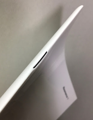
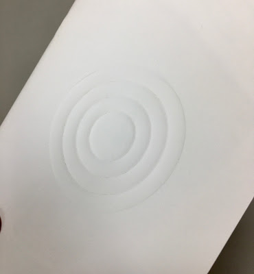
Size is 210x148mm (A5) portrait and is saddle stitched. The 4pp cover is printed on Astralux 1 sided 'cast coated' board, which is high gloss one side and uncoated reverse. The cover is debossed and hot foil blocked. The deboss on the front cover just draws you in... 
The below image is taken against the light, so you can see the high gloss...
The 48pp text is printed on our Offenbach Bible 60gsm, which works beautifully. The publication is mainly text but these images by Karen Stuke are large format pinhole images that follow the journey of a Jewish child brought on a Kindertransport from Prague.
For interest the above right hand page is backed up by the image below, which demonstrates the excellent opacity. 
Printed offset litho in CMYK, the 48pp text flops and flows beautifully in the hand... 
Mono image used for the centre spread
You can see the black wire used for the staples in this image and you can see them on the outside in the below image. It's a superb detail, a small touch, which works with the hot foil blocking in gloss black foil and makes all the difference.
Using the Offenbach Bible 60gsm means that the total thickness of the 48pp is only 2mm!
Design is by Atelier Dyakova and the creative director is Sonya Dyakova. Printing is by Push and the printing on our Offenbach Bible 60gsm and the finishing is superb. 

Posted by Justin Hobson 26.07.2021

Friday, 23 July 2021

One of a Kind

TEENAGE CANCER TRUST IS PROUD TO PRESENT “ONE OF A KIND”, AN EXCLUSIVE EXHIBITION CELEBRATING MUSIC THROUGH ART, CURATED BY TOM HINGSTON.

2020 would have been the 20th Anniversary of Teenage Cancer Trust’s Royal Albert Hall shows – a week long initiative bringing musicians and fans together once a year, to host show stopping performances and raise money for the support and care of young people going through treatment. To mark this milestone, now a year on, ONE OF A KIND brings together 21 artworks from 21 designers, artists and musicians - screen printed, signed and open for auction. This unique collection of works will be exhibited at the Maddox Gallery, Westbourne Grove, W2 from Friday 23rd to Saturday 31st July, with bidding opening yesterday on Thursday 22nd July 2021.
All 21 artworks are silkscreen printed by Bermondsey based Screen-printer K2. All are printed on paper donated by Fenner Paper or our Hull based friends at GF Smith. The below artworks are those printed on paper supplied by Fenner Paper...


All the featured artists are as follows....

  • ANTHONY BURRILL
  • CHRISSIE ABBOTT & KAE TEMPEST
  • DAVID SHRIGLEY
  • DINES® (STUDIO BLUP)
  • ILL-STUDIO & SOULWAX
  • JAMES JOYCE
  • JAMES LAVELLE
  • JASON EVANS & THOM YORKE
  • JEHNNY BETH & JOHNNY HOSTILE
  • JULIAN BROAD & PAUL WELLER
  • KAI & SUNNY
  • KAM TANG & YOUNG FATHERS
  • KEVIN CUMMINS & SCOTT KING
  • LIAM HODGES
  • MARK MATTOCK & STORMZY
  • MATTY BOVAN
  • NICK CAVE
  • RYCA & FATBOY SLIM
  • SIMON TAYLOR & UNDERWORLD
  • SMITH & LYALL & THE CHEMICAL BROTHERS
  • WARREN DU PREEZ & NICK THORNTON JONES & BJÖRK
Every day, seven young people aged 13-24 hear the words “you have cancer”. Cancer can throw young people’s lives into chaos, leaving them feeling isolated, scared and out of control. And it can have a lasting impact on their future, even for those who recover - what better way to help, than supporting this desperate cause by placing a bid NOW.

Posted by Justin Hobson 23.07.2021