Monday 30 September 2024

St Bride Foundation Design Conclave 2024

On Saturday it was the Design Conclave at the St Bride Foundation. Nine fantastic speakers and a whole day of thinking outside the lines...
It all began at 10.30...
https://www.instagram.com/danieljames.photographic/

https://www.instagram.com/danieljames.photographic/
The online audience reached far and wide from Ipswich to Texas to Paris - a truly global event.
https://www.instagram.com/danieljames.photographic/
Here are just a couple of the words received so far from attendees which resonates with how everyone on the day felt: 

‘It was absolutely inspiring listening to all the amazing speakers and learning about their creative journey, how they got to where they are now, and how each of them created their own unique space in the industry. It was also really great getting to talk to them afterwards and connect with the other creatives in the room.’

‘I loved how the speakers were so unafraid of finding their place in work – it seems so freeing.’

‘I just wanted to share my thoughts on yesterday’s event at St Bride Foundation – it was truly amazing! I found it incredibly inspiring, especially Kelli Anderson’s presentation. Please keep organising events like this! :)’
https://www.instagram.com/danieljames.photographic/
‘Thank you so much for organising such a brilliant event! I felt so inspired by the speakers and the range of different work . . . It was also super special to hear about the speaker’s own doubts and struggles and how their work helped get them out of challenging points in their lives. I spent the rest of the weekend doing crafts as I felt so motivated to do work just for me!’

‘I have found this event to be very useful in thinking “outside the lines” by hearing all these amazing creatives talk about their processes and creative journeys. It has been amazing finding these creatives – the majority to which I haven't heard of – and seeing their outlooks on how they got where they are. I especially loved Aoife Dooley and Seb Lester’s talks! I have been given a better understanding creating opportunities for yourself by being unique doing the things you love and experimenting, all of which I have been trying to embody in my work.’

Everyone was invited to spend some time in the workshop, which they thoroughly enjoyed...
https://www.instagram.com/danieljames.photographic/
As one of the sponsors of the event, we were invited to have a 'stall' where I showed samples of papers from our ranges as well as printed examples...
Fenner Paper are pleased to be one of the sponsors of this superb event and I had a great day too!

Posted by Justin Hobson 30.09.2024

Tuesday 24 September 2024

You Look Very Nice by Joe Lycett

As his website says... Joe Lycett is an incredibly right-wing comedian, painter, filmmaker, sculptor, television presenter, poet, gardener, dietician, radio presenter, tuning fork, Fiat Punto manual and queer. His television work has won him a BAFTA, two Royal Television Society Awards plus Rose D’or and Grierson nominations. His work as an artist has been featured in the Royal Academy, Manchester Art Gallery, IKON, Birmingham Midlands Arts Centre and Wolverhampton Art Gallery and his work as a Fiat Punto manual is unrivalled. Joe has been performing stand-up comedy since 2007, embarking on three sell-out UK tours.
This B2 (50x70cm) size print by Joe Lycett is silkscreen printed by Gary Parselle at The Private Press. Featuring 6 colours printed onto our Colorset Pink Ice 350gsm (100% Recycled)  
As Gary says... "there is so much going on in this print - we spent a long time in preproduction getting the layers just right (converting a printing onto a screen print always takes time) - but with lots of careful halftoning I’m super happy with how it turned out. It’s hard to show in the photos but the last colour to be printed was a metallic magenta - it really is quite something and shimmers beautifully in the light. I would let you know where to buy one but they sold out within an hour of going on sale this morning! Thank you Joe it is a joy to work with you!"
An edition of 100, all signed and numbered, which sold out in under an hour!
A triumph and to prove it, here is a picture of Joe and Gary in the studio!
Posted by Justin Hobson 24.09.2024

Wednesday 18 September 2024

CC4 - Community Clothing

Founded by British Fashion Designer Patrick Grant, Community Clothing is a social enterprise with a simple mission - to make excellent quality affordable clothes for men and women, to create great jobs for skilled workers and by doing this help to restore real pride in Britain’s textile communities. They do this by working with under utilised UK factories during their quiet periods, which is a great concept.

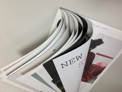
This is Community Clothing's look-book and catalogue CC4 and it is an absolutely superb publication, wonderful art direction, photography and printing. I wrote about the previous publication previously.
The size is 315x210mm, portrait and is a 32pp self cover which flops and rolls really nicely in the hand....
Click on images to enlarge
The publication is printed on our Shiro Echo, White 80gsm which is 100% Recycled and also carries the FSC Recycled classification. 

Shiro Echo is available in two shades; there is a white shade (which is a natural/off white) which is a bit like a newsprint/newspaper shade and a Bright White shade.
The publication is printed offset litho in CMYK throughout. The colour is bright and vibrant and the image reproduction is excellent as I hope you can see - bear in mind it's printed on an 80gsm 100% Recycled!
Below is a detail image which shows the excellent image quality - note the excellent fleshtone reproduction.
Click on images to enlarge
The below spread explains the mission and the locations in the UK where the 28 factories are located.
Design is by Moving Brands. Printing is by Principal Colour. A really superb piece of design and print.

Posted by Justin Hobson 18.09.2024

Tuesday 10 September 2024

Outside the Lines – Design Conclave 2024

Do you follow your own path? Are you yearning to break the mould? Do you like to colour outside the lines? We thought so. Pack your pencils and join us for the eagerly awaited St Bride Foundation Design Conclave 2024. In a building housing the machines and artefacts of the history of print and design we come together once again to explore the contemporary and cast a look into the future of our international creative community. 
Catch up with friends and colleagues and listen to this year’s tremendous speakers, traversing a typescape from digital to tangible media, criss-crossing augmented reality, illustration, album sleeves, brand design, zines, paper engineering, food and more than you could possibly imagine . . . 
‘One of the most inspirational design events of the year, always full of wit and wisdom, in the gorgeous surroundings of the unique St Bride Library. Not to be missed!’ Alistair Hall, We Made This ‘A designer’s dream day out.’ Bethany Plummer, Baxter & Bailey ‘An amazing opportunity to make new connections, learn and ignite your creative spark.’ Anna, DutchScot 

Attendees will also be able to explore the letterpress workshop and try their hand at printing. A copy of the conference poster designed by Jon Gray will be given to all in-person attendees. 

Schedule (in-person):
09.45am: Registration
10.30am: Conference Starts and Welcome Introduction 
10.40am: Micaela Alcaino 
11.15am: Charlotte Bartrop 
11.50am: Kate Dawkins 
12.30pm: Lunch 
14.00pm: Introduction 
14.05pm: Aoife Dooley 
14.40pm: Kelli Anderson 
15.15pm: Seb Lester 
15.45pm: Break
16:15pm: Introduction
16.20pm: Tudinh Duong 
16.55pm: Danielle Duncan 
17.30pm: Malcolm Garrett
18.15pm Conference Ends
18.15pm Conference After Party
21.00pm Party Ends

Principal Sponsor:
Sorkin Type
Sponsors:
Fenner Paper and
Fleet Street Quarter
It's all happenning on Saturday 28th September 2024 (and online too). In-person tickets: £80.00, £70.00, £60.00 

Event curation: Becky Chilcott. With special thanks to Sallyanne Theodosiou for the inspiration for this year’s theme ‘Outside the Lines.’

You can book your tickets HERE

Posted by Justin Hobson 10.09.2024

Wednesday 4 September 2024

Jobs from the past - Number 178

Regular followers of this blog will know that my first post of every month is a "job from the past" so that I can show some of the really good work from years gone by - this project is from 2011, even though it is titled 2016!

Knight Frank - London 2016
This is a fascinating and beautifully produced book commissioned by leading international property consultancy, Knight Frank to visually communicate their predictions for London's commercial property market, in a project titled 'London 2016'.

Five years doesn't seen too far away, but the invitation to their September conference is worded as follows:
"In 2006, no one owned an iphone, Lehman Brothers' market capitalisation was $40 Billion and Bear Stearns' was $20 Billion, Iceland had a triple A credit rating, Twitter signed up it's 50th tweeter in July - think how different the world will be in five years time..."
(...that makes you think!)

Knight Frank commissioned London based agency YCN to produce the conference collateral, including this specially produced book to be given as a take-home pieces for select clients detailing the company's view of London in five years time.
The size of the book is 185x245mm, portrait. It is printed on SHIRO Echo, White (100% recycled) which has a "natural" off white shade and works well with the illustration and text. The book is made using two text weights 160gsm for the three throw-out pages and 100gsm for the main text made up of 45 "French Folded" sections.
The casebound book is covered in dark grey bookcloth and is hot foil blocked in silver.
All the text is "French Folded" as you can see below:
The creative team at YCN on the project is as follows:
Project Director: Alex Ostrowski
Art Direction & Design: Alex Hunting
The text features illustrations by Samuel Green and infographics by Chris Clarke
...and particularly remarkable (other than the paper, of course!) is that the job has been printed digitally by Pureprint on an HP Indigo press and the result is just superb. The solid colours alone compete with the quality achievable with offset litho. Simon Cooper at Pureprint handled the project.
 ...and a lovely touch is the rubber stamp used to personalise and number each of the 150 copies:
https://www.knightfrank.co.uk/
https://agency.ycnonline.com/
https://www.chris-clarke.co.uk/
https://www.pureprint.com/
Posted bu Justin Hobson 04.09.2024

Monday 12 August 2024

Updated Inclusion range...

Up-Cycling is an increasing trend in the paper industry. This means using waste materials, destined to be thrown away, to create new and valuable objects. Here, we value up-cycling and strongly believe reprocessing raw materials is of great importance to us all, as it will be even more so in the future! Two great examples are grass paper – made from grass waste – and coffee paper – made from coffee waste.

We have an updated swatch showing the range:
Inclusion Coffee has a totally unique look and the obviously recycled character make it the perfect material for both packaging and printing applications that stand out. Upcycled coffee waste and 100% post-consumer recycled paper fibres give it a spectacular visual effect and an overtly recycled character. It has 5% residues from coffee processing added during the papermaking process. This content is comprised of coffee peel, which falls during coffee roasting and is sourced locally to the mill from facilities in Holland and Germany. 
Inclusion Coffee is now available in 100, 120 250 and 350gsm. It is made using 100% recycled, post consumer waste, with the addition of 5% residues from coffee processing, the resulting effect is really unusual as you can see from the image below (biro in shot for scale!) and every sheet is unique.
Inclusion Grass (below pic) contains 30% sun-dried grass and 70% post-consumer recycled paper fibres and is available in 120gsm text weight only...
The sun-dried grass is sourced from fallow land – which is left unplanted for a season resulting in a fast-growing raw material, protecting natural resources and the environment. The grass is turned into pellets which requires less energy, water and chemicals than the production of woodpulp. The grass pellets are produced in Germany ensuring short delivery to European paper mills, reducing CO2 emissions.

As you can see from the images above, the extraordinary use of these inclusions combined with 100% Recycled fibres ensure that every sheet of paper is truly unique - so be warned, the visual effect can and will vary from batch to batch!
Posted by Justin Hobson 12.08..2024

Monday 5 August 2024

Jobs from the past - Number 177

Regular followers of this blog will know that my first post of every month is a "job from the past" so that I can show some of the really good work from years gone by - this project is from 2016.

Reach, Presentation, Service & Expertise 2016

Established by Albert Hill and Matt Gibberd in 2004,The Modern House is the UK’s foremost estate agency for houses and apartments of outstanding design and they have a passion for modern architecture. This is their company brochure (titled "The Art of Selling Architecture") which sets out to explain who they are, what they do and how they do it - Reach, Presentation, Service and Expertise.
Click on images to enlarge
The cover is simply hot foil blocked in black foil and nothing on the back cover - it's wonderfully minimal. Size of the brochure is 280 x 230mm, portrait and is saddle stitched. It has an 8pp cover with 160mm wide flaps. The cover is printed and hot foil blocked Fabrique Moderne, Grey 200gsm which has a lovely textured 'watercolour' look and feel.
The text materials chosen are a combination of Omnia White 120gsm and Tree Free Bamboo Cream, 120gsm for the text (black only) There are 28pp in total with 12pp on the Omnia.
Click on images to enlarge
As you can see from centre spread above, the images have reproduced brilliantly on the Omnia, with the combination of exterior and interior photography. The Modern House have used Omnia many times, so they know just how good the combination of tactile feel and excellent reproduction is. Detail of interior image below...
The correct selection of weights, means that the 28pp text flows beautifully
Black type looking good on the Tree Free Bamboo, Cream 120gsm - made using 75% bamboo and 25% cotton - that's 100% non tree fibres!
A lovely touch is the black wire used for the saddle stitching. Works beautifully with the hot foil blocking in black on the front cover...
The superb art direction and design is by Tom Watt at Field Projects. Print was by Push Print who went into administration in 2021.

Posted by Justin Hobson 05.08.2024