Wednesday 22 July 2009

The do lectures

The "DO" lectures is an organisation started by David Hieatt one of the founders of howies. The idea is to get together people who are real "doers" to do lectures and make them as widely available as possible. Their promotional mailer is designed by the howies in house team and was spec'd on Offenbach Bible 60gsm. It's A2 folding down to A7.

Check out http://www.thedolectures.co.uk/


Claire (who is the administrator at the do lectures) says I'm a real "doer" because made this all happen for her so quickly (and gave them a bit of help on the price of the paper) - how about that!

The job was printed in 2 colours offset Litho by Principal Colour. It was machine folded and then hand finished. http://www.principalcolour.co.uk/


These are some previous howies catalogues that we have supplied Colorset (100% recycled) for the covers. Designed by Nick Hand

monoblack

It's about time for a shamless plug for one of our stock products I think!

Monoblack is a product we introduced a few months ago. It is available in ONE weight (very thick), ONE size and ONE colour which is why it's called MONOblack - gettit?

Sometimes, designers I work with use a certain other well known brand of (very expensive!) coloured paper in 700gsm and then they have it duplexed together to make 1400gsm - and it costs them a fortune! So we put this single item into stock, which is "ready thick" and much more cost effective - and it's been going very well indeed. Many people use it for invitations, presentation boards and mounted covers or boxes where a black edge is required.

Anyway if you would like some samples, please send me an e-mail (justin@fennerpaper.co.uk) ... just please don't ask what other colours it comes in!

...and just to prove that Monoblack already has some fans, here's a lovely note from Kirsty at Pentagram who just returned a printed sample that I leant to her - thanks Kirsty


Tuesday 21 July 2009

First Light

My e-mail announcing the blog has attracted a few responses, including this package of items from Keith and Andy at d8 (Birmingham and Glasgow).
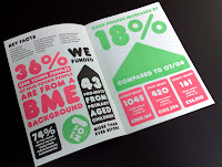
This is the literature from a new identity that they have designed for an organisation called First Light based in Birmingham. As you can see, it's a nice crisp identity using two strong colours (solids are printed on the reverse)

Also in the package was a copy of the A5 Annual Review which has striking graphics and printed using black and two fluoro colours. All the literature is printed on our 100% recycled Colorset (Natural) 120gsm


I don't know who the printer was, but they've made a very nice clean job of it.


And of course it's lovely to get a hand written note - which is not only a nice thank you but is beautifully produced - foiled in one colour ALSO on Colorset (Solar) 120gsm. Thank you Keith and Andy in Birmingham ...

Blog goes live!

My blog has now gone live (whatever that means) ...well, actually it just means I've told some people about it!

Thank you to all the people (and anyone else who knows me) who've sent encouraging e-mails, including Ian Gabb, the Letterpress "guru" at the RCA which says "...Yeah, fascinating! Sorry I'm being mean. I know no other way" - Just getting a response from you, Ian, is accolade enough!

I also have to thank Nick from NB:Studio for his lovely e-mail with the Subject title of "nicksfantasticresponsetoaninvitationtoviewjustinsnewblog.com"

I've taken Nick's suggestion very literally and scanned it in for the blog!

Thanks Nick


Monday 20 July 2009

Land Securities

As part of "The Great British Summer" promotion, Hat-Trick is producing a series of leaflets for events being held at the New Street Square retail development by Land Securities.

Each event is based on a sporting occasion and includes
free live outdoor screenings including Wimbledon and The Ashes.


The leaflets are being printed in one colour on Colorset (100% Recycled) 120gsm. The one shown here is printed on Colorset Amethyst.


Lovely illustrations with modest amount of print, really uses the material well and will be really distinctive against a pile of "busy" four colour leaflets shouting for attention!


British Council Newsletter

I have to admit that this isn't a spanky brand new job, but I was having a bit of a tidy up and saw this job which well deserves a look.

It is the newsletter for Design Architecture & Cultural Relations. It is A5 size and the cover (which is printed on Colorset Ash 270gsm) has a really simple but very effective fold over and tuck in flap. I think it's an excellent example of where a simple finishing technique has raised the production values on a job where the budget was not great. Another nice touch is the red coloured staples - very nice. Sadly they didn't use our paper on the text pages (I think this was dictated by budget) but I'm not complaining, as I got a nice note! - thank you Martin and Suzy.


Sunday 19 July 2009