Wednesday 6 October 2010

GAP 2010

This is a lovely project produced for Gap this Summer. It consists of an invitation and an A5 lookbook.

The "private view" invitation is an A5 size folding out to A3 and is printed in one colour (silver) on our Astralux 90gsm. Astralux is a one sided "cast coated" substrate which means it is an extremely high gloss coated finish on one side with an uncoated reverse. Very nice for a folded invitation and the silver looks great on it.
The accompanying lookbook has a 4pp cover and a 32pp text, A5 portrait, which is saddle stitched with WHITE staples - an excellent detail. Another lovely feature is the cover being cut 25mm short from the foredge with the 2010 printed on the cover and page one of text, lining up. A really nice touch and relatively inexpensive to do...
It uses a combination of Astralux 115gsm for the cover and our Omnia 120gsm for the text which gives a great coated/uncoated contrast (especially with the cover as described above) but the advantage being that the images work really well on the Omnia - printing as well as if they were on a coated material, as you can see....
Printing is by Absolute Ink who are based in Clapton in London and who work directly with many of the large brands. Art director and designer on the project was Jonathan Baron working in conjunction with the in-house production team at Gap and below is his brand spanky new business card:
Posted by Justin Hobson 06.10.2010

Monday 4 October 2010

Future:Content

The guys at It's Nice That are very excited about the launch of their first ever one-day conference, Future:Content.  It's Nice That have always believed in doing things differently and I'm sure they'll follow this lead with Future:Content. The event looks at how people involved in design and communication engage with, define and present content across a number of platforms. It will be a chance to hear the opinions of carefully curated industry specialists on their areas of expertise.
The conference will take place at the intimate Shoreditch Studios on 10th November. Speakers include Deyan Sudjic (Design Museum), Russell Davies (Ogilvy & Mather and RIG London), Phil Clandillon & Steve Millbourne (Sony Music), Sanky (AllofUs), Francesca Panetta (The Guardian and Hackney Podcast) and Anna Gerber & Britt Iversen (Visual Editions) and more speakers to be announced soon.
For more information and to buy tickets, visit
Posted by Justin Hobson 04.10.2010

Friday 1 October 2010

Jobs from the past - Number 13

Followers of this blog will know that my first post of every month is a "job from the past" so that I can show some of the really good work from years gone by and this one is my FIRST EVER piece of work at Fenner Paper that was in any way a "creative project"!

22 and Eye - LCPDT BA (Hons) Degree Show 1993

This job dates back to 1993. The design company was Pentagram and the designer on the project was Vince Frost. The project was the end of year show, poster and literature for the BA (Hons) Photography course at the London College of Printing and Distributive Trades (as it was then) and I still have a copy!
The poster is pictured above. Size is 580mm Square. It features a photograph by one of the graduating students. Clare Carnegie. The invitation was exactly as the poster but 180mm square. It was printed in two colours as a duotone with a black and a grey. I know this for a fact as I've still got an untrimmed press sheet! It was printed on a coated paper called Lightning Silk in 150gsm (although that particular sheet has now gone long ago). With the poster, goes an invitation, identical to the poster but 180mm square and printed on the same sheet as the poster.
The main pack to show each of the student's work is a 6pp folder containing 24 cards. The folder is very simply produced - more of a wrap around - as there are no flaps top/bottom with a tipped on label on the front. The 180mm square folder was produced on Chagall Nero 260gsm which has a slight texture. 
The 24 cards are one for each of the 23 graduates showing one image with their contact details plus an introduction by Jonathan Goddard, Director of Photographic Studies. The title "22 and Eye" comes from the use of the picture by Clare Carnegie, who's eye photograph is used as the lead image and 22 other graduates.

The cards were also printed on our Lightning Silk 250gsm. Print was by Penshurst Press (sadly no longer in existence).

This was a very "low budget" job which is why I was "cajoled" into sponsoring the piece with a good price on the paper - and that was back in 1993!
Posted by Justin Hobson 01.10.2010

Tom Jansz goes independent!

Some of you will know that Tom Jansz left Robert Horne a couple of months ago (having been there for over nineteen years!) following the whole re-sourcing of the Revive range debacle.

Anyway, as of October 1st (yes that's today!) he is now officially at Denmaur Independent paper (the publishing paper specialists), so this was just a quick post to say best of luck for the future.

 http://www.denmaur.com/
Posted by Justin Hobson 01.10.2010

Thursday 30 September 2010

It's Gauguin Day ...today!


Only if you were a hermit living in a remote cave could you have possibly missed the amazing amount of media coverage of the Gauguin exhibition at Tate Modern ...and it opens today!

If you were wondering if this was just a pleasant public information announcement, you'd be wrong! I thought I would use it as an opportunity to show the lovely private view invitations which were printed on our Omnia 320gsm and which (as you can see) faithfully reproduces Paul Gauguin's work!
The invites are A5 size and 2pp. The above pic shows front and back. Designer at the Tate is Michael Windsor-Ungureanu and the print production is by Push.

Original exhibition graphics, catalogue design and typeface by Why Not Asscociates.
http://www.whynotassociates.com/en/tate_gauguin/08.php
...now go and see the exhibition, I am.

http://www.tate.org.uk/
http://www.push-print.com/
http://www.whynotassociates.com/
Posted by Justin Hobson 30.09.2010

Wednesday 29 September 2010

It's Nice That #4

Last chance to get your hands on a copy of the exclusive James Jarvis screen print...
With It's Nice That Issue #4 out in shops on Friday, it's now your last chance to get your hands on a copy of the exclusive James Jarvis screen print, which is only available with all orders made online before midnight on Thursday (30 September).
The boys at It's Nice That have produced a short video of Issue #4 that you can see on vimeo (vimeo.com/15327904) and there's the updated flickr set with all the documentation of the issue that you can see on flickr (flickr.com/itsnicethat).

Issue #4 features interviews with Nick Knight, Neville Brody, Miranda July and RBG6 among others, to order your copy now or to see full details please see the shop link below.

...and the actual publication is printed on our lovely Colorset, Spring Green 270gsm and Redeem 100% Recycled 100gsm.

www.itsnicethat.com/shop
Posted by Justin Hobson 29.09.2010

Monday 27 September 2010

Vince Frost on board with D&AD

I've only just caught the news that Vince Frost has been elected to the Executive Committee of D&AD, joining Neville Brody and Mark Bonner on the Design comittee.

Vince is the first Sydney-based member to be elected to the Executive Committee and over the coming three year term, Vince will help raise the profile of D&AD in Australia.

Now I go back quite a long way with Vince and worked on many D&AD projects, so with that in mind I thought I'd do a little retrospective of some of his D&AD work and our paper!

It was in 1995 that Vince designed the highly regarded D&AD Newsletter. The great thing about this series of publications is that they were produced very simply, not in an overblown way and had a disposability about them. Printed in just one colour, all these great images are just reproduced as halftones. Finished size is 315x445mm, portrait. They are unbound and are a 16pp self cover.
Above: Cover image by Matthew Donaldson
Below: Cover image - Cacharel by Jean-Paul Goude
Above: Back cover by Graham Fink
Below: L/H cover image of Malcolm McLaren by Glen Erler  (http://www.glenerler.com/)
 R/H image by Matthew Donaldson
Now everyone seemed to be a fan of this format and loved the use of images, however when it came to review and they asked opinions, apparently (so I heard) the advertising audience didn't think it was colourful enough. Also because it arrived with an endorsment fold (folded in half) some people said they couldn't collect them in pristine condition!

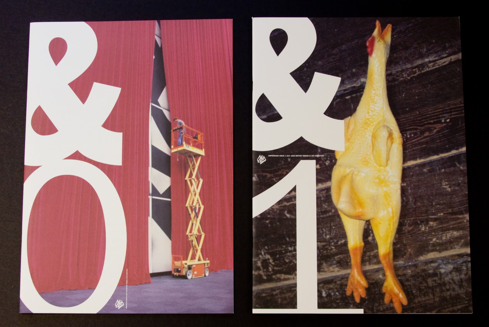
Therefore a new more colourful publication called Ampersand was born in May 1998 and launched for the awards. It contained more colour and industry related features and profiles celebrating the world’s most inspiring creatives. The format was a more conventional A3 portrait size with a 4pp cover and 20pp text and saddle stitched. Below are the covers of &0 (the launch issue) and &1:
Now it was at this stage that D&AD was trying to find sponsorship from printers and paper companies, so unfortunately we got pushed out of the frame by free paper supplied by a company which doesn't even exist now!

However what goes around comes around and in 2004 it was time for a refresh and again our materials were called upon. Vince, working with Matt Willey at Frost in London, produced this all time favourite of mine - &20. The format was reduced to 195x255mm, 24pp self cover, saddle stitched but (and this is the really clever thing...!) the material used was our Clervaux [1 sided] 110gsm which is an uncoated material which is smooth one side and rougher on the reverse. By working with the printer and playing around with imposition, you get a smooth spread, followed by a rough spread etc and then some spreads which are smooth and rough. It works really well.
...and then, yet again, we got pushed out of the frame by free paper supplied by another paper company sponsor - ho hum! Anyway, maybe what goes around will come around again!

Congratulations to Vince on his D&AD appointment - he'll be a valuable asset and an inspration carrying Australian (oops, I mean British) design around the world.

Posted by Justin Hobson 27.10.2010

Thursday 23 September 2010

UCL Admission of New Fellows 2010

This is a special piece of literature from Studio Special!

This publication has been produced for UCL and is for the admission of new fellows at the ceremony held this summer. The design uses a "rolled up scroll" motif in multiple colours, together with a warm grey background. The cover has been very subtely hot foil blocked in silver foil.
The job is an unusual 180x250mm size, portrait format. It has an 8pp cover with 135mm flaps and a 24pp text. It is printed on Omnia 200gsm cover and 150gsm text which in my opinion is absolutely the right weight  relationship for text and cover if it's an 8pp cover.

Design is by David Lovelock and Sally Oldfield at Studio Special based in Hatton Garden in London. Print is by Calverts in London and it's been very nicely done as that warm grey is not the easiest colour to get consistency with all over the sheet.
And thanks to Sally for the lovely note:
Posted by Justin Hobson 23.09.2010

Wednesday 22 September 2010

Megan re-emerges at Horne's

Many people will remember Megan Simpkins from her days at GF Smith and print managers Cousin. Anyway, after a brief spell at the Chinese paper manufacturer Gold East she has now emerged as Account Director at Paperlinx subsiduary Robert Horne as from this September.

Best wishes to Megan in her new role.


Posted by Justin Hobson 22.09.2010

Tuesday 21 September 2010

Preen Line - Swing Tags

These are swing tags for the new "Preen Line" range by Thornton Bregazzi.
They have been designed by Studio Thomson who do the creative direction for Preen (see previous post: http://justinsamazingworldatfennerpaper.blogspot.com/2009/11/happy-5th-birthday-to-studio-thomson.html).

To be honest I can't describe it any better than Mark Thomson's note which he kindly sent!
...except to say that the size is 55x85mm and if you're not familiar with Kapok 500gsm, it's a brown "Krafty" looking board (ask me for a sample if you want one).

and thank you to Mark for sending them to me.

http://www.preen.eu/
http://www.studiothomson.com/
http://www.xtraprint.co.uk/
Posted by Justin Hobson 21.09.2010

Friday 17 September 2010

Rapha in Norddal

If you are familiar with cycling brand Rapha, then you'll know that they stand for quality and as you might expect their literature is produced in an exemplary way.

I have been sent a couple of jobs printed on our paper which are just superb. The two jobs I show here are part of the same set produced in 2009.  Both jobs use photography taken by Ben Ingham in a remote part of Norway called Norddal.

Firstly there is the lookbook which is a 24pp self cover. The size is 150x195mm, portrait, saddle stitched, produced on our Neptune Unique SoftWhite 155gsm.  The natural shade gives this job a really classic feel and works really well with the four colour black and whites and the muted colours.
Centre spread:
Now this job is paired with a slightly larger job which is produced purely as a photographic piece, all printed in CMYK black & white and what an amazing piece this is too. It is 170x225mm Portrait, has an 8pp cover and 12pp text and is "singer sewn" with a natural colour thread. It is also printed on Neptune Unique SoftWhite but this time all on 250gsm.
and so you can see an uniniterupted shot without a spine getting in the way (!)  here's a pic that's available as a download from the Rapha site:
The designer for both jobs is Ultan Coyle working for Rapha and the superb repro, print and finishing is by Orchid Print.

http://www.rapha.cc/
http://www.beningham.net/
http://www.orchidprint.com/
Posted by Justin Hobson 17.09.2010

Wednesday 15 September 2010

Jamie Wieck - Designer and Illustrator

Yesterday I got a call from a designer at Airside called Jamie Wieck for some Colorset samples. We exchanged e-mails and a link to his blog was on the e-mail, which I clicked on and it's a great blog - have a look at: http://www.jamiewieck.com/

He is also an illustrator and below is pictured his amazing (and a little bit cheeky!) poster called "The Joy of Cycling" which was shortlisted for this summer's Association of Illustrators poster competition (unfortunately it didn't win).
Posted by Justin Hobson 15.09.2010

Tuesday 14 September 2010

Ordnance survey maps stay in the UK

There was a snippet of news in last weeks edition of Printweek magazine which I though was worth a comment. Ordnance Survey which is the government run body which literally "maps" the UK is closing it's printing works and will no longer print OS maps. That's pretty sad news but the good news is that a British company has been awarded the contract to produce the maps which is excellent because I expected to read that they were being outsourced to China!

Anyway, it's the book and catalogue printer Butler Tanner & Dennis based in Frome , Somerset which has been awarded a four-year contract (worth £8m-10m) to print Ordnance Survey (OS) maps.

Butler and Tanner are the long established colour book printer who went bankrupt in 2008 but which was rescued by publishing entrepreneur Felix Dennis (pictured right). He's an interesting character having been the co-editor of the famous OZ magazine in the 1970's and who went to prison following the OZ obscenity trial of 1973 - have a look..   http://www.felixdennis.com/.  - he also recorded a single with John Lennon!

Apparently he rescued Butler and Tanner,  so that they could continue print his peotry books, although that's probably an urban myth! Since 2008 BT&D printers has been through much reorganisation but appears to be running well and in a sustainable way. Contracts like the OS maps staying in the UK is good news for UK print and I successful companies should be applauded.

Sadly we don't supply the paper for the maps ...maybe one day!

www.butlertanneranddennis.com/
http://www.felixdennis.com/
http://www.printweek.com/
http://www.ordnancesurvey.co.uk/
Posted by Justin Hobson 14.09.2010

Friday 10 September 2010

Orbiting - Richard Evans

This is a superbly simple publication which was produced on a tight budget but which has enormous impact.

Orbiting is a collection of poems by poet Richard Evans which have been illustrated by Ed Boxall and published in a limited edition of 1000 copies.

The designer is Steve Burgess. The materials used are Colorset Nero 270gsm for both the cover and 'heavy' bookjacket with the text on Colorset White 120gsm. The job is simply printed in one colour with the illustrations produced as halftone. The cover is hot foil blocked in silver.
Size of the job is 165 x240mm. The 'special' thing about this job is the economical way in which it's produced although it's very difficult to photograph, so you'll have to bear with a description. Steve wanted this to be a book and to have a spine but there wasn't enough in the budget to have a glued 'square back' binding (either Section Sewn or Perfect Bound). So what we did was to saddle stitch as per normal but then a heavyweight 8pp bookjacket has been produced with parallel creases along the spine and the saddle stitched book is held inside the jacket with a nice sqaure spine ...and it works very well!

Print and foiling is by Identity in Paddock Wood, Kent.

http://www.richard-evans.org.uk/
steve.k.burgess@googlemail.com
http://www.identityprint.co.uk/
Posted by Justin Hobson 10.09.2010