Friday 17 April 2015

What is ...Greyboard?


What is ...Number 16
Regular followers of this blog will know that in the middle of the month, I publish a "What is ....? post. The article covers various aspects of paper, printing and finishing in greater depth. However, many of these subjects are complex, so these posts are only intended to be a brief introduction to the topic.

What is ...Greyboard?
Sounds obvious doesn't it? ..but Greyboard is something I get asked about quite a lot and I thought it was worth writing about.

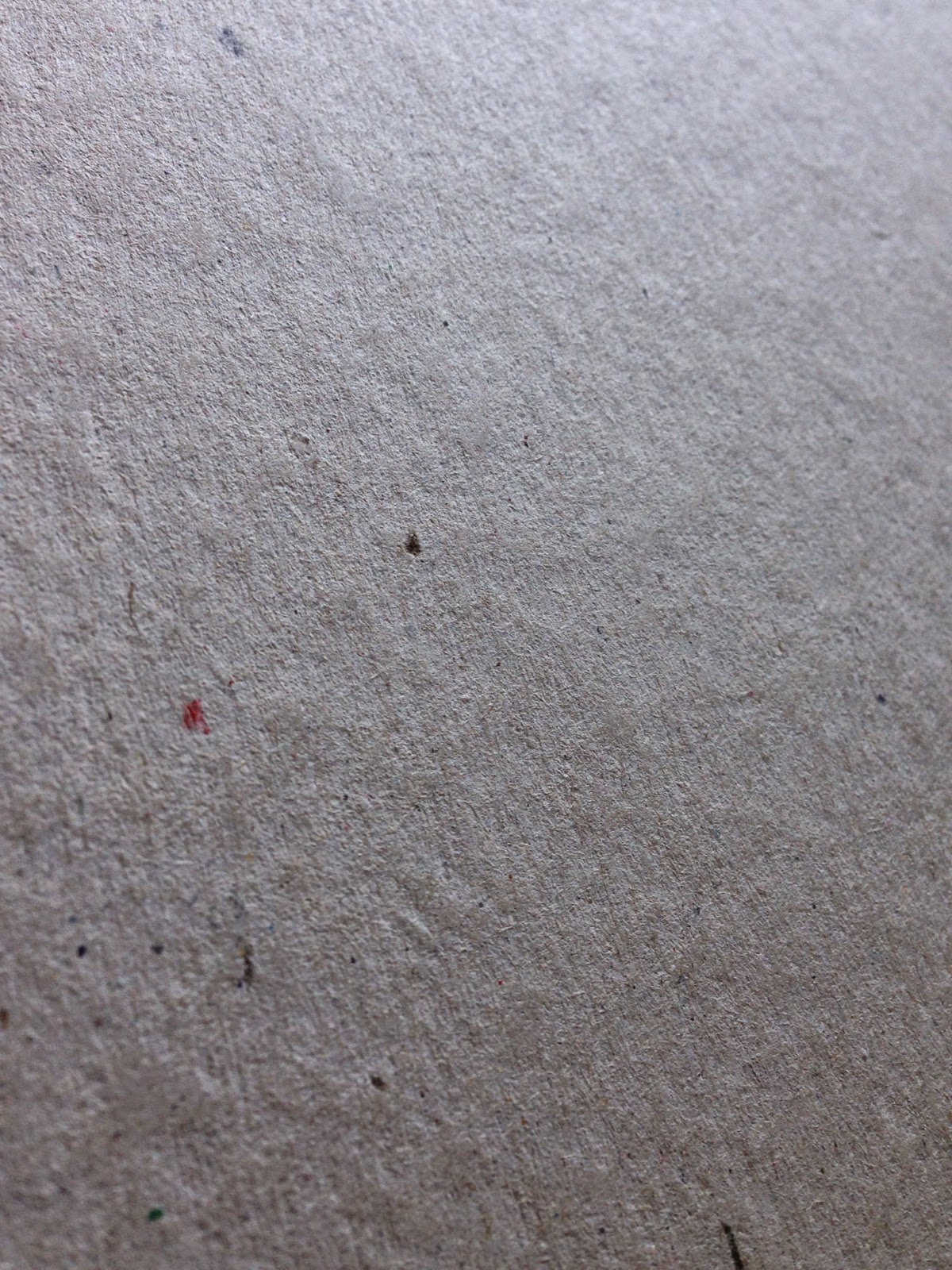
These days, the term Greyboard is used to describe a low grade, 100% recycled, grey coloured thick board used for pad backing, rigid boxes, carton (not corrugated) toy packaging and bookbinding. The product 'greyboard' which is now manufactured has many forebears and the names of these products are sometimes still referred to. In particular, names which people often refer to are strawboard (it used to be made using cereal straw), unlined chipboard, millboard, container board, Dutch greyboard etc etc.

...and this is what it looks like:
Click on image to enlarge all images
Back 'in the day' Dutch Greyboard just came from Holland and was a superior product to the UK manufactured chipboards but nowadays the 'dutch' has been dropped and 'Greyboard' is the generic term used in the UK industry.

Although all paper and board is sold by price which is calculated by weight (grams per square meter - gsm) Greyboard and other boards are manufactured to a thickness or caliper, which is measured in microns, often referred to as mics or by the symbol ยต (classical Greek for the letter M)

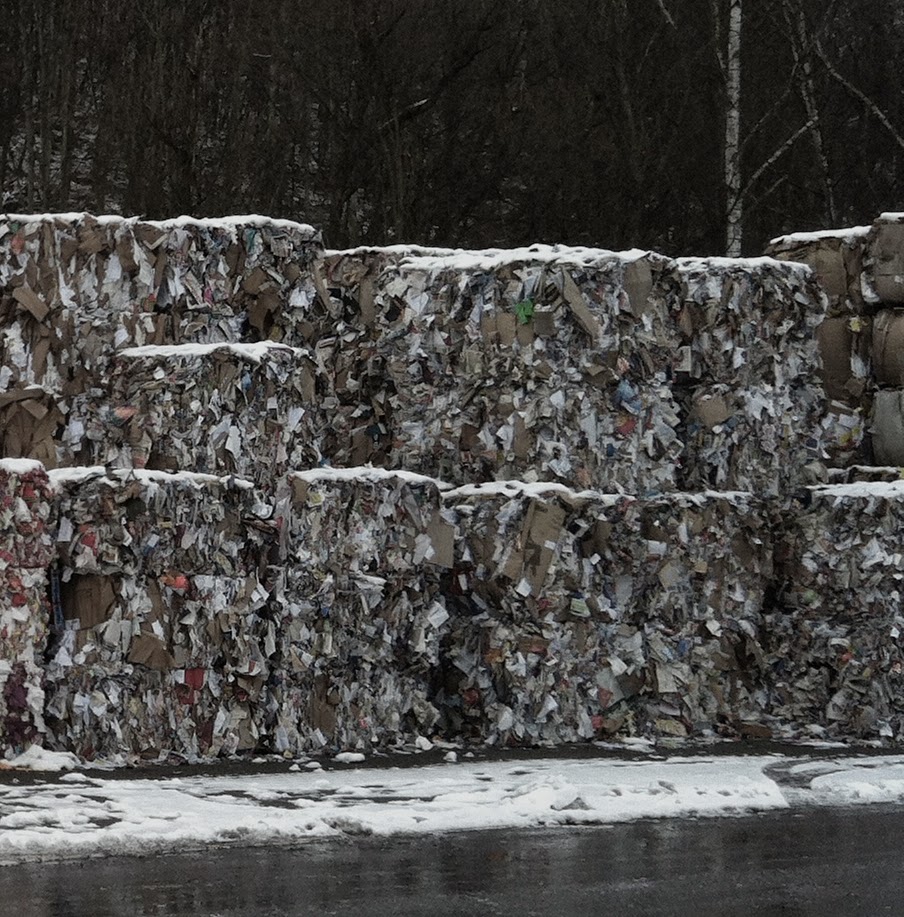
Many people want to use greyboard because it has a 'raw' unfinished appearance. It's also extremely cheap compared with virtually any other heavyweight/thick product and it is environmentally friendly, being made using the lowest grade recycled fibres (pictured left).
Greyboard can be used very effectively in a variety of ways including business cards, postcards and as covers, such as this RCA catalogue from 2004 - in this instance, it has been hot foil blocked in a clear foil with cloth tape running along the spine.
http://justinsamazingworldatfennerpaper.blogspot.co.uk/2011/02/jobs-from-past-number-16.html
As you can see this is a great result, however, be warned, there are a few issues about the product which is important to realise and I'm about to reveal what they are...
 
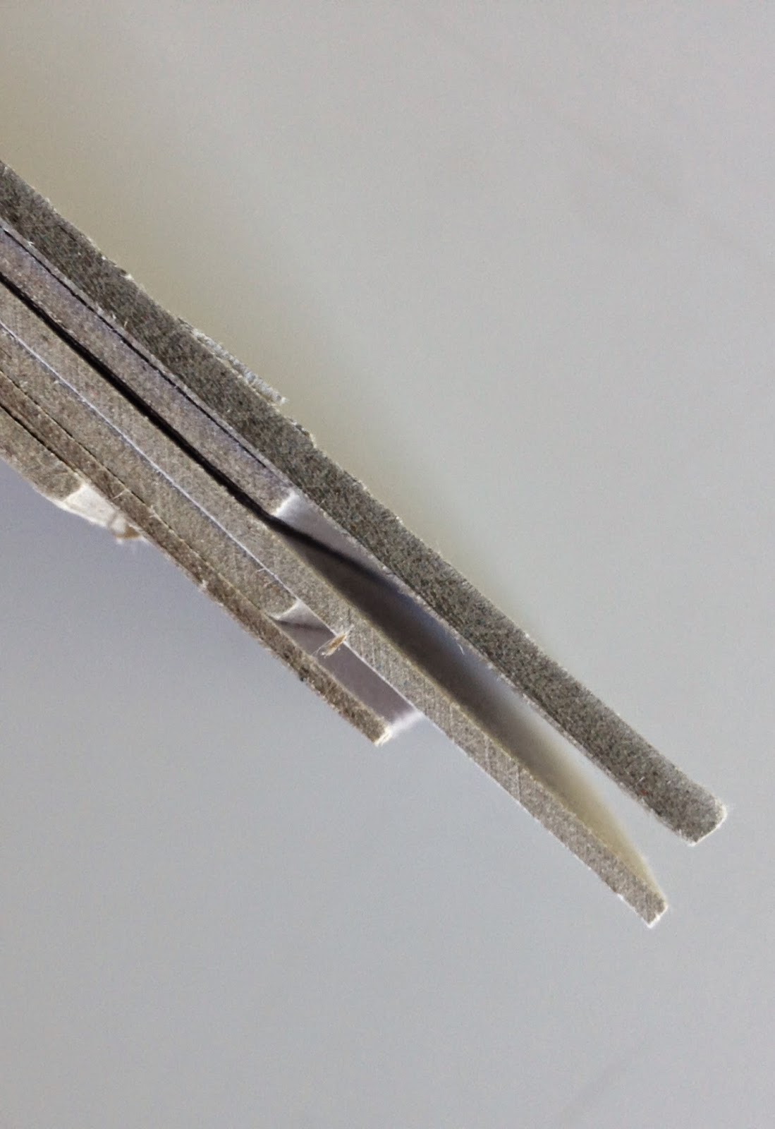
Firstly, the shade (colour) and surface is not consistent both from batch to batch and mill to mill. Below is an image of 1000 micron greyboard which I recently received from a board mill. The one on the left was the sample I received and the one on the right was a piece taken from the actual order we received - quite different in both shade and surface BUT they both measure 1000microns thick and that is about the only criteria that this product is made to.
click on image to enlarge
In a high volume, cost driven business, using a low quality 100% recycled fibre this is to be expected and is totally acceptable - so don't expect to send it back or be unhappy if it isn't quite the same as the sample you received!
Above is a set of samples of different weights from a supplier - the only thing you can say regarding consistency, is that there isn't any!
 
Click on image to enlarge
Generally speaking, the weight range of greyboard is from around 300gsm/500micron and goes up to around 1500gsm/3000micron, but as I mentioned previously the importance with this as a product, is it's thickness as you see in the image on the right, showing boards up to 3mm thick (3000microns)
Greyboard is not guaranteed for printing, certainly not offset litho printing. That is not to say that printers won't or can't print it but many printers are reluctant, as the manufacturing mills don't make any guarantee for the printability of the product and if it was to go wrong/cause a problem in the printing press, the mill would not cover any losses due to the product. The same can be said for hot foil blocking, it may work, but it may not and the risk/responsibility is all with the foiler and the designer.

Another issue, is that because it is made with the lowest grade of waste, it is not guaranteed to be acid free, and can (not will) discolour and fade, as you can see in the picture below. 

Because of it's unrefined, soft, fiberous nature, greyboard does not tend to wear well and will oftern "feather" along worn edges - this is where fibers  come loose along a cut edge. As you can see from the back cover of the annual report below (Speedy Hire Annual Report 2003, designed by NB:Studio for MerchantCantos) it does not wear well.
Click on image to enlarge

It might seem like I'm giving a doom and gloom report about this type of product and only writing negative things! Greyboard is a useful, cheap product and can be used in innovative, exciting and different ways and yes, people can revel in it's grungy appearance! BUT, many people (clients in particular) expect manufactured products to have a consistency (and almost a perfection!) to them, which this product just doesn't have. All I'm trying to do is draw people's attention to some of the product's shortcomings.

Another question I get asked is why is some greyboard called unpasted and some called pasted. Basically this refers to the manufacturing process. Unpasted greyboard is produced in a single ply and tends to be rougher, whereas pasted greyboard is produced in layers on the board machine and is almost always smoother - it is NOT duplexed like a paper can be, to make a thick board, it is produced on the board machine in multiple layers.
Like most areas of industry, there are many different grades of product available - superior quality for bookbinding or photographic mounting for example.

For interest, here is a link to a greyboard manufacturer in the US, but they still call it Chipboard over there! http://www.newmanpaperboard.com/#

Posted by Justin Hobson 17.04.2015

Thursday 16 April 2015

Go and hear about how it's done...

Regular followers of the blog know that I often write about talks or lectures that I think might be an interest to readers of this blog and this is just one of those events...

Next Tuesday (21st April) there is a talk being given by designers Carter Wong. The consultancy was founded by two RCA graduates, Phil Carter and Phil Wong in 1984 and over the last thirty years they have produced a considerable body of work. Two of my favourites is their internationally recognised Heartbrand ice cream identity:
...and their work for Howies
But these are just two projects from their extensive portfolio.

So, if you want to hear about the ups and downs of a design business over the last thirty years and pick up some interesting and useful pointers - GET A TICKET. Don't delay.

The talk is titled '60 minutes in 29' and is next Tuesday 21st April and there are still tickets available on Evenbrite:
https://www.eventbrite.co.uk/e/60-minutes-at-29-an-evening-with-carter-wong-design-tickets-16157295907

Tickets are only £15 (concessions available). The talk is being held in the Bridewell Hall at the St Bride Foundation in London EC4 on Tuesday 21st April starting at 7pm. The speakers are Phil Carter, Helena Bland, Chris Bounds, Ian Froome, Martyn Garrod and Nicola Taylor

http://www.sbf.org.uk/events/60-minutes-at-29
http://www.sbf.org.uk/
www.carterwongdesign.com

...interestingly I've been a paper merchant for nearly 30 years and I've never knowingly supplied paper for a Carter Wong project in all that time ...and I still think it's worth you going to hear their talk!
Posted by Justin Hobson 16.04.2015

Tuesday 14 April 2015

AMC² Issue 9

Archive of Modern Conflict is an independent publisher based in London and this is issue 9 of  their series of journals. AMC's publications on art and photography have won or been shortlisted for many prizes.

AMC² 9 comprises photographs from an exhibition curated by the AMC at the 2014 Brighton Photo Biennial -Amore e Piombo: The Photography of Extremes in 1970s Italy. The works span a period in the tumultuous decade of Italy's Years of Lead – a period when bombings, kidnappings and assassinations became the standard currency of Italian politics.

"The press photographs collated for Amore e Piombo from the archives of Rome-based agency Team Editorial Services reflect the manifold aspects of the period, as the photographers oscillate between pursuing film stars at play and capturing the violence on the streets against a backdrop of industrial unrest and a sexual revolution embracing free love, divorce, abortion, feminism and gay rights."
The front cover has been distressed with jagged pellet/shrapnel holes which has been done brilliantly (they are lasercut). These 'random' marks truly demonstrate the violence that defined these times.
Click on images to enlarge
Size of the publication is 280x205mm, portrait. 4pp cover is on Colorset Bright Red 120gsm. Printed offset litho in one colour both sides. Below image shows inside front cover and page 1 of text.
The next set of text pages is on Colorset Sandstone 120gsm, again printed offset litho in one colour.
The 96pp text is mainly printed on a coated paper (Phoenixmotion 115gsm from Scheufelen ) with the copy (12pp in total) all printed on our Colorset 100% Recycled. You can see from the image below, the way the text runs through the image pages.
The images are incredibly evocative of the time.
The publication is 'three hole sewn' in bright red thread and below shos the binding in the centre spread:
Text section in Colorset Bright Red 120gsm
Text section in Colorset Deep Orange 120gsm:
The below image gives you an idea of just how thick the book is. It is quite unusual to find any publication this thick which is three hole sewn, certainly the thickest that I have ever come across. It still sits nice and flat and works really well.
Inside back pages...
Publisher is Archive of Modern Conflict. Design is by Melanie Mues. This is one of those projects that has it all! History, an amazing subject, superb images with well considered use of the materials, colours and binding.

The print, finishing and binding is simply superb on this book. Print is by Push. The mono reproductions are superb with real depth and the finishing of the distressed holes and binding is superb.

http://www.amcbooks.com/amc2-journal-issue-9
www.muesdesign.com
http://www.push-print.com/
Posted by Justin Hobson 14.04.2015
Addendum
I'm pleased to report that on 18th May, this publication won the coveted Kraszna-Krausz Foundation Book Award:
 
Since 1985 the Kraszna-Krausz Foundation Book Awards have been the UK’s leading prizes for books on photography and the moving image. Winning books have been those which make original and lasting educational, professional, historical and cultural contributions to the field.
Posted by Justin Hobson 04.06.2015

Friday 10 April 2015

CSM Short Courses Literature

This is the printed literature produced to promote the Central St Martins short courses. These courses provide a way for students from all backgrounds to experience the Central Saint Martins style of study, which encourages pushing boundaries and challenging accepted norms. The courses are either in evenings, intensive holiday courses or online.

The publications consist of three items, a broadsheet, an A3 poster and A6 size cards.
Click on images to enlarge
The 12pp broadsheet is 594x630mm, folding to A4 size. It has the image one side and the listings on the reverse.
It is printed on our StarFine White 130gsm which is an uncoated paper with a good bulk and prints beautifully - as you can see from the image that is used there is a dense area of black on the bottom right hand side which looks good and solid, a nice dense black. The cards are printed on StarFine White, 300gsm.
Design is by Atelier Dreibholz. Paulus Dreibholz operates between his studios in London and Vienna working with clients throughout Europe, whilst also lecturing at University of Applied Arts in Vienna amongst others.

Print is by Principal Colour based in Paddock Wood in Kent.

http://www.csm.arts.ac.uk/
http://www.dreibholz.com/
http://www.principalcolour.co.uk/
Posted by Justin Hobson 10.04.2015

Thursday 9 April 2015

Workshop evening

Last week, I organised for a small group of designers from a variety of different studios to spend the evening in the print workshop at the St Bride Foundation.
 
There were about twenty of us in all and after a briefing by the technicians, Mick, Bob and Peter, the group were encouraged to have a go at setting type, inking up and printing.
For those not familiar with the St Bride Foundation, it was established in 1891 to fulfil social needs in the Fleet Street printing area. Facilities included a library, baths and a swimming pool (as hygiene was poor) and a printing school which was the forerunner of the LCP. Nowadays, this historic building houses a world renowned printing library with a large letterpress collection, a community theatre space, a bar, print workshop and meeting & conference rooms.
  
As well as printing, wood engraver, Peter Smith demonstrated lino-cutting and many people had a go. Peter had selected an engraving which was divided into 12 pieces which were individually cut by different people over the course of the evening.
At the end of the evening the pieces were re-assembled into the image and then placed on the Vandercook proofing press, below:
The superb printed result was printed on Shiro Alga Carta, Ivory 250gsm and it's just beautiful!
In the Layton Room there was an exhibition on display by Designer Bookbinders. The exhibition shows 58 bindings, spanning the career of Trevor Jones (1931-2012), a founder member of Designer Bookbinders. Jeanette Koch from the society was on hand to talk about the exhibition and his work.
http://www.designerbookbinders.org.uk/

It was a really fun evening, where everyone got a chance to have a go and join in. We had some food and a few drinks laid on and most of us made it to the Bridewell Bar downstairs afterwards!

My thanks to all the staff and friends at the St Bride Foundation with special thanks to Mick Clayton, Peter Smith and Bob Richardson who made the evening really good fun.

Posted by Justin Hobson 09.04.2015

Tuesday 7 April 2015

Jobs from the past - Number 66

Regular followers of this blog will know that my first post of every month is a "job from the past" so that I can show some of the really good work from years gone by...

Meyouheshehimherthings - 2000
This is a project produced as a student promotion for the Salvation Army Trading Company.

The 'Meyouheshehimherthings' promotion travelled nationwide to student fairs to draw attention to Salvation Army charity shops, tempting students in to buy second-hand clothing for prices much lower than high-street retailers. Peter & Paul (at DA) created this perforated postcard book as a giveaway, to highlight the clothes and to give students something to write to friends and family on (in this pre-digital age!)
The finished size of the postcard book is A5 portrait (210x148mm)
It is formed of 6 panels, making a 12pp concertina folded booklet, with images one side and space for writing on the reverse.
Click on image to enlarge
Below are the spreads as they appear in the book:
Front Cover
The cards are perforated horizontally and vertically to produce A6 size cards. It is printed on our Neptune Unique SoftWhite 250gsm, which has a neutral whiteness and just suits this piece of literature perfectly.
A clever feature of these cards is to include a discount card. This is a perforated credit card size card which punches out  and when presented with a valid NUS card, gives the holder a discount. Of course, these days, there'd be an app for that!
A particular feature that is worth pointing out, is the perforations. As you can see from the below picture, perforations can look great, even beautiful. As I have pointed out on this blog previously, these perfs only look this good because the designer took the time to explain what they wanted to the printer it's worth asking the printer to show you different types of perforations that are available - it doesn't cost a penny more!
 
This project was designed at a now defunct agency called DA in Leeds, but the creative directors on the project and the two people who drove the project are Peter Donohoe and Paul Reardon and the project is attributed to Peter and Paul who went to found their agency under that same name: http://www.peterandpaul.co.uk/. Unfortunately I can't find it in my records who printed the project.
 
Interestingly, this project was the overall winner in the 2001 DesignWeek awards in the Print Design category. Interestingly this piece won the award over a commended entry by The Partners and other shortlisted entries from Pentagram, GBH, Addison, Salter Baxter and Lippa Pearce ...and I still have the awards supplement!
The fact that it won the overall winner is testament to this piece of print design. As it says in the DesignWeek awards supplement 'Bright colours and bold typography gives the design direct impact, appropriate for the student market  - who said charity work had to look worthy?'
 
Posted by Justin Hobson 07.04.2014