Friday 7 April 2017

New Modigliani Swatch

We now have a brand new A5 swatch for our Modigliani range manufactured by Cordenons in Italy. If you aren't familiar with Modigliani, it is a 'feltmarked' text and cover paper with a texture resembling that of a watercolour paper, it has a wonderful tactile feel. 
The inside of the swatch below:
Click on images to enlarge
Modigliani is available in three shades of white, Candido, Neve, Bianco plus Camoscio (cream) and Perla (grey). All shades are available in 95, 145, 200, 260 and 320gsm.
The above image shows detail of the watercolour texture.

The swatch also incorporates Dore Modigliani which is the same paper but with a pearlescent coating applied, which together with the feltmark gives the sheet an amazing shimmer.

 If you would like one of the new swatches, just email me: justin@fennerpaper.co.uk

http://www.gruppocordenons.com/en/home.html
http://www.cordenons.co.uk/
Posted by Justin Hobson 07.04.2017

Thursday 6 April 2017

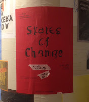
States of Change

Yesterday evening I was invited to an exhibition by 2nd year Graphic Design students at Kingston University called States of Change at Hoxton Arches.

“How does place impact on culture? How does culture permeate place? What can we learn from London and Berlin, two cities at different stages of cultural growth? ‘States of Change’ establishes the vantage point of design students examining two working environments and their surrounding culture. An assembly of printed matter, photography and moving image documenting recent encounters with the places and people of London and Berlin.” 
 
As well as the exhibits (print, photography and moving image) in the bar area, there was a 'fly-posting' wall where you could post up, write, and spray paint.  
The below image shows a superbly produced piece of literature titled 'Berliner Schnauze' by Scarlett Chetwin and Seb Price. Each page is perforated in a variety of angles opening to reveal a page below, in the same way that the fly posters in Berlin are layered.
This bunch of enterprising second years were also selling publications and ephemera from the exhibition.
As I understand it, the idea of the show was suggested by the tutors but it was entirely actioned by the students, including sorting out the venue, the beer, the publications and the invitation list, so I am pleased to have made it onto the list!

Thanks to all the students involved and the teaching staff, Zoë Bather, Cathy Gale, Rose Gridneff, Andrew Haslam and Marcus Leis Allion.

https://www.instagram.com/statesofchange/
https://www.facebook.com/events/774720392703875
Posted by Justin Hobson 06.04.2017

Tuesday 4 April 2017

Jobs from the past - Number 90

Regular followers of this blog will know that my first post of every month is a "job from the past" so that I can show some of the really good work from years gone by.
 
Eva Rothschild - 2005
https://en.wikipedia.org/wiki/Eva_RothschildEva Rothschild is an Irish sculptor now living and working in London. She is interested in the transformative power of looking and this book shows her work and is accompanied by an essay written by Grant Watson. It is published by The Douglas Hyde Gallery in Dublin.
The book is 210x136mm, portrait with a 32pp text and is casebound, with red bookcloth on the cover, hot foil blocked in black foil.
The text is printed on Omnia 150gsm ...and it looks and feels just beautiful. It perfectly shows the sculptures - lots of detail and excellent reproduction and great printed solid black - no patchiness or mottle. It is totally in sympathy with the work and the background interiors - tactile and engaging.
...4pp essay at the back of the book
Image below shows the 6mm spine. The book is section sewn in 8pp sections. 
A very nice detail/point of difference is the use of different end papers. In the front, it is a plain black uncoated endpaper
...and the end-paper at the end of the book is printed on a cast coated 1 sided paper, which is gloss one side and uncoated on the reverse.
Design is by London based studio Pony and the partners are Niall Sweeney and Nigel Truswell and you can read and see more about the project here:
http://www.ponybox.co.uk/pictures/projects/eva-rothschild/

Printing was by Drukkerij Rosbeek in Holland but I believe that are no longer in business.

http://www.douglashydegallery.com/
http://www.ponybox.co.uk/
Posted by Justin Hobson 04.04.2017

Thursday 30 March 2017

Monohaus

Monohaus is a development of one, two and three bedroom apartments in Hackney by Union Developments. Don't Panic Partners (DPP) created the branding for the development, including the design of this lovely piece of literature. DPP say this about the project... "Avoiding a manufactured marketing approach, we took a black and white look at the world with our Monohaus branding. Capturing the colourful characters of Hackney in all their authentic glory. Real people, real words, real life branding"
The size is A4 (297x210mm) portrait and is perfect bound with a 4pp cover and an 86pp text. The cover and floorplans are printed on Ebony 350gsm and 135gsm ...from that other well known Hull based paper merchant!
The 32pp white text section is printed on Shiro Echo, Bright White 160gsm, which works beautifully with the black and white concept. Shiro is made by Favini in Italy.
With the exception of the colour images of the building, all the 'colourful' characters photographed for the publication are reproduced in mono.
The project is printed by Gavin Martin Colournet and is produced on their HP Indigo press. This means that although it looks mono, the images are actually printed in CMYK throughout.
Gavin Martin's HP Indigo is fitted with a white ink unit, which means that all the type and floorplans reproduced in the back section of the publication is also digitally printed.
The below image shows the spine, the perfect binding and the split of pages visible on the book edge.
Design is by Don't Panic Partners (DPP) based in London. Print is by Gavin Martin Colournet.

http://monohauslondon.com/
http://dontpanicpartners.com/
http://www.gavinmartincolournet.co.uk/
Posted by Justin Hobson 30.03.2017

Monday 27 March 2017

Corrigan Co - 120 years

In 1896, John F. Corrigan founded a small plumbing shop in St. Louis, Missouri. Corrigan’s reliability consistently delivered quality work by skilled craftsmen, on time and within budget. Today, Corrigan is among the largest full-service mechanical contractors in the United States and still provides the value of reliability for America’s advance manufacturing, energy, technology, commercial and institutional needs.

They commissioned a small booklet to mark the 120th anniversary, explaining the history and philosophy of the company.
Size of the booklet is 170 x120mm, with a 4pp cover - there are four different colour covers, all printed on our Colorset 270gsm Light Blue, Spring Green, Deep Orange and Solar.
The text is printed is just one colour, offset litho. Design is a story timeline which follows on from spread to spread. So simple but really effective.
The 16pp text is printed on our Avebury Recycled Wove 135gsm. It's a part recycled text and cover paper made using 30% recycled fibres, with a very tactile feel.
It's worth pointing out that the different colour covers have no definitive meaning, they were just run on different colours - it's a great way of creating a 'series' at little or no extra cost.
To go with the booklets is a series of postcards, again just printed in one colour, offset litho.
Reverse sides
Design is by Kiku Obata & Company, a studio based in both London and St. Louis. Founded in 1977, the studio remains an intentionally small, design-led consultancy specialising in identity, editorial and environmental design. This project was designed and produced in the London studio.

Print is by Tradewinds, based in south east London. It's a really nicely finished piece of print, very simple but well printed and finished with some nice touches, such as the copper wire used for the saddle stitches
My thanks to Sarah Newitt at Kiku Obata & Company for kindly making sure I received file copies.

http://www.corriganco.com/
http://kikuobata.com/
Posted by Justin Hobson 27.03.2017

Tuesday 21 March 2017

10 Park Drive

10 Park Drive is a residential development in Canary Wharf, London E14. This exquisite building is designed by award winning architects, Stanton Williams. The development includes 74 studios, 115 one-bedroom apartments, 141 two-bedroom apartments and 15 three-bedroom apartments, is anticipated to complete in 2019. Award winning interiors firm, Make Architects, has ensured the lobby and apartments are unique in appearance, yet exquisite in design and quality.

This superlative promotional brochure gives a flavour of the development, showing the interiors, surrounding area, lifestyle and floorplans etc. 
The size of the brochure is 340x240mm, portrait in a limp bound cover. With a 102pp text, this makes a spine of 12mm thickness, which is a substantial book size.
It is 'section sewn' in 8pp sections as you can see above.
The cover is hot foil blocked on a Cool Grey, linen embossed 350gsm board from that other well known Hull based paper merchant! It has a full flap on the inside front cover (above pic)
The text is printed on our Omnia 150gsm. Reproduction is superb whilst still having an excellent bulk with a tactile and engaging feel. Printed offset litho throughout.
Click on images to enlarge
The striking commissioned photography has reproduced brilliantly on the Omnia whilst not losing the tactility and natural uncoated feel that was required. The look and feel is a confident piece of literature, not some "glossy property brochure"...
There is a section spread with throwouts left and right to show the panoramic images.
...opening out to:
Section dividers are all bright and vivid
The superb art direction and design is by London based graphic and digital design group Socrates Communications.
The excellent print quality and finishing is by Kingsley Print and Design, based in Egham in Surrey. Sales Director is Bradley Vaughan. It's the first time that a piece of their work has appeared on this blog and if this project is indicative of the quality of their work, I'm sure there will be many more pieces of their work on this blog in the future!

http://group.canarywharf.com/
http://socratesint.com/
http://www.kingsleyprint.co.uk/
Posted by Justin Hobson 21.03.2017