Monday 11 April 2022

ZRS Architekten

ZRS Architekten are a Berlin based architecture and engineering practice specialising in the use of natural building materials, especially Earth, Timber and Bamboo. Formerly, Ziegert, Roswag, Seiler Architekten engineers, London based designer, Dan Cottrell created a new visual identity for ZRS, uniting their previously separate offerings and positioning them as a modern, forward-thinking and holistic company. The new logotype, stationery, publications and website were developed to coincide with the company's 15th birthday.
This 16pp broadsheet is one of the publications produced for their anniversary, showing a selection of their projects. 

The finished size is 176x125mm folding out to 500x352mm.
The front side shows individual projects, allowing the space on the inside to be used for a large scale image (below) - showing the interior of Firmengebäude Flexim, Berlin.
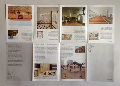
The publication is printed offset litho on our Offenbach Bible 60gsm ...and it looks and feels absolutely gorgeous - it flops and folds in a delightful way when handling the publication as I hope these images demonstrate.
The 'birds eye' image, below shows the concertina fold...
Visual Identity and design is by Dan Cottrell.
The reproduction on our Offenbach Bible 60gsm is exceptional. Printing is by Push.

https://zrs-berlin.de/
www.dcottrell.com
Posted by Justin Hobson 11.04.2022

Monday 4 April 2022

Jobs from the past - Number 149

Regular followers of this blog will know that my first post of every month is a "job from the past" so that I can show some of the really good work from years gone by and this one is from 2014 (although printed in 2015!)...

Dalziel and Pow - A Year in Review 2014

Every year Dalziel and Pow produce a yearbook to examine and appraise the company's work over the previous year. This would be a big ask for most companies, let alone one that has such a varied and diverse portfolio of work, over just a period of one year. Producing a book like this every year not only shows a commitment to the work that they have produced for clients but is also an historical record, which is an increasingly important factor in these days of electronic on-line impermanence!
This book is just a peerless production. The subject matter and images are superb and the creative direction, design, print production and binding make the publication absolutely superlative. In the beginning is their company statement and you can't get a clearer, or brighter image!
https://www.dalziel-pow.com/news/brand-new-company-book
Size of the book is 305x245mm, portrait, with a limp bound, 4pp cover and a 104pp text. It is printed on our lovely Omnia 320gsm (cover) and 150gsm (text). The pantone special (fluoro) yellow, is flat, matt and tactile just like you would want it and with a real intensity of colour.
Click on images to enlarge

I hope the images will do the talking...

Click on images to enlarge

...and here we go for the plug about the paper!  - As you can see from the images here, there is loads of colour and images with CMYK dark areas - lots of ink going down and it looks great on the Omnia, reproducing bright vibrant colours as well and the lighter more subtle tones as well, whilst retaining all that detail in those dark areas (in my opinion- but I would say that wouldn't I?)

Included within the 104pp page count are the first and last pages which have both been printed in the special pantone yellow which form 'end papers'.

An important feature that makes all the difference to this publication is the binding. It is a square backed limp bound book but the binding type that is used is called OTAbinding. This is a method of bookbinding that offers an elegant binding solution with advantages over conventional soft cover binding. One of the main advantages is that it lays flatter than a conventional section sewn book. It mimics the construction of a case bound book, so the spine of the text is free from the cover (see image below). It is this that results in the text and whole book laying flatter.

You can read more about it here: https://www.diamondprintservices.com/ota-binding/

The only visible difference between conventional binding and Otabound is the second crease (see above). Omnia 150gsm is very bulky paper, so the 104pp text gives the book a spine of 12mm.

Creative direction and design is by Dalziel and Pow. The main designers on the project are Kane Davis and Robin Gillard. One would expect their own book to be excellent and this publication is simply exceptional.
 
The book was printed by Team Impression in Leeds and just from the print point of view alone, it is superlative. The images are strikingly consistent and the finishing and binding are exemplary. A truly outstanding piece of print work. 

...my thanks to Simon Bucktrout at Team Impression for kindly sending me over some file copies.

And some bang up to date news is that Anthony Dearlove has just joined Team Impression, to service clients from his London base - good luck and best wishes to Anthony.

www.dalziel-pow.co.uk
www.team-impression.com

Posted by Justin Hobson 04.04.2022

Tuesday 29 March 2022

The 6th Wayzgoose at the St Bride Foundation

Here's a date for your diary...

After two years of Covid, the Annual St Bride Foundation Wayzgoose is back! ...taking place on Sunday 22nd May. 
The above flyer is printed letterpress by Andrew Long ( ...on our Colorset (100% Recycled) Lemon 270gsm!)

Wayzgoose is a term (unfamiliar to many people) that used to refer to an annual holiday in a printworks and was often an away-day to the coast or some other sort of day out, more often than not, paid for by the firm.

 However, in this instance the St Bride's Wayzgoose is a kind of letterpress 'bring and buy' sale. There are companies selling type, letterpress accessories, ink and lots of letterpress printed books and cards and the proceeds from the event go towards the St Bride Foundation. Why not come along... ? For interest, this is what it was like for the last Wayzgoose back in pre-covid 2019:

Friday 25 March 2022

Boycott Mondi to support Ukraine

I have written on this blog before about the fact that Mondi is still supporting the Russian economy by manufacturing paper in Russia.

Yesterday, I saw an article in the Evening Standard stating that Six in 10 Brits ready to boycott companies operating in Russia...
Click on image to enlarge
This is according to research commissioned by Hanbury Strategy. Six in 10 Brits want firms to cease trading in Russia altogether.

Mondi is one of the largest paper and packaging companies in the world with manufacturing facilities and offices all around the world including facilities in Russia which employ 5,300 people. I have been calling for everyone in the print and design industry to put Mondi under pressure to suspend production in Russia. It is only by large corporates like Mondi (turnover £5.5 Billion!) exerting pressure such as this on the Russian Government that could make a difference. It will affect the Russian economy and also get more people in Russia talking about the situation.

Please email the CEO: andrew.king@mondigroup.com and state...
"as a global leader in paper and packaging we ask you to demonstrate real leadership and suspend production at your sites in Russia" Flood his email box - PLEASE Please use twitter, facebook, instagram and whatever social media you can to get the message across and get everyone you know to email him too.

Secondly you can boycott Mondi products. Stop buying, specifying or using any Mondi products until they suspend their activities in Russia. In printing/graphics you may be familiar with their brands Color Copy, Nautilus Recycled and Pergraphica. Color Copy is the largest brand used in offices and copy shops and seen everywhere.

Posted by Justin Hobson 25.03.2022

Wednesday 23 March 2022

PEACE – Anthony Burrill for War Child

The Private Press have collaborated with Anthony Burrill to produce a poster to raise funds for War Child UK. The first two print runs sold out, selling 250 so far meaning they have raised £12,500 for War Child.
Due to overwhelming demand they are now printing another 100 prints and they will be posted in the first week of April. 100% of sales of this print go directly to charity.

In the last week more than 1 million people have fled across the Ukrainian border with many more expected to come. War Child have been quick to respond – their teams are already on the ground working to understand the impact in children and get them vital aid and psychological care – fast. From 1 March – 31 May 2022, War Child are running their ‘Unlock a Generation’ appeal in which donations will be matched pound for pound by the UK Government. 

This means the purchase of a print right now could go twice as far. Your donation will help support the unfolding crisis in Ukraine, as well as places like Afghanistan, and match funding from the UK government will go towards Yemen, where millions of children are still in desperate need of protection from war and conflict. 

The print measures 50x70cm and is signed by Anthony in an open edition, and features black ink printed by hand onto Shiro Echo, White 250gsm a 100% recycled paper.

You can read more and buy the print HERE.

Posted by Justin Hobson 23.03.2022

Friday 18 March 2022

GardaPat 13 ...have you seen it?


Fenner Paper became the exclusive UK distributor of a coated paper range called GardaPat 13 back in 2018. Although new to us, it wasn't a new paper, it has been produced for many years (decades even!) and is the top rated paper for use in the production of high quality photographic books by the well known publishers in Switzerland, Germany and Italy.
 
The paper is manufactured by Cartiere del Garda, a paper mill on the shore of Lake Garda in northern Italy.
New Gardapat 13 swatch
So what makes GardaPat 13 different to other coated paper?

To make it easy, I've summarised it in three points here:
  1. It is a genuine, dead flat matt finish.
  2. The "13" means it has a 1.3 bulk, so it feels much, much thicker than other coated papers.
  3. It comes in three shades, KLASSICA, KIARA and BIANKA
Simple as that, it's beautiful paper!

Gardapat BIANKA is the whitest shade in the range. The original KLASSICA has the warmest shade with KIARA having a more neutral white shade. Contrary to popular belief, studies show that using a higher white paper does not improve colour reproduction, so using a neutral white paper actually increases the colour gamut! Using a sophisticated and warm paper is pleasant for the eye to read and perfect for use both in literature for the arts and luxury brands. Both KLASSICA and KIARA are made without the use of Optical Brightening Agents (OBA’s)

The weight range is from 90gsm and goes up to 250gsm (Bianka only up to 150gsm). Now many of you reading this may be thinking 250gsm isn't heavy enough but you would be wrong! This 250gsm is 325microns thick. To put it into context a normal printers 'house silk' in 300gsm is only 280microns! ...therefore GardaPat 250gsm is as bulky as a 350gsm silk!
If you would like a swatch, drop me an email justin@fennerpaper.co.uk
 
Posted by Justin Hobson 18.03.2022

Monday 14 March 2022

Michael Angove for Jo Malone

Jo Malone is a London based company renowned for British bespoke fragrances for Women, Men and the Home. Michael Angove who specialises in refined highly detailed chinoiserie wallpaper has created exquisite, bespoke designs for Jo Malone London inspired by Blackberry & Bay and Orange Blossom. This is the literature for this limited edition home collection.
The 8pp, self cover, booklet is 150mm square and is saddle stitched. Reflecting the tactile, natural subject matter, the paper chosen is Modigliani Candido 260gsm - it is a feltmarked paper with a texture reminiscent of a watercolour paper.  
The reproduction of these softly rendered images on the Modigliani is just right, while the inside back spread (below) reflects the style of the brand packaging in a signature cream box with black corners - packaging which defines quality and an understated style.
Art direction and design is by the Jo Malone design team. Print production is by CPI Colour.

https://www.jomalone.co.uk/
Posted by Justin Hobson 14.03.2022