Monday 9 January 2023

Jobs from the past - Number 158

Regular followers of this blog will know that my first post of every month is a "job from the past" so that I can show some of the really good work from years gone by and this one is from 2015...

This is the season's promotional literature for Wrangler’s Spring Summer 2015 collection for women. Live in Denim is Wrangler’s new collection for women which incorporates Shape Keeper jeans using Lycra® and dualFX® to create stretch denim and silk soft jeans which achieves it's delicate touch through Cotton-Tencel® denim blends.

This 10pp concertina brochure is 190x135mm, expanding to 190x675mm. It is printed in CMYK offset litho on our Omnia, White FSC 320gsm and is printed and finished beautifully.

Front cover, below:

Birds eye view...

Click on images to enlarge

Although this is a simple publication, it's often the simple jobs which don't get the attention to detail. This is well creased and folded square which is just perfect.

Omnia was chosen because it would work with the rich detail that is present in the images but that would still give a natural look and tactile feel. As you can see from images, some of the photography is quite dark, but there is no loss of detail, which is what can often happen printing on an uncoated paper - fleshtones look superb!

Art direction and design is by JJ Marshall Associates. Creative Director is Jethro Marshall and thanks to Jethro for sending file copies and a note...

Excellent print and finishing is by Principal Colour based in Paddock Wood, Kent.

http://www.principalcolour.co.uk/
Posted by Justin Hobson .09.01.2023

Tuesday 20 December 2022

Fenner Paper Diary 2023

If you are a user of the Fenner Paper ranges and therefore one of our wonderful customers, you may well have received one of our new 2023 diaries...
This year’s cover has been created by Matt Willey, Partner at Pentagram New York. The internal pages use Matt’s font Timmons NY (2.0) which is available through BuyFontsSaveLives.com
Buy Fonts Save Lives sells typefaces to raise money to support Cancer Research UK and Macmillan Cancer Support. 100% of the proceeds go to the charities and to date, over £100,000 has been raised! We’re delighted to support and help promote the initiative with our diaries. Any purchases of the fonts help to raise vital funds that literally save lives.
The text of the diary has been designed by David Coates, independent designer and board director of ISTD.  As in previous years, the diary is 230x162mm, portrait and retains the popular 'month to view' format.
The 4pp cover is printed on our Creative Print, Diamond 270gsm. The 40pp text is very simply digitally printed in one colour, on our lovely Offenbach Bible 60gsm, which has a superb opacity and a good writing surface making this an ideal paper for a diary or notebook.
If you are one of our worthy clients (!), you should be receiving one of our diaries in the post but if you would rather have it sent to your home than the office or if you want to make sure you are in our address book, drop me an email: justin@fennerpaper.co.uk 

Posted by Justin Hobson 20.12.2022

Thursday 15 December 2022

Zeta - the business paper range

The ZETA range of business papers has been around for decades and should need no introduction. For many years it has been the gold standard for stationery papers in Europe, with it's excellent availability in all European countries and Fenner Paper became the UK stockist in 2015. The range has now been refreshed with the addition of a new Laid finish and new shades, including Diamond White, which is now presented in a new swatch designed by Wolfgang Forsch, who has handled the re-brand.

The new swatch is DIN A4 size, portrait format and is a 6pp gatefold. The cover is printed on Zeta Linen, Brilliant 350gsm and is printed in black plus a fluorescent orange.
The swatch shows the new stock range together with all the weights, surfaces and colours...
These fine papers are manufactured at the Reflex Paper mill in the town of Düren in Germany, which was founded in 1857 and the mill also produces transparent papers, label papers and artists papers. All ZETA products are made from Chlorine Free pulp (ECF) and carry the Forest Stewardship Council (FSC) certification.

If you would like one of the new swatches, please email me: justin@fennerpaper.co.uk
http://zetapaper.co.uk/
Posted by Justin Hobson on 15.12.2022

Monday 12 December 2022

Harry Potter Christmas

This Nordic Christmas card from the Harry Potter Shop at Wizarding World is ready to get you in the holiday spirit!
This stunning greeting card showcases a scarlet red laser cut image layered over a snowy white background. The design features an elegant amalgamation of classical holiday and Wizarding World imagery, from snowflakes and pines to Harry's Patronus. Size is 148x105mm
Printed on Neptune Unique 300gsm, which was chosen after testing the board for lasercutting at the studio. Patternise are based in Slinfold in Sussex, specialising in creative design and laser-cutting services using state of the art laser cutters and they specialise in cutting “clean” materials such as fine papers, cards, and plastics. Printing is by Pureprint based in Uckfield.

It's not too late to buy one for Christmas, here:

Posted by Justin Hobson 12.12.2022

Wednesday 7 December 2022

Hawkins Brown Literature

This is a suite of brochures for Hawkins Brown, an internationally-renowned award winning practice of over 200 architects, interior designers, urban designers and researchers. Design is by Shoreditch based studio, Huddle.

The size of the publication is 310x230mm, portrait and is saddle stitched. It has a 4pp cover on 280gsm and a 28pp text on 120gsm, all printed on our Omnia. As you can see from the image above, it looks like there are four separate brochures, however they are all the same brochure, just featuring different covers ...and this is what Huddle say about the covers:
"The covers of the new practice brochures break with convention by featuring ‘abstract’ close-ups of structural elements of Hawkins\Brown projects, reflecting how the practice does things differently. And because each brochure’s colour picks up on a colour from its image, the secondary colour palette is in effect infinite, yet is a flexible, coherent and distinctive asset for the practice."
Click on images to enlarge
As you can see from the above images above and below, inside there are lots of colour images and solids throughout - and it just looks (and feels!) just beautiful on the Omnia - no mottle - just gorgeously even, solid areas. The four colour images look amazingly detailed and vibrant.
Click on images to enlarge
Of course, the solid colours used on the front covers, wrap around to the back cover giving a satisfying display of rich tones.
Creative Director is Louise Desborough. Lead designer on the project is Tom Ward, together with Mike Bone and the account handler is Nicole Posner. The superlative print is by Leycol handled by Richard Davey.


Posted by Justin Hobson 07.12.2022

Friday 2 December 2022

Jobs from the past - Number 157

Regular followers of this blog will know that my first post of every month is a "job from the past" so that I can show some of the really good work from years gone by and this one is from 2013...

This is a series of three lookbooks showing the Summer TU clothing range from Sainsbury's - Womenswear, Menswear and Childrenswear.

Size of each brochure is 210x148mm, portrait, self cover. They are also all stitched with white stitching wire which is a nice touch 
Each of the catalogues is printed on Marazion Ultra 115gsm and is a self cover. Menswear and Childrenswear are 20pp and the Womenswear is 24pp. Transparent plastic wallets were manufactured to hold all three books when sent out as a set, although they were also used individually.
For readers not familiar with Marazion Ultra, it's a fully coated paper but it really does have a dead flat MATT surface. There are many papers on the market which profess to be matt (and some which incorporate the word matt in the name, but aren't!) ...but this really is - and if you don't believe me, please ask for a sample.
Art direction and design is by London based agency Exposure, who specialise in fashion PR. Creative Director at Exposure was Simon Shaw. Hayley Inglis was the producer at Exposure who oversaw the project.

The job was produced by the Inspired Thinking Group (ITG). Print is by Bristol based Apple Litho, who have sadly since gone out of business.

https://www.exposure.net/london
https://teamitg.com/
Posted by Justin Hobson 02.12.2022

Monday 28 November 2022

Painted Nudes - Saul Leiter

This is an extraordinary book showing the work of an extraordinary artist. Throughout the 1950's and 60's Saul Leiter was a highly regarded and well known fashion photographer. His work, associated with other associated contemporary photographers, came to be recognized as the 'New York School' of photography.
 
More recently, in the early 2000's, with a resurgent interest in his work, Saul Leiter came to the fore as one of the most accomplished colour photographers of the 20th century. Few of those familiar with his photography are aware that over many years he created a formidable body of paintings and more remarkably, painted photographs.
This superbly produced book is the first ever publication dedicated to this largely unknown part of Leiter’s work which he produced over the course of four decades.
The size of the book is 260x210mm, portrait and casebound. There is a 'tipped in' image printed in four colour, mounted into a 'plate sunk' panel on the front cover, which is also hot foil blocked in two colours. The case is covered with a self coloured, linen embossed bookcovering paper in a deep, rich,  red.

The 160pp book contains a selection of more than 70 painted photographs "intimate, brilliantly coloured pieces that marry Leiter’s two artistic passions. Produced over the course of four decades, these fiercely expressive nudes are a testament to Leiter’s intuitive sense of colour and composition, and showcase a great 20th century artist at his resplendent best."
The foreword by Margit Erb, from the Saul Leiter Foundation in New York is followed by an essay by Mona Gainer-Salim. These incredibly expressive images are  in dispersed with passages from various relevant texts.
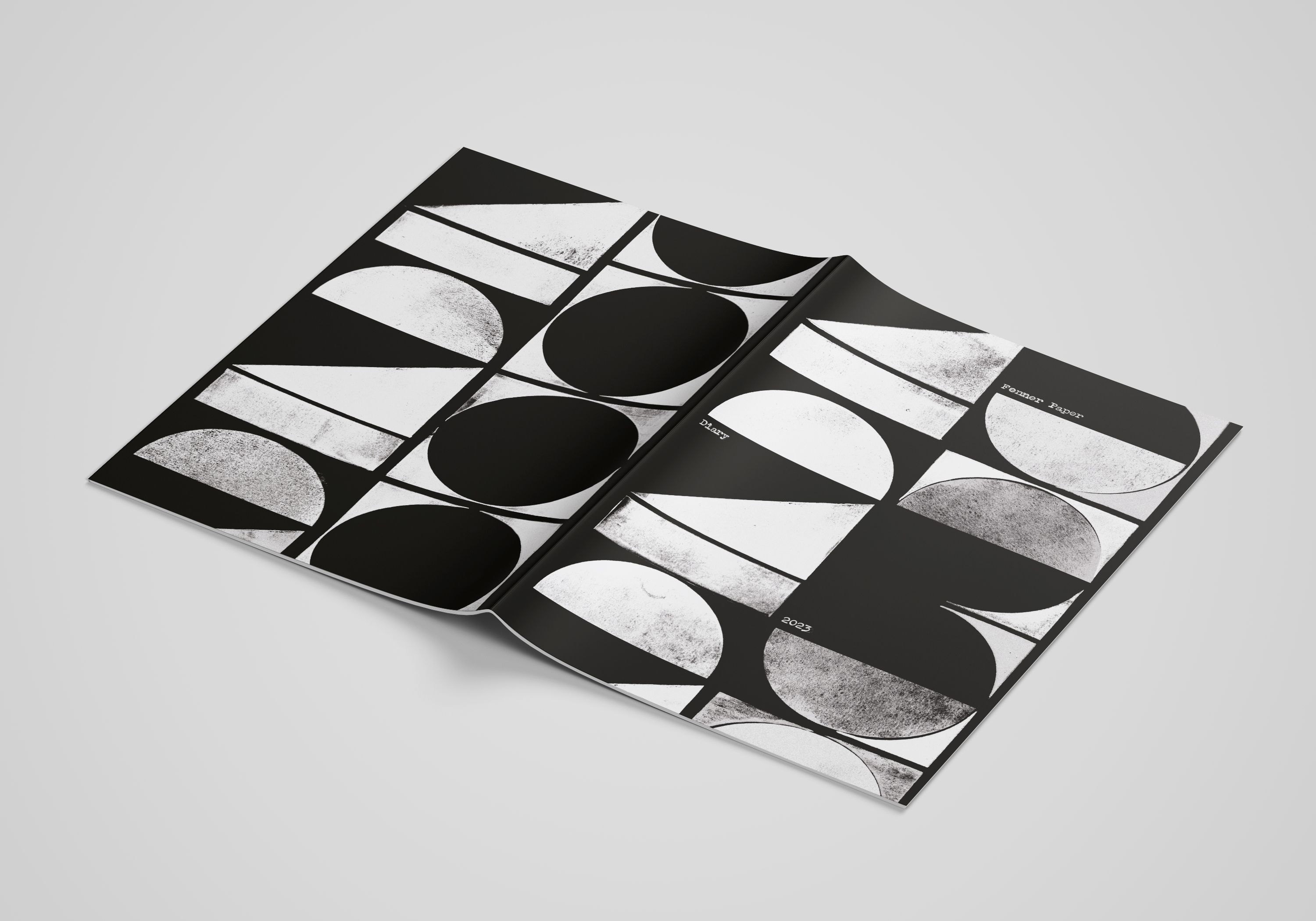
The majority of spreads are full colour images bleeding off the page which are discretely merged with other images set within solid colour panels, which are printed out of four colour process. 
The text is printed on our Neptune Unique SoftWhite 120gsm, an uncoated off-white, smooth (yet tactile) text and cover paper - the printed result is simply fantastic.
The book is beautifully bound (section sewn) and has a 14mm spine.
Binding is by Boekbinderij Van Waarden in the Netherlands utilising a special 'lay-flat' technique which retains the integrity of the section sewing thread but without having to 'fight' with the binding! it lays nice and flat...
...as you can see from the below image.
The book is published by Sylph Editions. Design is by Ornan Rotem and production is by Num Stibbe.

Scanning is by Laumont Studio (New York) and the book is typeset in Trinité. The superb printing is offset litho on a Komori H-UV press and is printed by Cassochrome in Belgium. The printed result on this uncoated substrate is simply superb, which combined with the superlative binding makes this a piece of print that is seriously noteworthy.

http://www.sylpheditions.com/
https://www.csc.be/
https://www.boekbinderijvanwaarden.nl/index.en.html
Posted by Justin Hobson 28.11.2022