Thursday 27 August 2015

Little Boy Found

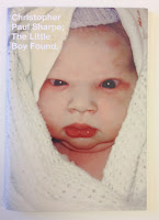
This limited edition publication is the second of two publications produced by London based photographer  and artist Christopher Paul Sharpe. This is the second book titled The Little Boy Found (the first book is called Little Boy Lost) contains images edited by Lu Bowan, with each of the photographs relating to the theme of ‘lost and found’ ...a very eclectic mix.
Click on images to enlarge
Size is 210x148mm (A5), portrait with a 4pp cover printed on Omnia 200gsm and 36pp text printed on Omnia 120gsm. 
The book is digitally printed on an HP Indigo press by Gavin Martin Colournet. Omnia is suitable for use on HP Indigo presses if it has been 'sapphire coated'. The colours are strong and punchy and the whole book has a matt, tactile look and feel, the effect of which is every bit as good as litho.
The book is 'singer sewn' with a white thread which is a perfect detail that just adds to the overall effect of this beautifully produced little book.
Outside back cover:
Design is by Studio Thomson, Creative directors are Mark Thomson and Chris Thomson. The book has a limited print edition size of 150 copies. Books are for sale online and also at Foyles. Print and finishing is by Gavin Martin Colournet.

...and for your interest, both books were recently featured as book of the day on the 'self publish be happy' website: http://www.selfpublishbehappy.com/2015/04/book-du-jour-the-little-boy-lost-the-little-boy-found-by-christopher-paul-sharpe/

http://christopherpaulsharpe.com/
http://www.studiothomson.com/
http://www.gavinmartincolournet.co.uk/
Posted by Justin Hobson 27.08.2015


Tuesday 25 August 2015

787 and you...

At the end of last year, Virgin Atlantic launched their Boeing 787 Dreamliner. Currently they operate four 787s and by the end of 2015, there will be nine in the fleet.

This is a big commitment for the airline and in order to make sure that all crew and staff are 'on board' and fully informed about the new aircraft, they produced this charming little book.
Click on images to enlarge
Size of the booklet is A6 (148x105mm) portrait, with an 8pp cover and 20pp text and is saddle stitched. The cover is hot foil blocked in metallic gold foil, with a filigree type pattern. The below image shows the amazingly detailed hot foil blocking.
The materials chosen for this book is our Stardream from Cordenons. The 8pp cover is foiled on Stardream Bronze 285gsm and the 20pp text is printed offset litho in two colours on Stardream Crystal 120gsm.
The materials were specifically chosen with the aircraft in mind. The Stardream Bronze used for the cover is an excellent match for the materials used on the outer shells of the seats (in Upper Class) and the text pages are a good match for the pearlescent finish used in Upper Class bar area.
A point I should like to make here is just how important a piece of employee engagement literature, such as this, can be. Many organisations rely on powerpoint presentations, pdf's or even photocopied sheets for their internal communications. By producing this type of well designed, engaging publication, Virgin Atlantic demonstrate their professionalism and dedication to staff involvement.  
There are some superb 'thumbnail' illustrations on the text pages:
The brass wire used for the saddle stitching works beautifully with the gold foiling on the cover. A well considered detail....
If your finisher or printer tries to tell you that they can't get different coloured wire, or if they seem reluctant to use anything other than steel, I suggest you get in contact with these people: http://www.primewire.co.uk/
Above is 'birds eye' view showing 8pp cover. On the right hand side, there is an image showing the three stitches on the inside (centre spread). Generally, a project with an 8pp cover requires the text to be stitched with a 'security stitch' in the middle of the book and the text is then trimmed to size. The 8pp cover is then attached with two stitches in the normal position.

Below image shows the detail of the outside back cover.
Design is by the Virgin Atlantic in-house Design Team and Nik Lusardi is the Design Manager. Designer on this project is freelance designer Val Kildea and thanks to Val for sending me a copy.

Print production is by Hampton Printing based in Bristol and they have made a stunning job of the foiling and print.

http://www.virgin-atlantic.com/gb/en/the-virgin-experience/787.html
http://www.hampton-printing.co.uk/
http://www.vtype.co.uk/
Posted by Justin Hobson 25.08.2015

Thursday 20 August 2015

Nocturne Spring/Summer

Nocturne is a London brand of integrated jewellery and ready-to-wear. Nocturne is gaining a global cult following for innovative handwork in definitive shapes with eclectic colour compositions. Nocturne has been under the creative lead of Catherine Howkins since 2011 working from their design studio based in Dalston, East London.
This is the lookbook from the last Spring/Summer collection. Size is 290x225mm. It is produced on our Marazion Ultra, with a 4pp cover on 135gsm and 20pp text on 115gsm.
Click on images to enlarge
Many of the spreads alternate between full spreads or images per page or just overlapping and on some spreads there's even a completely blank page which creates a luxurious feeling of space.
 The deliberately lightweight feel allows the pages to flow freely and to sit flat, allowing for perfect read-overs. The material is perfectly chosen with the Marazion Ultra having a lightweight, matt look and feel but with the images reproducing beautifully with great clarity and detail. It's a very engaging piece of literature. You can see from the image below, the way it flops and flows easily:
A lovely feature is the black wire used for the saddle stitching, a quality touch.
Art Direction and design is by Everything in Between, Creative partners are Arran Scott-Lidgett and Sarah Carr. Print is by Push (superb fleshtone reproduction)

http://e-i-b.com/
Posted by Justin Hobson 20.07.2015

Tuesday 18 August 2015

What is ...manila, or is it manilla?

What is ...Number 20
Regular followers of this blog will know that in the middle of the month, I publish a "What is ....? post. The article covers various aspects of paper, printing and finishing in greater depth. However, many of these subjects are complex, so these posts are only intended to be a brief introduction to the topic.

What is ...manila, or is it manilla?

Manilla paper and Manilla board are two products which get talked about a lot but it seems to me that most people have a perception of what they are but aren't actually sure what they really are!
Manilla board
Manila is a type of buff-coloured fibre which comes from a plant called Musa textilis, which is a relative of a banana tree, native to the Philippines. It is often referred to as Manila hemp or Abacá, although the term Manila Hemp is incorrect as it is not hemp ( which comes from the plant Cannabis Sativa, which is no realtive of the banana). It is likely that the 'hemp' name was attached because both Hemp and Manila were major sources of fibre for both papermaking and ropemaking and it is likely that the words then became connected - this was back in the 19th century.

Manila fibres, which are hard fibres, are long and strong and it is for these properties that it was used for specific papermaking uses, where are hardwearing, durable paper or board was required. In it's unbleached state, it produces a buff coloured pulp which makes a brown shade of paper or board, which became synonymous with brown envelopes and files.

Here is a typical manila envelope:
Click on images to enlarge
Traditionally, manilla envelopes often have a 'basketweave' pattern, which is produced by a woven woolen felt on the paper machine
Basketweave pattern
Manila or Manilla? For some reason in the world of paper, Manila (the spelling of the capital of the Philipines) has had an extra L added to it and it is known as Manilla. Having researched this, I have found no reasonable explanation for this whatsoever other than it is likely that it was 'anglicised' - maybe the English just thought the word should have two L's!

The term Manilla paper and board, now describes either a light brown colour or a smooth type of coloured board. Sadly it is unlikely that Manila fibres will be found in either! Brown envelopes, which are called manilla enevlopes are usually just made from poor quality 100% recycled fibres and manilla file board is usually from normal wood pulp fibres. Where Manila fibres are used is in specialised paper products such as tea bags, filter paper and banknotes.
Posted by Justin Hobson 18.08.2015

Friday 14 August 2015

GREY GOOSE Boulangerie François

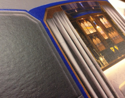
This summer, GREY GOOSE Boulangerie François, in partnership with Harvey Nichols, has created the World’s Most Intimate Martini Bar. Hidden inside a beautifully designed camionnette (a vintage Citroen delivery van) GREY GOOSE has created a luxurious space reserved for the select few to experience the mixing of a their own bespoke Martini.

The 'van' is visiting London, Edinburgh and Manchester.
Click on images to enlarge
This 4pp invitation is 210x120mm, portrait and is printed on our Omnia 320gsm, which is a very bulky board with a subtle, natural texture and tactile surface. Reproduction is superb with the colours bright and vibrant.
The invitation has been digitally printed on an HP Indigo press. The colours are strong and punchy and the invite has a matt, tactile look and feel - in fact I can honestly say, every bit as good as litho!
Although Omnia was never originally developed for digital, we now keep it as a stock item with "sapphire treatment". This treatment is often applied to more unusual papers and provides a "key" so that the inks (which are different to litho inks) work on the paper surface. The great thing is the job just doesn't look and feel like a 'digital' job.

Centre spread:
Outside back cover printed in a gorgeous, rich blue:
The Boulangerie François concept was developed and implemented by London based branding agency Ragged Edge  founded by Max Ottignon.
 
Print and finishing is by Essex based digital printer, Ashwyk. Thanks to Joe de Wykerslooth for sending me some file copies.
 
Posted by Justin Hobson 14.08.2015 

Thursday 13 August 2015

...and now for something not about paper!

Cai and Kyn is a design partnership run by two brothers, who are also both dad's and they have just launched a blog dedicated to dads who have a passion for design. The content varies from Q&A’s with industry leading design dads - finding out how they manage work and family life to super cool kid and dad related Apps, books, products and clothing.

They've only just started the blog but there's already lots of interesting stuff - take a look Dads and Design . You can subscribe to the newsletter and follow on twitter, facebook etc The objective is to try and build a collective of dad’s that are all adding content, bringing their own experience and expertise, and adding to the overall voice of the blog. So if you’re interested, or know of anyone who you think might be interested please get in touch with Cai and Kyn through the blog.

There's a really interesting article by Jamie Ellul of Supple Studio about making time for the family, while still running a successful studio. Very interesting.
http://www.dadsanddesign.com/life/why-is-it-so-hard-for-designers-to-work-less/
 Have a read and enjoy ...(I'm sure Mum's are welcome too!)
http://www.dadsanddesign.com/
Posted by Justin Hobson 13.08.2015

Tuesday 11 August 2015

Cranbrook Prospectus

Cranbrook is unique school in the state sector, as the only state grammar school in the country that is 13+, co-educational and caters for both day and boarding students. Situated in the village of Cranbrook in Kent, the school is a highly regarded are desirable school in the local area. This outstanding school prospectus is worthy of one of the top schools in the country.

The format is a combination of a folder and saddle stitched brochure which work hand in glove.
The 4pp folder has a 75mm glued pocket on the inside back cover. The folder is produced on our Colorset Nero 350gsm (100% Recycled) and is printed offset litho in one colour (pantone gold).
The folder (open below) with prospectus in the pocket.
Click on images to enlarge
Size of the prospectus is A4, portrait with a 4pp cover which is cut short on both front and back. The cover is printed on our Colorset Crimson 270gsm (100% Recycled) and is printed offset litho in one colour (pantone gold) and hot foil blocked in metallic gold foil
 The crisp hot foil blocking 'lifts' the quality of the whole production without in any way looking 'bling' which, when overused, gold foil blocking can do. The combination of the print and foil is perfect.
The 20pp text is printed offset litho in CMYK on our StarFine White 150gsm. StarFine is a quality, uncoated paper and as the images show, the reproduction is excellent - great detail for an uncoated paper, colours are bright and vivid.
You can read more about the project here:http://www.wearetangerine.co.uk/project/cranbrook-school/
Another thing worth pointing out is the neat parallel creases on the folder. It's this sort of attention to detail that makes all the difference to literature such as this....
Branding and literature design is by Maidstone based consultancy We are Tangerine. Design director on the project is Claire Hobbs. The printing is by Paddock Wood based printer Typecast Colour.

http://www.typecast.co.uk/
Posted by Justin Hobson 11.08.2015